Elements
With drag & drop, it is easy to create high performance applications and forms. You have a toolbox of modules at your disposal with which you can create application pages: Input fields, buttons, tables, diagrams, filters and much more. Each element has a graphical configuration dialog, the properties dialog, in which you have access to all settings.
Create elements
Elements can be created in the "Applications" module. Find out how to access the module in the Portal Manager here.
Create an application or open an existing, published application.
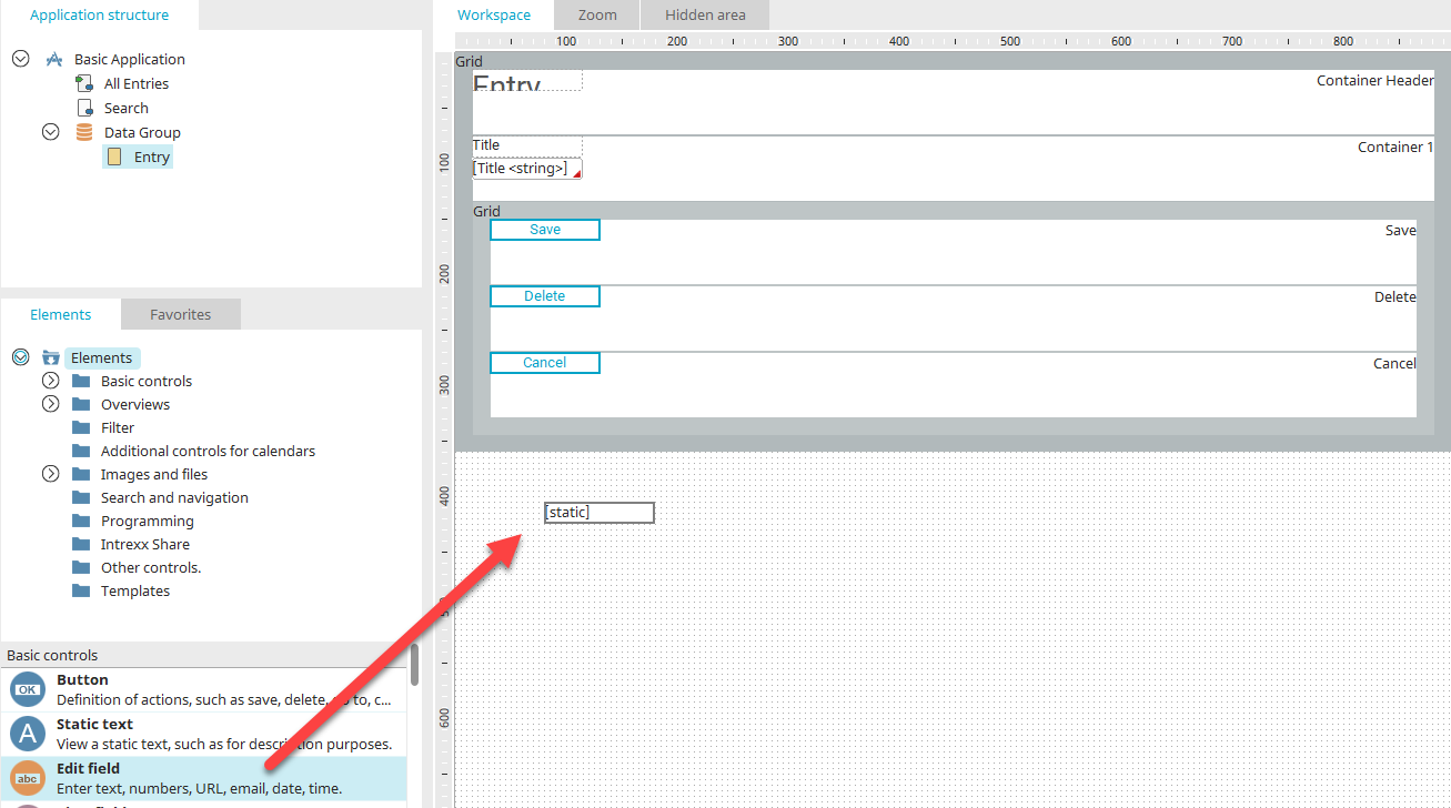
To create a new element, please select a page in the application structure. Depending on the type of page you selected, only the elements which are suitable for the page will be available in the Elements area. Next, drag the element that you wish to create to the workspace. The borders of the element will be shown as a preview of the element. When you let go of the mouse button, a wizard will open that will help you configure the element.
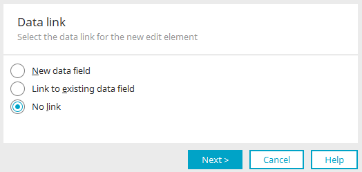
Data link
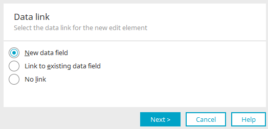
When creating most elements, the data link is defined first. A data field can only be newly created or linked to the element if the page containing the element is in a data group. If this is not the case, only the "No link" option is available here.
If you select the "New data field" option, a new data field is created together with the element and is automatically linked to the element. All data entered later in the input element is stored in this data field when the data record is saved.
Click "Next".
New data field
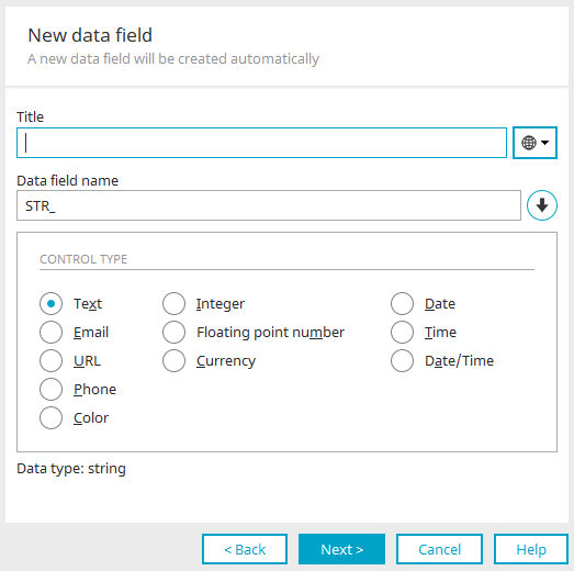
Title
The data field's title can be modified here. Click here for more information about this topic.
Data field name
The name of the data field can be changed here, provided the application has not been published yet. The prefix is updated when the data type (see below) is modified. The actual name is not modified. If the specified name does not possess a data type prefix, changing the data type will leave the name as it is. This means, for example, changing the data type from string to datetime would change the name from "STR_NAME" to "DT_NAME", whereas "TEST_NAME" would not be changed.
 Create name from title
Adopts the title as the name of the data field, keeping the prefix of the data field name.
Control type
All information about the control types can be found here.
Click on "Next" and it will take you to the final settings.
Link to existing data field
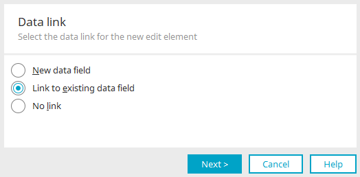
If you select the option "Link to existing data field" in the first step, the data field you want can be selected after clicking "Next" in the next step in the dialog shown below.
Link data field
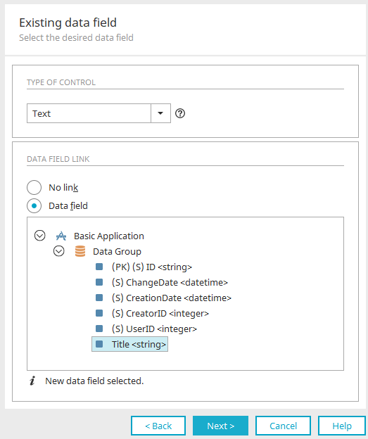
A data field can only be linked to an application element if the page containing the element is in a data group. If this is not the case, only the "No link" option is available here. The element is then not linked to a data field. Otherwise, select the "Data field" option to link the element to an existing data field and select the desired data field in the application structure illustration.
Control type
Depending on the data type of the data field linked here and the element, different control types can be selected here. Information about the control types can be found here.
If you access the dialog via the "Dynamic view", "Selection list", "List field" or "Sortable list" elements, a control type cannot be selected.
 Information
Displays an explanatory text for the selected control type.
Click on "Next" and it will take you to the final settings.
No link
The element will be created without a data field.
Click on "Next" and it will take you directly to the final settings.
Final settings
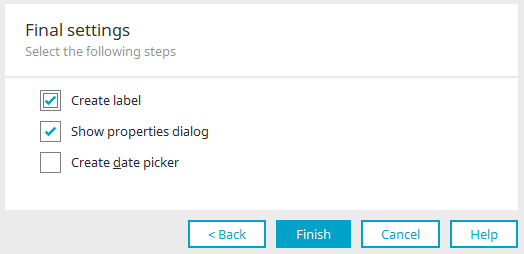
Create label
Together with the new element, a "Static text" element is created as a label, which automatically adopts the title of the new element.
Show properties dialog
You will find these settings for most application elements. This automatically opens the properties dialog once the new element has been completed.
Create date picker
This option is available for selection for input fields with the control type "Date", "Time" or "Date & Time". See here for further information.
Displayed value
In the properties dialog of most elements, the display value that is output in the respective element can be defined on the “Link" tab. You can find a description of the very flexible options available to you here.
Behavior of focus and autofocus
You can define that edit fields and buttons (which have the “Button” or “Text” type) should be given the focus when the page is loaded via the Edit menu / Set focus. One or more elements of the page can be set with "Set focus". When the page is opened, the focus is set to the first visible element.
You can define that a page should not set a focus in the Page properties. If "Set focus" has not been defined for any elements on a page, the initially focused element on the page is determined automatically. The following exceptions apply:
-
The focus is not set on fields in free layout tables
-
The focus is not set within portlets
-
If a page has a tab index, the focus is set on the element with "Tab index 1"
Appearance in the Elements area
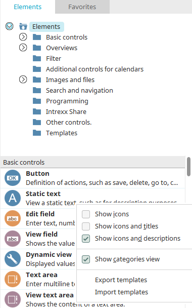
How the elements are displayed in the Elements area can be changed via the context menu.
-
Show icons
Only the icons of the elements are shown with this option.
-
Show icons and titles
The elements' icons and titles are shown with this option.
-
Show icons and descriptions
The elements' icons and descriptions are shown with this option.
-
Show category overview
For this setting, the element categories will be shown in the top half of the Elements area.
If you select a category from the category overview, only the elements from that category will be shown in the bottom section of the Elements area.
Search
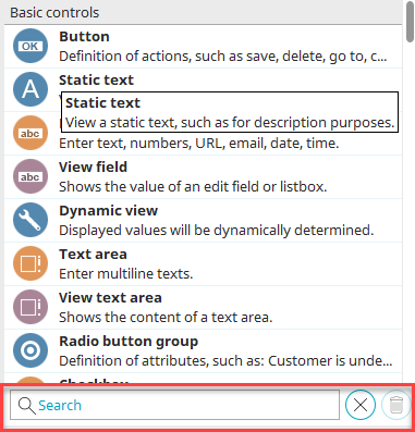
The search is at the very bottom of the Elements area. Enter a search term here. And the elements will be filtered based on your entry.
 Reset filter
Deletes the search term and removes the filter.
The list of application elements is shown below.
Basic controls
Basic controls - Lists
Multiple selection / Multiple selection view
Multiple selection 2.0 / Multiple selection 2.0 View
Sortable list / View sortable list
Overviews
Overviews - Tree controls
Filter
Value menu list/Value list field
Additional controls for calendars
Images and files - Image controls
Images and files - File controls
File selection/File selection view
Exchange file selection for attachments / Exchange file selection view
MS365 OneDrive - integrate into application / use in portal
Search and navigation
Programming
Intrexx Share
Other controls
Tagging – Bookmarks / Tagging bookmark view
Sortable vertical grouping / Sortable horizontal grouping
Templates
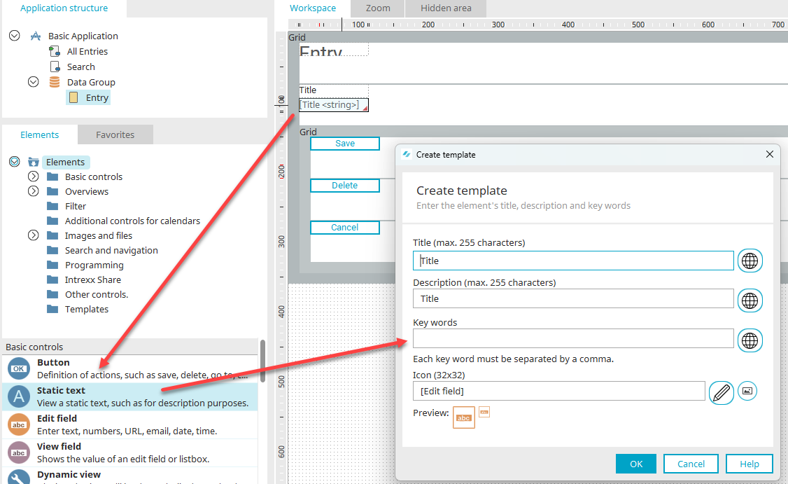
If you drag created elements from the workspace to the Elements area, a dialog will open automatically where the element can be defined as a template. The properties of the element will be transferred to the template. Therefore, if you find that you apply the same configuration to elements again and again, it could be worth creating a template.
It is also possible to drag several elements from the workspace to the "Elements" area at the same time. To do this, simply select the desired elements on the workspace. After dragging and dropping, a template is created that contains all the selected elements.
If the same page is set as the destination for a group of buttons with the Save, Cancel or Delete action, the buttons can be reused without further adjustment.
Create template - Standard icons
The title and description of the element template can be edited here. A maximum of 255 characters is permitted.
Based on the keywords entered here, the user-defined element can be found using the search field in the Elements area. Each keyword must be separated by a comma.
 Multilingualism
In each case, opens a dialog where the title, description or keywords can be entered in multiple languages.
Icon (32x32)
Displays the path and filename of the selected image.
 Select icon
Opens the normal dialog where an image with the dimensions 32 x 32 px can be selected as an icon for the new, user-defined element; this icon will be displayed in the Elements area.
 Select from Intrexx standard icons
Opens a dialog where an icon from the Intrexx standard icons can be selected.
User-defined elements will be saved as a template in the client directory.
Standard icons
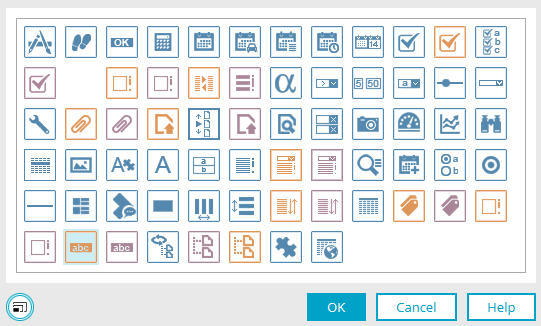
Select the desired standard icon here. Then click "OK" to save the selection and close the dialog again.
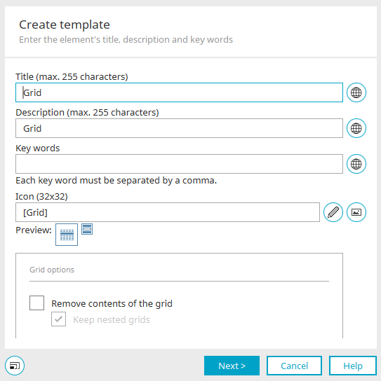
Grid options
Discard contents of the grid
If you want to use an existing grid element as a template, you will also find the "Discard contents of grid" setting here, which discards all elements contained in the grid when the grid template is created.
If the "Keep nested grids" option is selected, grids that are nested in the grid template are kept. If this option is not active, all nested grids are also discarded.
Click "Next".
Configure link destinations
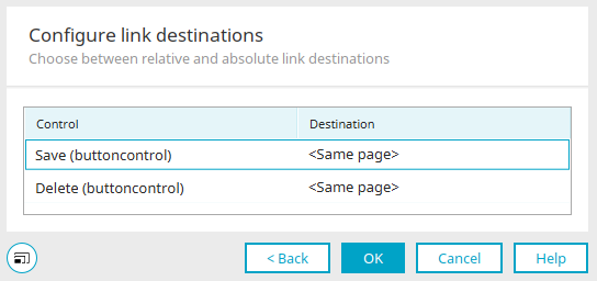
This dialog opens if an element, which links to the application's homepage or the page on which the element is located, is dragged from the workspace to the "Elements" area.
"Control" column
The element and/or components of the control, for which a link destination has been defined, are listed here.
"Destination" column
Here, you can choose whether the link destination should be viewed as absolute or relative when the template is used - even in other applications. Absolute link destinations will always link to the homepage or page, on which the element is located, respectively, from the original application. Alternatively, the link destination can be defined relatively, which is equivalent here to the selection "Start page of the application" or "Same page". This means that the element based on this template will open the corresponding homepage of the current application or the page of the application, where the element is located, respectively.
Click "OK" to save all changes and close the dialog again.
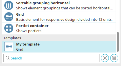
You can find the new template in the Template category at the end of the elements list in the "Elements" area. It can now be used to create new elements with the properties of the template. If you would like to delete a template, simply drag it to the garbage bin symbol at the bottom right.
Import / Export templates
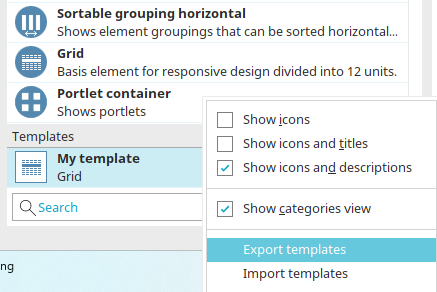
The "Export templates" or "Import templates" context menu opens a dialog that can be used to export and import element templates.
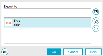
Select the template(s) you would like to export / import.
Export to / Import from
Displays the path to the export / import file. Element templates are exported as a file with the extension ".ixt".
 Select folder
Opens a dialog in which the file export or import directory can be selected.
 Select all
Selects all templates.
 Deselect all
Deselects all templates again.
Functions for the elements sortable list, file selection, view field with control type "Image URL"
|
|
Sortable list |
Image selection |
Image URL |
||
|---|---|---|---|---|---|
| Edit |
View |
Edit |
View |
|
|
| Display link to image in original size | - |
- |
+ |
+ |
+ |
| Rotate images in original size | - |
- |
+ |
+ |
- |
| Rotate images | + |
+ |
+ |
+ |
- |
| Maximum size (Width / Height) | + |
+ |
+ |
+ |
+ |
|
Crop image |
+ |
+ |
+ |
+ |
- |
|
Optimize file size for thumbnails (reduce) |
+ |
+ |
+ |
+ |
- |
|
Adjust control size to maximum size |
- |
- |
- |
+ |
+ |