Button

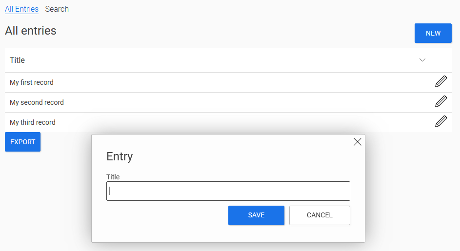
The "Button" application element is part of the basic controls. The figure above shows the "New" button, which when clicked opens an edit page in the tooltip. A new data record can be entered on the edit page. The "Save" and "Cancel" buttons perform the corresponding actions when clicked and then close the edit page again.

Buttons are very versatile and can do a great deal more.

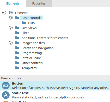
The button element can be found in the "Applications" module in the "Elements" section. A new button can be created by dragging & dropping the element from here and positioning it in the workspace.

More information on creating elements can be found here.

The properties dialog of a button opens automatically when a new button is created. The properties dialog of an existing button can be opened by double-clicking on the element in the workspace, via the "Properties" context menu or via the "Edit / Properties" main menu item when the button is selected.

"Summary" tab

The type of the button, its text and other options can be set here.

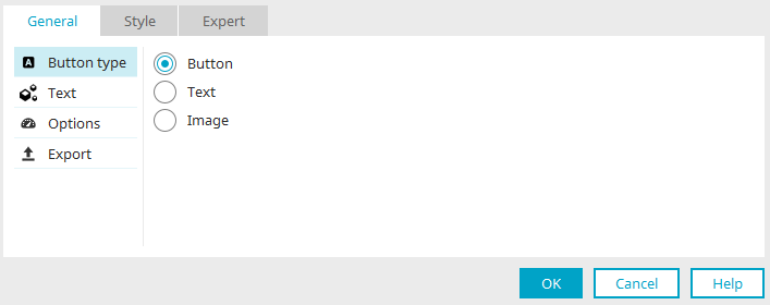
Button type

There are different types for displaying buttons in the browser and they are shown here using the "New" button as an example:

The "Button" setting displays the "New" button as a button in the browser.

The "Text" setting displays the "New" button in the browser as a text link.

The "Image" setting allows an image of your choice to become the button in the browser.

Button text

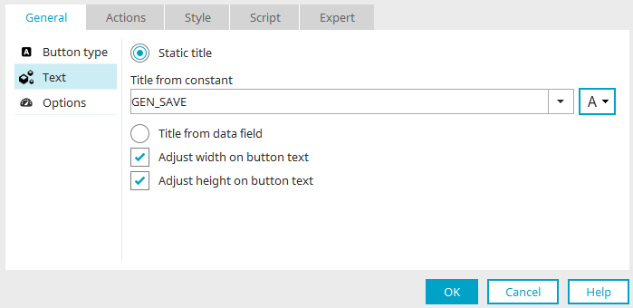
Set which text is used as the label or title of the button here.

Static text

A static text can be defined with this option.

Title

Enter the static text here. Click here for information on multilingual titles.

Adjust width / height on button text

The width or height is adjusted to the size of the button text.

Title from data field

This option can be used to select a data field in the application structure whose value will be used as the title for the button.

Show text if access permissions are insufficient

If this setting is activated and the user does not have the corresponding page or data group permissions, a notification will appear to inform them of this.

Show "empty" when value does not exist

With this setting, the word "empty" will be shown if there is no value.

Adjust width / height on button text

The width or height is adjusted to the size of the button text.

Text button

Here, the "Text" option was selected as the button type in the first step. If you then select "Text" on the left, you can then define the text for the text link in this dialog. The settings correspond to those of the button type "Button".

Screen button

If you select the "Image" option as the button type, the "Text" entry in the left pane of the dialog changes to "Image". Here you can set which image is to be used as a button in the browser.

Static image

With this option, a static image with or without an option for MouseOver can be used.

  • Edit

    Opens a dialog for selecting the image.

  • Delete

    Removes the image.

  • With the arrow buttons the selected image in "Image /Image on MouseOver" can be copied to the other field.

  • Edit alternative text

    Opens a dialog where the text can be entered which should be displayed as an alternative for the image on devices that cannot display images.

Save settings

If you click on "OK" here, the button will be created. The size of an image will then be adjusted to the size of the button on the workspace. With the "Set original size" from the context menu, you can show the image in its original size on the workspace.

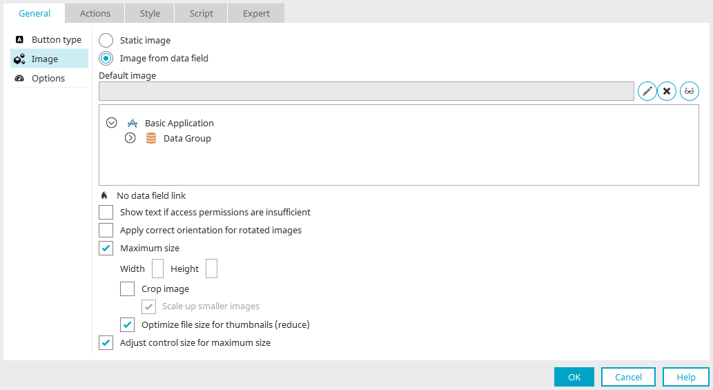
Image from data field

With this option images which are saved in a file data field will be used. Select the data field in the image underneath the setting "Default image".

  • Default image

    The image selected here is shown when the linked data field does not deliver a value.

    • Edit

      Opens a dialog for selecting the image.

    • Delete

      Removes the image.

    • Edit alternative text

      Opens a dialog where the text can be entered which should be displayed as an alternative for the image on devices that cannot display images.

  • Show text if access permissions are insufficient

    If this setting is activated and the user does not have the corresponding page or data group permissions, a notification will appear to inform them of this.

  • Rotate images

    Images from digital cameras always have the same aspect ratio. If a photo is taken upright, the subject will later be shown in a horizontal position in the image. In general, cameras have a position sensor. Instead of rotating the image correspondingly, they will write the positioning information to the image. With this setting, the positioning information will be evaluated by Intrexx and the image will then be rotated as necessary.

  • Maximum size: Width / Height

    The image size is limited to the pixel value entered here.

    • Crop image

      Allows the width and height of the image to be adjusted to the aspect ratio of the button.

      • Enlarge smaller images

        Smaller images will be enlarged up to the stated maximum size.

    • Optimize file size for thumbnails (reduce)

      Reduces the file size for the sake of increasing the application page's loading time.

  • Adjust control size to maximum size

    If the size of the button is changed on the workspace, the current width and height are automatically written in the general properties. If this setting is not active, these values and the size of the control on the workspace will not be synchronized.

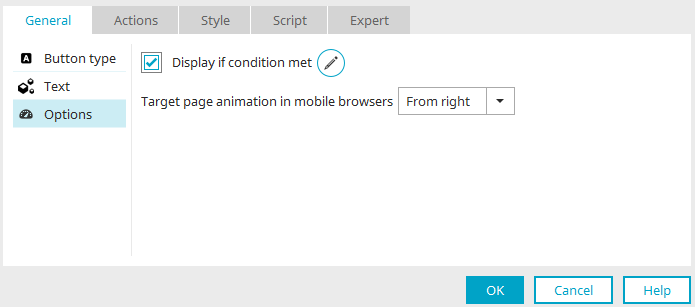
Options

Conditional display

Click here for more information about this topic.

Target page animation in mobile browsers

Allows you to determine how the button will function for touch screens. Select the direction of movement, "From right" or "From left".

This setting is only available if the current page has been transformed for mobile devices.

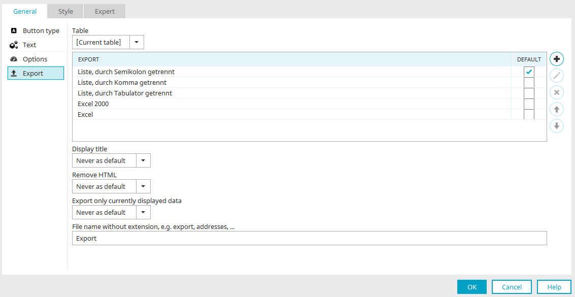
Export

This setting can be found on the "Options" tab at

Click here for more information.
Actions

With a click on a button in the browser, a variety of other actions can be performed in addition to saving and deleting records. You can find out how to configure the button here as an application developer.

No action

If a button is only used to load another page, for example, select the action type "No action".

Save

Button on edit pages

The "Save" action is available if the button is on edit pages that a WriteContainer has been defined for. The current data record is saved when the user clicks on the button.

Button on view pages

The "Save" action is available on view pages that contain a free layout table. All data records in the free layout table will be saved. Click here to read our Tips & Tricks article about editing data in free layout tables.

Permissions

If the user does not have the corresponding permissions, the button will be hidden in the browser.

Delete

On a page within a data group, the current data record and all dependent data records in subordinate data groups will be deleted with this action.

Link destination

Under "Link destination", you can define whether and which page should be opened when a user clicks on the button.

Jump

In this drop-down list, you can select that the button should jump "To a page of an application", if the action type “Save” or “Delete” has been chosen. If the action type “No action” is selected, the following options are available:

  • No jump

    This setting can, for example be used, if a button performs a JavaScript but should not perform another action or load a page.

  • Back

    Jumps back to the previously loaded page.

  • To a page of an application

    Loads the corresponding page.

  • To URL

    Jumps to the URL specified in the "Destination" field below the drop-down list.

  • To the start page of the portal

    Loads the portal's start page (cannot be selected for the "Button" button type).

  • To the Plugin page

    If the jump target is set from a calendar element, the page where the calendar plugin is defined can be opened here.

Link destination

The page that should be opened is automatically entered into this field when you click on it in the application structure depicted beneath.

Application

Here, select the application that contains the target page.

Create new record

This setting can be activated for pages that perform a jump to edit pages. In this case, the edit page will be loaded with empty fields and without data so that the user can create a new data record.

Jump to existing data set

This option can be used, for example, to open an existing data set contained in view tables.

Link destination for view table, free-layout table and diagram

A link destination can also be set for

  • buttons and data fields that are included in a column in a view table

  • Data records in a free-layout table, if the setting "Entry is link" is enabled here

  • clicks on points in charts

The link destination determines which page will be loaded to display the data record when a user clicks on the button or on a data record in the free layout table in the browser.

Enable the "Entry is link" setting for the free-layout table if a link is should be executed on clicking a data record.

Also set the "Entry is link" setting for data fields that are included in view tables so that the entries function as text links.

Parameters

Parameters can be defined for the "No action", "Save" and "Delete" actions. These parameters are then analyzed by the called page defined as the link destination. Click here for more information about the settings in this area. Click here for general information about parameters.

Target page options

For the actions "No action", "Save" and “Delete”, here you can set how the target page is opened.

Open target in current window

Opens the target page in the currently opened window.

If buttons with this setting open pages from within a portlet, then the page will be opened in the portlet. If the page contains a lot of elements, all page elements may not be displayed in some cases. The "Open target in main window" setting is much more suitable in this case as the loaded page will be displayed in its entirety.

Open target in main window

Opens the target page in the main window.

Open as tooltip

Opens the target page as a tooltip. The following settings can also be made here:

  • Open at mouseover

    The target page will be shown as a tooltip as soon as the user moves the mouse over the link/button.

  • Open modal

    This setting is not available if the "Open on mouseover" setting is selected.

    A modally opened dialog disables the rest of the application as long as it is being displayed. This means that users can only interact with application elements within the modal dialog but not with elements outside the dialog.

  • Show page title

    The page title is shown in the title bar of the tooltip in the browser. Use drag & drop to move the tooltip via the page title. This is not possible without the page title.

  • Show close symbol

    A symbol will be shown in the upper right-hand corner of the tooltip, allowing the tooltip to be closed.

  • Configure tooltip positioning

    Clicking this button opens a dialog that allows you to set the position of the tooltip on the page.

  • Show confirm dialog when closing the tooltip

    With this setting, the message shown above is displayed when a tooltip page is to be closed via the close icon at the top right and there are entries in input or text fields. This helps prevent data from being lost unintentionally. So that this setting functions correctly, the elements to be checked may not be in the hidden area. They should also not be write-protected. This option is not available for the Show/Hide flexible action.

Open in grouping (embedded tooltip)

With this setting, the tooltip will open in a grouping on the current page; this can be selected beneath this setting. The grouping has to use the HTML element "DIV". If a different HTML element, apart from div, is used in a group that will be the target container for a tooltip, a notification will appear. Furthermore, the area “Notifications” lists the elements for which this grouping is setup as a target container. From here, you can navigate to the triggering elements by double-clicking.

Create new grouping

Creates a new, empty grouping.

Restore grouping content when closing the tooltip

When displaying a tooltip in a new grouping, the tooltip will take up the entire container. Content, which was already there, will be overwritten in this way. The setting "Restore grouping content when closing the tooltip" means that the original content will be shown again, when the tooltip is closed. If this option is not selected, the grouping will remain empty.

Print view

Use this setting to print the page via the browser. For this, the target page must be loaded in a popup window. The "Print view" setting has no effect for pages in the main window.

The layout of the print view can be influenced with custom styles. Click here for more information.
Within tooltip window

These settings are relevant if the page, where the destination options are defined, is displayed in a tooltip.

Close tooltip

Closes the current page when the button is clicked on.

Reload window

The target page can be reloaded with this setting.

Delete / Save at link destination

If the target page is opened in a popup or a tooltip, you may define which area of the page, which the target page will be loaded from, should be refreshed. After the Save / Delete action is performed, the entire page (or just the table) can be refreshed. If the button is located within a free layout table, then this free layout table can be reloaded as well. After the Save / Delete action is performed, the entire page (or just the table) can be refreshed.

Email configuration

Click here for more information about this topic.

WriteContainer

At least one WriteContainer needs to be selected for the actions "Save" and "Delete". The action is then applied to the data linked in the WriteContainer. In doing so, different areas on one page can be saved separately from another via their own button.

Add container

Opens a dialog where a WriteContainer can be selected.

The desired WriteContainer can be selected here.

Click "OK" afterwards to save the changes and close the dialog again.

Remove container

Deletes the link to the currently selected WriteContainer.

Move up / Move down

Modifies the order of the selected WriteContainers.

Move container up / down

With this action type, the button can be used to page through data records.

Options

Select the property of this navigation button.

Edit parameter

Opens a dialog where parameters for the navigation button can be defined.

To the first record

Jump to the first record.

To the previous record

Jump to the previous record.

To the next record

Jump to the next record.

To the last record

Jump to the last record.

Save current data record

With this option, the data record will be saved.

Email configuration

Click here for more information about this topic.

Data Picker

This action type compares a search term with the values of a data field. The edit fields of the current page can be mapped to the data fields of the selected application and data group. If the search is successful the found data will automatically populate the mapped edit fields. If, for example, a user enters the name of an employee into the field and clicks on the Data Picker button, the Data Picker searches for the email address and telephone number of the employee and enters these automatically into the assigned edit fields.

Search field

Select the edit field that should be used as the search field.

Extended

Opens a dialog where the appearance of the table, where the search results are listed, can be modified.

Columns

Available

In this list, all edit fields in the connected data group will be shown.

Selected

The fields in this list will be shown in the results table as a column.

Move right / left

Move entries from one list to the other.

Move up / down

Set the order of the columns in the table. The following rule applies here: the higher a field is placed in the list, the further left the column will be shown in the table.

Edit

Opens a dialog where the title of the column can be changed.

Control type

The desired control type can be selected here to display the values in the results table.

Sort

The results table will be sorted by the field entered here.

Sorting

Opens a dialog where the sorting can be edited.

Results list

Number of records

The maximum number of shown hits per table page.

Show navigation element

Shows the navigation element at the foot of the results table, which allows the user to move to additional pages of the table.

Show results with an entry length of at least ... Display characters automatically

If a single result is found, it will automatically be entered into the connected fields by the Data Picker. Multiple hits will be shown as a tooltip. This setting defines after how many entered characters this tooltip will open.

Click "OK" to save changes and close the dialog again.

Operation

The type of comparison can be determined here:

  • Contains

    Returns results if the search term is contained in the data field value.

  • Starts with

    Returns results if the search term corresponds to the first characters of the data field value.

  • Ends with

    Returns results if the search term corresponds to the last characters of the data field value.

  • Equal to

    Returns results if the search term corresponds to the data field value.

Application, Data group, Data field

Here, select the data that should be searched through.

Filter

Opens a dialog where a filter for restricting the data can be defined.

Mapping

In this list, you can see every element that can be populated by the Data Picker.

Data fields

Mapping list

All of the elements on the current page, which are available for the Data Picker, are listed here.

Data fields list

All of the available data fields from the current application and data group are listed here.

Maps the selected elements to one another or removes the mapping, respectively. An assignment can only be made if the data type of the elements and data fields match.

If no data record is found: Clear the related input controls

The search field will be cleared if the search was unsuccessful.

Show an info view

With this setting, a message is shown both in case of an unsuccessful search ("No data record found") and if data records were found (e.g. "A record was found and inserted"). The message is also shown if multiple potential data records are shown in a results table for selection.

Add data record

With this action, new entries can be added to drop-down lists, listboxes or free layout table in the browser. The new entries will be simultaneously saved to the data group connected to the drop-down list or table, respectively.

Depending on whether you select a drop-down list or a listbox or a free layout table, different settings are can be chosen here.

Drop-down list / Listbox

Control

Select the desired drop-down list or listbox here.

Page

Select the edit page where new data can be defined. When the user clicks on the button in the browser, a tooltip will open where the new entry for the drop-down list can be defined.

Parameters

The description for these settings is available here. You can find general information on parameters here.

Free layout table

Control

Select the desired free layout table. Only tables that use an edit page for the data view can be selected here.

Number

Enter an integer that defines how often the edit page should be loaded in the table. With a number > 1, multiple data records can be defined in the table.

Parameters

The description for these settings is available here. You can find general information on parameters here.

Function in the browser

Here you can see the free layout table after clicking the "Add data" button. The number is set to 1 in the button properties. A blank linked input page is therefore displayed at the bottom of the table and a record can be entered. The "OK" button with the "Save" action on the edit page is also shown. When the user clicks on "OK", the new data record will be saved. Here you will find tips and tricks for editing data in a free layout table.

Calendar plugin

Click here for further information about this action button.

Show/Hide

This action will show or hide grouped elements in the browser.

Grouping

Select the group to be shown or hidden from this list.

Show grouping on initial status

This setting will show the group when the page is loaded.

Save changes in cookie

Selecting this option will return the user to the last status (group shown or hidden) when the page is reloaded in the browser.

Show/Hide flexible

As opposed to the “Show/Hide” action, the grouped elements will be shown here in the form of a tooltip.

Grouping

Select the grouping from this list that should be shown or hidden in the tooltip.

Open modal

If a tooltip is opened modally, the rest of the page is only accessible once the tooltip has been closed.

Show close symbol

Shows a button at the top right of the tooltip. This can be used to close the tooltip.

Positioning

The currently defined positioning of the tooltip is shown here.

Configure tooltip positioning

Opens a dialog where the position the tooltip should open at can be configured.

Search

The Search button action is used in connection with the “Search” view element. Find all the information here.

Microsoft Teams communication

Click here for more information about this topic.

Create document

Click here for more information about this topic.

Previous / Next

Click here for more information about these actions.

Delete folder

This action is used in combination with the elements Tree and Tree view for the "Delete folder" button. This button can be generated in the Final settings dialog while creating a Tree element. Clicking on this button in the browser deletes the currently selected folder in the tree.

Options

Tree

Select the tree element that the button is connected to.

Configure tooltip positioning

For the button actions "Save", "Delete" and "No action", the position where the corresponding tooltip should be shown can be configured in the target page options, and the button action "Show-Hide-Flexible".

Positioning

Use default settings

Depending on the other settings (e.g. a modally opened tooltip), the previously used positioning will be applied. With the standard setting, the tooltip will, for example, always orientate itself to the button clicked on.

Position at browser window

If this setting is selected, the tooltip will orientate itself to the browser window. Click on the graphic below this setting to determine the position of the tooltip relative to the browser window.

Fix tooltip position

With this setting, the tooltip stays at the assigned window position and does not scroll with the page's content.

Open at element

You can select an element here at which the tooltip should be opened.

Positioning

Here, the element will be symbolized with a border and green dots. The greyed-out areas around the dots correspond to the later position of the tooltip. In the positioning schema, click on the position where the tooltip should be opened.

Offset X / Y

An additional offset from the element can be specified in pixels here. Offset X offsets the tooltip horizontally and Offset Y vertically.

Examples

In the following figure, you will see a few examples of how the positioning (without offset) will be implemented in the browser.

View

Tooltip height / width

The height and width of the tooltip can be defined in pixels or as a percentage based on the window height/width.

Style class

Here, one of the style classes defined for tooltips in the "Design" module can be selected. By selecting "Default style class", the default style class for tooltips will be used.

Close automatically

The tooltip will be closed automatically after the specified time.

After ... milliseconds

The length of time is specified in milliseconds here.