

View Table

A view table displays data records in tabular form. For each data field included in the table, a table column is created; for each record, a table row is created. You can sort the table in your browser by clicking on a column header. A view table can display data from the same level, data from parent data groups, and data from the immediately subordinate data group (child data group).
General information about data groups in applications can be found here.
Data from a view table can be exported in various formats.
The "View Table" element is part of the overviews.
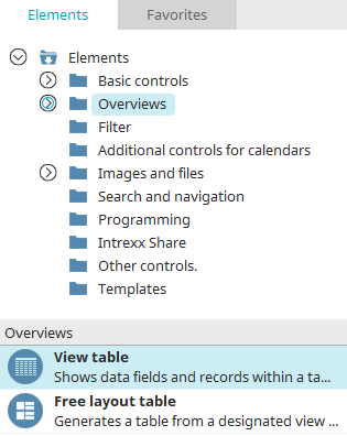
You can find the view table in the "Applications" module under "Elements. " You can create a new element by dragging and dropping it from here onto the workspace.
For more information on creating elements, click here.
The Properties dialog box for a view table opens automatically when the table is created.
You can open the Properties dialog box for an existing view table by double-clicking the element on the workspace, selecting "Properties" from the context menu, or choosing "Edit / Properties" from the main menu when the table is selected on the workspace.
Data
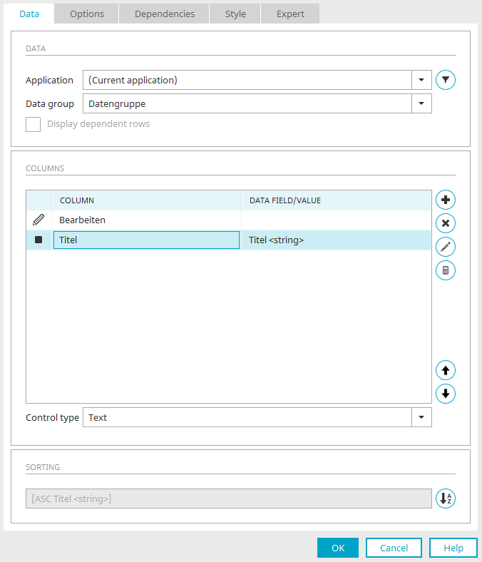
On the "Data" tab in the View Tables Properties dialog box, you can configure the data source and the table columns. In addition, you can specify how the table is sorted.
Application / Data Group
Select the data source here.
 Filter
Opens a dialog box where you can define a filter to limit the records in the view table.
Show Dependent Rows
This setting is available only if you have selected a child data group as the data source. With this setting, only the records that have a parent-child relationship with the currently selected record are displayed.
Columns
This section lists all the names of the data fields that are included as table columns. Under "Data Field/Value," you'll find the data type for each of the integrated data fields.
 Add a column
Opens a menu with additional functions.
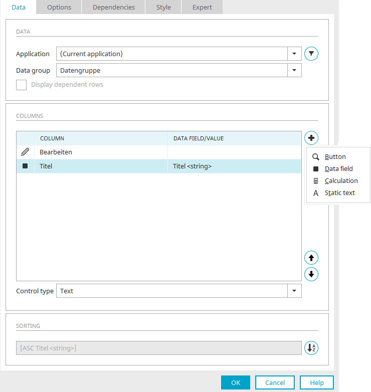
 Button
This menu option allows you to create any number of buttons that will later be available for each row in the table. Each button is displayed in its own table column and can open a page showing the data in detail. You can select the page you want from the "Jump to" drop-down list.
 Data field
Opens a dialog box where you can select the desired data fields and add them as table columns.
Select a column
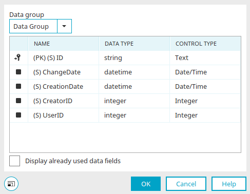
Select the desired data group here, and then select the data field.
Show data fields that have already been used
If this setting is not enabled, only those data fields that have not yet been included in a table column or as a control will be offered as options. If this setting is enabled, all selectable fields will be displayed.
Click "OK" to confirm your selection and close the dialog box.
 Calculation
This menu option allows you to perform calculations in an area below the view table, such as calculating the total for a column. You can find more information here.
 Static Text
A column is inserted here to allow for the inclusion of static text.
 Remove Column
The selected table column will be removed from the list.
 Edit Column
Depending on which column is currently selected (button, data field, calculation, or static text), the corresponding Properties dialog box opens, where you can find additional settings.
For further assistance, click "Help" in the lower-right corner of the dialog box or press the F1 key.
Edit the section for the overall calculation
Here, too, calculations can be performed in an area below the view table. You can find more information here.


You can use the arrow buttons to change the order of the columns. The rule is: the higher a field is positioned in the list, the further to the left the column will appear in the table.
Control Type
If a table column is selected, the available validation types are listed under the "Columns" section. For a button, you can specify the link destination.
The "Dynamic View" control type can be used for data fields of the type
-
string
-
text
-
integer
-
double
-
datetime
-
boolean
can be selected (that is, for all data types except the file data type) if the data field comes from the data group that provides the data for the view table.
The "Multiple Selection" or "Multiple Selection 2.0" control type must be used for data fields of the type
-
string
-
text
-
integer
-
double
-
datetime
-
boolean
can be selected (i.e., for all data types except the "file" data type) if the data field comes from a child data group of the data group that provides the data for the view table. For child data fields of the file data type, the control type "Multiple Selection" or "Multiple Selection 2.0" may be selected, but this is not required.
Sorting
 Sorting
Opens a dialog box where you can set the table's sort order.
Click "OK" to finish configuring the view table. It is then placed on the work surface. There, you can open the Properties dialog by double-clicking the element if you want to edit the settings.
Options
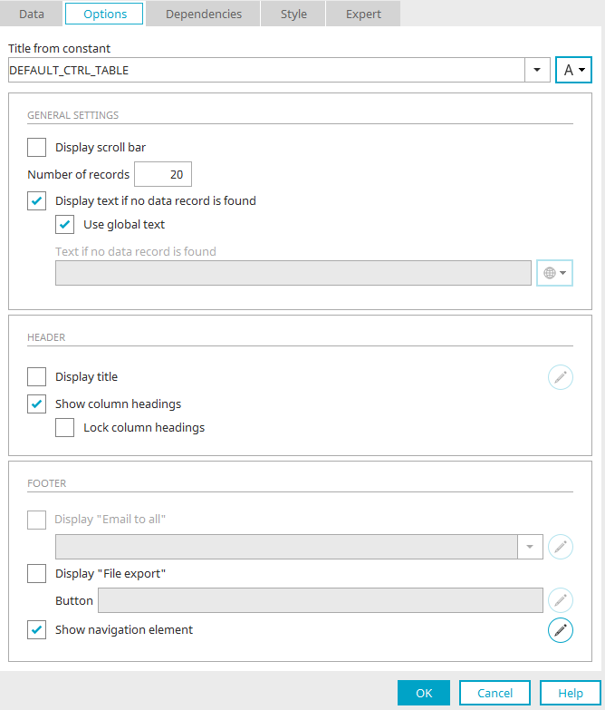
Title
Enter the title of the view table here. You can find more information on this topic here.
General Settings
Show scrollbar
If this setting is enabled, a horizontal scroll bar will appear if the view table is too wide.
Number of records per page
Here, you can set the number of records to be displayed initially per page in the table. If this number is exceeded, the navigation element that allows you to scroll through the remaining table pages is automatically displayed in the table's footer. A value of -1 displays all records.
The "Number of records per page" affects the "Maximum number of records per page" setting in the navigation element. You can find the relevant information here.
Display text if no record exists
This setting causes text to be displayed when no data is available.
-
Use Global Text
Uses the text stored in the portal properties in the global language constant DR_NO_RECORD in multiple languages.
-
Text to display if no record is found
Static text or a constant can be entered here if the "Use global text" setting is not selected.
Header
Show Title
With this setting, the table header is displayed.
Edit
Opens a dialog box where you can format the table header.
Show column headers
The column headers are displayed.
The maximum height is determined by Portal Manager and depends on how large the view table is displayed on the workspace. However, this maximum height applies only to tooltips; otherwise, the table header is displayed as usual at the top of the browser window or the application container (Stage).
Lock Column Headings
Ensures that the column headers remain visible when scrolling.
Footer
Show "Email to All"
This option is available only if data fields with the "Email" control type are included as table columns.
Select the data field containing the email addresses from the drop-down list. A link will then appear at the bottom of the table in the browser that allows you to send an email to all the email addresses displayed in that column of the table.
Clicking this link opens a window where the user can configure the separators and how email addresses are used, and launch the default email client.
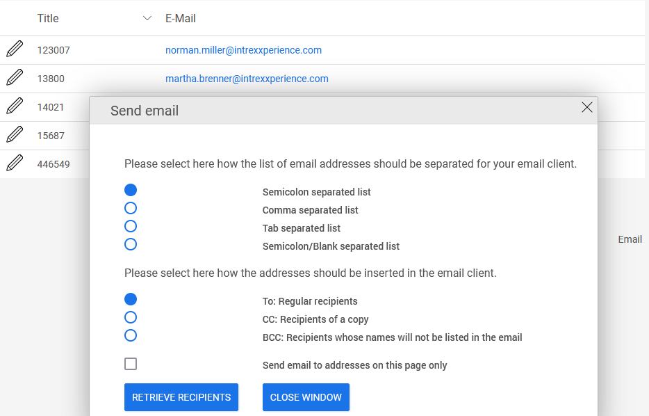
The distribution list for sending emails is created using the email addresses in the table. No other data from the table will be included in the email.
Edit
When the "Show 'Email Everyone' button" setting is selected, clicking "Edit" on opens a dialog box where you can edit the button's properties.
Show "File Export"
You can find all the information about exporting the data in the table here.
Navigation element
You can find all the information about the navigation element here.
Export
The Elements
-
View Table
allow you to export the table data as needed. To do this, the "Export" button can be displayed below the table.
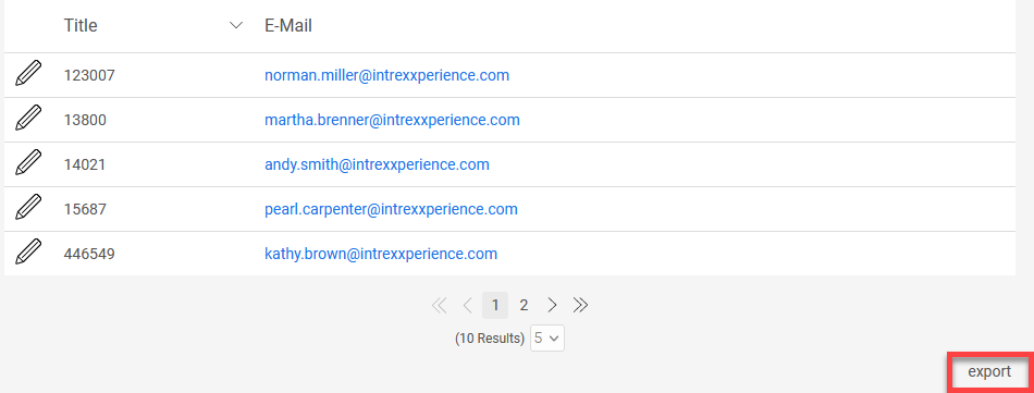
Clicking this button in your browser opens a dialog box where you can select from various export formats.
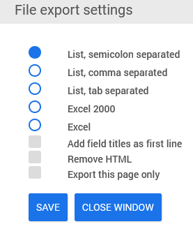
You can find the settings for the export function in the table's Properties dialog box on the "Options" tab.
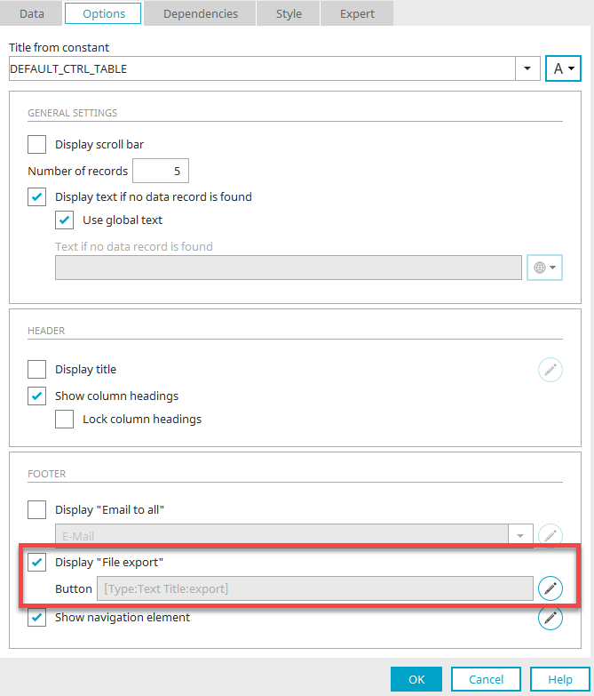
To export, the "Show File Export" setting must be enabled here. Click "Edit" under " ."
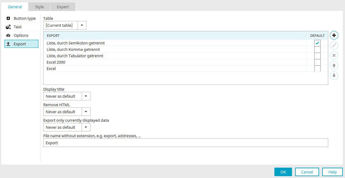
Here, you are directly in the button properties and can edit the button's settings. General information about buttons can be found here.
You'll also find the "Export" option on the left, with the following settings:
Table
You can select the desired table here. Only tables that are on the current page and display data from the same data group as the current table can be selected.
During the export, the records from the corresponding table are exported. For the "Search" element, you can only select the search results table; you cannot select other tables on the page.
"Export" Column
In this column, you can see the available export formats:
-
List, separated by semicolons
-
List, separated by commas
-
List, separated by tabs
-
Excel 2000
-
Excel
"Default" column
This column is used to set which export option should be preselected in the browser.
Add Template
Displays a menu where you can select the additional export formats "List, separated by delimiters" and "Custom template."
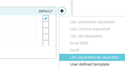
If either of the two formats is selected from the menu, new corresponding rows are inserted into the template list.
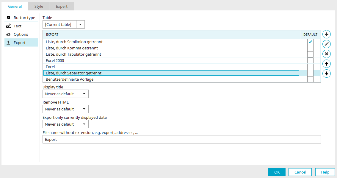
Edit Template
Opens the dialog box for editing the template currently selected in the list. In this context, the dialog box displays different settings for each template.
Edit Template at
-
List, separated by semicolons
-
List, separated by semicolons
-
List, separated by semicolons
-
Excel 2000
-
Excel
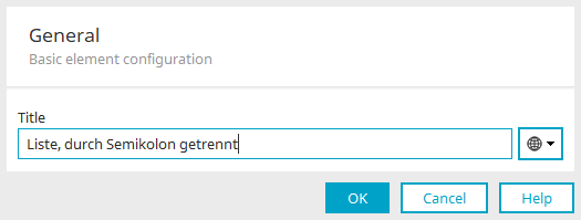
Title
Here, you can change the title of the template. You can find more information here.
Edit Template at
-
List, separated by a delimiter

In addition to the title, the following settings are available here:
Separator
Predefined
You can specify a separator here that will be used to separate the export data. In addition to the selectable, predefined line breaks, you can also enter any custom separator directly into the drop-down list field.
Ask the user
Alternatively, the user can set the separator in the browser.
Edit Template at
-
Custom Template

In addition to the title, the following settings are available here:
Velocity file
A Velocity file that generates the export can be included here. You can find more information on this here.
Click "OK" to save your changes and close the dialog box.
Remove Template
The currently selected template will be removed from the list.
Move the template up or down
Changes the order of the templates.
Show Title
Here you can choose whether to include the field headings as the first row in the export file.
-
Never
The headings are not included.
-
Never as a guideline
Allows the user to enable the transfer of headings in the export pop-up.
-
Always
The titles are included in the export file.
-
Always as a default
Displays the "Include field headings as the first row" setting as already enabled in the browser.
Remove HTML
Removes HTML formatting from the text. Here, too, the available options are Never, Never by default, Always, and Always by default (see above).
Export only the data currently displayed
Specifies whether all records or only the displayed records in the table should be exported. Here, too, the available options are Never, Never by default, Always, and Always by default (see above).
Filename without an extension, e.g., Export, Addresses, ...
You can enter a name for the export file here. Do not specify a file extension, as it will be added automatically depending on the export format.
In the button's Properties dialog box, under "General," you'll find properties that define the button's appearance. Buttons can be displayed in the browser not only as buttons, but also as text links or images.
Navigation element
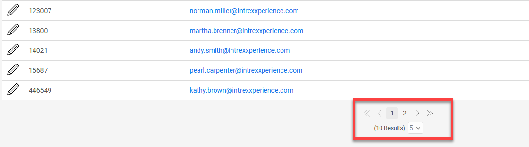
The navigation element is useful for tables containing large amounts of data. It appears below the table and allows you to flexibly distribute the data across different table pages and scroll through them.
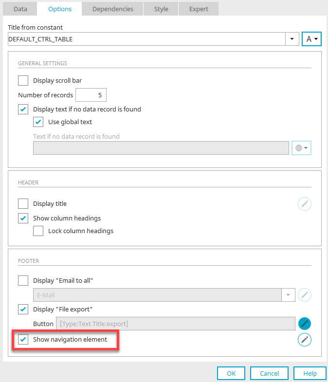
On the "Options" tab, you'll find the "Show navigation element" setting. You can also turn off the navigation element here.
Click "Edit" on to open the navigation element's settings.
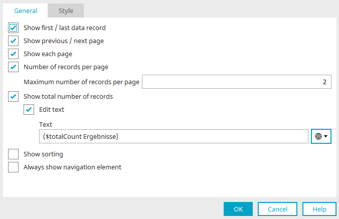
Here, you can show or hide the following features of the element.
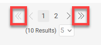
Jump to First / Last Record
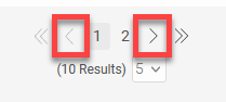
Show "Jump to Previous/Next Page"
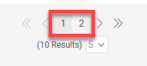
Show links to individual pages
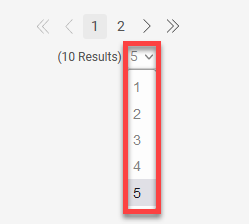
Make the number of records per page adjustable
Maximum number of records per page
Use this setting to specify how many records appear per table page in the navigation element. A value higher than the one entered here cannot be selected in the browser. If you specify "-1" as the maximum number, the highest value—corresponding to the total number of records—will be selectable in the browser.
The "Number of records per page," which can be set in the options, is the largest number offered for selection in the navigation element—with one exception:
If the initial number is greater than the largest number in the navigation element, the initial number is used as the largest number in the navigation element. Otherwise, it would not be possible to return to the initial view if the number of records displayed in the browser had been changed.
Show total number of results
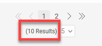
The total number of records contained in the table (including those from pages that are not currently visible) is displayed.
Customize Text
In the standard version, the total number of records is automatically calculated using the "$totalCount" function. If you wish, you can enter any text here or use a constant that provides the text.
Show Sort Order
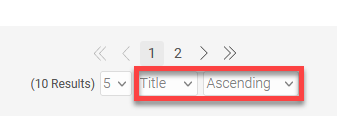
Allows you to select the data field by which the table will be sorted in ascending or descending order.
Always show navigation element
If this property is not set, the navigation element is displayed only if the number of records per page exceeds the value you specified in the table properties on the "Options" tab.
Preselection
Preselections are used to group data. You can create a preselection via the main menu (Edit / Preselection / Create Preselection ) when the view table is selected on the workspace.
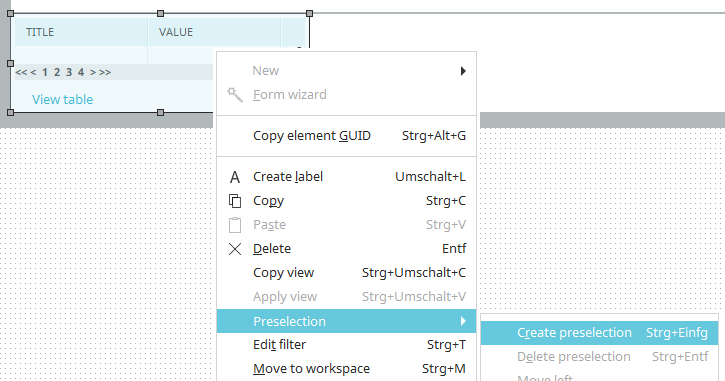
You can use the two tabs at the bottom of the table to switch between the table and the preselection.
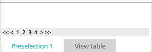
Double-clicking the preselection opens the Properties dialog box. This corresponds exactly to the Properties dialog box in the view table. For preselection, you can select a data field there to group the records in the table by.
A "DISTINCT" query is executed in the database to filter the records. You can create as many preselections as you like for each table. The order of the preselections can be changed via the main menu under "Edit / Preselection / Left or Right."
You cannot create preselections for view tables that are connected to OData data sets. The SQL keyword "distinct" cannot be used by OData. In this case, the selection of data records must be handled using filters or dependencies.
Calculation
Calculations can be performed in view tables in two ways:
1. In a row of a table
2. As a total calculation
You can find instructions on how to proceed here.
Total Calculation
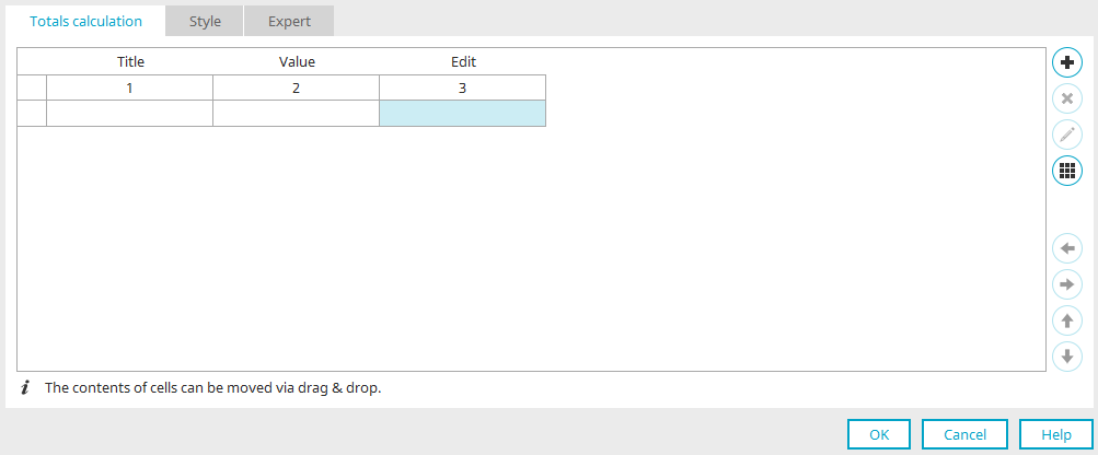
You can access this dialog box by opening the Properties of a view table, selecting the "Data" tab, and clicking " " > "Edit Total Range for Calculation."
Here, you can configure the cells used in a table's overall calculation. Only the columns that are visible in the table—that is, those that are not hidden—can be used in the calculation. Below the column names, you'll see a number for each column. This number represents the index of the respective table column used in the calculation.
When performing actions such as adding, moving, or deleting table columns, please note that only the index of the visible columns is adjusted in the total calculation area. The contents of a column are not automatically moved, but may be deleted, depending on the action taken. The user must make any changes to the content themselves. Columns are always added or deleted at the end of the total calculation range.
Add a check
Opens a menu from which you can choose whether to insert static text or a calculation.
Delete Check
The currently selected checkbox will be cleared. Place the controls for the calculation in the empty cell below the column index of the column to be calculated.
Edit Check
If a calculation is currently selected, a dialog box opens where you can edit the calculation.
"General" tab
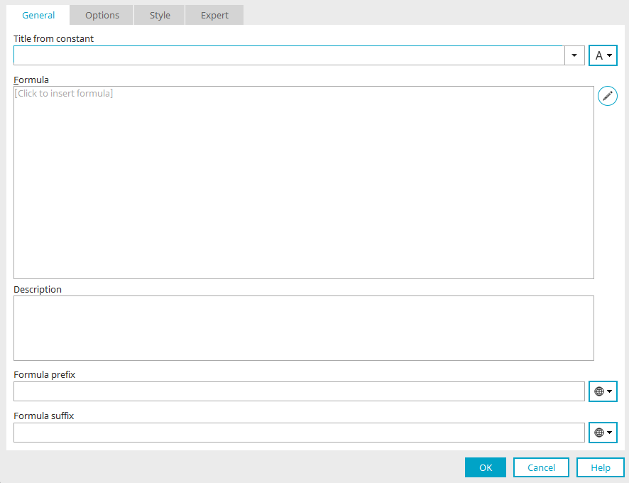
Title
Enter the title of the calculation here. You can find more information here.
Formula
The final formula is displayed here.
Edit Formula
Opens the formula editor.
Description
Below the formula, you can enter a description, which will also appear in the "Description" section when the element is selected on the workspace.
Text before the formula / Text after the formula
You can enter text here that will appear before or after the formula on the application page. Constants can be used here as well.
Click "OK" to save the changes and close the dialog box.
 Edit Table
Opens a menu with the following functions:
-
Add a row
-
Delete Row
-
Connect cells
-
Split Cell
-
Select a custom background color


Moves columns and cells with controls to the left or right.
Rows are moved up or down.
Move content using drag and drop
Cell contents can also be moved to empty cells using drag-and-drop. However, unlike when moving cells using the arrow keys, this operation moves only the contents of the cells and not their properties.
Calculation in a table column
Calculations in a table column can be configured via the properties of a view table / "Data" tab / click on "Add Column" / "Calculation." A new table column will then be created; you can edit its properties and, just as in the overall calculation, access the dialog box for creating the formula.
You can find detailed instructions on how to proceed here.
API for Tables
A special API was developed for use in Velocity that allows defined tables (e.g., from the hidden area) to be processed, displayed, and iterated through. You can find the API object documentation here.
You can find information about the Intrexx JavaScript API for Intrexx 12 here: Intrexx JavaScript API.