Additional controls for calendars
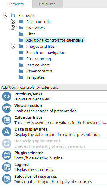
Additional controls for calendars, except for the "Appointment Series" element, can only be used if there is a calendar or resource element on the current page. Many of the additional controls are already included in the calendar or resource element.
Any additional controls can be found in the "Elements" section of the "Applications" module. A new additional control can be created by dragging and dropping the element from here and positioning it on the workspace.
More information on creating elements can be found here.
The Element Properties dialog opens automatically when a new element is created. The properties dialog of an existing element can be opened by double-clicking the element in the workspace, via the "Properties" context menu, or via the "Edit / Properties" main menu, if the element is selected in the workspace.
Previous / Next
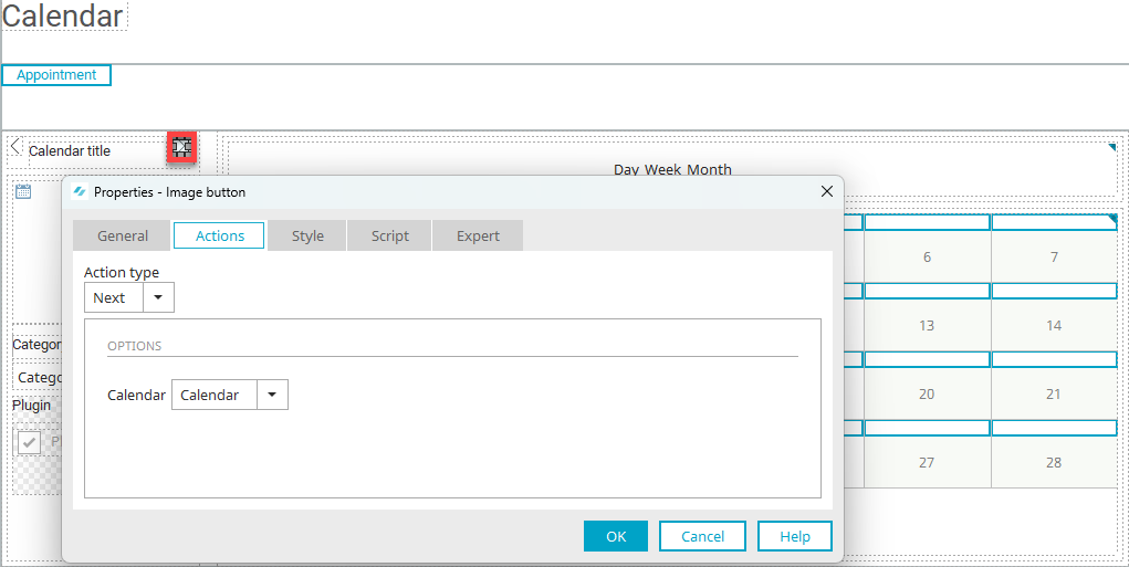
These two action buttons are used in combination with the elements “Calendar” and “Resource”. With these buttons, the user can navigate forwards and backwards through the calendar or resource element.
In the properties dialog of a Back or Forward button, select the action type (Back or Forward) and the calendar or resource item being controlled.
Basic configuration of the element
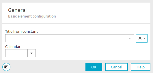
This dialog is only shown if there is more than one calendar or resource element on the current page. If the additional control "Previous/Next" is then created, you can decide in this dialog which calendar or resource element is to be controlled by it.
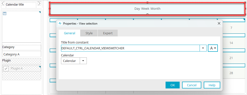
View selection
You will also find this dialog when you edit the Legend properties.
This element allows you to switch change the view of the calendar or resource element, such as from the daily to weekly or monthly view.
In the properties dialog, you can change the title of the element and select the calendar or resource element that should be controlled by it.
Calendar filter
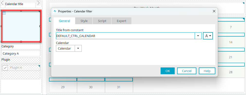
This additional control displays a small calendar that can help select a date in the chart of a calendar or resource element.
Find all the information about the properties dialog here.
Date display area
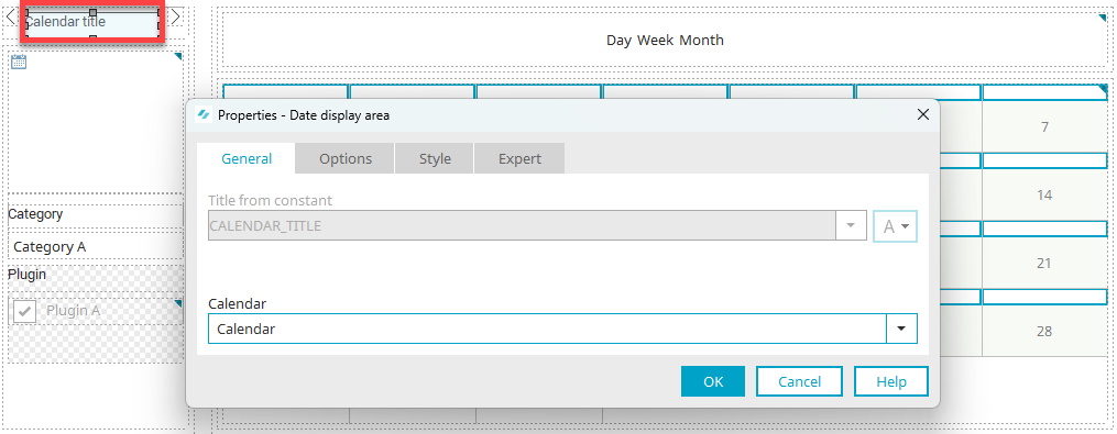
This element displays the current date in the calendar. The title is formatted depending on the view selected by the user.
Find all the information about the properties dialog here.
Appointment series
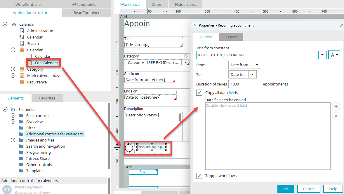
This allows appointment series to be created. This element is used on edit pages.
A link is then displayed in the browser, via which a page for the configuration of the appointment series is displayed. For more information about the features of the appointment series in the browser, click here.
Properties dialog settings
Title
Give the appointment series a title. Click here for information on multilingual titles.
From / to
In these drop-down lists, select the fields that contain the start and end of the appointment.
Series duration
Defines how many appointments will be created in total. In this, the interval is used that is defined by the user in the browser. The start date will be repeated either daily, weekly, monthly, or yearly.
Please note that entering a high value for the series duration may cause high levels of system load.
Copy all data fields
This setting causes all data fields in the current data group to be copied. The value that is chosen for the start date will be applied to any new appointments created by the recurring appointment. Intrexx uses a separate "Recurring appointments" data group to store the new appointments.
Data fields to be copied
If the "Copy all data fields" setting is not active, you can double-click on this area to open a dialog where data fields can be selected. If data fields have already been selected, you can use the context menu to add additional data fields or remove existing ones.
Trigger workflows
With this setting, processes connected to the start date will be initiated, as well as for subsequent appointments. Disable this setting if this is not desired.
Plugin selector
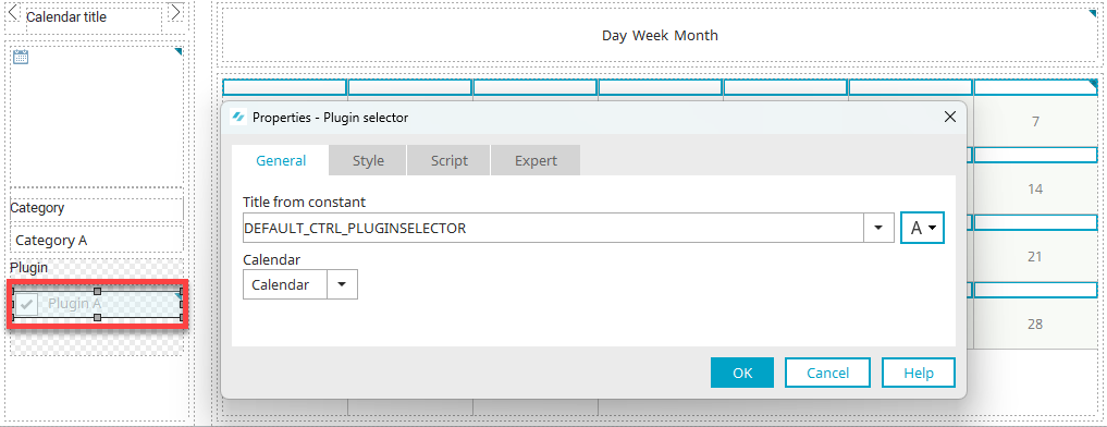
The Plugin Selection element allows users to hide or show appointments from calendar plugins in the browser that are included in the current calendar. Click here for more information.
All the information about the settings in the properties dialog of the additional control can be found here.
Legend
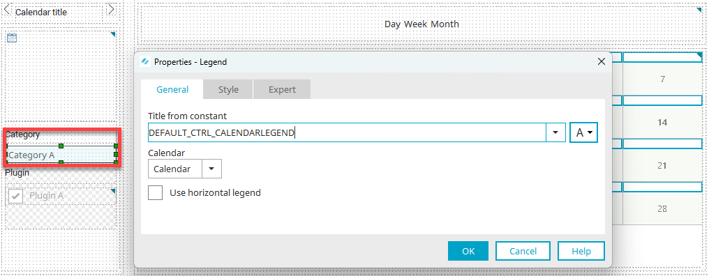
Appointments can be categorized in calendar and resource elements. The legend lists these categories with their corresponding background and font color. A category is only shown here if an appointment was assigned to it. This makes it quick and easy to see the category of an appointment in the calendar diagram.
In the properties dialog, you can change the title of the element and select the calendar or resource element to link to the legend.
It is also possible to set the legend to be displayed horizontally instead of vertically.
Selection of resources
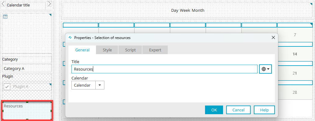
This element displays a link in the browser that can be used to open a page for selecting resources. The resources that should not be displayed in the resource diagram can be deselected there. Resources that are not shown can also be hidden again if required. Click here for more information.
The settings in the properties dialog are equivalent to the available settings for the legend.