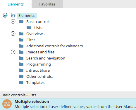
Multiple selection
The multiple selection control is a list element in which several entries can be selected at once. For example, it is suitable for distribution lists, article groups etc. Multiple selection is available as an input and view element.
Multiple selection as an input element
Properties in the browser
Data source "Values from applications" / "User-defined values"
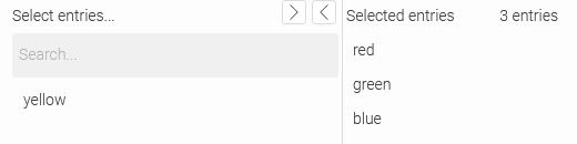
If you select the options "Values from applications" or "User-defined values" as data source in the properties of the multiple selection conytol, the browser element consists of two lists. All selectable entries are listed on the left, and all selected entries are listed on the right. The selected entries are stored in the linked data field when the page is saved, if a link to it has been configured.
The arrow buttons to the top right or left of the list titles can be used to move the currently selected entry from one list to the other. This can also be done by double-clicking on an entry. You can also select multiple entries by holding down the CTRL key.
The multiple selection can be configured to get its entries from, for example, an ID or GUID but display a different value from the same data group. For example, article numbers could be used as entries and the article description could be displayed instead.
Furthermore, you have the ability to set up a so-called selection filter, depicted by images that you can select freely, which will be shown above the entries. Clicking on an image activates the filter accordingly.
The values that have been entered with a multiple selection can be shown with the view elements “view multiple selection” and “view table”.
To support a "contains" filter for the search in the multiple selection, the setting “control.distribution.list.searchContainMode=true” needs to be defined.
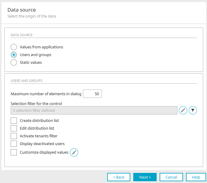
Users and groups
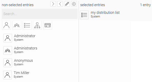
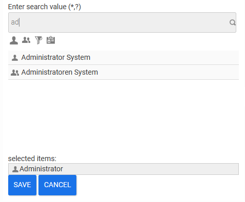
If you have selected the "Distributor selection" options as the data source in the properties of the multiple selection, the multiple selection can be used in the browser to select users, user groups and other objects from the "Users" module.
You can search for terms and filter the list of user objects. You can define which data should be used for the search in the schema manager. Activate the setting "Use in User manager search" for the corresponding attributes.
The selection filter - filter buttons above the user lists - allows you to restrict or expand the search to users, user groups, distribution lists, organizational units and roles, depending on whether the corresponding button is activated or deactivated.
When you save the data record, the GUIDs of the user objects will be saved to the linked data field. By clicking on  "Create distribution list”, new distribution lists can be defined, provided that the setting "Create distribution list" is activated in the data source.
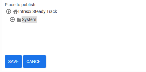
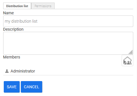
The structure of the User Manager will be shown here. Select where the new distribution list should be created and click on "Save".
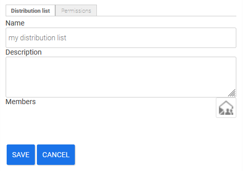
Provide the new distribution list with a name and description here. The members of the distribution list can be defined underneath. Click on the  button to the right to do that.
Select the desired member(s) here and click on "Save".
Go to the "Access permissions" tab.
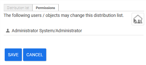
You can define which users and/or objects from the User Manager will be allowed to change the recently created distribution list. Click on the button to the right to select the corresponding users. After saving, the new distribution list is entered in the "Users" module.
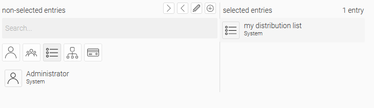
Click on  to edit an existing distribution list.
Properties in the "Applications" module
When you create a multiple selection control in the Applications module, the Properties dialog opens automatically.
General
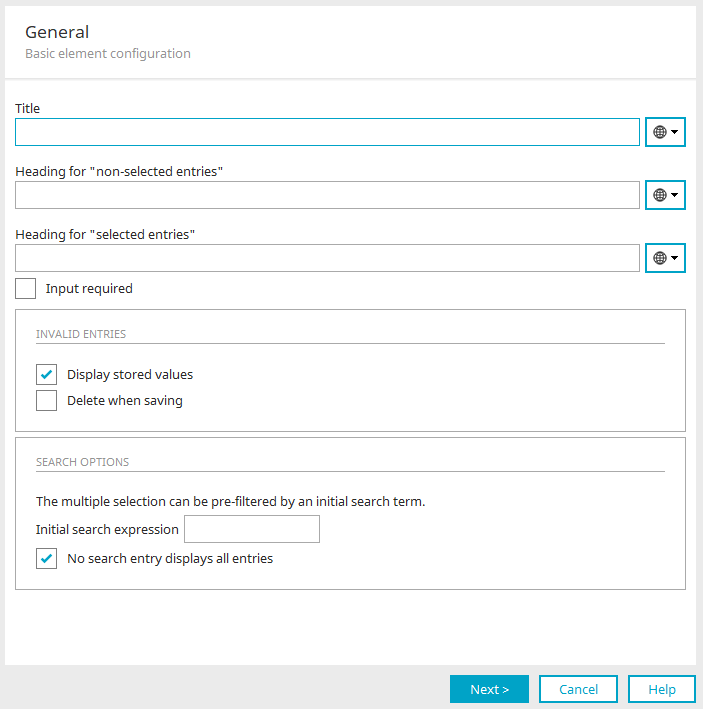
Here you can set the general properties of the multiple selection.
Title / Title from constant
A static title can be entered here. Alternatively, the title can be obtained from a language constant, which you can select here. All information on this topic can be found here.
Heading for 'non-selected entries' / Heading for 'selected entries'
The titles for both lists in the Multiple selection element can be defined here. A constant can be used here as well.
Input required
The element will be made into a mandatory field.
Invalid entries
Display stored values
If values from a multiple selection can be written to a data field, it is possible, e.g. through the export or import of an application, that the values are no longer valid. With this setting, these invalid stored values will be displayed instead of the current configured display values.
Delete when saving
If this option is selected, invalid values will be deleted from data fields in the current data record.
Search options
Initial search expression
This search expression will be automatically entered in the search field and will filter the "Available" list when the corresponding page is loaded. The maximum number of entries will be shown, if the character * is entered in the search field.
No search entry displays all entries
Displays all entries when the search field is empty.
Click "Next".
Data source
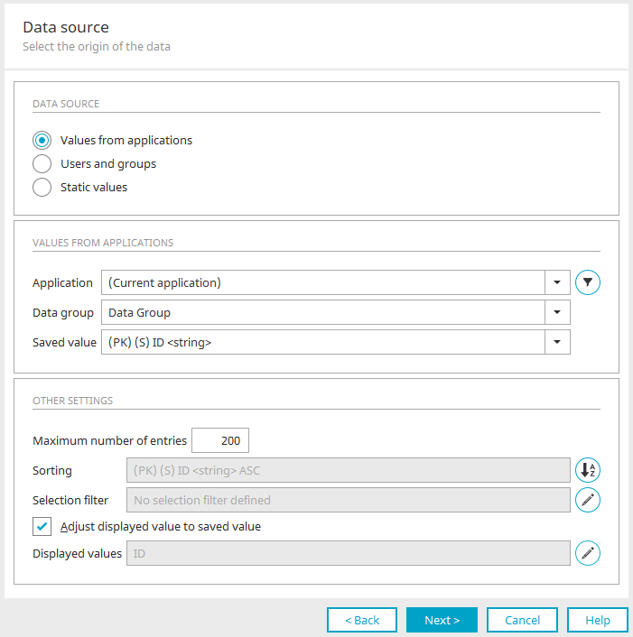
The source of the entries in the multiple selection is configured here.
Values from applications
With these settings the entries are created from the data of any application.
Application, Data group
Select the application and data group whose values should be shown in the multiple selection.
 Filter
Opens a dialog where a filter can be defined. The data will then be displayed in the multiple selection according to the filter criteria.
Saved value
Here, all data fields from the selected data group will be shown. You can define the field, whose values will be saved when the user selects an entry in the multiple selection. This gives you the ability, for example, to show names of employees in the multiple selection, but to save their ID number instead of the name.
Additional options
Maximum number of entries
The value limits the number of entries. With the value -1, all entries will be shown.
Sorting
The fields according to which the entries are currently sorted are displayed here. Click on  "Sorting" to open a dialog in which the data fields to be sorted can be selected.
Sorting
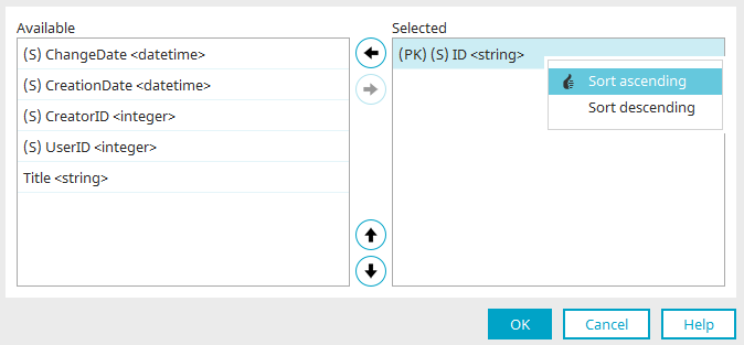
"Available" column
All data fields that can be used for sorting are listed here.
"Selected" column
All data fields that are already selected for sorting are listed here.
 Add / Remove data field from sort order
Move the currently selected field from one list to the other.
 Move data field up / down in the sort sequence
Adjusts the order of the selected field(s). The following applies here: The field at the top of the list is the main sorting criterion. All subsequent fields perform sorting in the result of the parent field.
Sort ascending / descending
Right-click to open a menu where the sorting can be set to ascending or descending order, respectively.
Click "OK" to save changes and close the dialog.
Selection filter
A filter can be built above the element with buttons for filtering the entries in the browser. In the properties dialog - if available - the active selection filter is entered under "Data source" in the "More options" area.
 Selection filter
Opens a dialog where you can assign the images and define the filter.
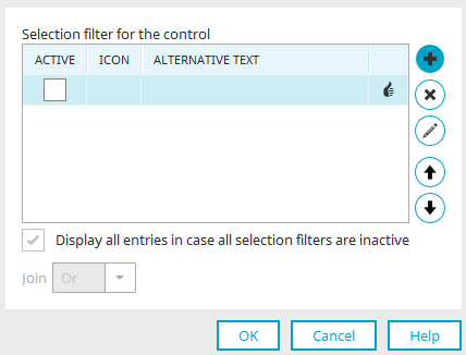
Selection filter for the control
"Active" column
In the browser, a button will be displayed for each filter that you configure here. In this column, you can decide whether the button is already activated (active) or deactivated (inactive) when the element is loaded.
"Image" column
Displays the path to the selected image.
"Alternative text" column
Displays the defined text alternative.
Create new selection filter / Edit selection filter
Opens a dialog in which a button for the selection filter can be created or an existing button can be edited.
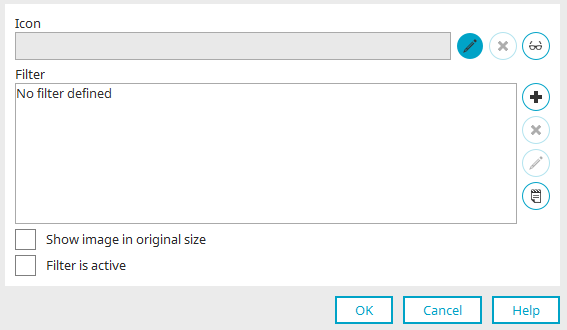
Image
If an image is selected for the button, the path to the image is displayed here.
Select image
Opens a dialog where an image can be selected.
 Remove image
Removes the image specification.
 Edit text alternative
Opens a dialog where text can be entered that will be displayed instead of the icon on end devices that cannot display images.
Filter
The defined filter expressions are displayed here.
Add new filter expression / Edit filter expression
Opens a dialog in which a new filter expression can be defined or an existing filter expression can be edited.
Remove filter expression
Removes the filter expression from the list.
 Edit filter in expert mode
Opens the filter editor where the XML of the filter expression can be edited. This option is only available if the expert options have been activated.
Show image in original size
With this setting, the selected icon will be shown in its original size. If this setting is not active, the icon will be shown in 16x16 pixels on desktops and 32x32 on mobile devices.
Filter is active
The filter is automatically activated when the page is loaded.
Click "OK" to save the changes and close the dialog.
Delete selection filter
Removes the currently selected selection filter from the list.
 Move up / down
Adjusts the order of the buttons.
Show all entries in case all selection filters are inactive
If this setting is not active, no entry will be shown if all selection filters are inactive.
Join
The individual filters can be connected using an "Or" or an "And" link. For Or links, at least one criterion must apply so that the corresponding data is shown. For And links, all of the criteria must apply.
Click "OK" to save the changes and close the dialog.
Adjust displayed value for saved value
If this setting is enabled, the data from the data field you selected in the "Saved value" setting will be displayed.
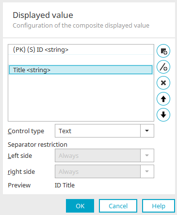
Displayed value
The current display value is indicated here, if a display value has been configured.
Displayed value
Opens a dialog where a displayed value that differs from the saved value can be selected.
Displayed value
 Add displayed value
Opens a dialog where the data field, whose value should be displayed, can be selected.
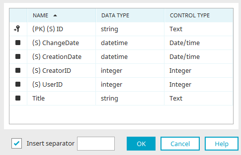
"Name" column
Here you will find the name of the data fields that can be selected as a display value.
"Data type" column
This column displays the data type from the data field.
"Control type" column
The specific control type is displayed here.
Add separator
A separator can be entered here to separate individual values from each other. This can also be done in the previous dialog. In addition, enable the "Insert separator" setting so that the separator is applied.
Click "OK" to save changes and close the dialog again.
 Add separator
Adds a new row where a freely definable separator can be added.
Remove displayed value
Removes the currently selected displayed value from the list.
Move displayed value left / right
Adjust the order of the displayed values and separators. The following applies here: The higher a displayed value or sepearor is on the list, the further to the left it will be displayed in the browser later.
Control type
Select the desired control type for your displayed values.
Separator restriction
The display of the individual separators can be disabled here if the display values are empty.
-
Always
A separator will be displayed on the left or right respectively.
-
Text is not empty
A separator will be displayed on the left or right, respectively, if the text on the left or right, respectively, is not empty.
-
Data field is not empty
A separator will be displayed on the left or right, respectively, if the data field on the left or right, respectively, is not empty.
Preview
In the lower part of the dialog, you can see a preview of the list with the current settings for display values and separators.
Users and groups
Instead of the data source option "Values from applications", the setting "Distributor selection" can also be chosen for the multiple selection. This means that the element can be used to select users, user groups and other objects in the "Users" module. Find out here how this multiple selection appears on the web and can be used there.
Maximum number of elements in dialog
With this setting, the number of search hits to be shown can be restricted. In the users and groups selection, no additional filters can be defined or changes made to the existing filter settings.
Selection filter for the control
Click here for more information.
Filter
Opens a dialog where an additional filter can be created. This is applied as an AND link to the selected selection filter.
Create / Edit distribution list
These show the corresponding buttons in the browser for the creation and editing of distribution lists. Here you can specify the default container where a new distribution list is to be created in the user manager.
Activate tenants filter
If the tenants filter is enabled, only user objects, to which at least one of the tenants of the current user has been assigned, will be shown.
Display deactivated users
With this setting, the users whose accounts are disabled in the users module will also be displayed.
Customize displayed values
Here you can edit the values that are displayed in the distribution list selection.
Edit displayed values
Opens a dialog for editing the display values.
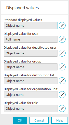
Edit displayed values
Click here for all information on editing display values.
Click "OK" to save changes and close the dialog again.
User-defined values
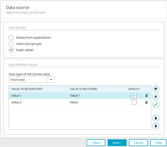
Instead of the "Value from applications" or "Distribution selection" options, user-defined values can also be used as entries in the multiple selection. User-defined values therefore do not originate from a data source, but are statically entered here in the dialog.
Data type of the stored value
Specify the data type that should be used for saving the selected value.
"Value to be displayed" column
The value entered here will be shown in the multiple selection in the browser.
"Value to be stored" column
The value entered here will be saved in the data field connected to the multiple selection.
"Default" column
The displayed value whose checkbox is activated in this column is preselected when the page is loaded.
Add new user-defined value / Edit user-defined value
Opens a dialog where a new value can be created or an existing value can be edited.
List entry
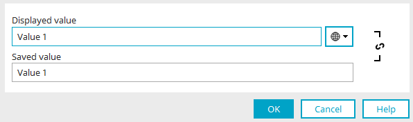
Here, enter the value to be displayed for selection by the user and the value to be saved. The display value can also be recorded in multiple languages.
 Synchronize displayed value / saved value
As a rule, the contents of both fields are automatically transferred to the other field when a change is made. This behavior can be prevented and also restored by clicking "Synchronize title / Value to be stored".
Click "OK" to apply the changes and close the dialog again.
Delete user-defined value
Deletes the value currently selected.
Move up / Move down
Change the order of the entries.
Click "OK" to save changes and close the dialog again.
Click "Next".
Saving options
Here you will set how the value of the multiple selection is to be saved.
No link
With this option, the multiple selection will not be connected with a data field. The selected values are not saved.
List in a text field
With this option, the values will be entered to a "text" data field.
Create new data field
Opens a dialog where a new text data field can be created.
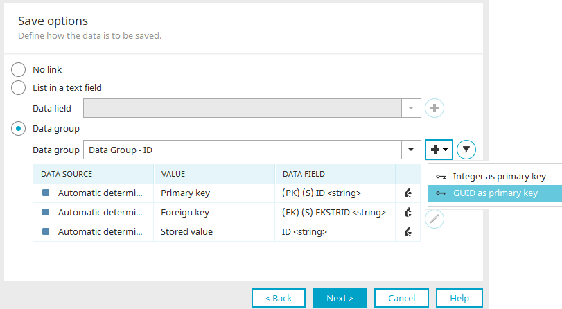
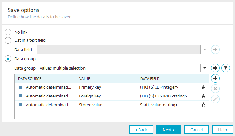
Data group
The values of a multiple selection will be stored as individual data records in a subordinate data group.
"Data group" drop-down list
If subordinate data groups are available, these can be selected and used here.
Create new child data group
Creates a new child data group with the relevant system data fields and an ID field for the ID of the saved value.
The values in the primary key and foreign key created automatically when data records are created in the browser. The value of the primary key corresponds to the ID of a child data record; the value of the foreign key to the ID of the parent data record. The memory value is determined by the data source.
The small arrow icon to the right of the button displays a menu that allows you to select the type of primary key for the new child data group ("Integer as primary key" or "GUID as primary key").
Group filter for saved data records
Opens a dialog where you can define filters that will come into play when using more than one multiple selection edit elements on one edit page. For example, say you use two multiple selection edit elements on one edit page. With the first multiple selection, you will select employees of the call center; with the other multiple selection, employees of the service department, in order to call together a team to take care of a common task.
"Data source" column
For an existing child data group, the data field names will be shown here. For a newly created child data group, the entry "Automatic determination" will be shown.
"Value" column
Displays the value type stored in the corresponding field.
"Data field" column
Displays the data field name.
4. Column - Status
|
The configuration of the value to be stored is valid. |
|
The configuration of the value to be stored is permitted. The assignment does not meet the standard. However, there may be constellations in which the assignment is nevertheless useful. Functionality at runtime (in the browser) is not guaranteed. A confirmation dialog is displayed when the dialog is closed with "OK". The configuration can be applied despite warnings. |
|
The configuration of the value to be stored is invalid. The assignment will not work at runtime. As long as an invalid configuration is specified, the dialog cannot be closed with "OK". |
Add new memory value / Edit memory value
Opens a dialog where a data field, from which the stored value comes, can be assigned to a data field from the child data group integrated here.
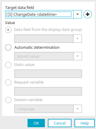
Target data field
Select the data field where the stored value should be saved.
Create new data field
Opens a dialog where a new data field can be created.
Value
Data field from the display data group
Select the data field from the data group that is connected in the data source configuration.
Automatic determination
With this setting, the following values, depending on the selection, will be determined automatically and written to the target data field:
-
Saved value
-
Primary key
-
Foreign key
The stored value is taken from the field in the data source.
Static value
A fixed value can be entered which is saved to the target data field every time a data record is saved.
Request variable
Enables you to enter the value of a request variable; enter its name here.
Session variable
Even a value from a session variable, e.g. the language setting, can be used as the value for the target data field. Select the sessions variable from the list.
Click "OK" to save the changes and close the dialog again.
Remove value to be stored
Deletes the stored value from the list.
Click "Next".
Final settings
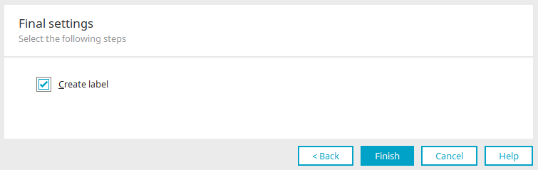
Create label
With this setting, a "Static text" element is created along with the new element and its label automatically adopts the name of the new element.
Click on "Finish". Multiple selection is now configured and can be used after saving the application in the browser.
Multiple selection view
Properties in the "Applications" module
When you create a multiple selection view in the "Applications" module, the Properties dialog opens automatically.
Apply settings from input control
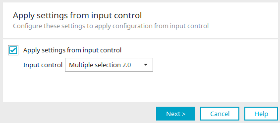
If a multiple selection input control already exists, the settings can easily be applied here. To do this, select the desired multiple selection control and make the "Apply settings from input control" setting.
Click on "Next".
General
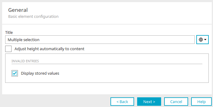
Title / Title from constant
Provide the Multiple selection element with a title. Click here for more information about this topic.
Adjust height automatically to content
The multiple selection will be shown with a height that allows the display of all existing entries in the list.
Invalid entries
Display stored values
If values from a multiple selection can be written to a data field, it is possible, e.g. through the export or import of an application, that the values are no longer valid. With this setting, these invalid stored values will be displayed instead of the current configured display values.
Click "Next".
Displayed values
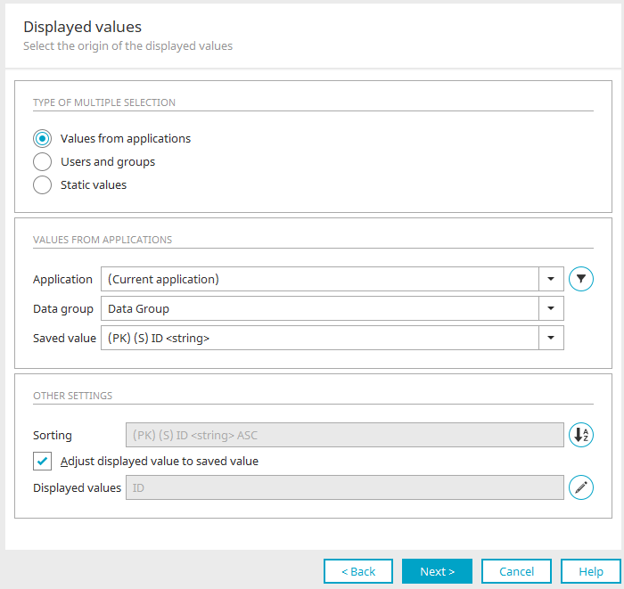
The settings options here mainly correspond to the settings that can also be configured for the multiple selection input element as data source. Click here for the relevant description.
Click "Next".
Data source
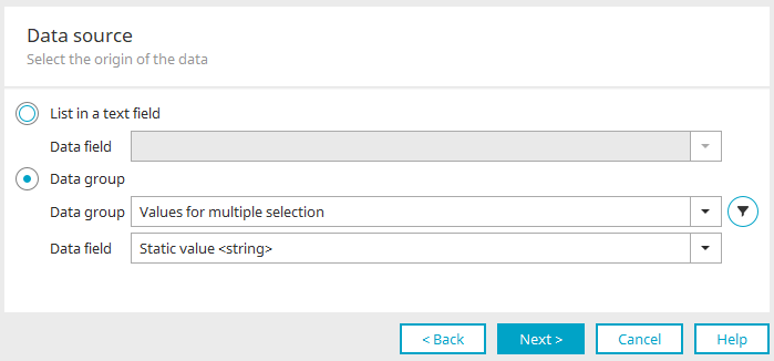
Here you define the source from which the entries of the multiple selection view are to be read.
List in a text field
Reads the values from a data field with the data type "Text".
Data field
Select the appropriate data field here.
Data group
This option reads the values from a data group.
Data group
Select the data group.
Data field
Select the required data field.
Filter
Opens a dialog where a filter can be defined. The data will then be displayed in the multiple selection according to the filter criteria.
Click "Next".
Final settings
Click here for detailed information about the settings in this dialog.
Click "Finish" to save all changes and close the properties dialog again.
Control type "Multiple selection" in view tables
Browser
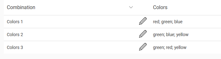
In view tables the control type "Multiple selection" can be selected if data fields from the multiple selection are included as a column in the table. In the browser, the data are subsequently displayed per cell in the table column in an expandable selection list.
Learn how to configure table columns and select control types here.
Options in the table column properties
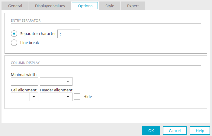
In the properties dialog of a table column with the control type "Multiple selection”, the following settings can be configured in Options:
Entry separator
Defines how entries in the table column should be separated.
Separator character
Enter the separator of your choice.
Wordwrap
If this option is activated, each entry will be shown in its own row within the table column.
Column presentation
Click here for more information about this topic.