Checkbox / View checkbox

The "Checkbox" element is one of the basic controls. This element exists as an input and view element. Checkboxes as input elements store Boolean values (true, false or Yes, No) and can be associated with Boolean data fields accordingly.
From Intrexx version 12.1.0:
In view tables ("Checkbox" control type) and in the "Checkbox" element, data fields with the data type Integer and String can also be used as of Intrexx version 12.1.0. The following rules apply:
Integer: all values != 0 are true, 0 is false.
String: true, 1 ,yes, yes becomes true, all other values become false. Not set (null) behaves like the Boolean data type - no value is displayed.
Depending on the value, the element is displayed in the browser as selected or not selected.
The values of the checkbox can be saved using a corresponding button.

The checkbox element can be found in the "Applications" module in the "Elements" area. A new checkbox can be created by dragging & dropping the element from here and positioning it in the workspace.
Click here for more information on creating the element.
The properties dialog of a checkbox opens automatically when a new checkbox is created. The properties dialog of an existing checkbox can be opened by double-clicking on the element in the workspace, via the "Properties" context menu, or via the "Edit / Properties" main menu if the checkbox is selected in the workspace.
Properties checkbox
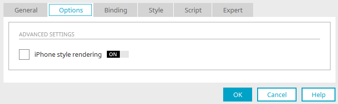
The iPhone view can be activated or deactivated on the "Options" tab. The checkbox is displayed as a typical iPhone on/off switch when the setting is enabled.
Properties checkbox view
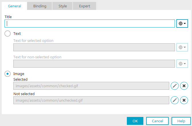
Title
Provide the checkbox with a title here. Click here for information on multilingual titles.
Text
-
Text for selected option
Here, you can predefine a text that will be shown when the connected data field returns the value "Yes".
-
Text for non-selected option
Here, you can predefine a text that will be shown when the connected data field returns the value "No".
The preset text can also be defined using constants.
Image
As is the case with buttons, you can select a custom image to replace the default checkbox.
-
Selected
This image is shown when the connected data field returns the value "Yes".
-
Not selected
This image is shown when the connected data field returns the value "No".
 Edit
Edit
Opens the Slide log to load an image.
 Delete
Removes the current image.