In applications, there are different types of calendars for recording and displaying appointments. In the Intrexx application templates, you will also see the "Calendar" template and the "Resource" template. This allows you to create appropriate applications, which are already preconfigured to the extent that you can use the applications right away.
Learn how to create applications based on templates here.
Click here for more information about the calendar application template.
Click here for more information about the resource application template.
Click here for more information about the configuration in the "Applications" module.
Date picker calendar in connection with edit fields
Create a date picker calendar
If an input field with the control type "Date", "Time”, or "Date & Time" is created, a calendar for date selection can be generated in Final Settings. This means that when you click in the input field, a calendar is displayed in the browser, in which the date you want can be conveniently selected. The selected date is automatically copied to the input field in the correct format.
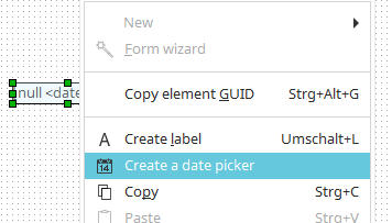
The calendar for date selection can also be created subsequently at the previously created input field via the context menu of the input field or, if the input field is selected on the workspace, via the main menu "Edit/Create calendar for date selection". On mobile devices, a corresponding date picker, which is shown when the user touches the edit field, will be generated automatically.
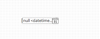
The workspace will then display a date selection icon next to the input field. From a technical perspective, this is a button with the action type "Calendar".
"Calendar" action button
You can learn how to set an action type for a button here.
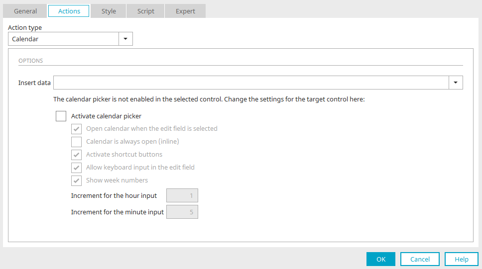
With the "Calendar" action type, a button can show a small calendar for date selection when clicked in the browser. The date is automatically entered in the input field selected here for "Insert data". If the setting “Activate calendar picker” is not yet activated in the options of the connected edit field, the corresponding properties are shown here with the action type of the button and can therefore also be edited from here. More information about these settings can be found here.
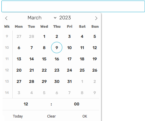
Date picker calendar in the browser
In the browser, clicking in the edit field now displays a calendar from which a date can be selected. The current date is highlighted in the calendar. The selected date is automatically entered in the edit field. Depending on the selected control type, the time can also be selected at the bottom of the calendar. The calendar will be closed again when you leave the edit field.
At the top of the calendar, the month can be selected from a list. The list appears when you click on the month. The year can also be increased or decreased one at a time. To do this, click on the small arrow buttons that appear when the mouse hovers over the year. The arrow buttons at the top right and left can be used to scroll forward or backward by month.
Calendar settings
The settings of the small calendar for date selection can be edited in the properties dialog of the connected edit field on the "Options" tab.
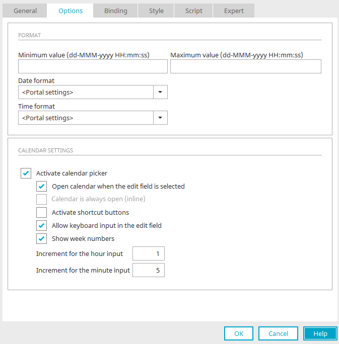
Activate calendar picker
This setting is only available if the "Write-protected" setting has not been activated on the "General" tab.
Open calendar when the edit field is selected
This setting is available if the element is linked to a "Date" data field. If the edit field is in focus in the browser, then a small calendar will be shown. The date selected here is then transferred to the edit field. If the page has been transformed for mobile devices, a corresponding date picker will be shown on the end device.
Calendar is always open (inline)
The calendar is always shown beneath the corresponding edit control. The elements beneath the edit control will be moved down as a result.
Activate shortcut buttons
Shows three buttons:
-
Today
-
Clear
-
OK
"Today" selects today's date, "Clear" deletes any entry from the date field, "OK" closes the calendar for date selection.
Allow keyboard input in the edit field
The date can also be entered via the keyboard with this option.
Show week numbers
Only available for edit controls for date or date & time data types.
Close calendar on selection
When the user selects a date, the calendar will close. This setting is only available for edit fields with the "Date" control type.
Increment for the hour input
Defines how many hours the arrows should add to the current time when clicked on. Only available for edit controls for time or date & time data types.
Increment for the minute input
Defines how many minutes the arrows should add to the current time when clicked on. Only available for edit controls for "time" or "date & time" data types.
Layout
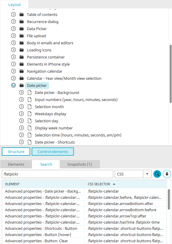
When the current layout of the portal is open in the "Design" module, the appearance of the small navigation calendar can be changed in the "Layout" area. There, click on "Controls" and search for "date picker" or "flatpickr". Here you can find the styles that you can change as you wish for the individual elements of the navigation calendar.
Calendar element
The calendar element is an application element and can be created and configured like any other element in any application. Click here for more information.
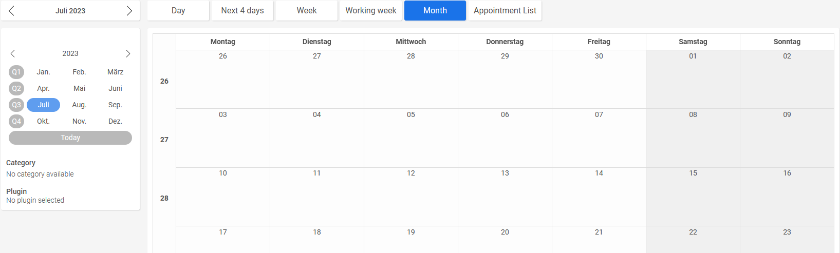
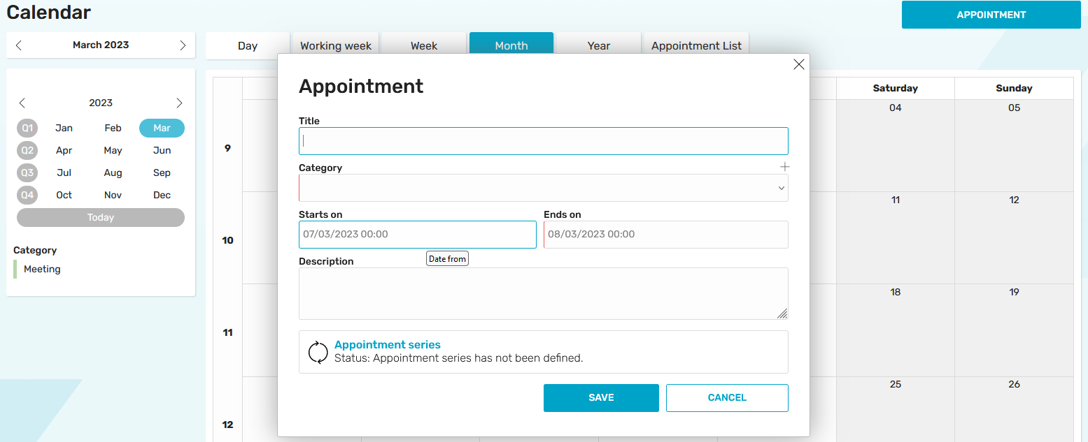
In the browser, the calendar element consists of a navigation calendar and a chart. The navigation calendar is structured somewhat differently here than in connection with an edit field. Clicking on "Today" always automatically selects the current date, which is also highlighted here. Above the navigation calendar and diagram in the calendar element, you will find several buttons that can be used to change the view of the calendar and diagram. By dragging the mouse while holding down the left mouse button, any period of time can be marked, such as a single day or several days. The chart is always automatically updated according to the view and appointment selection in the navigation calendar.
Day view
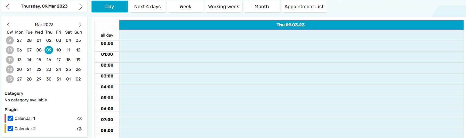
At the top of the calendar you can scroll from month to month. In the left column, the whole calendar week is selectable with one click and is selected in the navigation calendar and in the diagram. The days of the week are displayed in the top line of the navigation calendar.
Next 4 days
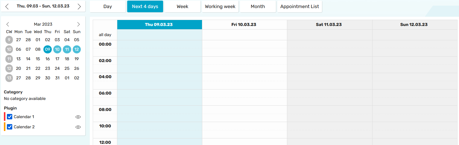
The next 4 days - including the current date - are selected in the navigation calendar and in the chart.
Week
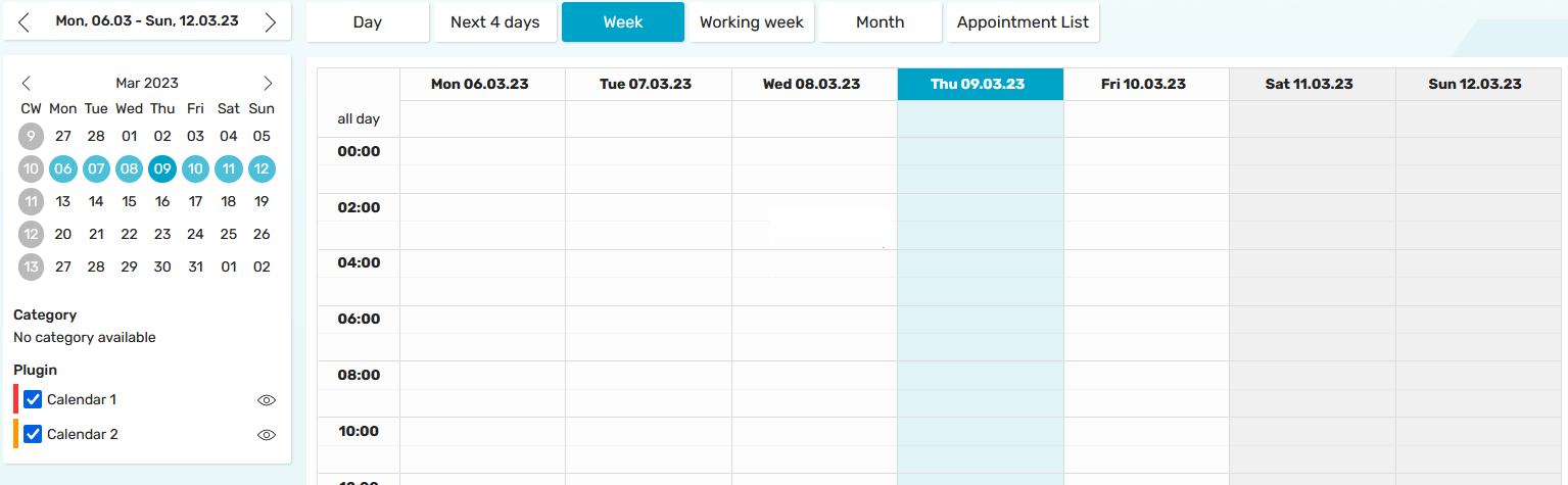
The current week is selected here in the navigation calendar and in the chart.
Working week
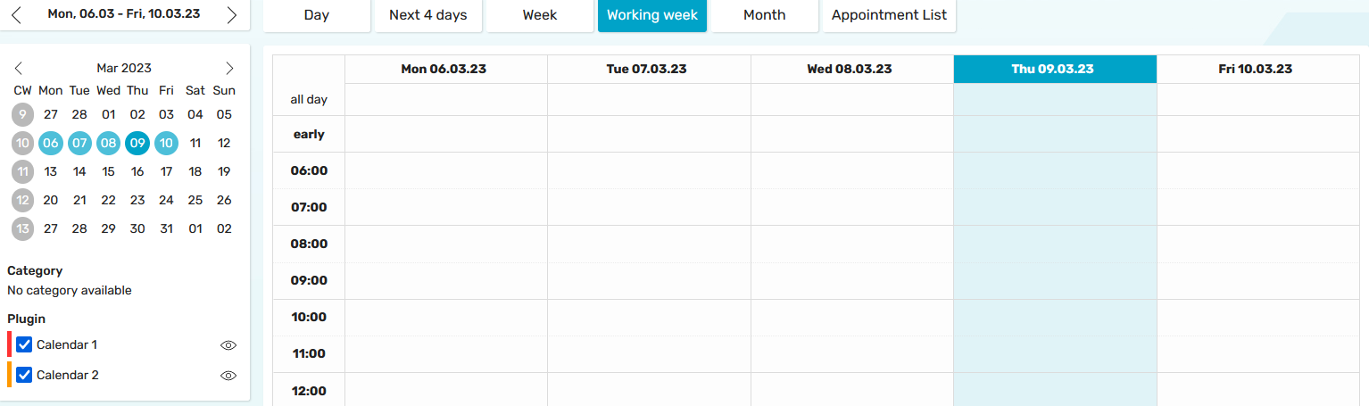
The days of the current working week are automatically selected in the navigation calendar. The diagram is filtered and presented accordingly.
Month
A month or a whole quarter can be selected here in the navigation calendar.
Appointment overview
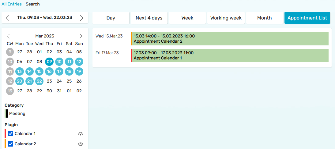
Instead of the diagram, outputs an appointment list showing all appointments of the selected period.
Year view / Month view
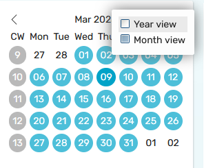
You can switch between the month and year view via the context menu of the navigation calendar header.
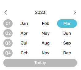
You can select entire months or quarters in the year view. Click on "Today" to select the current month.
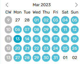
Calendar weeks can be selected in the month view.
Resource
The resource element is suitable for bookings such as the reservation of meeting rooms or company vehicles. Schedules can also be created with it. It consists of a navigation calendar and a diagram. The navigation calendar has the same functions as the navigation calendar of the calendar element. Above the navigation calendar and diagram in the calendar element, you will find several buttons that can be used to change the view of the calendar and diagram. By dragging the mouse while holding down the left mouse button, any period of time can be marked, such as a single day or several days. The chart is always automatically updated according to the view and appointment selection in the navigation calendar.
The resource element is an application element and can be created like any other element in any application. Click here for more information. The element is also included in the previously configured "Resources" application template. Click here for more information.
Plugins
In the "Applications" module, plugins can be defined in the Calendar or Resource element properties; these display appointments from the same or other calendar/resource applications in the current calendar. You can find instructions on how to define plugins in this Tips & Tricks article.
Print appointments
Here you will find instructions for printing out individual appointments.
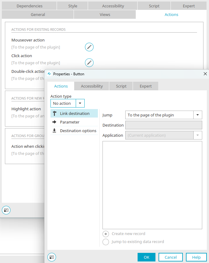
If you open the properties dialog of a calendar diagram and switch to the "Actions" tab, you can see the current setting of the jump target by clicking on  "Edit" - here, for example, for the "Action on click". The default setting is the jump "To the plugin page". This page can be defined in the plugin.
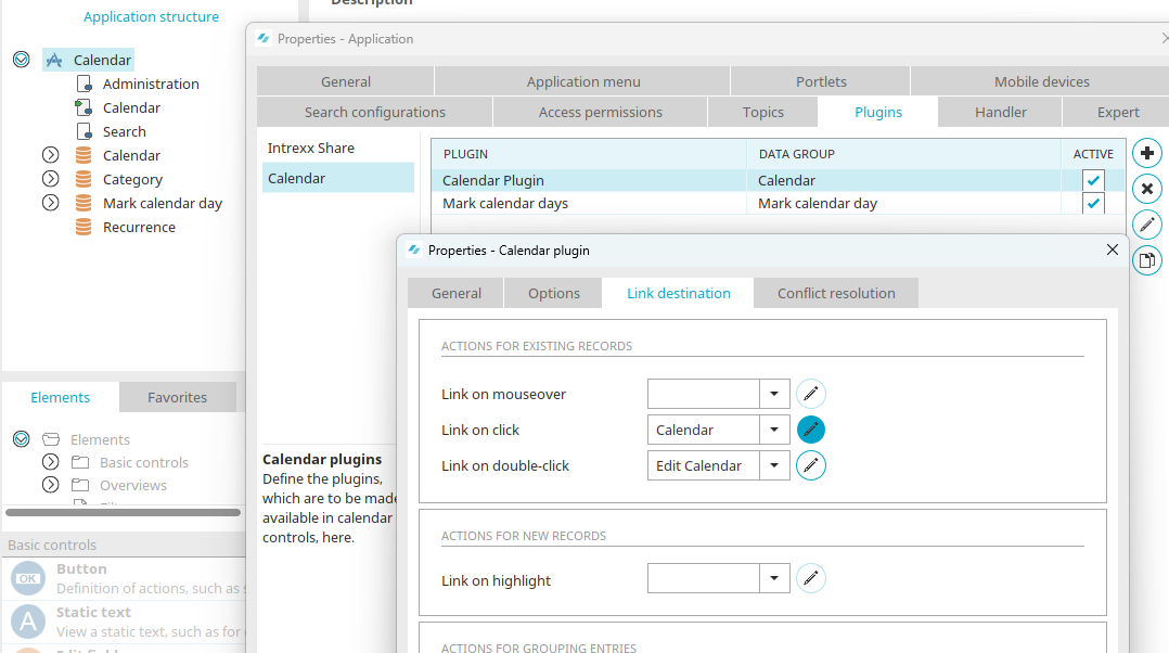
Plugins that are configured in an application can be accessed via the properties of the application by double-clicking on the application node.
Switch to the "Plugins" tab, select the "Calendar" entry on the left and then the plugin whose appointments you want to print. Click on "Edit selected calendar plugin".
Go to the "Jump target" tab. There you will find the corresponding actions. When clicking on an appointment in the calendar diagram, the "Calendar" page should be loaded in this example - a view page that shows the details of the appointment. Click "OK" to close the open dialogs again.
A print button is now configured on the "Calendar" target page.
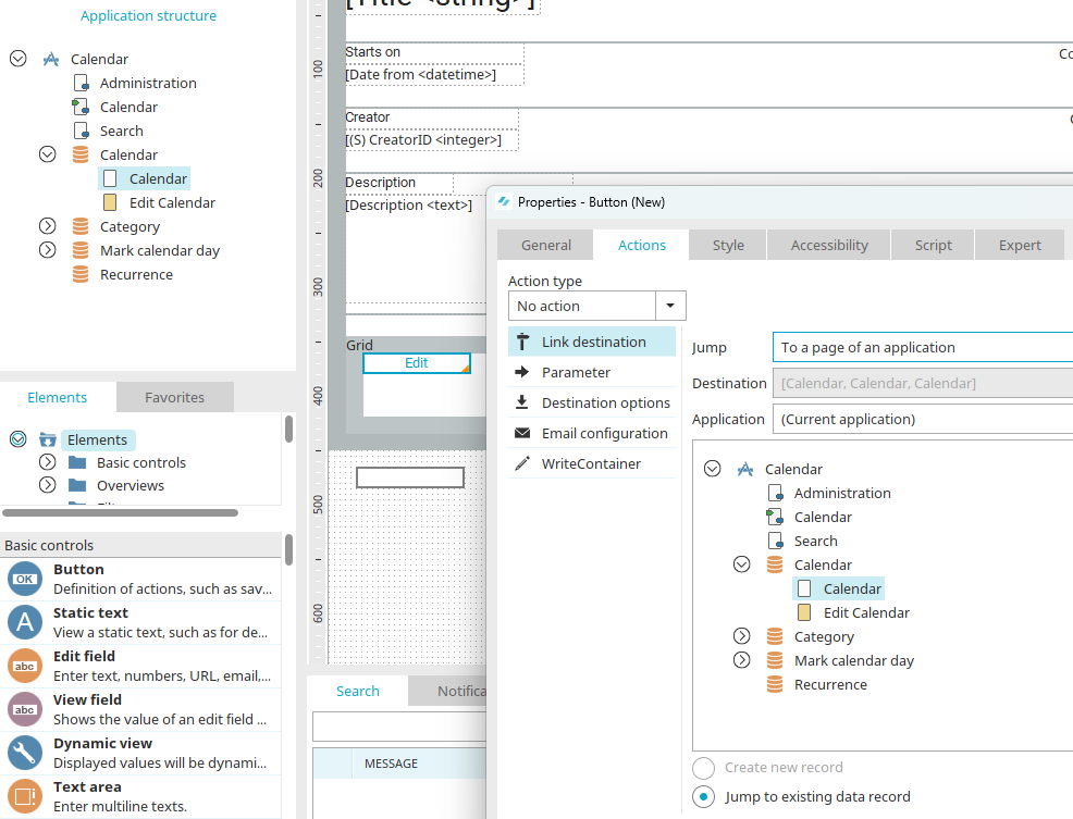
Create a new button by dragging it from the "Elements" area onto the workspace. Select the "Calendar" page as the jump target.
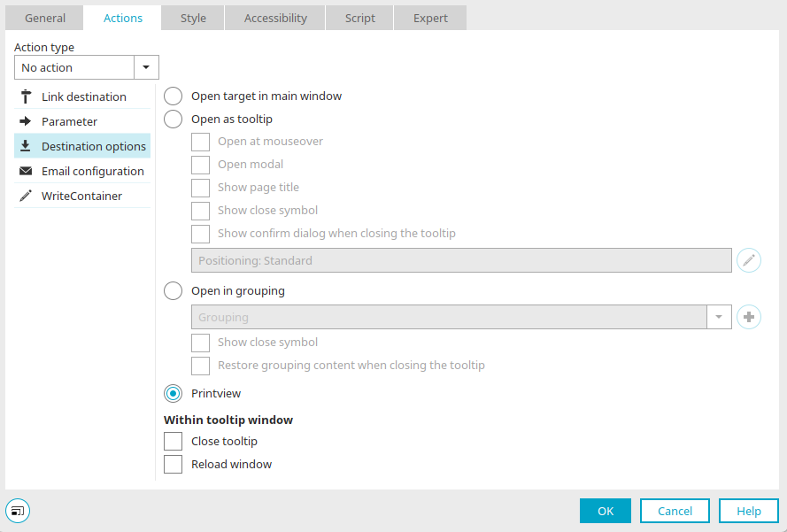
In the target page options, select the option "Open as print view". Close the dialog by clicking on "OK" and save the application.
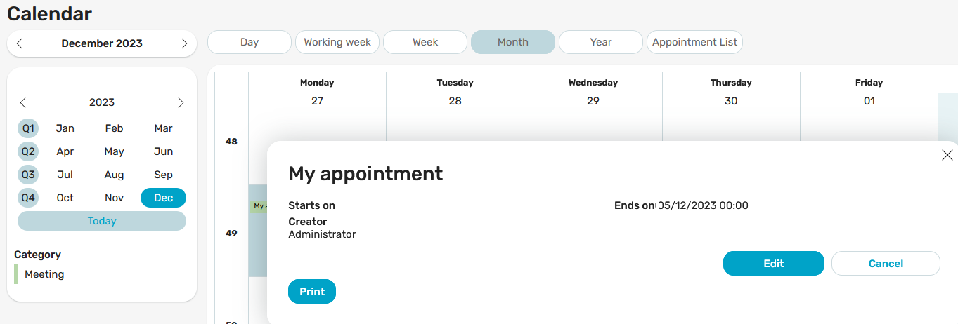
Click on the "Print" button to load the desired page in the browser.
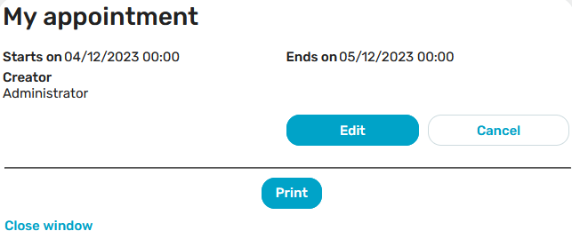
Click on "Print" here to print the page.