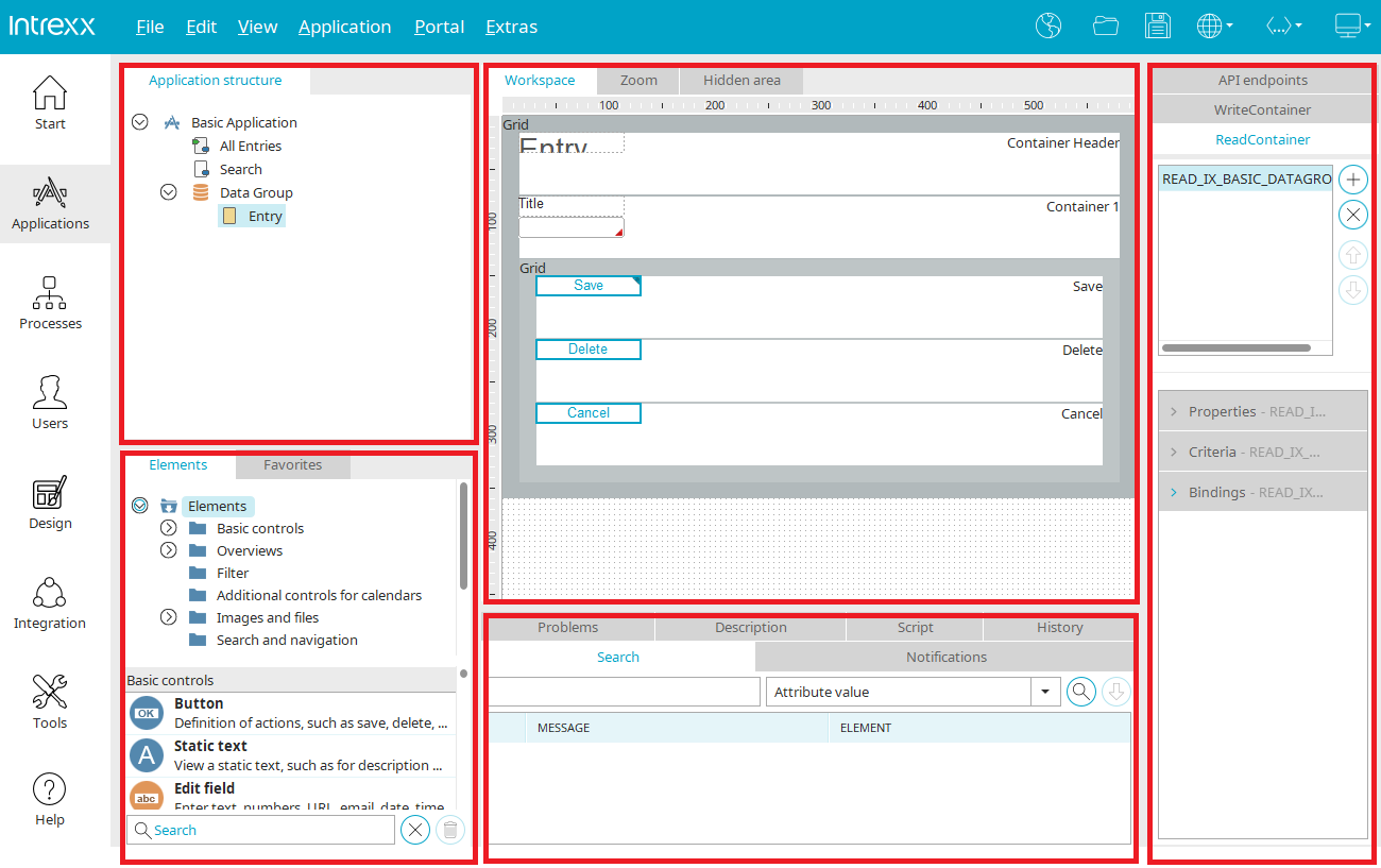
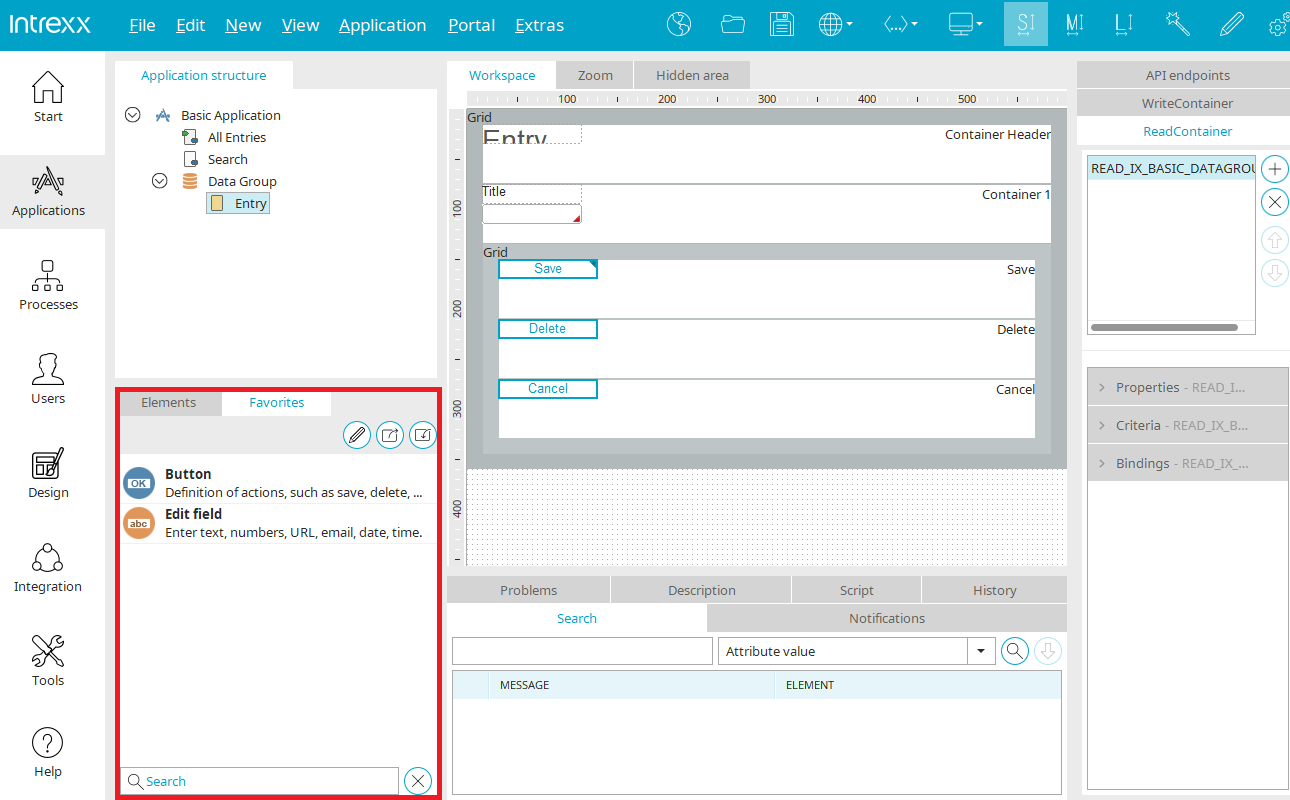
The "Applications" module is subdivided into five areas. The size of each area can be adjusted by dragging with the mouse. To do that, position the mouse at the edge of an area until the mouse pointer changes to a double-headed arrow. If there is insufficient space for elements to be displayed in an area, vertical and/or horizontal scroll bars will be shown automatically.
Every tab, with the exception of the workspace, At the area title, the whole area can be dragged & dropped to another position.
For the duration of the move, the area moved by drag & drop is colored gray to preview the future position and is anchored the moment you release the mouse button. Areas can also be made into their own window.
Individual areas can be shown and hidden via the "View" main menu. Additionally, the original arrangement can be restored for all areas.
Application structure

In the upper left area of the Applications module, the hierarchy of the individual pages and data groups of an application will be displayed.
Clicking on the  arrow symbols left of an element's name allows subordinate levels of the application structure to be opened or closed.
 Application node
The application node can always be found at the top of the application structure. It represents the application itself. Settings such as title, version, application menu, portlets and permissions can be edited in the properties dialog. New data groups, external data groups, system data groups and view pages can be created via the "New" menu when the application node is selected.
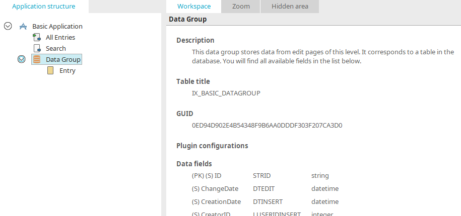
 Data groups
Click here for more information about data groups.
System data groups
Click here for more information about system data groups.
 External data groups
Click here for more information about external data groups.
 Data fields
All the information on data fields can be found here.
 View pages
This symbol designates view pages, on which data entered to an application will be shown. Click here for more information.
 Edit pages
Edit pages are always found within a data group. Click here for more information.
 Pages in the application menu
This symbol designates view or edit pages that are connected to the application menu. These pages can be directly accessed in the browser from the application menu. The application menu can be changed in the properties dialog of the application node.
 Start page
This symbol designates a main or edit page that has been defined as the start page of the application via the "Edit menu / Start page". The start page will be loaded first when the application link is clicked on in the browser, regardless of its position in the application menu or whether it is there at all. Edit pages can therefore only be defined as the start page if they are located in data groups directly beneath the application node.
 Portlet pages
View pages used as a portlet.
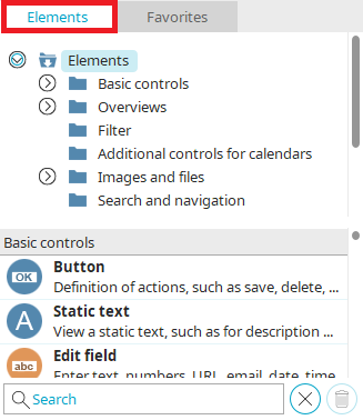
Elements
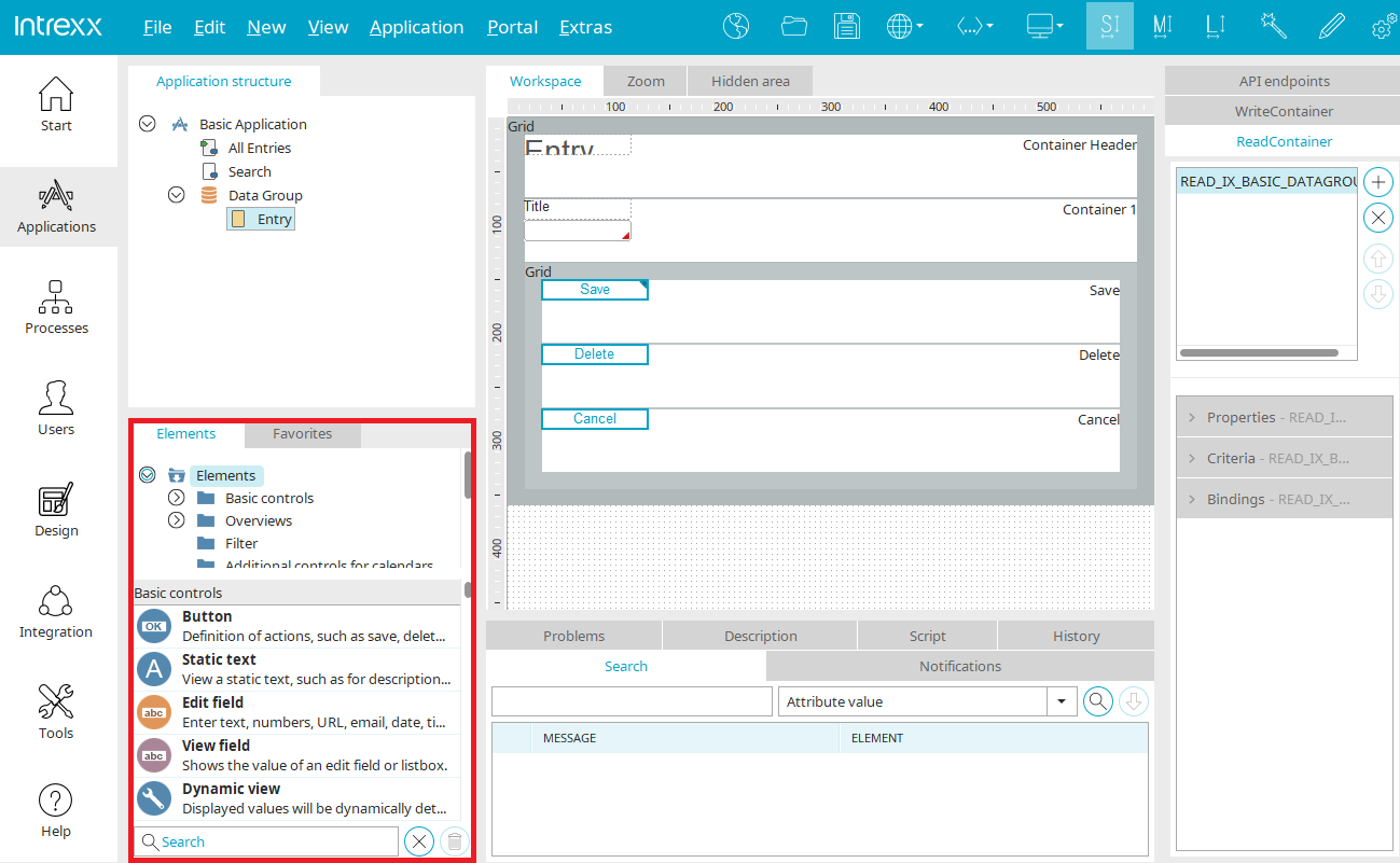
All information on this topic can be found here.
Favorites
Frequently used items can be included in this area for quick and easy access.
 Configure favorites
Opens a dialog w here elements can be added to the favorites list.
Select favorites
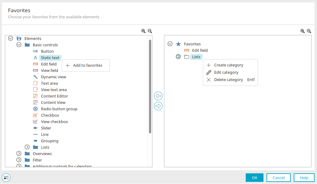
All application elements are listed in categories in the left-hand area. The "Add to favorites" context menu can be used to add a selected element or an entire category as a favorite. You can see the current favorites on the right.
A favorite can be removed from the favorites list using the "Remove from favorites" context menu.
Alternatively, you can also use the 
 arrow buttons to move elements from the left to the right area and vice versa.
In the right-hand area, you can create your own categories using the "Create category" context menu. Existing categories can be edited using the "Edit category" context menu. Elements can be moved to the desired category using drag & drop.
Create category / Edit category
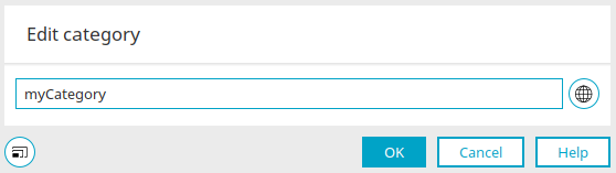
Enter the name for the category here. By clicking on  "Multilingualism", the title can also be written in several languages.
Click "OK" to save changes and close the dialog again.
Context menu: "Delete category"
Deletes the currently selected category. You will be asked whether the elements it contains should also be deleted. If you select No, the elements will be moved to the top level of the favorites before the category is deleted.
 Open / Close all categories
Shows or hides subordinate elements.
Click "OK" to save the selection and close the dialog again.
 Export favorites /
  Import favorites
Opens a dialog that can be used to export or import favourites.
Importing favorites / exporting favorites
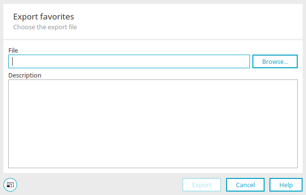
The export directory is selected here when exporting. The previously exported file can be selected here when importing. "Browse" opens a dialog in which the export directory or the import file can be selected. Favorites are exported as an XML file.
Read and WriteContainer, API endpoints
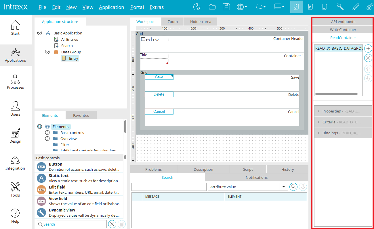
Every ReadContainer or WriteContainer that has been defined on the current page will be shown here. More information about this topic can be found here.
Information about API endpoints can be found here.
Workspace
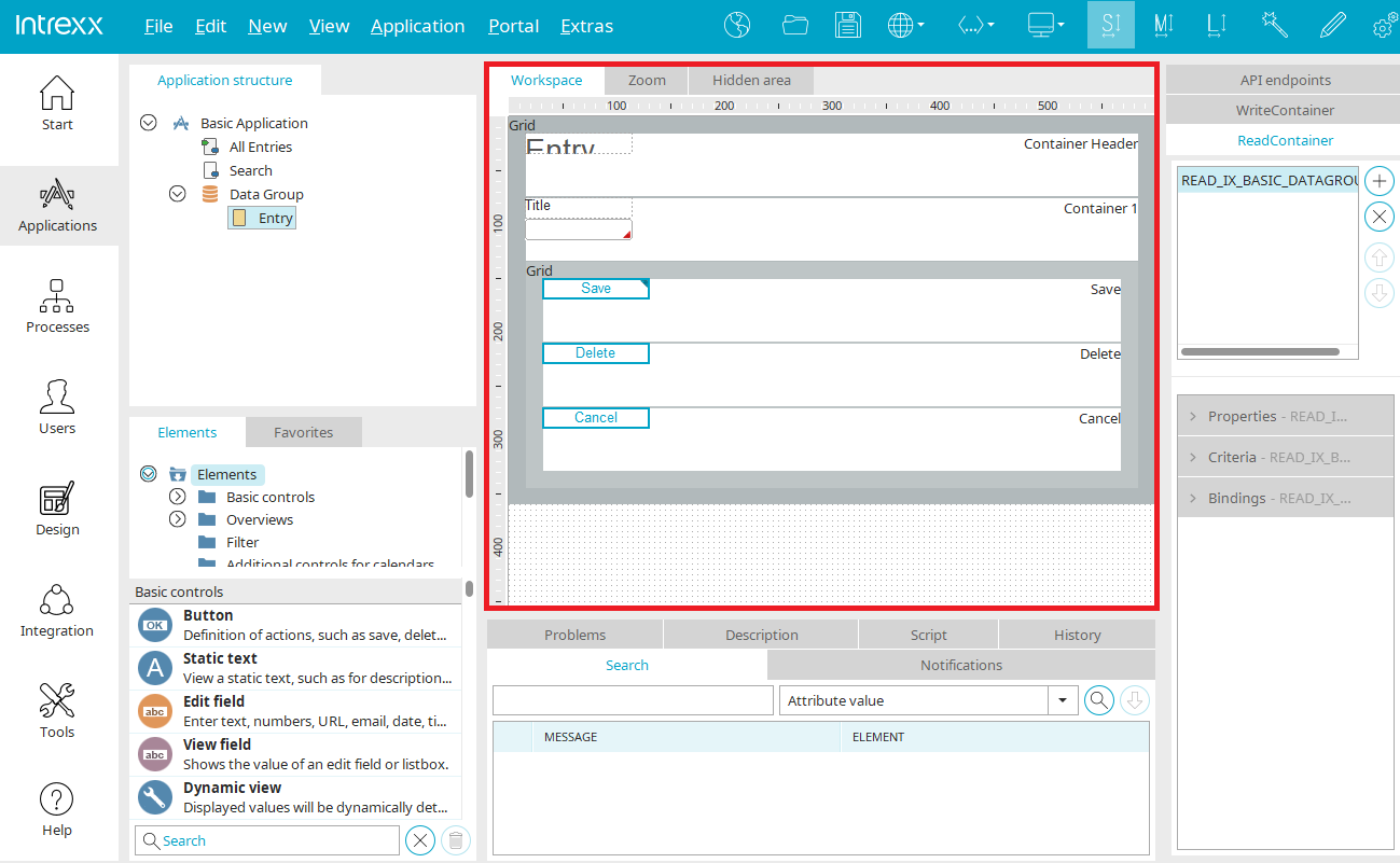
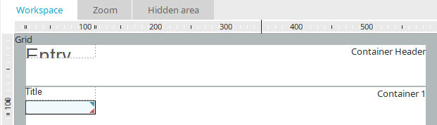
The contents and appearance of the workspace will change, depending on whether a page, data group, or the application node is selected in the application structure. If, for example, the application node has been highlighted, the workspace will provides information about the application description, start page, additional pages and the application history with ID and date.
If a data group has been highlighted, the name of the corresponding database table will be shown. All data fields and references of the data group will be listed.
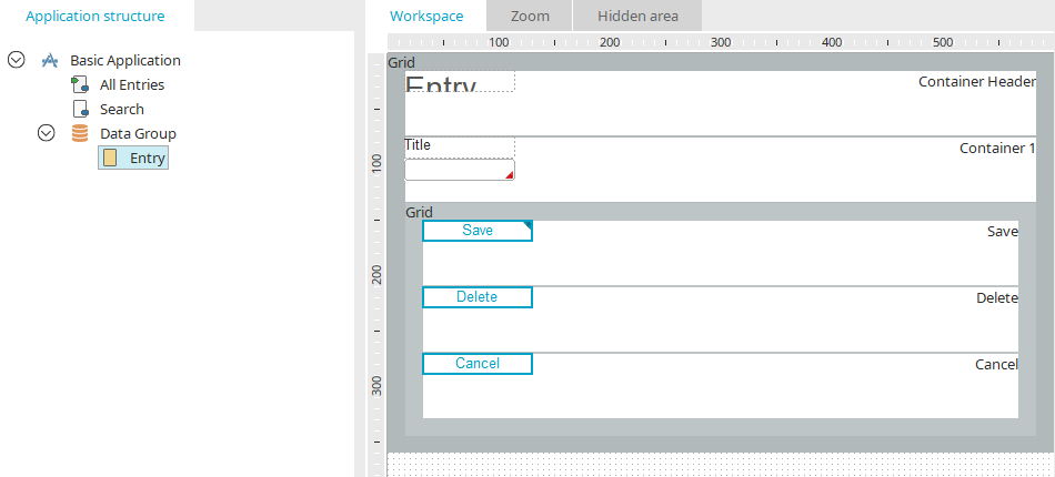
If an application page in the application structure has been selected, elements can be assigned via drag & drop to the workspace.

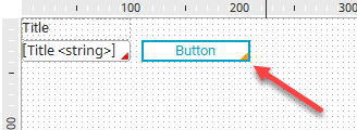
If an element on the workspace is moved with the mouse to a position that is not allowed, such as when elements overlap one another or when the borders of the workspace have been exceeded, the border of the element will be shown in red. It will not be moved. When you let go of the left mouse button, it will return to its original position.
The most important properties of the elements will be displayed in a quicktip when the mouse is positioned over an element.
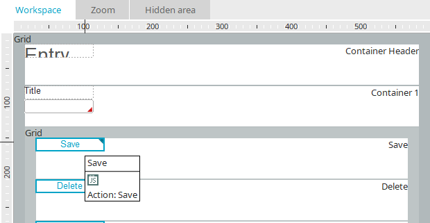
Script
Elements with script calls or comments will be automatically designated with a blue  symbol. Mandatory fields will be designated on the workspace with a red
  symbol.
Conditional display
The elements Grid, Grouping and Button can be shown or hidden with a conditional display. If a conditional display is defined, the element is marked with an orange triangle at the bottom right.
Help lines
On the workspace, vertical and horizontal help lines can be inserted via the menu "Edit/ Horizontal/Vertical help line". They are added at the last position of the mouse. Existing help lines can be deleted via menu "Edit / Delete help line".
The workspace is occupied by a grid to which view and input elements are aligned. Additionally, a ruler will help you to position the elements. The current coordinates of the mouse pointer will be shown highlighted on the ruler.
In the application options, the properties of the workspace can be modified, e.g. to deactivate the ruler or grid.
You can select elements on the workspace by clicking on them. You can select multiple elements by clicking with the mouse and dragging a border around the elements, or by clicking on the elements, one after another, while holding down the Ctrl key.
Grouping
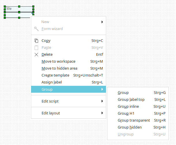
A grouping can be used to combine several elements, e.g., to limit their expansion on the page, to combine them visually, or to move them together.
Select the desired elements on the workspace and choose the main menu "Edit / Group", or the context menu of the same name. You can use the following submenus to select the desired type of grouping:
-
Group
The group uses a background shading.
-
Group label top
The grouping is created with the HTML element div and the page, where the grouping is made, is transformed to a layout without tables. Titles in the controls are hidden and title fields are shown above the controls.
-
Group inline
All elements are transformed as inline elements. Depending on the element type, display:inline; or display:inline-block will be written in the CSS.
-
Group H1
The text of the grouped elements are automatically assigned the style class H1.
-
Group transparent
Groups the elements without background shading.
-
Group hidden
Groups the elements and hides them.
-
Ungroup
Removes the grouping.
Once the grouping has been created, the properties of the grouping can be opened by double-clicking on the grouping frame.
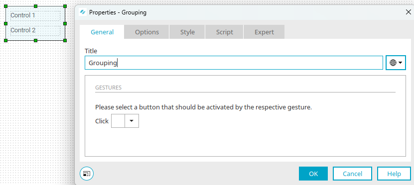
The grouping is also available as an application element. All information about the settings in the properties dialog of a grouping can be found here.
Zoom
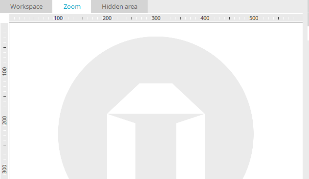
You will find the "Zoom" tab in the workspace. If the "Grid" element is located on a page without a table layout, the containers in the grid can be edited in the Zoom area.
Hidden area
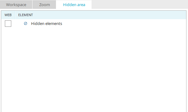
In addition to the workspace, there is also a hidden area, which – like the workspace – can have elements added to it. The elements contained here are not displayed in the browser.
Using the keyboard shortcut Alt + h, the hidden elements can be displayed if necessary, for example, for testing purposes.
New elements can be created directly in the hidden area by dragging them from the "Elements" area to the "Hidden Area" tab. Existing elements can be selected on the workspace and then moved to the hidden area via the main menu "Edit / Move to hidden area".
Elements can be moved back to the workspace in the same manner.
If elements are to be used in JavaScript and the functions are to be available in the browser, the respective checkbox must be selected in the "Web" column. If the setting is not activated for a particular element, then that element can only be used server-side, (e.g. in Velocity).
Hidden group
Groups the elements and hides them. You can open the properties dialog of the hidden group by double-clicking on "Hidden elements" when you are in the hidden area.
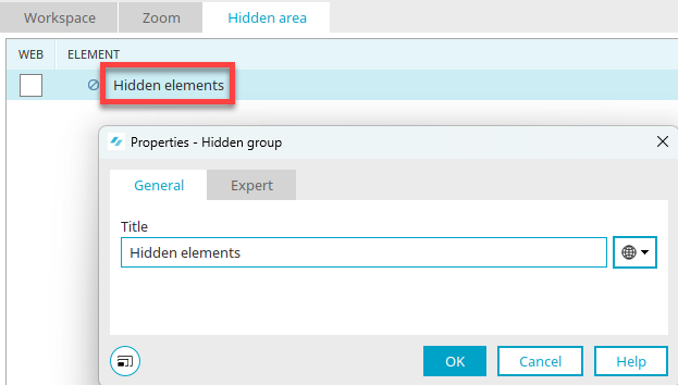
The title of the hidden group can be edited here. Click here for information on multilingual titles.
Other groups can be created within the highest level grouping in the hidden area, e.g. to group the hidden elements into smaller units for clarity.
Search, Notifications, Problems, Description, Script
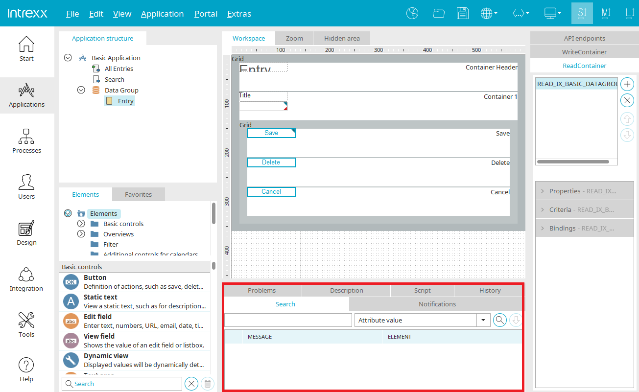
At the bottom, you will find more tabs which can be shown/hidden via the "View" menu.
Search
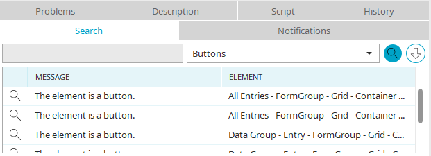
Here you can search specifically for elements with certain properties, GUIDs, integrated script etc.
Search field
Enter a search term here.
Drop-down list
The following functions are available here:
-
Attribute value
Searches for the value of an attribute.
-
Data fields without edit control
You can search through the application for Data fields without edit element in order to list all data fields that are not connected to an edit element.
-
Elements with comments
If you search for Elements with comments, all elements will be listed that have been assigned comments, as long as you enter no text to the search field. If text has been entered to the search field, the search engine will look for elements that contain this text in their comments.
-
Elements using JavaScript
When searching for Elements using JavaScript, all elements will be listed that have a script call entered in their events.
-
Elements using style class
Elements using style class will find elements that have been assigned a specific style, which you can enter to the search field.
-
Elements linking to other applications
The search for Elements linking to other applications returns all elements that are connected to other applications, such as buttons whose target page is found in another application, or tables that show data from other applications.
-
Elements without title
Searching for Elements without title will find all elements that have no title entered for any of the portal languages.
-
Groovy
The search for Groovy returns all elements that are using Groovy script.
-
GUID: Definition
This function will find the element with the GUID you entered in the search field.
-
Buttons / Buttons sending an email
The search can be run for buttons and buttons that execute a send email action.
-
Velocity
Searching for Velocity finds all VTL include view elements integrated into the application.
 Search
Triggers the search. Hits will be shown beneath the search field. If you click on a hit, the corresponding element will be highlighted on the workspace.
 Search history
Opens a window with a list of the most recent searches. Click on a search action to repeat it.
Messages
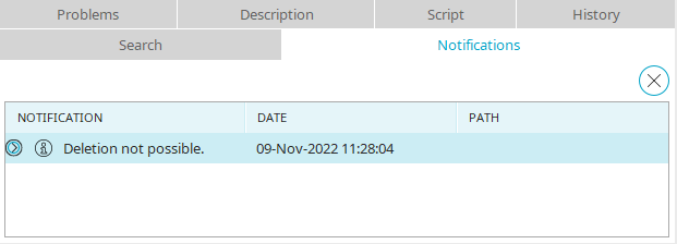
On this tab messages will be printed, for example if an element cannot be deleted because it is linked with other elements.
Problems
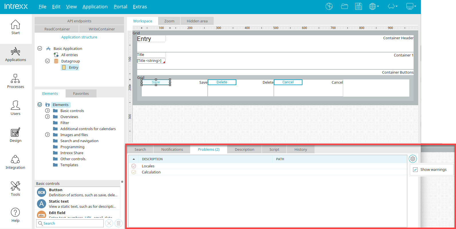
Intrexx supports you in many ways when developing applications. Most of the checks for avoiding incorrect configurations are already performed directly when editing elements. In addition, there is the "Problems" pane, which scans the currently opened application for errors and warnings. The underlying algorithm is constantly being expanded and will help you to ensure that your applications will continue to function properly and be maintainable in the future.
Even in seemingly problem-free applications, new problems can be specified after a software update. This is not due to a faulty Online Update but to the continuous development of the algorithm for detecting errors.
By clicking on  "Settings”, the warning display can be switched on and off.
The "Problems" pane contains the following types of messages:
-
FIXME or TODO marker in JavaScript
This gives you an overview of all fixme or todo comments in the application's JavaScript. The application can be published despite the messages, if desired. You can learn how to set the appropriate markers in the script here.
-
 Errors
Prevent the application from being published and must be fixed unless the "Allow application to be published despite error entries in the 'Problems' area" setting is enabled in the options.
-
 Warning:
The application can be published despite reported warnings.
By default, the FIXME and TODO markers from the JavaScript are listed at the top, followed by the errors and then the warnings. The sorting of the individual columns can be changed by clicking on the column header.
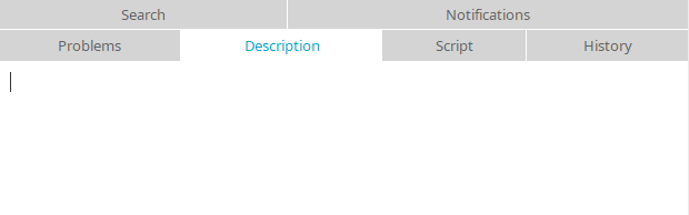
Description
Here you also have the ability to enter a description of the currently selected element. This applies for all elements of an application, i.e. pages, data groups, data fields, etc. The text that you enter here will be entered in only one language when the application is saved. Elements with a description are marked on the workspace with a icon.
|
|
If entering a description is not possible, such as when multiple elements are currently selected, this symbol will appear in the comments field. |

Script
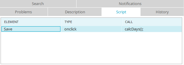
On the "Script" tab, an overview of all script calls used on the page is provided. By double-clicking on an entry in the "Element" column, the element, which the script call is assigned to, will be highlighted on the workspace. A double-click on an entry in the "Call" column opens the corresponding script at the right place in the editor.
History
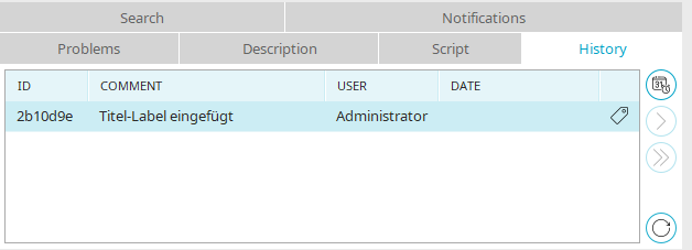
All information on this topic can be found here.
Settings
You can access general settings for the "Applications" module via the main menu "Extras / Options / Applications".
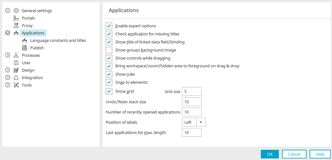
Enable expert options
Click here for more information.
Activate options for accessibility
If you activate this checkbox, the "Accessibility" tab is displayed in the elements.
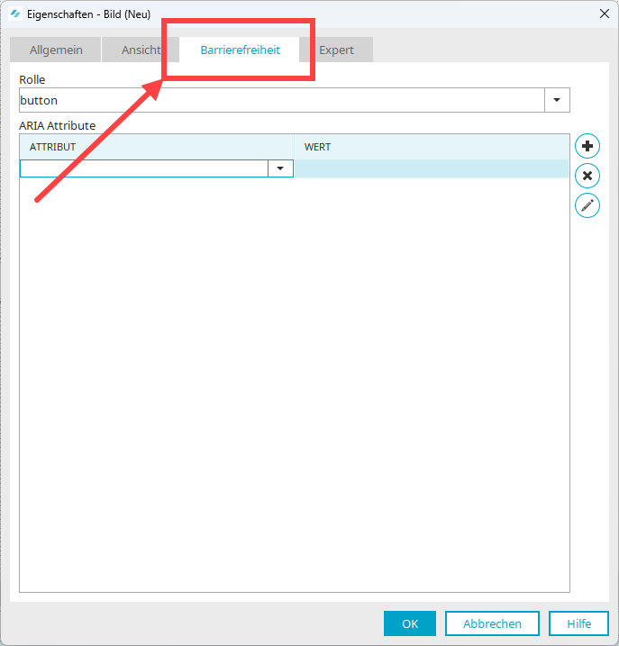
You can assign ARIA roles and attributes on the "Accessibility" tab.
More detailed information is available in section Assign ARIA roles and attributes.
Check application for missing titles
Causes the application to be searched for missing titles in other portal languages when it is opened. Click here for more information.
Show title of the data field / binding
With this setting the title of the connected data field and binding will be shown on the workspace in the application elements.
Background image of groups
In the Design module, images can be included as a background for groups. With this setting, the images will be shown on the workspace.
Show controls while dragging
When elements are moved on the workspace, both the original and the new position of the element will be displayed.
Bring workspace / hidden area to foreground on drag and drop
The hidden area will be moved to the foreground as soon as a control is moved to the "Hidden area" tab via drag & drop. Controls can also be moved from the hidden area to the workspace by drag & drop. In this case, the workspace will be brought to the foreground. If this behavior is not desired, please deactivate this setting.
Show ruler
Displays or hides the ruler on the workspace.
Snap to elements
If you drag a new element to the workspace or move an existing element, this setting will activate dashed lines which help you to align this element to the others.
Show grid
This setting will show a grid on the workspace. The grid size (the distance between the grid points on the workspace) can be set here. The standard value 5 corresponds to a distance of 5 pixels between individual dots.
Undo / Redo stack size
Defines the number of editing steps that can be reversed via Main menu "Undo".
Number of recently opened applications
With this option, you may choose the number of recently opened applications that will be shown in the lower area of the Main menu "File".
Position of labels
Defines whether the titles of edit and view elements, which can be created automatically, should be assigned to the left or above the element on the workspace.
Last application list max. length
Here, you can specify how many of the most recently edited applications will be displayed in the Application Manager, when "Recently edited" is selected.