Chart
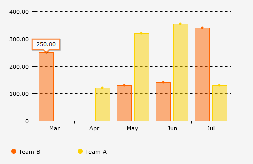
This view element allows values of an application to be graphically displayed. The chart control provides many different templates, enables the number of data records to be limited, the integration of dependencies, the manipulation of all chart properties, and the ability to export charts as jpg, png, svg, and pdf.
The "Diagram" application element is part of the "Images and files" element category.
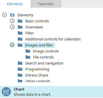
The diagram element can be found in the "Elements" section of the "Applications" module. A new diagram can be created by dragging and dropping the element from here and positioning it on the workspace.
More information on creating elements can be found here.
The properties dialog of a diagram element opens automatically when a new diagram is created. The properties dialog of an existing diagram can be opened by double clicking on the element on the workspace, via the "Properties" context menu, or via the "Edit/Properties" main menu if the diagram is selected on the workspace.
General
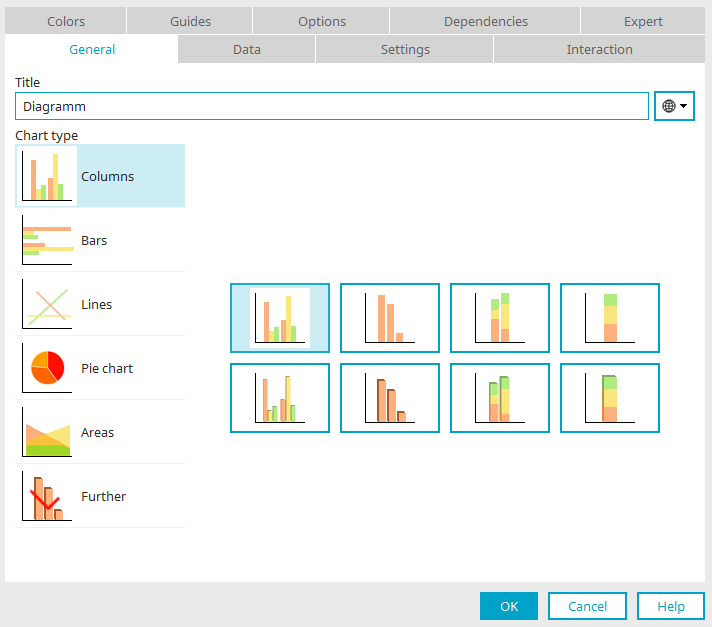
In the properties dialog of the diagram you can set the title, including a multilingual title, under the "General" tab.
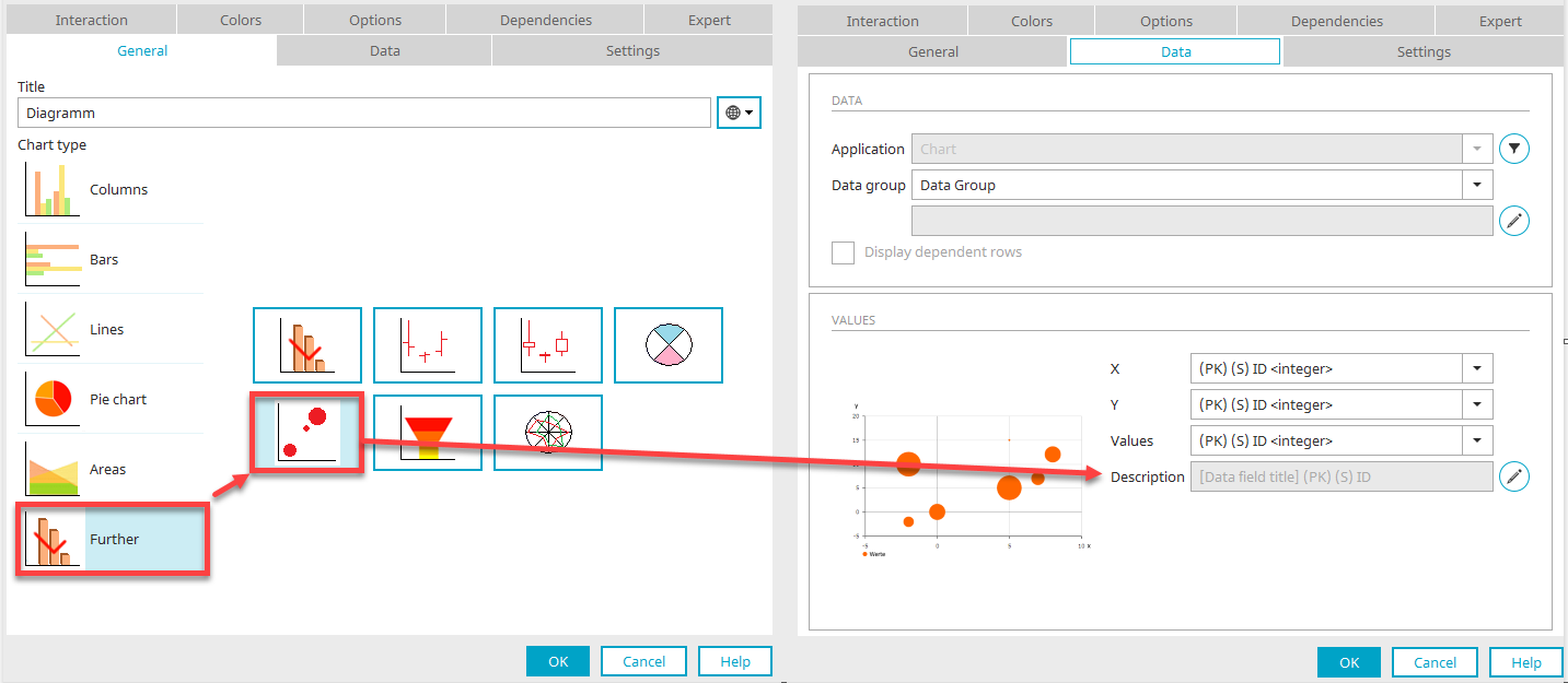
Chart type
Once you have selected the chart type on the left (Columns, Bars, Lines, Pie chart, Areas and Further), you can choose from the different sub-options on the right.
Data
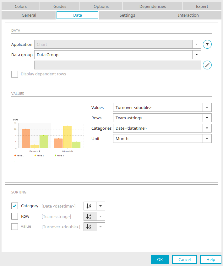
The data source of the diagram and the structure of the diagram components are configured here.
Data
Application
The current application is already selected here.
 Filter
Opens a dialog where a filter can be defined. This filter will filter the application data before it is presented in the diagram.
Data group
Select the data group whose values should be shown in the chart.
 Add subordinate data group
Opens a dialog where the subordinate data groups, whose data should be included in the diagram, can be selected here.
Subordinate data groups
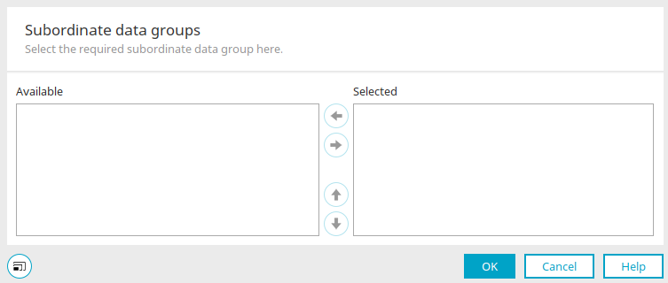
In the "Available" column, you can see all selectable sub-data groups. Move the desired data group to the "Selected" list by clicking on  "Move to right".
 "Move up / down" changes the order of the selected sub-data groups.
Click "OK" to save the changes and close the dialog.
Display dependent rows
Show dependent rows This setting affects the way records that exist in a parent-child relationship to the superior, currently selected data record will be shown.
Values
In this area, you will see an image of the previously selected chart.
Values
Here, a field should be selected that contains a meaningful value. The values of this field will be automatically summated. This sum defines, depending on the type of chart, the height of the columns, length of bars, or size of the areas in the chart. Negative values can also be displayed, in that the individual rows will then be shown in the bar chart below the row axis.
Rows
In this drop-down list, you will define by which criteria the values will be arranged on the x-axis (horizontal axis). By selecting "[One row]", which can be chosen for all chart types other than the pie chart, the "Values" are summated.
Categories
Here, a field can be selected that should be used to group the data in the chart.
Unit
For categories of the “date” type, a corresponding "Unit" (Second, Minute, Hour, Day, Week, Month, Quarter, and Year) can be selected for display in the diagram.
Sorting
Category
The chart is sorted by categories with this setting.
Row
The chart is sorted by row values with this setting.
Value
The chart is sorted by the values defined in the value range with this setting.
 Sort ascending / descending
Specify here whether sorting should be in ascending or descending order.
Special feature: XY diagram type
In the case of the XY chart, which can be selected under the "Other" diagram type, the description of the values can be edited.
Click on "Change description".
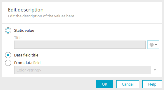
Here you can enter what is being displayed as a description of the individual values in the XY chart.
Static value
Enter a static title here. Click here for information on multilingual titles.
Data field title
If this option is active, the title will be obtained from the selected data field.
From data field
Enables the selection of a data field whose content will be used as a description of the values.
Settings
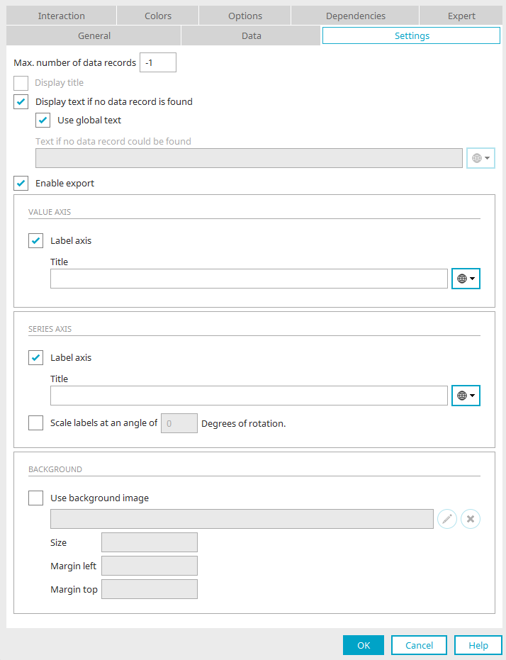
Max. number of data records
Defines the maximum number of data records to be shown in the chart. If -1 is entered here, all data sets will be displayed.
Number of records displayed initially
Define how many data records should be shown when the chart is loaded. Activate the "Show scrollbar" setting on the "Interaction" tab to gain access to more values in the chart.
Display title
Displays the diagrams legend.
Display text if no data record is found
If this is selected, a text will be displayed when there is no data available.
Use global text
The global text is used that is stored in the Regional settings of the portal properties under Global language constant "DR_NO_RECORD".
Text if no data record is found
A static text or a constant can be entered here if the "Use global text" setting is deactivated.
Enable export
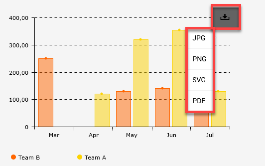
With this setting, a button will be shown next to the chart in the browser that can be used to select an export format. The chart can be exported as a jpg, png, svg or pdf file.
Value axis / Series axis
Label axis
Enter a label for the Value/Series axis here.
Scale labels at an angle of ... degrees of rotation
The series axis labels will be rotated by the angle entered here.
Interaction
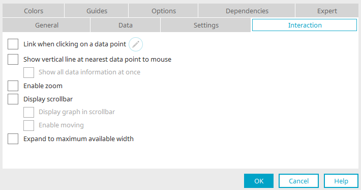
Link when clicking on a data point
Edit
Opens a dialog where a page can be defined, which is opened when a user clicks on a data point.
Show vertical line at the closest mouse data point
To improve orientation, a vertical line at the data point closest to the mouse can be shown.
Show all data information at once
Shows all data points at once in a quicktip on the chart surface.
Enable zoom
This setting allows an area to be selected with the mouse and zoomed in on.
Display scroll bar
Additionally, a scrollbar can be shown, which is shown in the chart's Header, enabling an area of the chart to be reduced in size.
Display graph in scrollbar
Additionally shows the area that is currently restricted.
Enable moving
Can only be selected if "Enable zoom" is not activated.
Expand to maximum available width
Adjusts the width of the element to its surrounding elements.
Colors
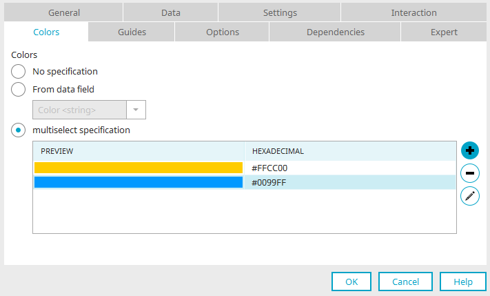
No specification
The existing colors will not be edited with this option.
From data field
A data field can be selected that contains a hexadecimal color value. If, for example, all of the bars in the diagram for Employee A should be shown in green, the hexadecimal value for green needs to have been entered for every data record created for this employee.
Fixed specification
The colors listed here will be used one after the other for the row element of the diagram.
"Preview" column
A preview of the color is shown here.
"Hexadecimal" column
Shows the hexadecimal color value.
 Add color / Edit color
Opens a dialog where a color can be selected.
 Delete color
Removes the currently highlighted color from the list.
Guides
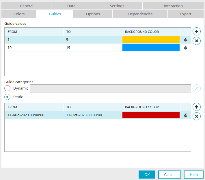
With guides, areas in the diagram can be highlighted in color. Guides can be defined for every diagram type apart from pie chart, funnel and XY charts.
Guide values
"From" / "To" / "Background color" column
Specify the area, which should be colored, in the first two columns. The color can be selected in the third column.
Create guide
Adds a new row to the list. The values can be edited directly by clicking on the corresponding cell.
 Delete guide
Removes the selected guide from the list.
Guide categories
Dynamic
This option available if a data field with the type Date is selected for the Categories on the "Data" tab. If the option is selected for the first time, a dialog will open automatically where the guide series can be configured.
Edit guide series
Opens a dialog where the color, series pattern and duration for the guide can be defined.
Guide series
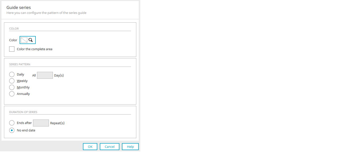
Color
Select color
A color can be selected for the guide, e.g. to highlight the month of June.
Color the complete area
The entire area is colored in.
Series template
Define an internal for the series pattern here.
Series duration
Ends after
After this amount, the highlighting will no longer be shown.
No end date
If an end date is not selected, the highlighting applies to the entire diagram.
Click "OK" to save the changes and close the dialog again.
Static
Here, static areas for the categories can be colored in.
"From" / "To" / "Background color" column
Specify date values for the area, which should be colored, in the first two columns. The color can be selected in the third column.
Create guide
Adds a new row to the list. The values can be edited directly by clicking on the corresponding cell.
Delete guide
Removes the selected guide from the list.
Options
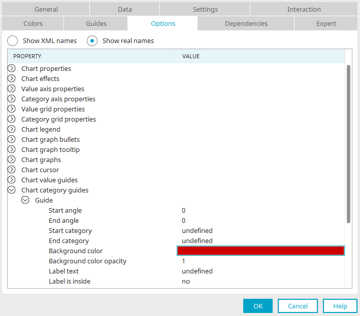
Show XML names
Displays the chart's layout properties in XML.
Show real names
Displays the names of the chart's individual layout properties
Line color, line strength, graphs, help lines, the background image, and much more are defined here. More information on possible adjustments can be found in the API for the third-party solution amCharts.