Content Editor / Content View
The "Content Editor" application element is one of the basic controls. It is available as an input element and as a view element. Markdown can be entered or displayed in the Content Editor. The input length is not limited. The Content Editor can only be connected to data fields with the data type "Text".
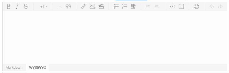
In the image above, you can see the Content Editor in the browser. Entries can be saved with a corresponding button if a data field is linked to the editor.
The "Content view" element is used to view the data that you have entered using the Content Editor. Simply connect it to the data field to which the Content Editor is also linked to display the Markdown text. No further settings need to be made.
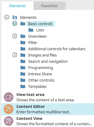
The "Content Editor" and "Content View" elements can be found in the "Applications" module in the "Elements" area. A new element can be created by dragging and dropping it from here and positioning it in the workspace.
More information on creating elements can be found here.
The Element Properties dialog opens automatically when a new element is created. The properties dialog of an existing element can be opened by double-clicking the element in the workspace, via the "Properties" context menu, or via the "Edit / Properties" main menu, if the element is selected in the workspace.
General
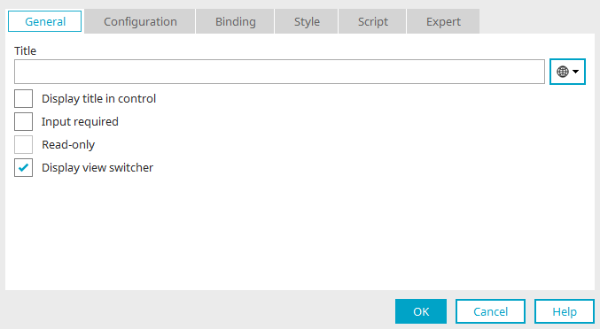
Title
Enter the title of the content editor here. Further information on multilingual titles and the use of language constants can be found here.
Display title in control
This setting means the title will be displayed in the edit field when it is viewed in the browser.
Input required
This setting makes the edit field into a mandatory field.
Write-protected
The text area cannot be edited if this setting is active.
Show view switcher
This option displays the switch between "Markdown" and "WYSIWYG" in the footer of the Content Editor.
Configuration
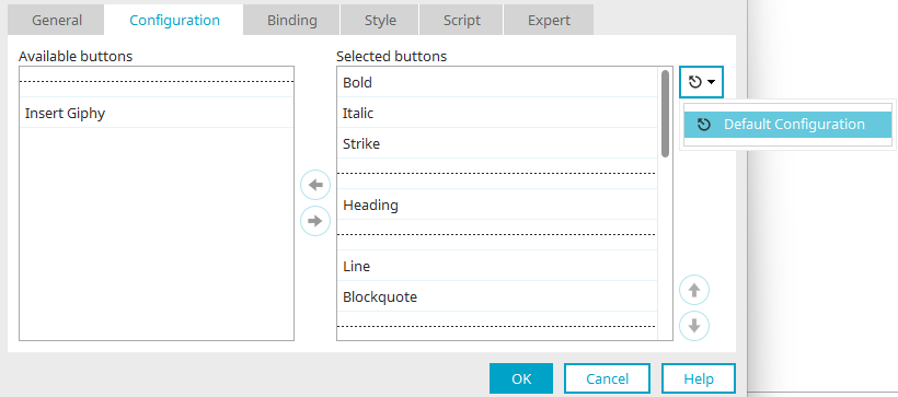
From Intrexx version 12.0.1
The editor toolbar is configured on this page. Various buttons are available that can be added to the editor on the web.
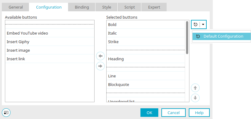
Available / Selected buttons
Here, you will find all buttons that you can add to the editor. If you want to add an additional button, highlight it in the column and move it with the arrow button to the "Selected buttons" column. With the dotted line, buttons will be visually combined into groups. In this way, you will get a clear overview in the Editor. The solid line will be used to create an additional icon bar below a previous one.
 Move right / Move left
The selected field is moved to the right/left column, respectively.
 Standard configuration
Click on this button to reset the settings to the default configuration.
 Delete configuration
Moves all elements from the "Selected buttons" column back to the "Available buttons" column
 Move up / Move down
These define the order of the buttons in the editor. The following applies here: The higher the button is in the list, the further to the left it will be shown in the editor toolbar. Displays which HTML element is currently being edited in the status bar at the bottom of the editor, depending on the position of the cursor.
Control type "Content view" in view tables
If you include a data field that is linked to the Content Editor as a column in a view table, you can select the "Content view" control type there. Further information on control types can be found here.
Create your own standard configurations
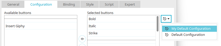
To create your own standard configuration, an XML file must be created in the portal directory "internal/cfg/htmleditor/markdown". The format for this can be adapted from the existing "ixdefault.xml".
Your own standard configuration can then be easily selected via the corresponding menu in the configuration dialog.
GIPHY
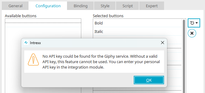
To use the GIPHY picker or the GIPHY search in the Content Editor, move the "Insert Giphy" entry from the "Available buttons" list to the "Selected buttons" list.
Why do I need an API key from GIPHY?
For data protection reasons, a valid API key is required for GIPHY, which you will be notified of with a corresponding message.
There are two different types of API key: the so-called beta key and the production key.
The beta key is generated automatically after an account is created at GIPHY Dev and a new app has been created. The beta key only has limited access to the GIPHY servers and is used to test access.
A video of the application in which the key is used can also be created. This video is required to request a production key. The production key grants full access to the GIPHY servers and is to be used for the actual application.
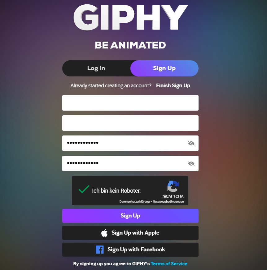
Where do I create my GIPHY account?
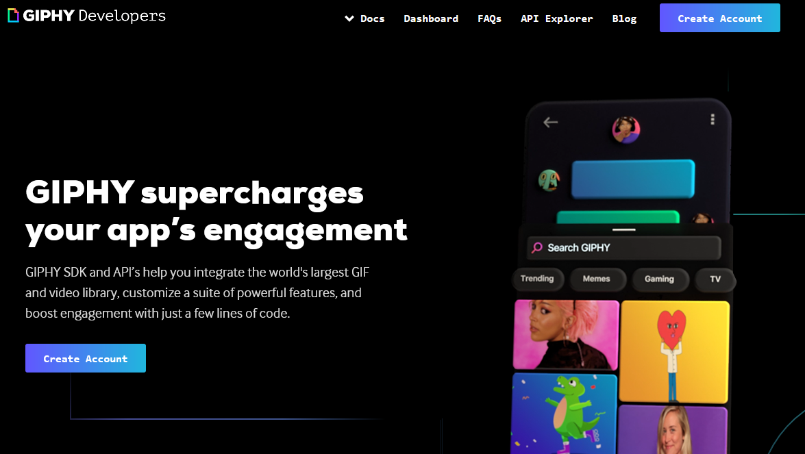
You can create a new GIPHY account at https://developers.giphy.com/. Click on "Create Account" here.
How do I generate my beta key?
Once the account has been created and you have logged in, click on "Create an App". You can define the scope of the key in the following window. We recommend selecting "API" here.
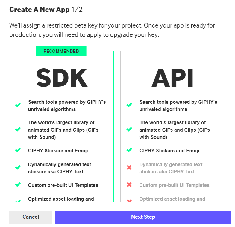
After making your selection, click on "Next Step".
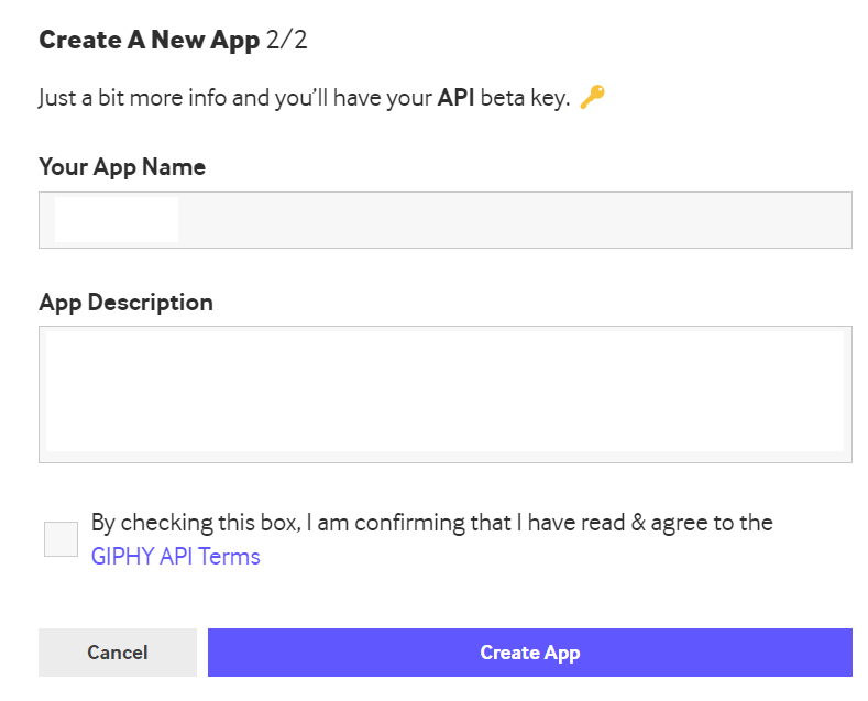
Enter the name of the app and a description here. Then click on "Create App".
Then confirm the GIPHY API terms and conditions to complete the process. The beta key for your app will now be created and activated.
Where do I store my GIPHY key in Intrexx?
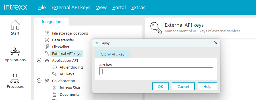
Enter your key in the "Integration" module under "External API keys". To do this, select the main menu item "External API keys / Add new API key".
How do I generate my production key?
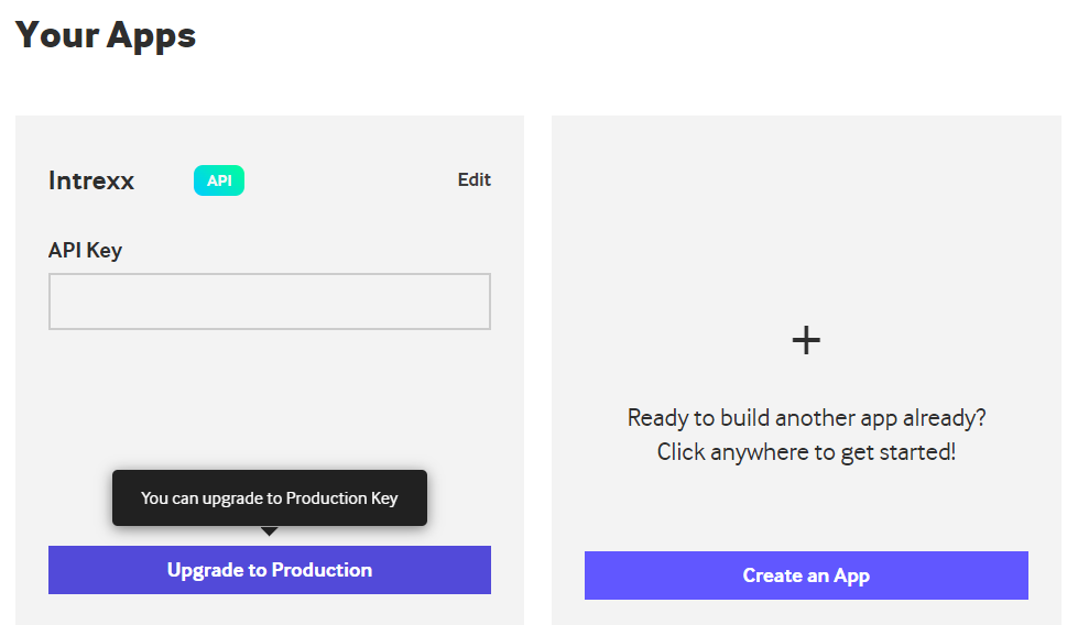
If you are on the GIPHY dashboard(https://developers.giphy.com/dashboard/), all the apps you have created are displayed with the corresponding beta keys. You will find the "Upgrade to Production" button for each app.
You will then be taken to a page where you need to enter more specific information about the app and the use of the key. You must also post a video showing your GIPHY search in action using the beta key. The disclaimer can be shown in the GIPHY search.
Once you have entered all the information, you can submit the form. GIPHY will then inform you how long it will take to check your request and activate the production key.