

Radio button
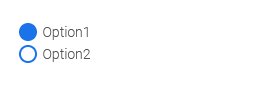
The "Radio Button" control is one of the basic controls. It consists of individual options grouped together. The user can select only one of the options in the browser. The value of the selected option is stored as text in the data field that is automatically created when the element is created and can be linked to the element.
The values of the radio button can be saved using the corresponding button.
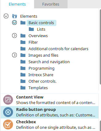
You can find the radio button element in the "Applications" module under "Elements. " You can create a new radio button by dragging and dropping the element from here onto the workspace.
For more information on creating elements, click here.
The Properties dialog box for a radio button opens automatically when a new radio button is created. The Properties dialog box for an existing text field can be opened by double-clicking the element on the workspace, selecting "Properties" from the context menu, or selecting "Edit / Properties" from the main menu, provided that the checkbox on the workspace is selected.
Create a radio button
When you drag the element from the Elements pane onto the workspace, a wizard opens to guide you through the settings.
Data Binding
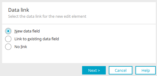
You can find all the information about this dialog here.
Select the desired option and click "Next."
New Data Field
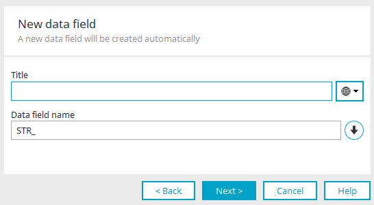
You can enter the title of the data field here. The name of the data field will then be suggested automatically. The prefix for the data field name is "STR_" because a data field with the "string" data type is always created for a radio button. The values for the radio button—which you can specify later—are saved as text.
Click "Next."
General
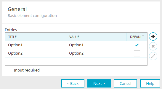
The individual options are set here in the options box. The title is displayed as the label for the option, and the value is stored in the linked data field. You can edit both entries by simply clicking in the corresponding cell.
"Preselection" Column
Here, you can select an entry that should already be selected when the page loads in the browser.
All options that have the same value as the option marked as the default are displayed as selected in the browser. Please be sure to use unique values for each option.
 Create a New Option
A new option entry is created.
 Delete Option
The currently selected option will be deleted.
 Edit the option title in multiple languages
Opens a dialog box where you can edit the option's title and value.
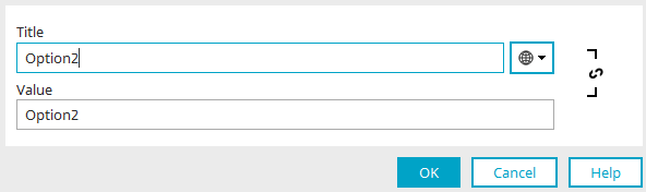
You can find all the information here. Click "OK" to apply the changes and close the dialog box.
Input Required
With this setting, the radio button becomes a required field. Click "Next." In the final step, all that remains is to configure the final settings. You can find all the information here.
Edit an existing radio button
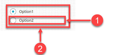
A radio button consists of individual options (1) and a group box (2).
You can view the properties of a single option by double-clicking on it.
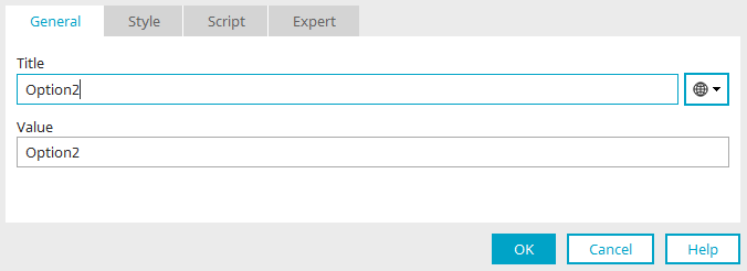
In the Properties dialog box, you can edit the title and value of each option on the "General" tab.
You can open the properties of the entire option group by double-clicking the group box.
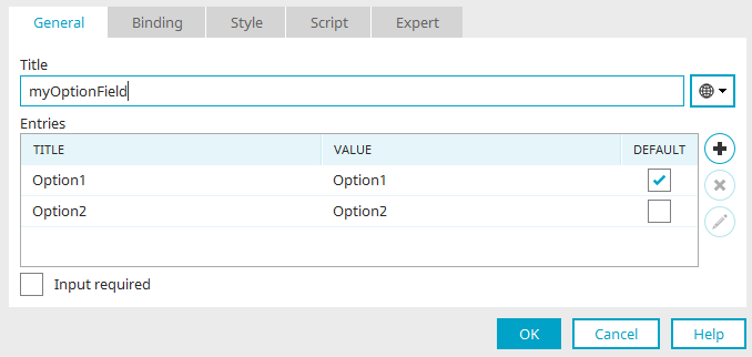
Here, you can edit the title of the radio button group as well as the labels for each option.