File selection/File selection view
With the file selection, files can be uploaded to the server and made available for download.
First, create the file selection on an input page. The uploaded files can be saved with a corresponding button, provided that a file data field is linked to the file selection.
From Intrexx version 12.0.2:
Please note the information on generating file names.
Clicking on the element opens the standard dialog where an image file can be selected. You can also drag and drop files onto the element or paste images that you have previously copied to the clipboard using the CTRL + V key combination.
The File Selection View element can display uploaded files.
For both elements, templates are available for different displays of the images.
Both application elements are part of the "Images and files" element category.
The file selection elements can be found in the "Elements" section of the "Applications" module. A new element can be created by dragging and dropping the element from here and positioning it on the workspace.
More information on creating elements can be found here.
The properties dialog of an element opens automatically when a new element is created. The properties dialog of an existing element can be opened by double-clicking the element in the workspace, via the "Properties" context menu, or via the "Edit / Properties" main menu, if the element is selected in the workspace.
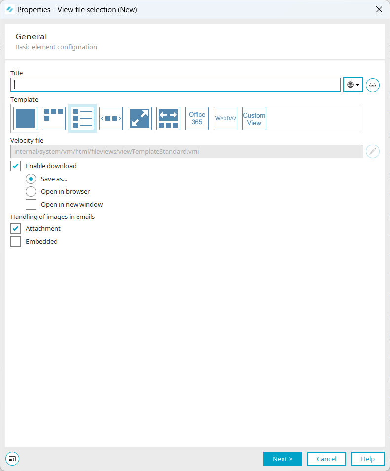
File selection
General
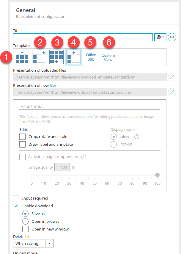
In the properties dialog of the file selection, you will find the following settings under the "General" tab:
Title
Give the file selection element a title. Click here for information on multilingual titles.
 Edit text alternative
Opens a dialog where text can be entered that is shown instead of the icon on end devices incapable of showing images.
Document template
Templates for displaying the files in the browser can be selected in this section. Every template is based on a VM file; these can be found in the portal directory internal/system/vm/html/fileviews. Most templates use custom style classes, which are entered in the field on the "View" tab.
The templates function according to the settings under the "Options" and "Appearance" tabs.
1. Advanced" template (downloadTemplateAdvanced.vmi)
Style class: File_Edit_Advanced
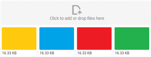
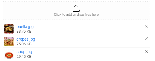
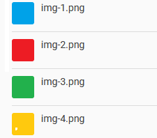
Displays the downloaded image files as thumbnails in a row. The file size is displayed under each image. You can upload additional files above the images. When you hover over an image, a button appears in the upper right corner that can be used to delete the image. Click on an image to download it.
2. Basic" template (downloadTemplateBasic.vmi)
Style class: File_Edit_Basic
With this template, additional files can be uploaded in the upper area.
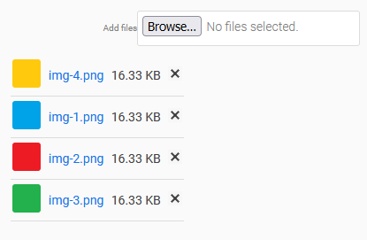
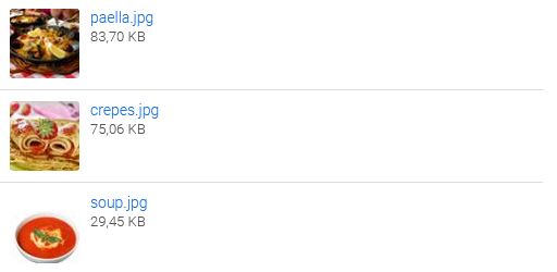
Below that, all images are displayed one above the other as a thumbnail. Click on an image to download it. The filename and file size are shown to the right of the image. You will also find a button to delete the corresponding file.
3. Minimal" template (uploadTemplateMinimal.vmi)
Style class: File_Edit_Minimal
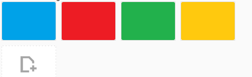
Here you can find all uploaded images in the upper area as thumbnails in a row. Click on an image to download it. When you hover over an image, a button appears in the upper right corner that can be used to delete the image. Below the images you will find a button that can be used to upload additional files.
4. Standard" template (downloadTemplateStandard.vmi)
Style class: File_Edit_Standard
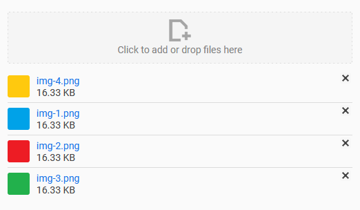
Here you will find the option to upload additional files in the upper area. Below that, all images are displayed as thumbnails, according to the settings in the view. Clicking on an image loads it in original size. The image can be downloaded by clicking on the filename link. For each image, the file size is also displayed below the file name and a button that can be used to delete the corresponding image.
5. Office 365" template
Template customized specifically for Microsoft Office 365. This allows files to be opened directly in Microsoft Office 365 in addition to being able to download them. The thumbnails of the files from Microsoft Office 365 can be displayed as well.
6. Own view" template
If you select the "Custom view" template, you can use your own Velocity file for the presentation.
Presentation of uploaded files / Presentation of new files
When you click one of the preview images, the paths to the corresponding Velocity files in use will be refreshed in the fields below the preview images. Clicking on the "Custom view" preview graphic clears these fields and activates the buttons for editing so that a custom Velocity file can be integrated.
 Select Velocity file
Opens a dialog where a Velocity file can be selected to be used as a template for a custom view.
Select Velocity file
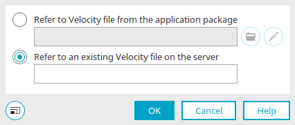
Reference a Velocity file in the application
Displays the path to the file from the application package. All Velocity files from the application package are stored in the portal directory internal/application/store/<AppGuid>/resources.
 Select Velocity file
Opens the Velocity file manager where a Velocity file can be selected.
Edit Velocity file
Opens the script editorwhere the current Velocity file can be edited.
Reference an existing Velocity file on the server
Displays the path to the file on the server.
Please take note of our security notice when using Velocity files.
Click "OK" to save changes and close the dialog again.
Image editing
This function provides two editors that can be activated for editing previously uploaded image files (JPEG and PNG). Click here for more information.
Input required
This setting will make the file selection mandatory.
Enable download
Users can download the files with this option.
-
Save as...
Users can save the file after downloading it.
-
Open in browser
Users can open the file in the browser after downloading it.
-
Open in new window
With this setting, the file will open in a new window when it is opened in the browser.
Delete file
The following options are available:
-
Do not enable
A button will not be shown in the end device that allows the file to be deleted.
-
While saving
A button is shown to delete the file. The file will only be deleted, however, when the entire data record is saved.
-
Immediately
A button is shown to delete the file. The file is immediately physically deleted when the user clicks this button.
Please note that if you choose the "Immediate" setting for deletion, the file will be irrevocably deleted, regardless of whether the entire data record is saved.
Upload mode
-
Replace existing files
With this setting, files of the same name will be replaced in the upload procedure.
-
Attach files at beginning
New files will be inserted at the top of the file list. Intrexx uses an internal sorting field for this.
-
Attach files at end
Causes the files to be attached at the end of the list.
Options
Find all the settings for uploading files here.
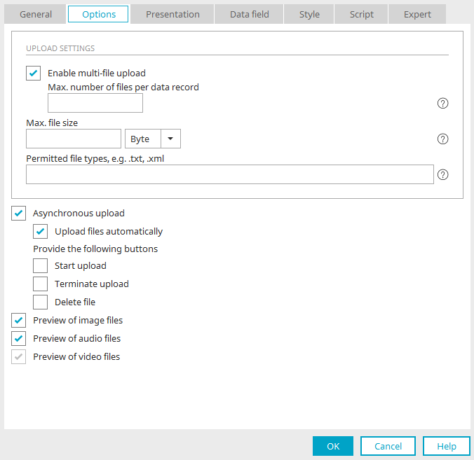
Upload settings
Enable multi-file uploads
This setting allows multiple files to be uploaded for each data record. Below, you can specify the permitted "Maximum number of files per data record".
Max. file size
You can specify the maximum file size that can be uploaded here. Select the desired unit in the list to the right of the edit field.
You can also select the "Max. number of files per data record" and "Maximum file size" for a file field.
If you do not want to restrict the file size or number of files, leave the corresponding fields empty here.
The setting you define there is decisive for "the File selection control". This means that, for example, if you define a maximum of size of 10 MB in the file field properties, the File selection is unable to upload more than 10 MB, regardless of the number you set in its properties. If you set a maximum of 5 MB for the File selection, for example, the data field will allow up to 10 MB, but the control will only permit 5 MB to be uploaded. Therefore, the setting in the File selection properties takes priority when setting restrictions.
The same principle applies for the setting for the "Allowed file types", which you can also specify in this dialog.
Permitted file types
Enter extensions for "Allowed file types" with a period in front of them, such as ".txt" or ".xml", each of them separated from the others with a comma. These entries are not case-sensitive. Wildcards cannot be applied here. When testing, whether a file is permitted or not, only the ending will be tested. In principle, if for example "document.txt" is entered here, the test will interpret all files as permitted that end in "document.txt", even a file with a name such as "my-document.txt".
Asynchronous upload
Enables individual files to be uploaded to the server without saving the data set at the same time. However, the assignment to the record will only be created when the data set is saved. With this, the upload process can be controlled more precisely, especially with large files.
Please note that the user needs to be informed about this process. If this is not the case, we recommend using the "Upload files automatically" option.
-
Upload files automatically
Means the files added by drag-and-drop are immediately uploaded after the mouse button is released.
-
Start upload, Terminate upload, Delete file
The corresponding buttons will be shown on the end device, allowing the upload process to be controlled accordingly.
Preview of image / audio / video files
The preview is shown when the file has already been selected but the data record has not been saved yet. When viewing an existing data record, this setting is not relevant for the presentation, but rather the setting for the thumbnail.
View
Here you can find all the settings for displaying uploaded files.
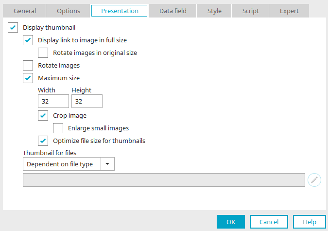
Display thumbnail
With this setting, every image uploaded with the file selection is automatically made smaller and shown as a thumbnail in view tables.
Display link to image in original size
Provided it has already been saved, the image will be shown in its original size in a new window when the user clicks on the image. This setting can be selected only if the "Enable download" setting on the "General" tab is not selected.
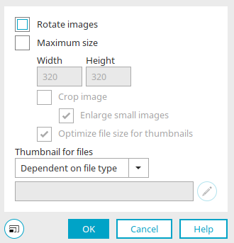
Rotate images in original size
Rotates the image in its original size.
Rotate images
Rotates the images in the size specified in the Application Designer.
Maximum size
Define the maximum Height and width that an image can take up in pixels. Larger images are reduced proportionally but smaller images will not be changed.
Crop image
The image's width and height will be adjusted to the surrounding element.
Enlarge smaller images
If this setting is also selected, smaller images are enlarged to the specified maximum size.
Optimize file size for thumbnails (reduce)
Reduces the file size in favor of a faster loading time of the application page.
Thumbnails for files
If the uploaded file is not an image, you can decide how the thumbnails will be shown here.
-
Dependent on file type
With this setting, you can define which file extension is linked with which thumbnail image in the file "fileextension.properties" which is found in the portal directory /internal/cfg.
-
Intrexx standard
An image defined by Intrexx is used.
-
Static image /
Select imageOpens a dialog where an image can be selected.
From Intrexx version 12
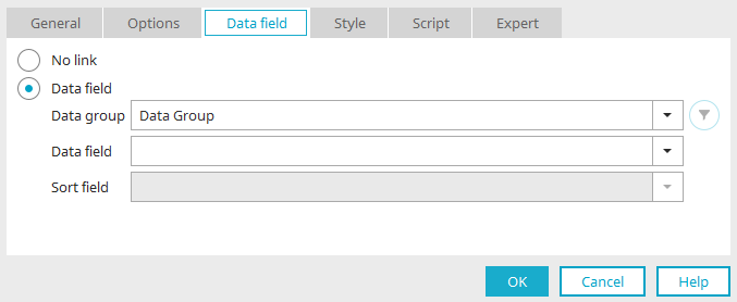
Data field
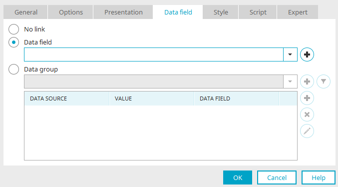
No link
With this option, the File selection element will not be connected with a data field. The selected values are not saved.
Data field
An existing file data field can be selected here.
 Create new data field
Opens a dialog where a new data field can be created.
Data group
Click here for more information about the settings in this area.
File selection view
General
Most of the settings here on the "General" tab in the "File Selection View" properties dialog can also be found in the "File Selection" properties dialog. The settings which differ are described below:
Document template
In this section, as in the file selection, templates for displaying the files in the browser can be selected. Every template is based on a VM file; these can be found in the portal directory internal/system/vm/html/fileviews. Most templates use custom style classes, which are entered in the field on the "View" tab.
The templates work according to the settings in the options. If, for example, the maximum number of files per record is limited to "1", only the first image is displayed for each template.
viewTemplateBasic.vmi (1)
Style class: File_View_Basic

Displays the first image. The size is based on the setting that is set for "Show Thumbnail" in the options.
viewTemplateMinimal.vmi (2)
Style class: File_View_Minimal

Displays all images uploaded for each record as thumbnails in a row.
viewTemplateStandard.vmi (3)
Style class: File_View_Standard
Displays all images as thumbnails one above the other. Provided the settings are set in the options, the text and file size are displayed here to the right of each image.
viewTemplateImageScroller.vmi (4)
Style class: File_View_Scroller

This template can be used to display multiple images on a small area. On the right and left of this are arrow buttons that can be used to scroll through the images.
viewTemplateBgImage.vmi (5)
Style class: ix-cover ix-center-center

Displays all images in original size one above the other.
viewTemplateResponsiveGallery.vmi (6)
Displays all images in a gallery.
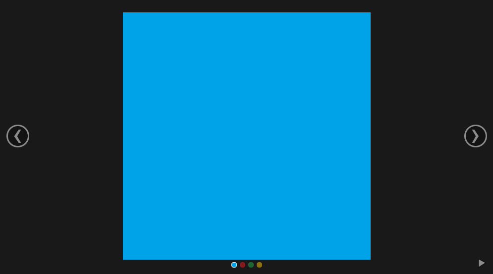
On the right and left of this are arrow buttons that can be used to scroll through the images. Below the selected image, the other images in the gallery are displayed as small circles. Click on a circle to change to that image. In the lower right corner you can start a slideshow by clicking on the play button.
Office 365 (7) and custom view (8)
These two templates can also be found in the properties dialog of the file menu. The functions here are identical.
WebDAV (8)
This template is related to the "WebDAV functionality", which allows you to open, edit and save documents or files directly with the appropriate program via your portal.
All other settings required for the "WebDAV functionality" and further explanations on this topic can be found in the following sections:
Handling images in emails
Attachment
Images from the File menu will be treated as an attachment.
Embedded
Images will be embedded by the File menu element.
Options
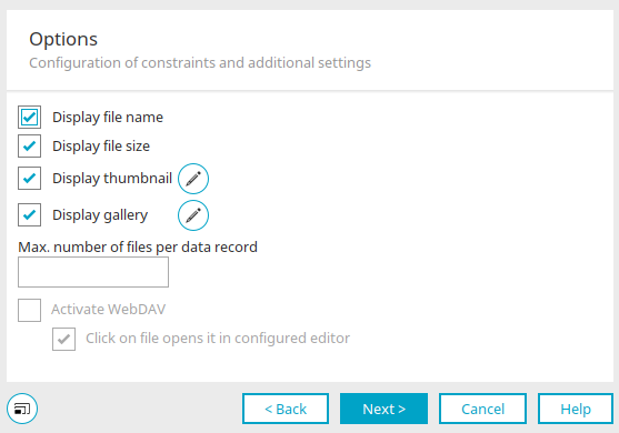
Display file name
Causes the names of the uploaded files to be shown in a vertical list in the column.
Display file size
Causes the size of the files to be shown in the column as well.
Display thumbnail
A thumbnail image is displayed for each uploaded file.
Edit settings for thumbnail
Opens a dialog where the settings can be edited.
Options for responsive images
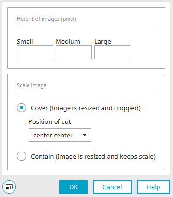
Height of images (pixel)
Define the maximum image height in pixels for the layout sizes Small, Medium and Large. If a field is left blank, the setting of the respective smaller layout size will be used (if available).
Scale image
Define how the image should be scaled here.
Cover (image is resized and cropped)
With this option, the image is resized and cropped.
Position of cut
Define where the image should be resized and cropped.
Contain (image is resized and keeps scale)
With this option, the image will be resized but not cropped. It keeps its original proportions.
Click "OK" to save the changes and close the dialog.
Display gallery
Causes two buttons to be shown within the table column, allowing the user to navigate forwards and backwards through a small gallery of uploaded images.
Edit settings for gallery
Opens a dialog where the settings can be edited.
Click here for detailed information about the settings in this dialog.
Click "OK" to save the settings and close the dialog.
Maximum number of files per data record
Determines the maximum number of files that can be uploaded for each data set.
Enable WebDAV
Click on the file to open it in the configured editor
If you enable this checkbox, when you click on it the file is opened immediately in the portal with the program that you have defined as the default in the configuration settings.
Data field
No link
With this option, the File selection element will not be connected with a data field. The selected values are not saved.
Data field
An existing file data field can be selected here.
Create new data field
Opens a dialog where a new data field can be created.
Data group
Click here for more information about the settings in this area.
Column presentation in view tables
Click here for more information on this topic.