Free layout table
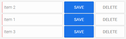
An application page can be included in the free layout table, which will be displayed in the table once per existing data record. The integrated page can be designed as you wish.
Dependencies guide for this is available here. A guide for this is available here.
Free layout tables cannot be nested, i.e. used on pages that are already being used in a free layout table.
The data of a free layout table can be exported to different formats.
The "Free layout table" element is one of the overviews.
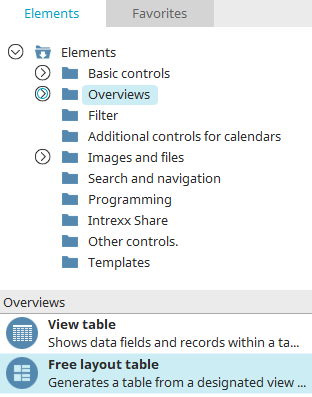
The free layout table can be found in the "Applications" module in the "Elements" area. A new element can be created by dragging and dropping it from here and positioning it in the workspace.
More information on creating elements can be found here.
The properties dialog of a free layout table opens automatically when it is created new.
The properties dialog of an existing free layout table can be opened by double-clicking on the element in the workspace, via the "Properties" context menu or via the "Edit / Properties" main menu item when it is selected in the workspace.
Data
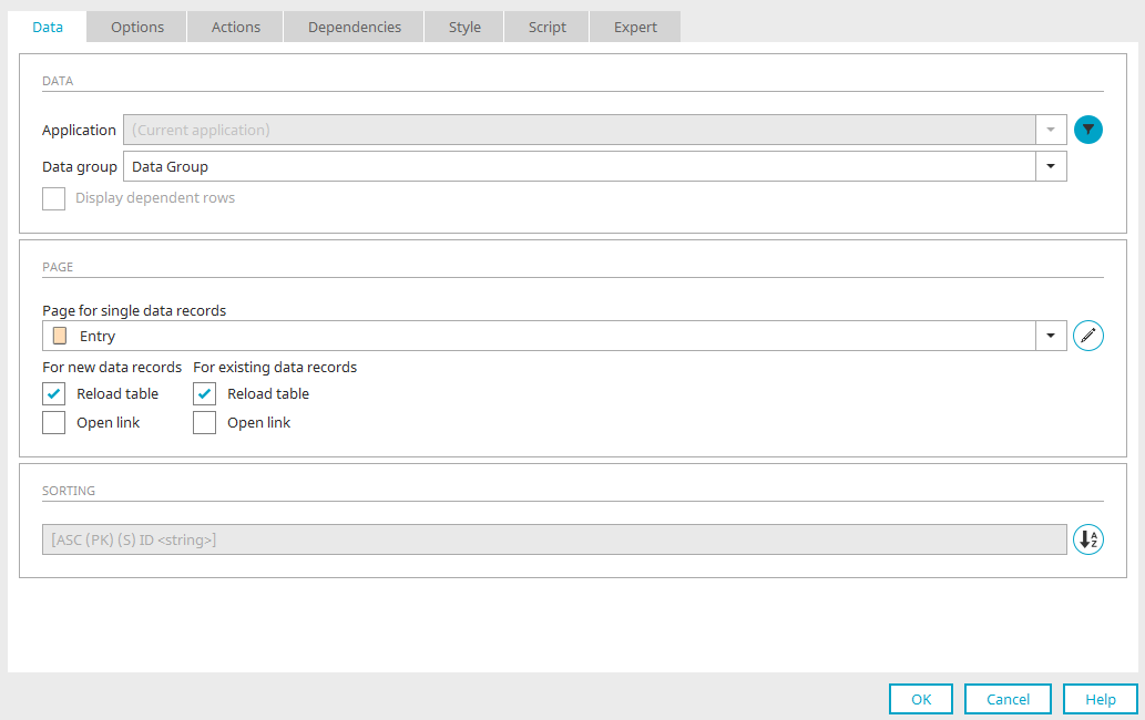
Use the "Data" tab in the properties dialog of the free layout table to specify the data source and the integrated page. It is also possible to specify the sorting of the table.
Application / Data group
Select the data source here.
 Filter
Opens a dialog where a filter can be defined that restricts the data records in the view table.
Display dependent rows
This setting can only be selected if you have chosen a subordinate data group as the data source. This setting will only display the data records that are in a parent-child relationship with the currently selected data record.
Page for single data records
Select the page you would like to use in the free layout table. This page is repeated in the table for displaying (view page) or editing (input page) the data records.
Please note the requirements for integrated pages.
 Edit parameter
Opens a dialog where the page parameters can be edited. Click here for more information.
For new data records / For existing data records
Reload table
If new records are generated via the "Insert data record" button action, you can define whether the table should be reloaded to display the new or existing data records, respectively.
Open link
With this setting, the link, which is defined as the link destination of any buttons contained in the integrated edit page, will be opened.
Sorting
The data fields defined for the table's sorting are displayed here.
 Sorting
Opens a dialog where the table's sorting can be defined.
Click "OK" to complete the configuration of the table. It is then created in the workspace. There you can open the properties dialog with a double click on the element if you want to edit the settings.
Options
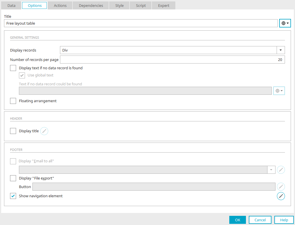
Title
Enter a title for the free layout table here. Click here for more information about this topic.
General settings
Display records
Here, you can choose between the following HTML elements:
-
Table (display as table)
-
Unordered List (display as unsorted list with numbering characters)
-
Div (display in rows)
Number of records
Defines the maximum number of data records that should be shown on a page in the browser. If -1 is entered here, all data records will be displayed.
Display text if no data record is found
If this is selected, a text will be displayed when there is no data available.
-
Use global text
Uses the text defined in the global language constant "DR_NO_RECORD" defined in the portal properties.
-
Text if no data record is found
Here, a static text or a constant can be defined if the "Use global text" setting is not active.
Floating arrangement
This option is only available when the setting "Div" is selected from the "Display records" drop-down list. In the default setting, data records in free layout tables are arranged one beneath the other. With the floating arrangement, data records are shown next to one another and a line break is added as soon as the end of the row is reached.
Header
Show title
The table heading will be shown.
Edit
Opens a dialog where the table header can be formatted.
Footer
Information about the settings can be found here.
Advanced settings for displaying data records as "Table" and "Unordered List"
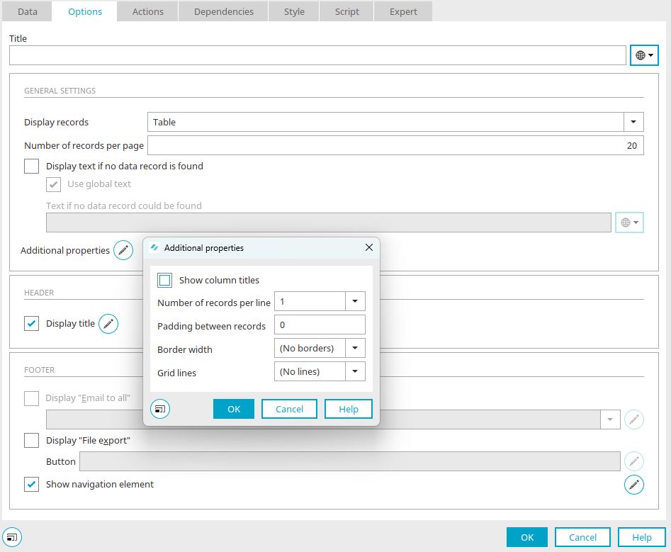
Show column titles
With this setting, the titles of the elements on the view page are displayed as column headers.
Number of records per line
This will result in a multi-column display as soon as a higher value than 1 is entered. The view page will then be repeated from left to right.
Padding between records
The padding will be expanded vertically and horizontally by the value entered here in pixels.
Border width
A border and its width can be defined here.
Grid lines
Grid lines can be shown, either as row or column lines.
Requirements for integrated pages
You can design the integrated page however you like as long as it does not contain one of the following elements:
-
Free layout table
-
Tree (edit and view element)
-
Exchange file selection (edit and view element)
The following functions are not available on pages that are integrated into a free layout table:
-
Data Picker action for buttons
-
Data mapping for drop-down lists
Dependencies guide for this is available here. A guide for this is available here.
Free layout tables cannot be nested, i.e. used on pages that are already being used in a free layout table.
Responsive appearance with tiles
The free layout table can be assigned style classes, which can be used to display the page as a "tile".
There are different style classes that display a different number of tiles for S, M and L screen sizes side by side. These style classes are added in the properties dialog of the table on the "Style" tab.
The following configurations are available:
|
Style class |
View |
|---|---|
| .ix-l2 |
S= one tile at full width M= one tile at full width L=two tiles side by side at 49.5% width |
| .ix-m2l2 |
S= one tile at full width M=two tiles side by side at 49.5% width L=two tiles side by side at 49.5% width |
| .ix-m2l3 |
S= one tile at full width M=two tiles side by side at 49.5% width L=three tiles side by side at 32.66% width |
| .ix-m2l4 |
S= one tile at full width M=two tiles side by side at 49.5% width L=four tiles side by side at 24.25% width |
| .ix-m3l5 |
S= one tile at full width M=three tiles side by side at 32.66% width L=four tiles side by side at 19.2% width |
| .ix-s2m4l6 |
S=two tiles side by side at 49.5% width M=four tiles side by side at 24.25% width L=six tiles side by side at 15.66% width |
| .ix-s2m5l7 |
S=two tiles side by side at 49.5% width L=five tiles side by side at 19.2% width L=seven tiles side by side at 13.4285% width |
The distance between the individual tiles is always 1%.
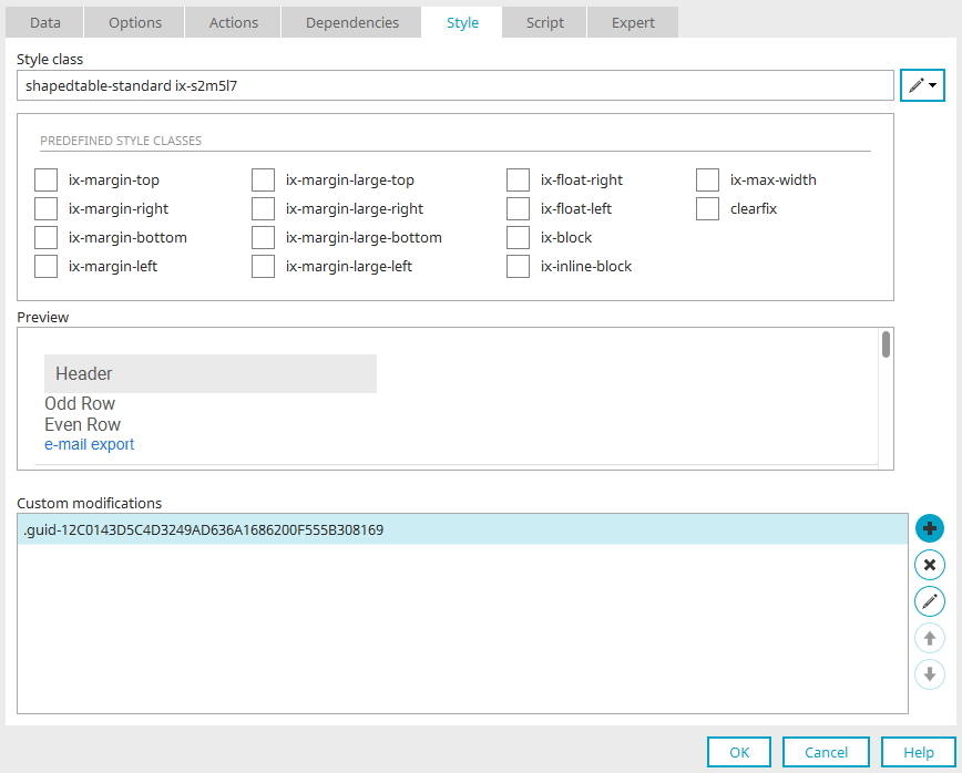
Enter the desired style class on the "Style" tab in the "Style class" field with the format "shapedtable-standard <styleclass>" (example: shapedtable-standard ix-s2m5l7).
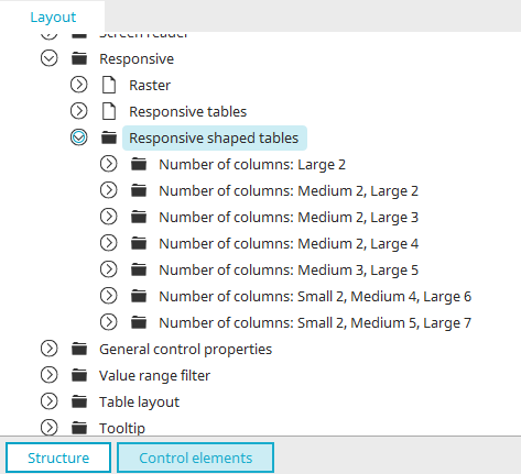
The style classes can be found in the Design module in the Layout > Control elements > Advanced properties > Responsive area under the "Responsive shaped tables" style node. The node is only visible if the Expert mode has been activated.
Actions
Click here for more information about these settings.