

Tree / Tree View
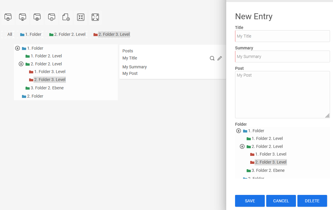
The tree element is used to represent hierarchical folder structures, such as table of contents. You can change the folder structure in the browser using drag-and-drop. The tree is available as an input element ("Tree") and as a view element ("Tree View").
Both elements can be linked to a data field. The tree input control can save selected values, while the tree view control can load previously saved values on a page specified as the jump destination.
Both elements are part of the overviews. In the description that follows, you will learn how to configure the elements in the "Applications" module.
You can find a practical guide to the tree's features in the browser here: Tips & Tricks - Tree.
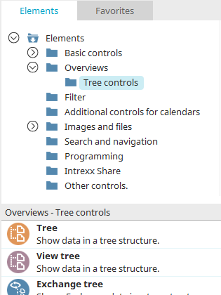
You can find the tree elements in the "Applications" module under "Elements. " You can create a new element by dragging and dropping it from here onto the workspace.
For more information on creating elements, click here.
Tree and Tree View - Properties
Since the settings for input and display control differ only slightly, they are described together here.
General
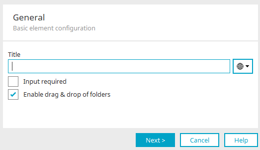
When you create the tree, the Properties dialog box opens automatically.
Title
You can enter the tree's title here. You can find information about multilingual titles here.
Input Required
With this setting, the "Tree" input control becomes a required field.
This setting is not available for the "Tree View" element.
Allow moving folders
With this setting, you can use drag-and-drop to move folders to a different location in the tree within the browser.
Click "Next."
Data
Data
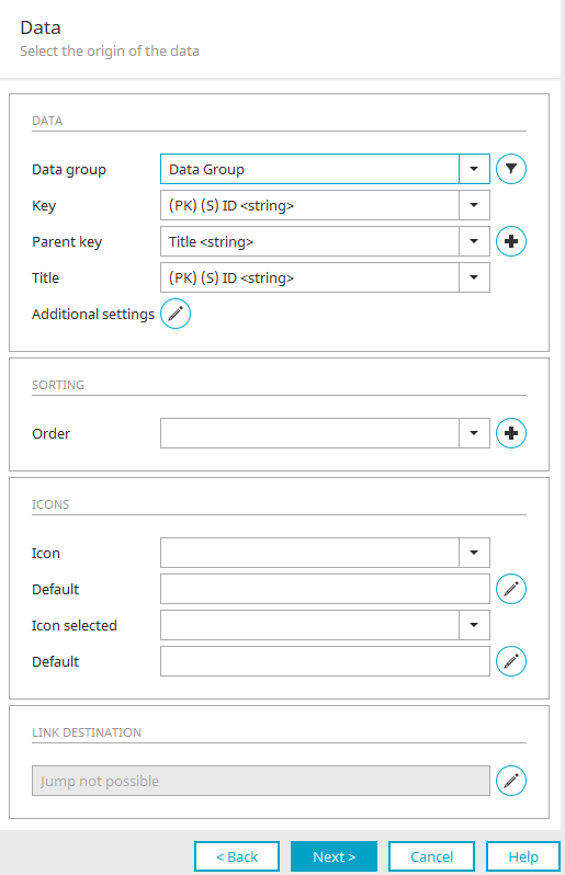
Data Group
Select the data group here whose data you want to display in the tree structure. Clicking "Filter" at  opens a dialog box where you can set up a filter to narrow down the tree data as needed.
Key
The field selected here should contain unique values that can be used to identify a single tree node. It does not necessarily have to be the primary key.
Parent Key
Field in which the tree element automatically stores the ID of the parent folder as soon as a new folder is created in the browser.
 Create a New Data Field
Opens a dialog box where you can create a new data field in the selected data group that contains unique integer values for identifying the records.
Title
Field containing the folder label.
 Advanced Features
Opens a dialog box where you can limit the tree view to specific sections.
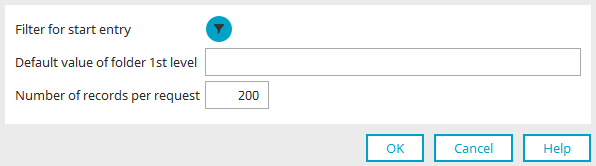
Filter for the first entry
Clicking "Filter" at opens a dialog box where you can define a filter to hide parts of the tree.
Default value for Folder 1. Level
Enter the parent ID of the folder that is not visible in this section here. This ID can be found in the database. It is automatically entered by the tree checker in the "Parent Key" field for newly created folders at the top level. Only by specifying the "default value for Folder 1." "Level" allows the folder hierarchy to be accurately represented throughout the entire tree.
Number of records per query
Specify here how many records should be preloaded when a branch is expanded. This setting improves performance when displaying layers that contain a large number of entries. Ultimately, the browser displays all entries contained in a folder. The restriction specified here applies only to the initial loading of the records.
Click "OK" to save the settings and close the dialog box.
Sorting
Order
The field selected here determines the sort order of the folders on the same level in the tree.
Create a New Data Field
Opens a dialog box where you can create a new data field that determines the sort order.
Please do not change the values in the data fields associated here with the key, the parent key, and the order. These values are automatically managed by the tree control when new folders are created or existing folders are modified. Otherwise, the proper functioning of the tree check cannot be guaranteed.
Symbols
Symbol
You can use this field if you do not want to use the image specified in the "Default" field (see below).
In this case, select the column from the data group that contains the desired image for the folder.
Specification
The image or icon selected here serves as the default image for the folders in the tree structure.
Edit
Opens a dialog box where you can load any image or icon.
Icon selected
You can use this field if you do not want to use the image specified in the "Default" field (see below).
In this case, select the column from the data group that contains the desired image for the selected folders.
Specification
The image or icon selected here serves as the default image for selected folders in the tree structure.
Edit
Opens a dialog box where you can load any image or icon.
Jump to
Edit
You cannot navigate away from the tree control because clicking on an entry selects it, which prevents a second action—such as loading a page—from being performed. Instead, a dialog box opens here where you can write JavaScript functions and assign them to events.
Selecting "Tree View" opens a dialog box where you can configure the jump destination
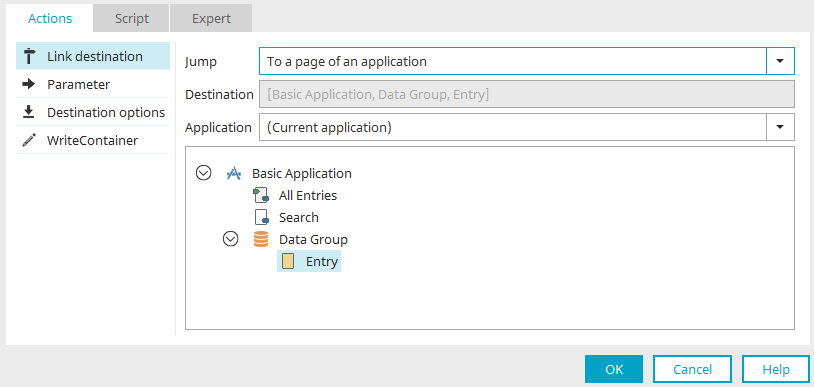
You can find all the information about this dialog here.
Click "OK" to save your changes and close the dialog box.
Click "Next."
For the tree control, you can configure the data binding in the next step. You can find more information here.
In the "Tree View," the next step gives you the option to define the element's binding. You can find all the information here.
Then click "Next."
Final Settings
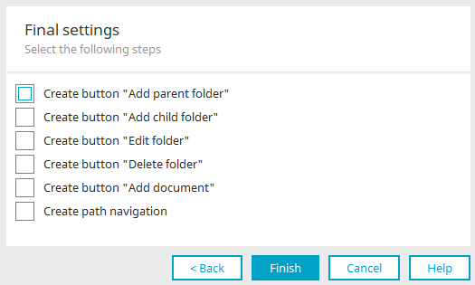
Here, you can show or hide the buttons located above the folder tree in the browser that are used to edit folders.
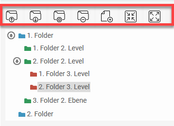
These buttons can also be created later via the "Edit" main menu, provided that the tree element is selected on the workspace.
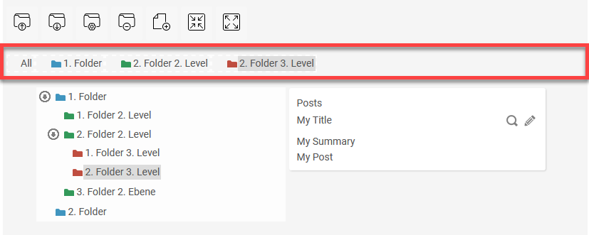
When you click "Create Path Navigation," a path navigation is created along with the new tree element; it is then already linked to the tree and configured accordingly.
Click "Finish" to save all settings and complete the tree configuration.
More Information