

Gallery
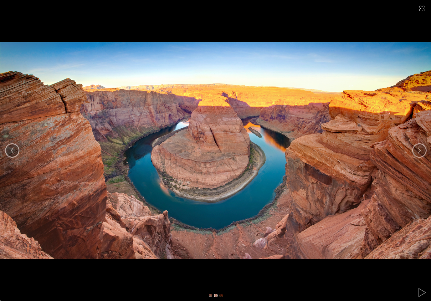
With the Gallery, you can easily integrate photo albums into your portal.
The application element belongs to the "Images and Files" element category.
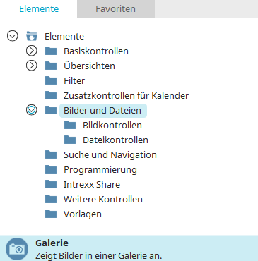
You can find the Gallery element in the "Applications" module under "Elements. " You can create a new gallery by dragging and dropping the element from here onto the workspace.
For more information on creating elements, click here.
The Properties dialog box for a gallery element opens automatically when a new gallery is created. You can open the Properties dialog box for an existing gallery by double-clicking the element on the workspace, selecting "Properties" from the context menu, or choosing "Edit / Properties" from the main menu, provided the gallery is selected on the workspace.
General
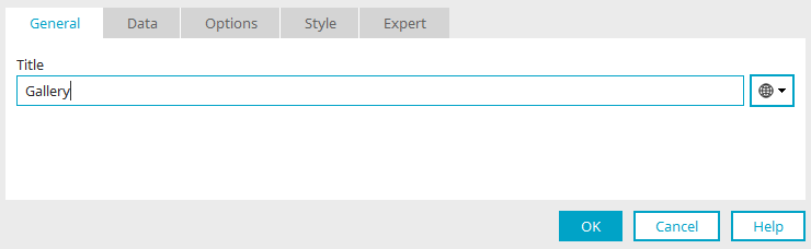
Enter the title of the gallery here. You can find information about multilingual titles here.
Data
Data
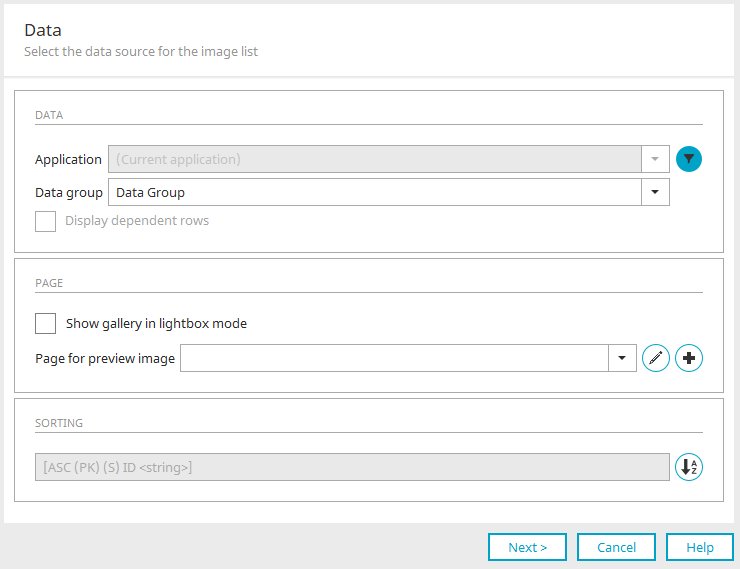
Application / Data Group
Select the data source from which the images come here.
 Filter
Opens a dialog box where you can set a filter to apply to the images before they are displayed.
Dependent Rows
Loads all images from a child data group that are associated with the parent dataset.
Page
View the gallery in Lightbox mode
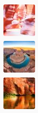
With this setting, a preview of the images is displayed first. Clicking on an image opens the gallery view.
A gallery in Lightbox mode requires a different view page than a gallery where this mode is not enabled.
Page for thumbnail image
Select the page here where you want to view the images in lightbox mode.
 "Create a View Page"
Opens a dialog box that allows you to create a new view page in the current data group.

Title
Enter the title of the gallery here. You can find information about multilingual titles here.
File Data Field
Select the desired file data field here.
"Create File Data Field"
Opens a dialog box that allows you to create a new file data field if needed.
Click "OK" to save the changes and close the dialog box.
 Edit Parameters
Opens a dialog box where you can define parameters for the page.
Sorting
This is where you specify the field by which the images will be sorted.
 Sorting
Opens a dialog box where you can edit the order of the images.
Options
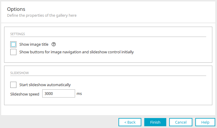
This is where you configure the gallery's optional settings.
Settings
Show image caption
With this setting, the title of the currently selected image is displayed in the upper-left corner of the gallery.
Show image navigation and slideshow control buttons by default
Displays buttons on the right and left of the gallery that allow you to navigate forward and backward, respectively. If this setting is not enabled, no buttons for controlling the gallery will be displayed when the page loads. As soon as you click on the gallery image, all the buttons will appear. Clicking anywhere else in the image will hide the buttons again.
Slideshow
Automatic Start of the Slideshow
Makes the slideshow start automatically when the page loads.
Slideshow speed in ms
Here you can specify the interval, in milliseconds, at which the images should change.