Calendar and resource
The "Calendar" and "Resource" elements are part of the overviews. The following section describes how to configure the elements in the "Applications" module.
Related information:
Calendar and resource functions in the browser
View appointments from other calendars or resources
Additional controls for calendars
The "Calendar" and "Resource" elements can be found in the "Applications" module in the "Elements" area. A new element can be created in each case by dragging & dropping the element from here and positioning it in the workspace.
More information on creating elements can be found here.
Both elements consist of several individual components, some of which you can also find as additional controls for calendars in the "Elements" area.
Calendar and resource elements differ depending on the plugin configuration. There you can set whether or not the plugin enables the resource view. Accordingly, you will then find the additional settings for displaying and booking resources in the properties of the elements. If the resource view is not enabled in the plugin, a resource element has only the calendar functions.
Plugin
To display data from the application in which a calendar or resource element is located requires that a plugin be defined or integrated.
If you use the "Calendar" or "Resource" application template, the elements, including the plugin, are already preconfigured to the extent that they can be used directly. Click here for more information about how to create a calendar or resource application based on an online template.
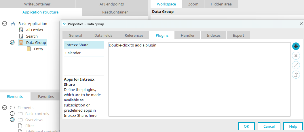
Open the properties of the data group whose data is to be displayed in the calendar or resource element with a double click. It is also possible to create a plugin via the application node.
Click  "Create new calendar plugin".
"Summary" tab
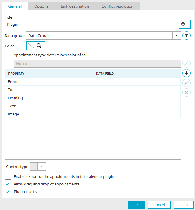
Title
Provide you calendar plugin with a name here. Click here for more information about multilingual titles.
Data group
Underneath, you can select the desired data group as long as you create the plugin via the application node. If it is created in a data group, the data group is preselected and cannot be changed.
 Filter
Opens a dialog where a filter definition can be created to restrict the data.
Color
A specific color can be defined for the calendar plugin. Appointments from this plugin will be displayed in the specified color.
Appointment type determines color of cell
With this setting, the entire cell in the calendar will be filled with the selected color. For example, a different color could be used for birthdays or holidays.
 Select color
Opens a dialog where the color or icon can be defined.
Color selection
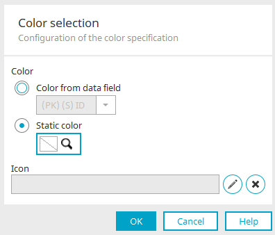
Color from data field
A data field can be selected that contains a hexadecimal color value.
Static color
The selected color is shown here.
 Select color
Opens a color palette where the color can be selected.
Select image
Opens a dialog where an image can be integrated to additionally label the data record in the calendar plugin.
 Remove image
Removes the image specification.
Click on "OK" to save the settings and close the dialog.
Data fields for "From", "To" and "Heading" are required as a minimum for a calendar plugin.
Optionally, data fields for "Text" and "Image" can also be assigned. Clicking in the respective line under "Data field", opens a selection list from which the desired data field can be selected and assigned. Only the data fields that have the correct data type are offered for selection - e.g. datetime for the "From" and "To" fields.
Information on how to create the required data fields in a data group can be found here.
Add data field
Adds another line for another data field.
Edit format
Opens a dialog in which the format can be edited, depending on the data field type. Click here for more information.
Image
An existing file data field in which the references to an image are saved can be selected here to display an image during the appointment.
Edit format
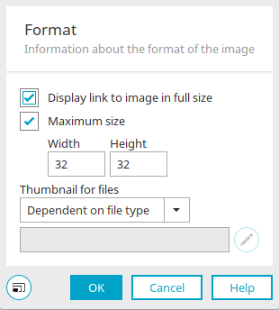
Opens a dialog for images in which the format settings for the image can be edited. Click here for more information.
Click "OK" to save the settings and close the dialog.
Reset selected data fields
Only the standard fields are reset, additional fields are removed from the selection.
Control type
The desired control type for the data field selected in the list can be selected here.
Enable export of the appointments in this calendar plugin
This option shows a small link in the browser for each appointment; this can be used to export the appointment.
Allow drag and drop of appointments
Defines whether appointments in the calendar or resource may be moved to other dates.
Plugin is active
This setting enables the plugin and makes it available in the browser.
"Options" tab
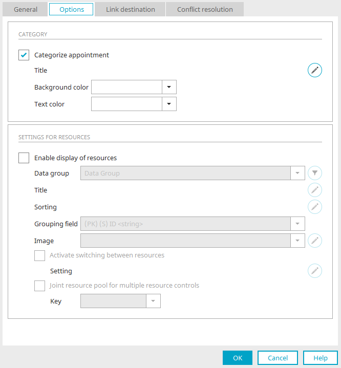
Category
Categorize appointment
Activates the grouping of appointments based on categories
Title
Displays the current title of the displayed value.
Edit title
Opens a dialog to configure the displayed value.
Background color / Font color
Select the corresponding fields for the background and the font color. The colors are based on the category defined by the user in the browser.
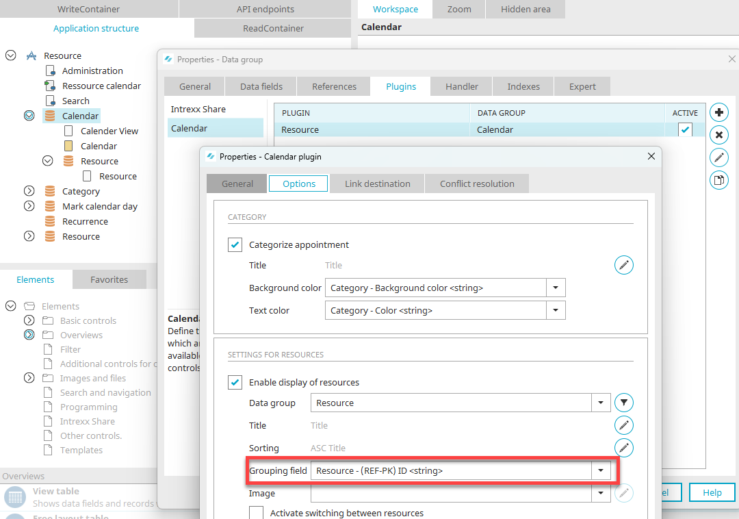
Settings for resources
Enable display of resources
A resource view enables you to display resource bookings on a timeline. Furthermore, double bookings are avoided.
Data group
Select here the data group from which the resource data (e.g. company vehicles, inventory or similar) originate.
Filter
Opens a dialog where a filter expression can be defined to restrict the data.
Title
Displays the current title of the displayed value.
Edit title
Opens a dialog where the displayed value can be configured.
Sorting
Displays the currently defined sorting field.
Sorting
Opens a dialog where the sorting can be edited.
Sorting
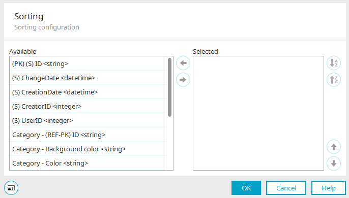
In the "Available" list, you can see all the fields that are available for sorting the resources. If you want to include further sorting criteria, simply move the desired fields to the "Selected" list by clicking on the arrow button.
At the top right, you can sort the fields  in ascending or
  in descending order. The arrow buttons at the bottom right change the order of the fields in the list.
Resource
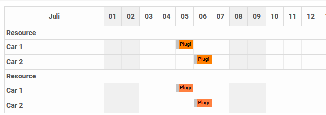
Resources from various plugins can be displayed in resource diagrams. The bookings of the resources can be grouped in different views to make the display in the diagram clearer.
The "Resource" setting allows you to select the field that is decisive for the grouping of resources in the resource diagram. Reservations, which have the same value for this field in all of the integrated plugins, will then be grouped together.
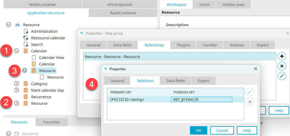
For example, if you import the "Resource" application template, all appointments will be stored there in the "Calendar" data group (1).
All resources are stored in the "Resources" data group (2) and have a unique ID there.
The bookings are stored in the child data group "Resource" (3) under the "Calendar" (1) data group. Here you will find a reference to the "Resource" (2) data group.
This resource field is already selected accordingly in the calendar plugin options for a resource application. This fulfills the requirements for the different views in the resource diagram.
Image
Displays the selected data field.
Edit image format
Opens a dialog where the image format can be edited.
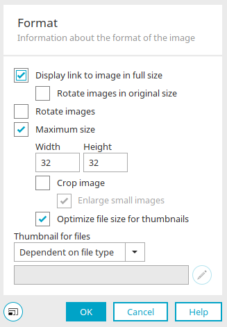
Format
Some of the settings described here may not be available if the dialog is called up from the properties of other elements or via the "General" tab in the plugin properties.
Display link to image in original size
With this setting, a tooltip is displayed, which shows the image in its original size, when the image is clicked on.
-
Rotate images in original size
This function corresponds to the setting "Rotate images" (see below), but in this case, the image's original size is maintained.
Rotate images
Most cameras write information about the image's orientation (rotated by 90, 180 or 270 degrees) in the header of the image file. With this setting, this information is evaluated and the images are rotated automatically when they are shown in the portal, so that they are not upside down.
Maximum size
The maximum size of the image can be predefined here. Larger images will be reduced proportionately, smaller images will not be changed.
-
Width / Height
Enter the maximum pixel width or height here.
-
Crop image
The image's width and height will be adjusted to the surrounding element.
-
Enlarge smaller images
Smaller images are enlarged based on the predefined maximum size.
-
-
Optimize file size for thumbnails
Reduces the file size in favor of a faster loading time of the application page.
Thumbnail for files
Here, you can choose from the following options that determine how a thumbnail will be displayed instead of the original image.
-
Dependent on file type
In the file "fileextension-custom.properties", which can be safely updated, it is possible to link a file ending to a particular thumbnail. You can find the file in the portal directory "internal/cfg". The file content also determines the preview images for files in the Filewalker element. The path for the preview images must be inputted relative to the portal directory "external/htmlroot" (e.g. docx=images/assets/drive/docx.svg)
-
Intrexx standard
With this option, an image predefined by Intrexx is used.
-
Static image
This option allows you select a static image.
-
Select image
Is then activated. Click on this button to open a dialog where the desired image can be selected.
Click "OK" to save the settings and close the dialog.
Activate switching between resources
This setting allows bookings of a resource to be assigned to another resource in the resource diagram using drag & drop.
Setting
Displays the selected data fields.
Select data fields
Opens a dialog where the data fields can be selected that should be transferred when an appointment is moved.
Joint resource pool for multiple resource controls
In general, different plugins can be defined that access the same resources. Here, a key can be defined that is used to save the resources selected by the user in the browser; this is saved in the user profile. Plugins with the same key will then access the same selected resources.
Key
Enter the key here, or select an existing key. You can simply write a new key directly into the key field.
Go to the "Jump target" tab.
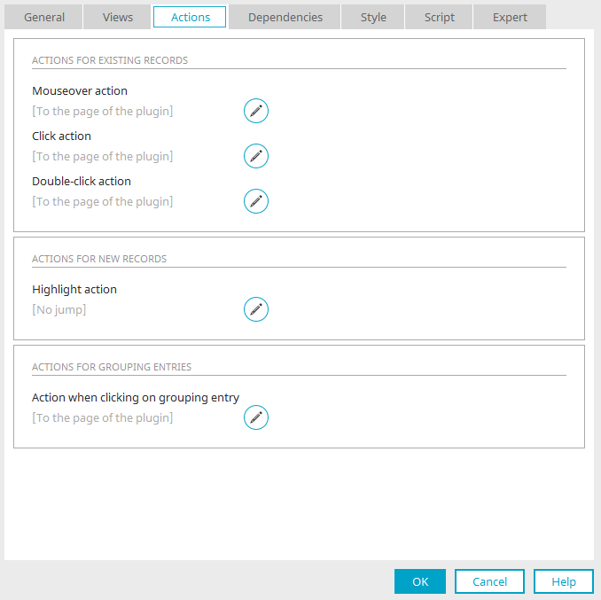
"Jump target" tab
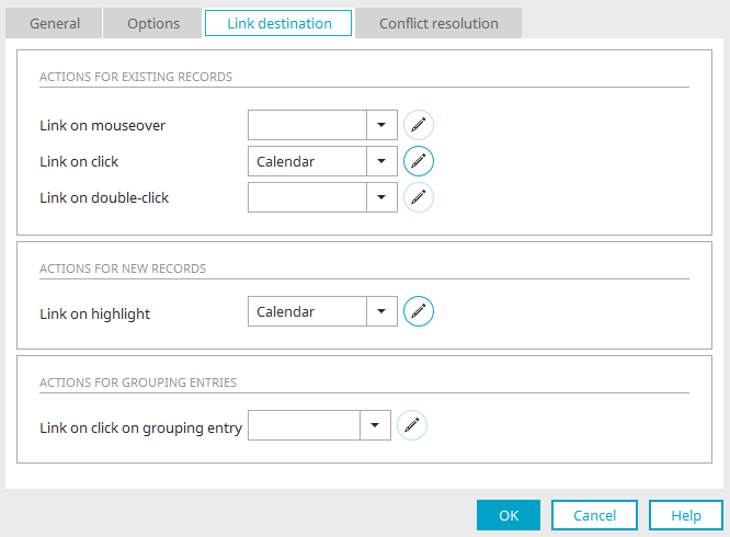
Here you can define which page should be loaded for which actions.
Actions for existing records
Link on mouseover
Select the page that should open when the user moves the mouse over an appointment.
Link on click
Select the page that should open when the user clicks on an appointment.
Link on double-click
Select the page that should open when the user double-clicks on an appointment.
Actions for new data records
Link on highlight
Select the page that should open when the user double-clicks on an appointment while an empty cell or area is selected.
Actions for grouping entries
Link on click on grouping entry
Is only available if the setting "Joint resource pool for multiple resource controls" is activated on the "Options" tab. In that case, the page that should be opened when the user clicks on the group entry can be selected.
Edit parameter
Opens a dialog where the parameters demanded by the target page can be edited.
Go to the "Conflict resolution" tab.
Conflict resolution
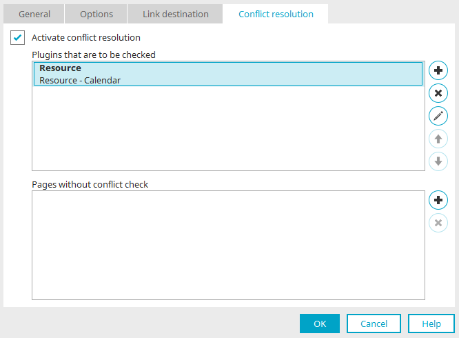
Conflict resolution allows you to define which plugins should be checked to make sure, for example, that a room is not booked twice. You can also define which edit pages are exempt from the check, even if the check is in principle active. The check is performed when an appointment is saved.
Activate conflict resolution
Activates the conflict resolution.
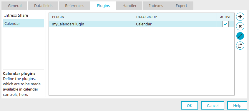
Plugins that are to be checked
All plugins that are included in the check are listed in this area.
Add plugin
Opens a dialog where the plugins to be checked can be selected.
Delete plugin
Removes a plugin from the list.
 Move selected plugins up / down
Modify the order that the plugins are processed in.
Pages without conflict check
All pages that are exempt from the conflict check are listed here.
Add page
Opens a dialog where pages can be selected and added to the list.
Pages without conflict check
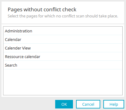
Select the desired page here and click "OK".
Delete page
Removes the currently selected page from the list of pages without a conflict check.
Edit conflict resolution
Select a plugin to be checked against. Clicking on "Edit conflict resolution" then opens a dialog in which the conflict examination can be set.
Conflict examination
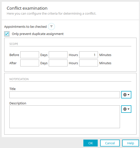
Appointments to be checked
If required, create a Filter here.
The "Only prevent duplicate assignment" setting can only be selected if a plugin performs conflict resolution with itself.
A filter is then defined internally that finds a conflict when a resource is already booked at a specific time. If the setting is selected, no static filter may be specified at the same time. Deactivate this option if you want to define your own filter.
Scope
For the "Before" and "After" buffer, you must enter an integer value if a conflict should be reported before or after a conflict. Three notation styles are valid to specify the individual parts of this buffer ("Day", "Hour", and "Minute"):
-
Integer without a leading sign
-
Integer with negative sign
-
Integer with positive sign
If a sign (+ or -) is specified, the corresponding time frame will be added or subtracted. If integers without a sign are entered, the time portion is replaced.
Notification
If a conflict is detected, the user will be notified of this when saving the data record.
Title
Provide the conflict resolution with a title. Click here for information on multilingual titles.
Description
As with the title, the description can be specified either statically or dynamically from a constant.
Click on "OK".
Click on "OK".
Click "OK" here as well. The plugin configuration is now complete.
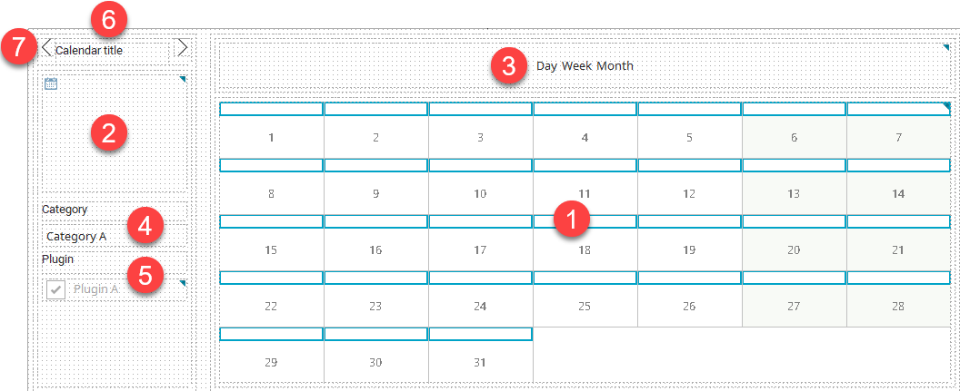
Calendar plugin
This shows you the individual components of a calendar element after you have created it in the workspace:
-
Chart
-
Navigation calendar
-
View
-
Categories
-
Plugins
-
Calendar title
-
Previous / Next
Chart
Open the properties dialog by double-clicking on the diagram (1).
"Summary" tab
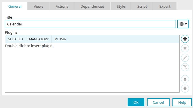
Title
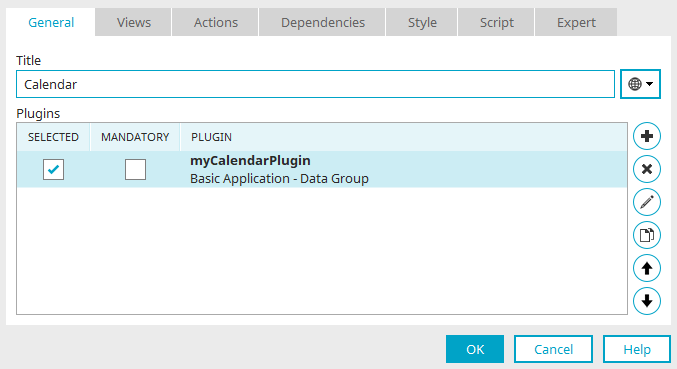
Enter the title of the calendar or resource here. Learn how to define a multilingual title here. Click on "Add plugin".
Available plugins
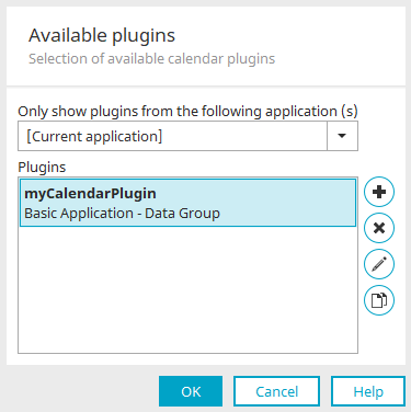
Here you can select all plugins whose data are to be displayed in the calendar element. To do so, you can also select other applications in the upper selection list. The available plugins will then be displayed in the lower area. You can also directly edit the selected plugin or duplicate it here.
Click on "OK" to save the settings and close the dialog.
You will then be back on the "General" tab in the properties dialog of the calendar. Go to the "Views" tab.
"Views" tab
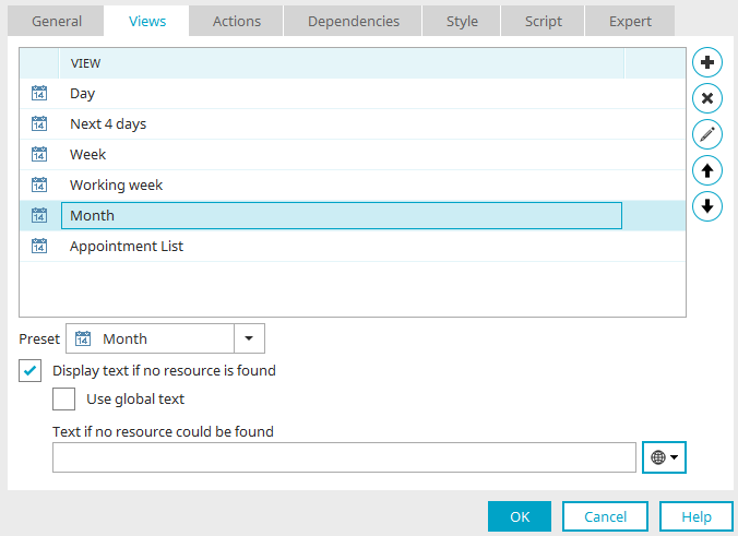
In the browser, the user has the ability to switch the view mode, such as from a month view to a week view. On this dialog page, you define which views are available in the browser. Clicking on "Add view" will show you the list of all available views.
Available views
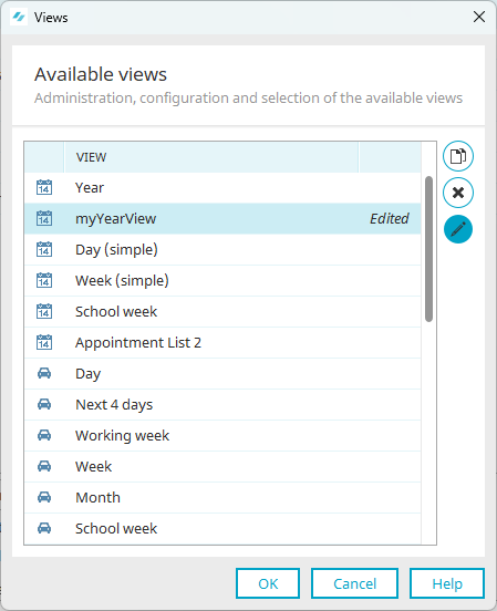
Views that are provided with Intrexx cannot be deleted or edited. However, it is possible to copy a view by clicking  "Duplicate view" and to then edit it. Select the duplicated view and click "Edit view".
Accessibility
The calendar has an accessible display with the designation "Appointment overview (accessible)".
More detailed information is available in section Accessible calendar.
General
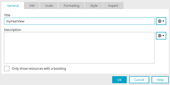
You can specify the title and description of the display here.
For resource elements, there are additional settings at this point. Click here for more information.
Go to the "VM" tab.
VM
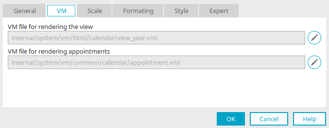
A modified VM can be included here for the display of the view and the display of the appointments. Click here for more information about this dialog.
Scale
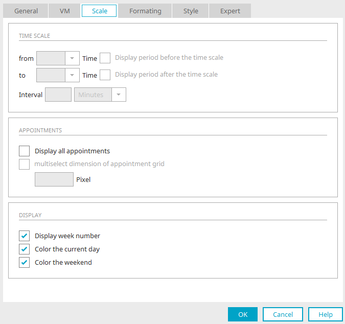
Time scale
You can enter settings for the time scale or the resource chart here. Depending on the view that is currently selected, not all settings may be available.
From / to
The time scale for the calendar can be defined here. Enter the corresponding times in the two fields to make your selection.
Display period before/after the time scale
Additional columns are shown in the chart, correspondingly titled "before" and "after".
Interval
Defines which interval, which is specified with an integer here, and which unit (Hours or Minutes) should be used for the chart.
Appointments
Show all appointments
If this setting is not active, a small field is shown underneath an appointment with the number of total appointments in this interval (such as on this day); the other appointments can be shown via this field.
Fixed dimension of appointment grid
Define in pixels how much space the text for an appointment may take up. Appointments with longer text will be cut off after this point.
View
Show week numbers
The calendar week number will be shown in suitable views with this setting.
Color the current day
Highlights the current day, separating it from other days.
Color the weekend
Puts a shadow around Saturday and Sunday, separating them from the workdays.
Formatting
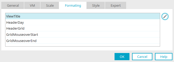
You will find an overview of the formats for the currently selected view.
Edit
Opens a dialog where the currently selected format can be edited.
Formatting
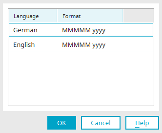
The portal languages and the current format are displayed here.
The formatting can be edited directly by double-clicking on the cell.
Click here for more information.
From Intrexx version 12.0.0
Click here for more information.
Click "OK" to save changes and close the dialog again.
Click "OK" here too to save changes and close the dialog.
Click "OK" here as well.
Use the "Views" tab to remove a selected view from the list by clicking "Delete view". It will then no longer be available in the browser.
Click "Edit view" to edit a view. "Move view up / down" changes the order of the views.
Default
One of the views must be selected as the preset. This view is then used when the page is loaded in the browser.
Display text if no resource is found
With this setting, a text can be defined that is used if no resources are available.
Use global text
Uses the Intrexx default text.
Text if no resource exists
A static text can be specified in multiple languages here, or a constant can be used.
"Actions" tab
Actions for existing/new records and grouping entries
The currently defined action is shown here.
Edit action
In each case, opens a dialog where the target destination can be defined.
Clicking on "OK" saves all settings and completes the configuration of the calendar element.
Resource
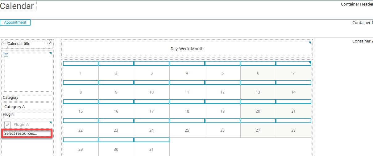
When you create a new resource element in the workspace, it looks essentially the same as a newly created calendar element. In the resource element, there is only the additional function "Select resources", which can be used in the browser to specify which resources from the resource pool should be visible in the chart.
Chart
The "General" tab in the properties dialog of the chart also corresponds to the "General" tab of the calendar element. Click here for more information about these settings and functions.
Go to the "Views" tab.
Views
Here you will also find the same settings and functions that are already familiar from the calendar element.
For the resource element, however, there are additional settings if you change a view, e.g. the "Month" view, by clicking "Edit view" - provided that the "Enable resource view" setting is set in the Calendar plugin options.
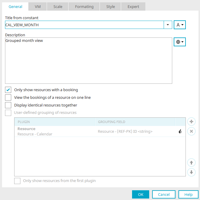
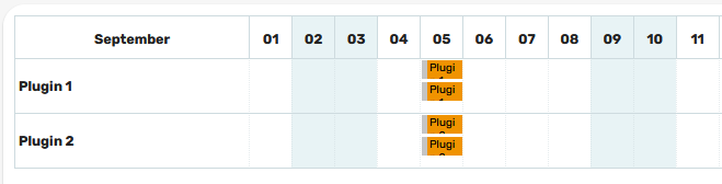
Only show resources with a booking
Here is the "Month" chart view in the browser, in which none of the following settings is set, except for the setting "Show only resources with bookings".
Every plugin name is displayed as a row in the diagram. Beneath this, the resources for each plugin are listed in the first column. Each reservation is displayed in the corresponding rows and columns for each resource.
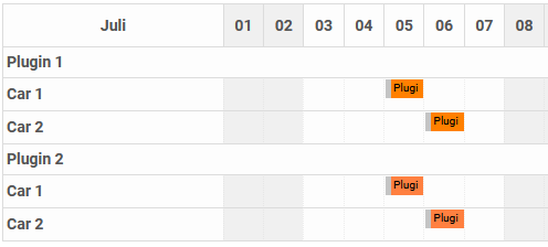
View the bookings of a resource on one line
If the setting "Display identical resources together" is not set, the setting "View the bookings of a resource on one line" causes the bookings of different resources per plugin to be displayed on one line.
Display identical resources together
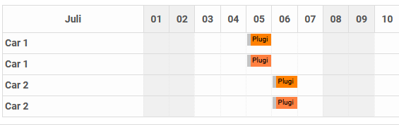
If in addition to the setting "View the bookings of a resource on one line" the setting "Display identical resources together" is also set, the bookings from different plugins will be shown per resource on one line.
If only the setting "Display identical resources together" is set, resources are grouped together in which the value for the resource field defined in the plugins matches. If no User-defined grouping of resources is applied, all additional group properties, such as Title or Sorting field, must be the same for all plugins from which the resource originates. Otherwise, the resource cannot be combined.
With this setting, each resource name is shown on one line in the chart. Beneath this, the plugins for each resource are listed in the first column. Each reservation is displayed in the corresponding rows and columns for each resource. If the Resource field is selected accordingly, the resources that have the same value will then be grouped. In this way, for example, resources with the same title can be combined.
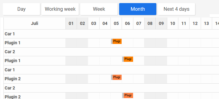
User-defined grouping of resources
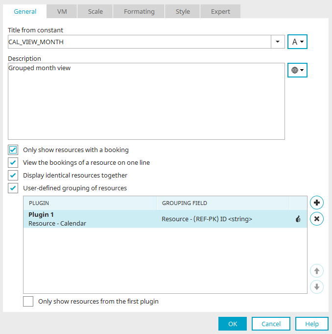
In addition to the setting "Display identical resources together", this setting enables you to combine resources from different plugins based on the same value in the various Resource fields, without the need for other grouping properties to match, such as Title or Sorting field. The top plugin in the list defines a so-called master plugin, that, for example, defines the title of the resource in the view, as soon as multiple resources are combined.
Add plugins
Opens a dialog where available plugins can be selected.
Delete plugins
Deletes the currently selected plugin.
Move plugin up / down
Adjust the order of the plugins in the list.
Only show resources from the first plugin
You can restrict the view further with this option.
Click "OK" to complete the configuration of the resource element.
Formats
The format of the data fields can be edited on the "General" tab in the properties of the calendar plugin.
General information on data types and control types can be found here.
To do this, select the desired data field, select a control type and then click on "Edit format".
Data type "string" and "text", control type "text"
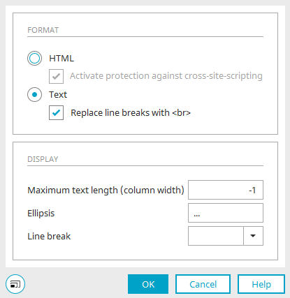
HTML
This format option will interpret the text as HTML.
Activate protection against Cross-Site-Scripting
If this setting has been set, this will prevent information, which comes from a context where it is not trusted, being inserted into a context where it would be classified as trustworthy.
Text
If this option is selected, unformatted text will be shown. In addition, the setting "Replace line breaks with <br>" can be enabled.
View
Maximum text length (column width)
By entering a whole number, the maximum text length of the view field If you enter -1, all characters are shown.
Ellipsis
In this context, "Ellipsis" defines the character(s) that will be shown after the text, if it exceeds the maximum text length.
Wordwrap
The settings, which can be selected in the drop-down list here, have the following effects on the line break:
-
inherit
The setting of the CSS parent element is applied
-
normal
Collapse breaks, spaces + tabs collapse, automatic upheaval
-
nowrap
Line breaks collapse, whitespace + tabs collapse, no automatic wrapping
-
pre
Line breaks are preserved, whitespace + tabs are preserved, no automatic wrapping
-
pre-wrap
Line breaks are preserved, whitespace + tabs are preserved, automatic wrapping
-
pre-line
Line breaks are preserved, whitespace + tabs collapse, automatic wrapping
Data type "integer", control type "integer"
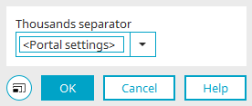
The type of separating character for multiples of 1000 can be defined here. Selecting "Portal settings" will use the current format settings for the portal.
Data type "Double", control type "Currency" and "Floating point number"
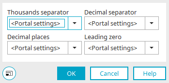
Select the desired format for 1000 separators, decimal separators, decimal places and leading zeros. Selecting "Portal settings" will use the current format settings for the portal.
Data type "datetime", control type "time"

Select the time format of your choice.
-
"HH" is the two-digit display of the hours.
-
"mm" is the two-digit display of the minutes.
-
"ss" is the two-digit display of the second.
Selecting "Portal settings" will use the current format settings for the portal.
Data type "datetime", control type "Date & Time"
Select the date format of your choice.
-
dd is the two-digit display of the day.
-
MM is the two-digit display of the month.
-
"yyyy" is the four-digit display of the year
Selecting "Portal settings" will use the current format settings for the portal.
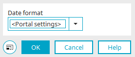
Data type "datetime", control type "date"
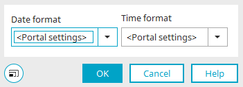
Date format
Select the date format of your choice.
-
dd is the two-digit display of the day.
-
MM is the two-digit display of the month.
-
"yyyy" is the four-digit display of the year
Time format
Select the time format of your choice.
-
"HH" is the two-digit display of the hours.
-
"mm" is the two-digit display of the minutes.
-
"ss" is the two-digit display of the second.
If "Portal setting" is selected, the format setting in the portal properties is used.