Areas of the "Design" module
Read how to access the "Design" module in the Portal Manager here.
Information about how to create and edit layouts for your portal can be found here.
If you have more than one layout open, you can use the tabs at the top of the workspace to switch between them.
The size of each area can be adjusted by dragging with the mouse. To do that, position the mouse at the edge of an area until the mouse pointer changes to a double-headed arrow. If there is not enough space in an area to display all of the elements, horizontal and/or vertical scroll bars will appear.
Any tab in the module can be closed by clicking on the  symbol next to the title.
In the "View" menu, you can select which tab should be displayed or hidden. If a tab is shown in its own window, you can also anchor it to the right or left of the workspace by dragging the title to the desired position with the mouse. If an entry has been created in History, the entry ID will be shown next to the name of the layout in the tab.
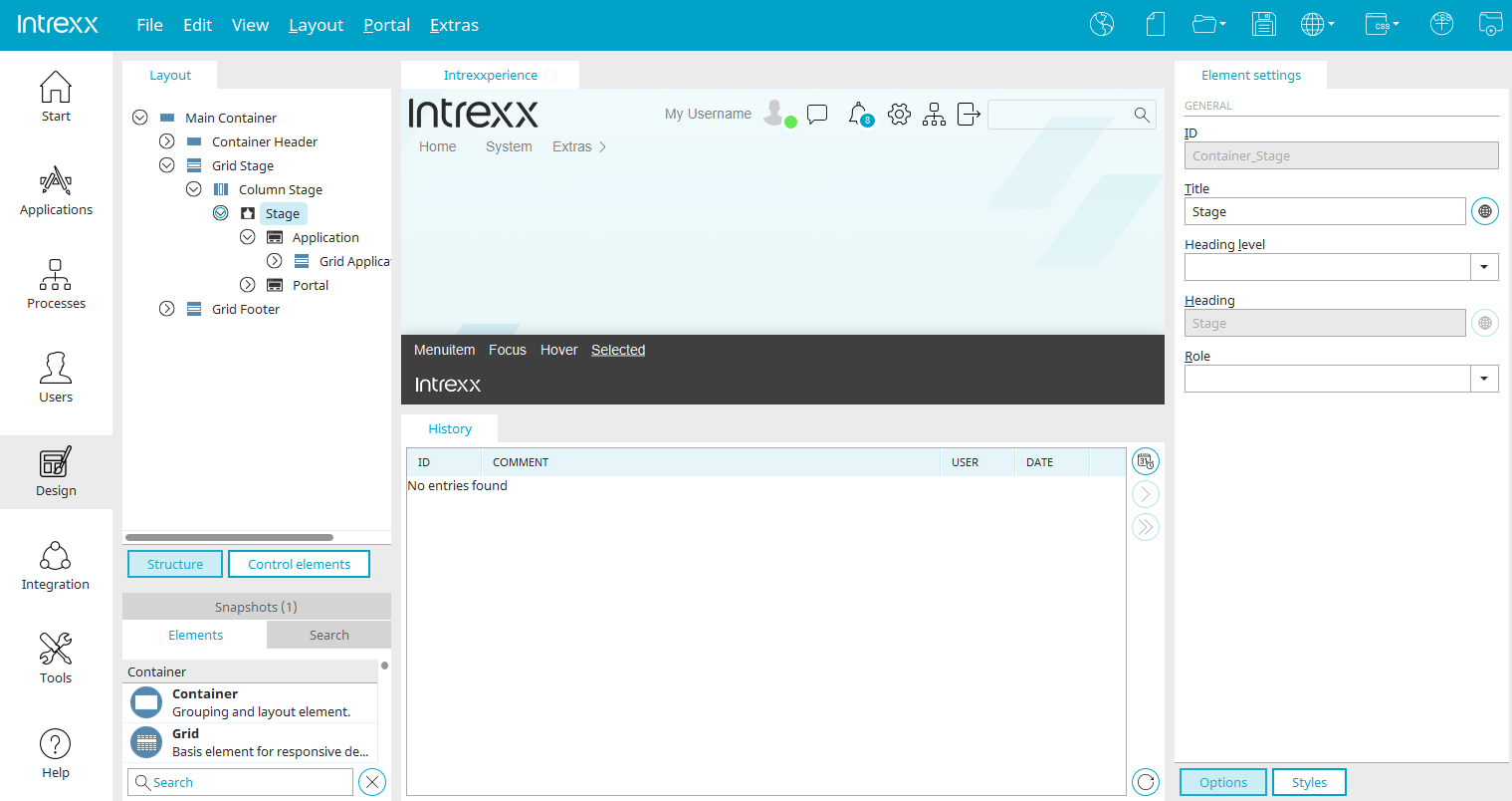
Layout
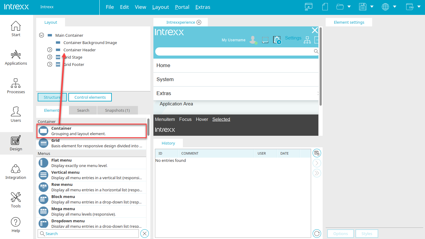
Structure
In the "Layout" area, you can access the layout structure by clicking on "Structure". The hierarchy of all elements in the layout is displayed there in a tree structure. If the structure allows, the elements can be moved here using drag & drop to change the arrangement.
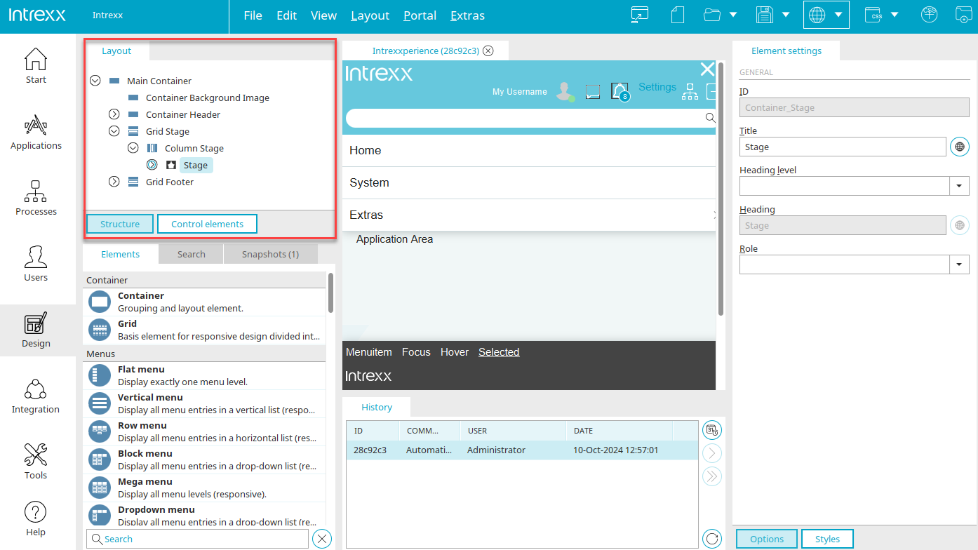
Grouping CSS rules
When an element is selected here in the "Layout" area, a grouping for CSS rules can be created via the main menu "Edit / Insert new layer".
Title
Enter a title that should be used for your grouping in the Layout structure area.
Learn how to create user-defined styles here.
Control elements
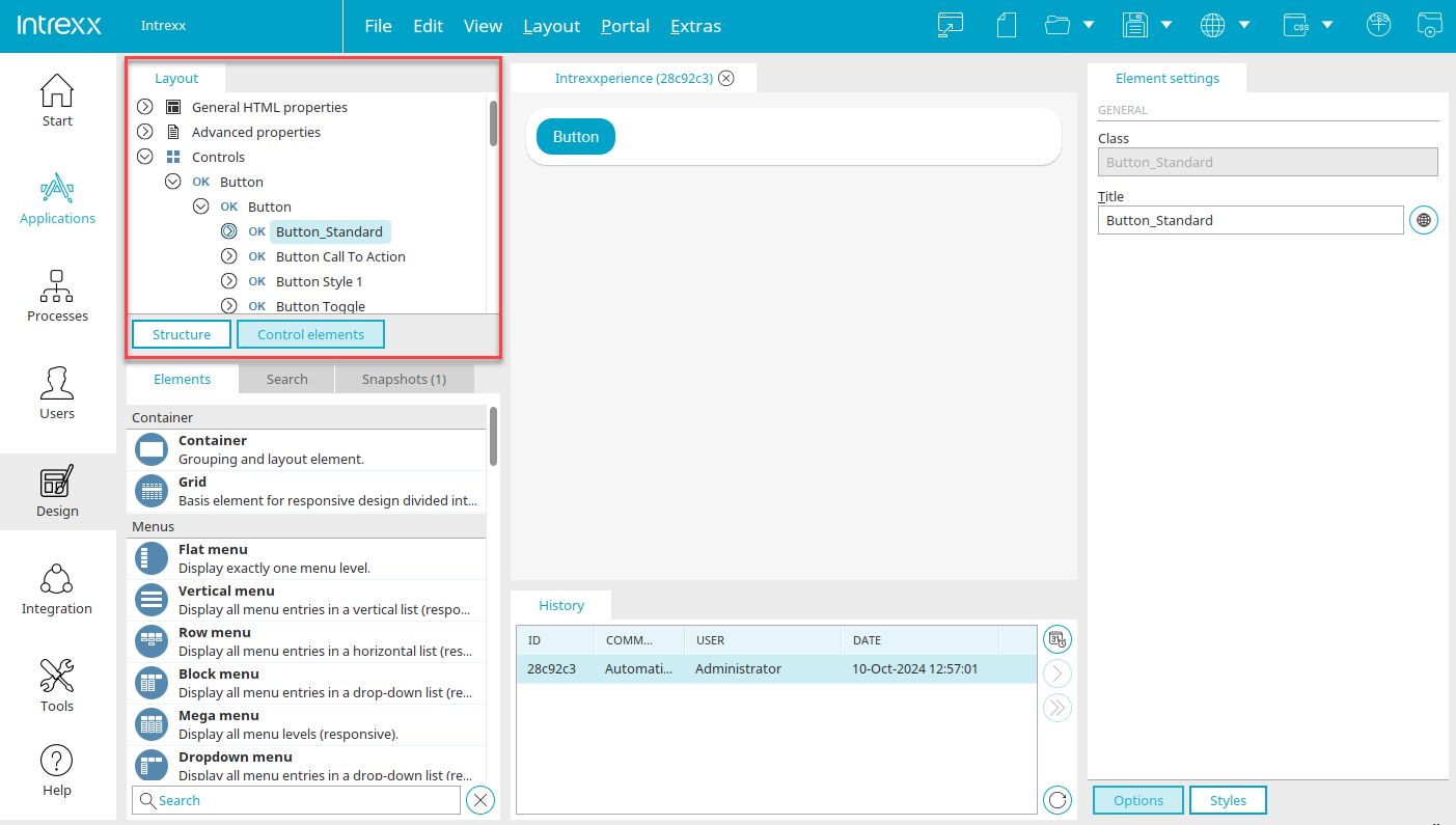
You can access the settings for control elements in the "Layout" area by clicking on "Control elements". The following settings can be modified here:
-
General HTML properties
e.g. body, table or div
-
Advanced properties
e.g. Login, warnings, error messages
-
Controls
Style properties that can be assigned in the "Applications" module on the "View" tab in the properties dialog of elements.
If you select something here, the properties will be loaded in the Element settings area. The control elements are organized by type (e.g. input elements or buttons).
Add control element
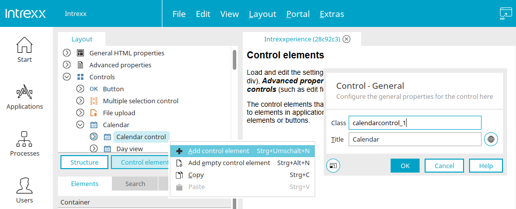
Additional control elements can be added in the "Control Elements" area when the desired type (e.g. text or button) is marked. The class and title can be edited in the dialog. The new control automatically adopts the styles of the parent control that you selected before creating it.
Add empty control element
Opens a dialog where a new control element can be created that does not contain any predefined CSS rules except for a class selector. To do this, the desired type (e.g. text or button) must be marked in the "Control elements" area.
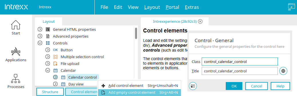
The class name and the title can be edited here in the dialog as well.
Edit properties
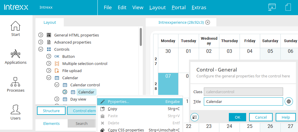
The same dialog can be opened via the main menu "Edit / Properties" or the context menu if an existing control element is marked in the layout structure.
"Elements" area
Click here for more information on this topic.
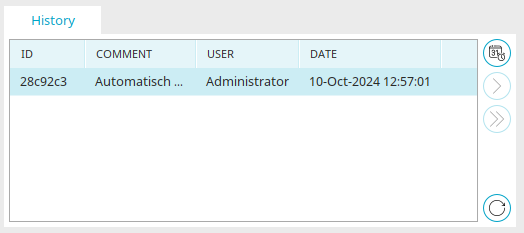
Snapshots
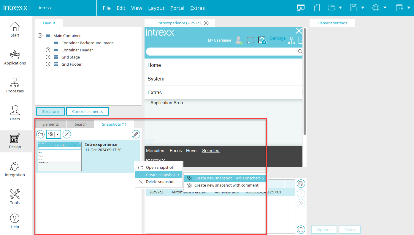
With snapshots, the current layout will be cached at defined intervals. Clicking on a snapshot resets the layout to the state at that specific time.
 Open selected snapshot
Opens the layout in the state of the selected snapshot.
 Create new snapshot
Opens a submenu where a new snapshot can be created. The sub menu "Create new snapshot with comment" opens a dialog in which the new snapshot can be commented.
Comment
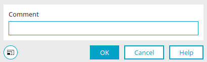
You will also find this dialog in processes if you create snapshots there.
The comment that you can write here is displayed after clicking on "OK" in the snapshot area under the date on which the snapshot was created.
 Settings
Opens a dialog where the maximum number of created snapshots and the interval between automatic snapshots can be defined.
Settings
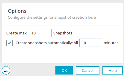
You will also find this dialog in processes if you create snapshots there.
Create a maximum of ... snapshots
The maximum number of created snapshots can be defined here.
Create snapshots automatically every ... minutes
The time between automatically created snapshots can be determined here.
Search
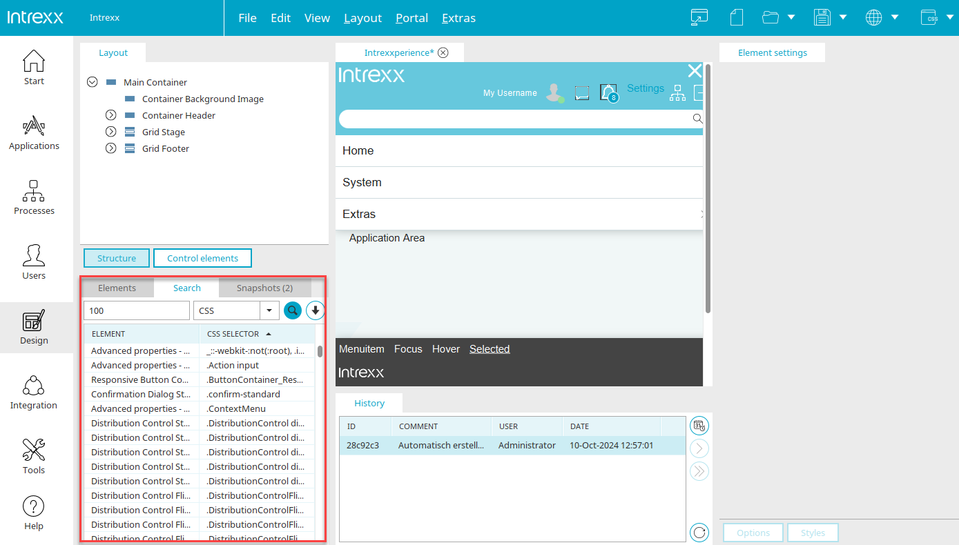
Here, you can search for the title of an element, a CSS selector, or for properties in the CSS by selecting "CSS".
Search field
Enter a search term here.
Drop-down list
Here are different functions available for the search.
-
CSS
Searches for element properties in the CSS.
-
CSS selector
Searches for the entered CSS selector.
-
Title
Searches for element titles.
 Search
Triggers the search. Hits will be shown beneath the search field. If you click on a hit, the corresponding element will be highlighted in the Layout structure.
 Search history
Opens a window with a list of the most recent searches. Click on a search action to repeat it.
Workspace
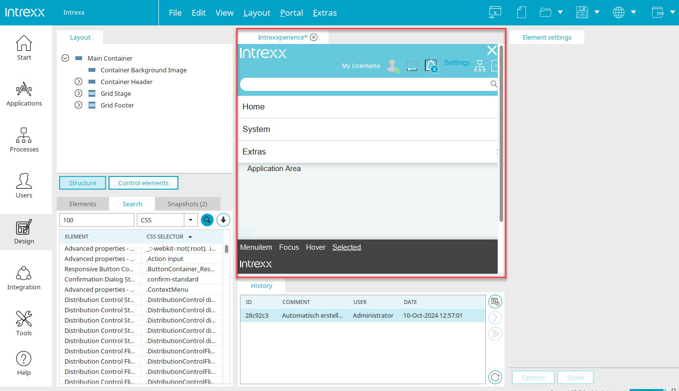
You can arrange the individual elements of your layout in the workspace, which you will see in the middle area.
Element settings

Here you will find the two buttons "Styles" and "Options" with which you can switch between the CSS properties (styles) of the elements and the settings (such as title, size, etc.). The settings defined for the respective element selected in the layout structure are displayed in both areas.
Click "Options" to edit the properties of the currently selected element.
Options
Click here for more information on this topic.
Styles
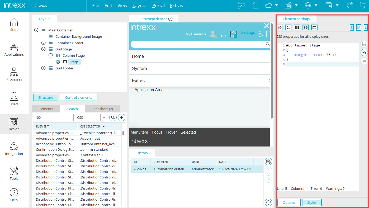
The CSS properties of the element currently selected in the layout structure can be edited in this area. With the S, M and L buttons at the top right, you can define to which display sizes the CSS property applies. At the top left, you will find several buttons that can be used to display the CSS properties in different ways.
 Display CSS variables
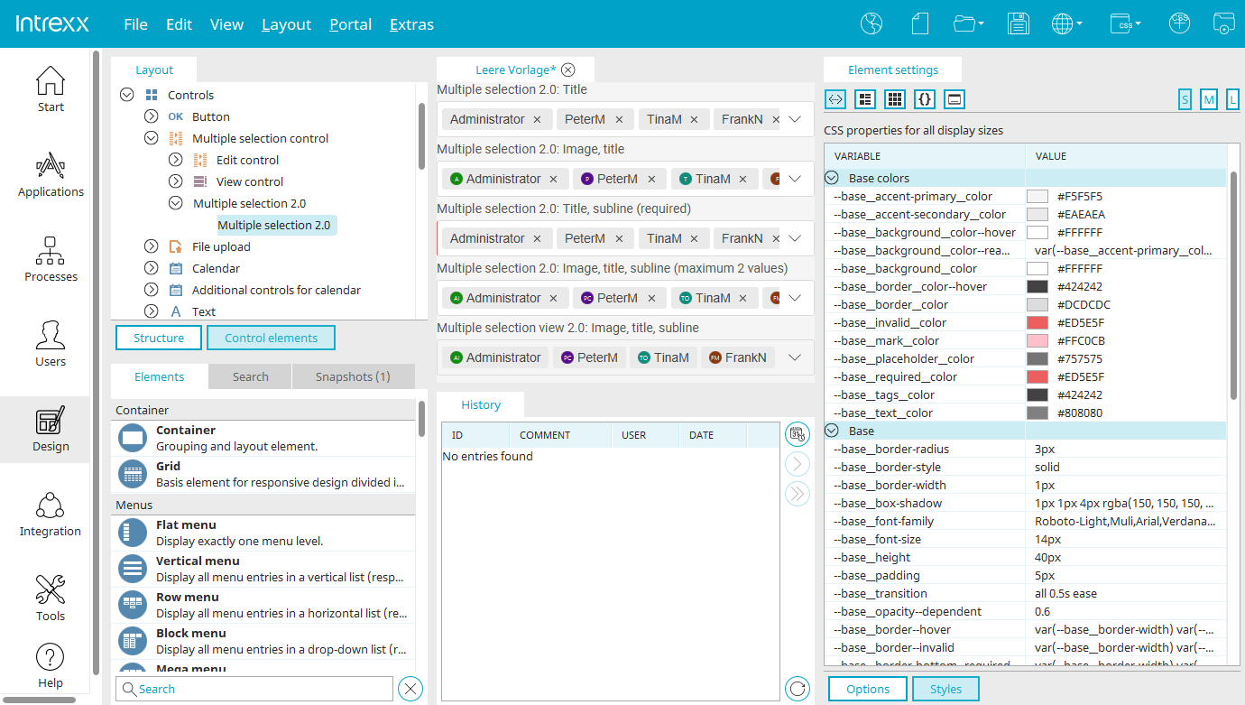
For some elements, such as multiple selection 2.0, the variables defined for control can be edited. Further information on this topic can be found in the help for the respective application element.
 Show CSS properties in compact table
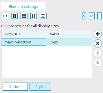
Only the most important style properties, or style properties edited by you, are shown here.
 Add CSS property
Adds a new, empty row to the bottom of the list. You can enter an available CSS rule here.
Remove CSS property
Removes the property from the list.
 Modify the order of the properties.
Input length
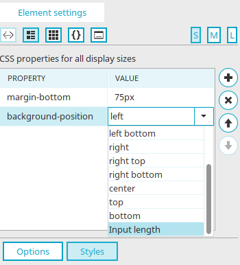
If the value "Input length" is selected for the CSS property "Background position", a dialog is opened automatically.
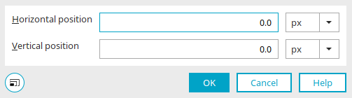
Horizontal / vertical position
Enter the displacement and select the desired unit in the drop-down list to the right of the edit field (px, em, or %).
If the value "Length/number/percent" is selected for the CSS property "Line-height", a dialog opens automatically.
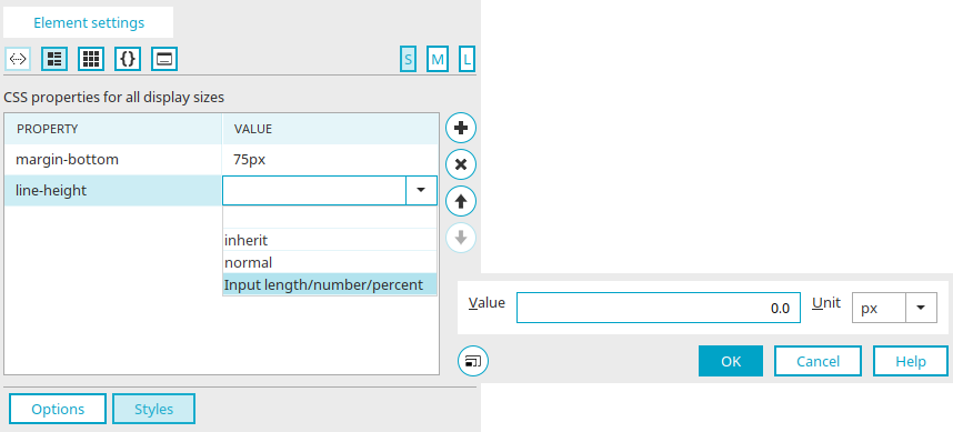
Value
Enter the desired value here and select the unit in the drop-down list to the right (px, em or %).
Select fonts
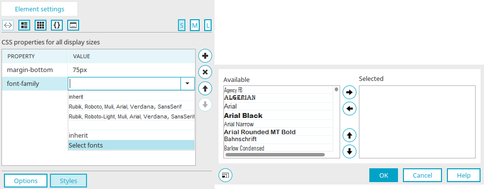
If the value "Select fonts" is selected for the CSS property "Font-family", a dialog is also automatically opened in which the fonts can be specified.
Available list
Every selectable font is listed here.
Selected list
The fonts in this list will be used in the CSS.
 Move right / Move left
Move the currently selected font from one list to the other.
Move up / Move down
Adjust the order that the fonts are used in the browser. If the client does not support the first font because it is not installed, the other fonts will be tried one after the other.
 Show CSS properties in grouped table
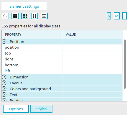
The style properties of the element are displayed here in a table where they are sorted by groups.
"Property" column
All the style groups are shown here.
 Displays the style properties that belong to the selected group.
"Value" column
The value of a property can be defined here. Just click on the corresponding cell to do that.
 Show CSS properties in editor
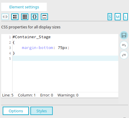
CSS properties can be edited directly here.
 Save CSS
Changes are applied.
 Undo last action
Restores the state before the last change.
 Redo last action
The undone action is performed again.
Please note that own comments will not be saved.
To change the properties of text or links in table cells, an a or span must be appended to the selector.
Example:
The default selector
table.Table_Standard > tbody tr td.textvcontrol5ECDF9CF
hits the background properties of the table. The edited selector
table.Table_Standard> tbody tr td.textvcontrol5ECDF9CF span
influences the text format in the table cells of the column.
 Show CSS properties in dialog
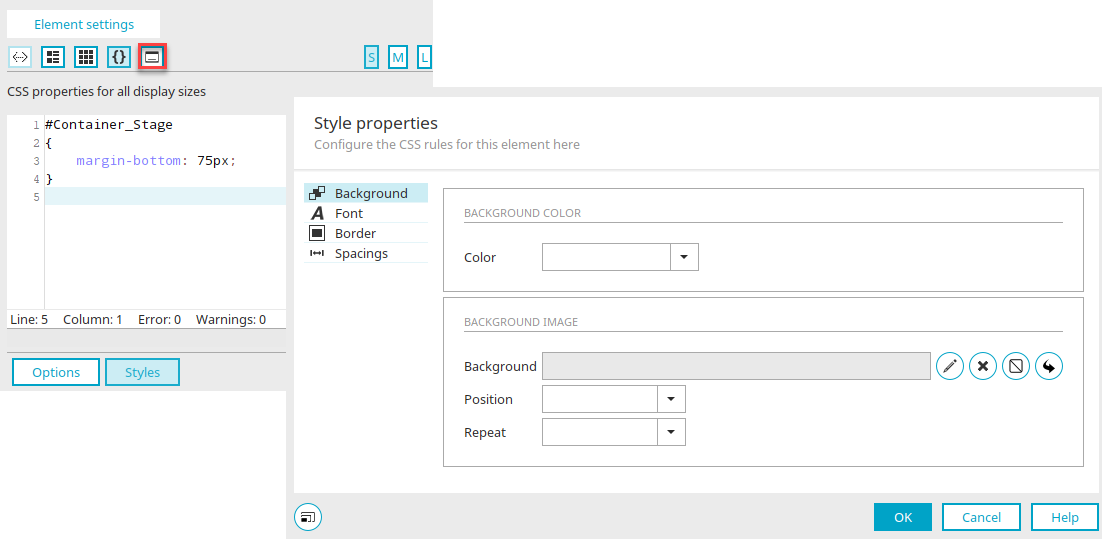
If you click here on  "Show CSS properties in dialog", CSS rules can be conveniently edited in a wizard. With the S, M and L buttons at the top right, you can define to which display sizes the CSS property applies.
Background
Background color
The currently selected background color is shown here.
Select color
Opens a small color palette from which the desired background color can be selected.
Background image
 Select image
Opens a dialog where the background image can be selected.
Delete image
Removes the defined image.
 No image
The property "background-image: none" is entered in the CSS of the element.
 Inherit properties from parent element
Transfers the color from the parent element. The value "inherit" is entered in the CSS.
Position
Here, you can define the positioning of the background image within the element: Left, Left top, Left bottom, Right, Right top, Right bottom, Top, Bottom or Center.
Repeat
Defines how the image should be repeated. "X and Y repeat" repeats the image horizontally and vertically, respectively. "No repeat" means the image will be shown in its original size.
Font
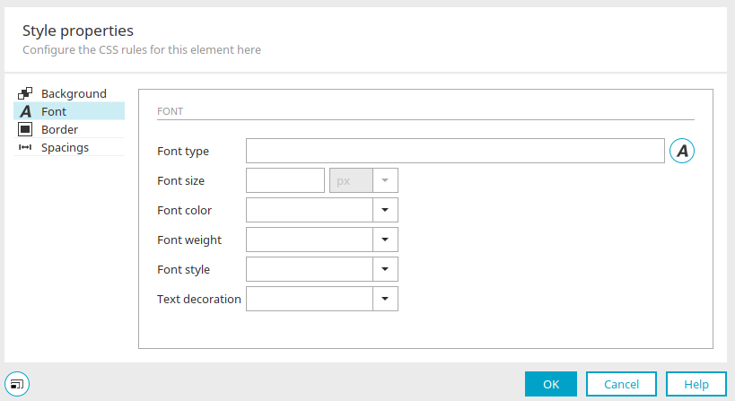
Font type
The currently selected font type is entered here.
 Select font type
Opens a dialog where the font type can be selected.
Font size
The currently selected font size is shown here. You can select the unit - pixel, em or percent - for the font size in the drop-down list.
Font color
The currently selected font color is shown here.
Select color
Opens a small color palette from which the desired font color can be selected.
Font weight
Defines whether the font should be shown normally or in bold.
Font style
Defines whether the font should be shown normally or in italics.
Text decoration
Defines whether the font should be shown normally (none) or underlined.
Borders
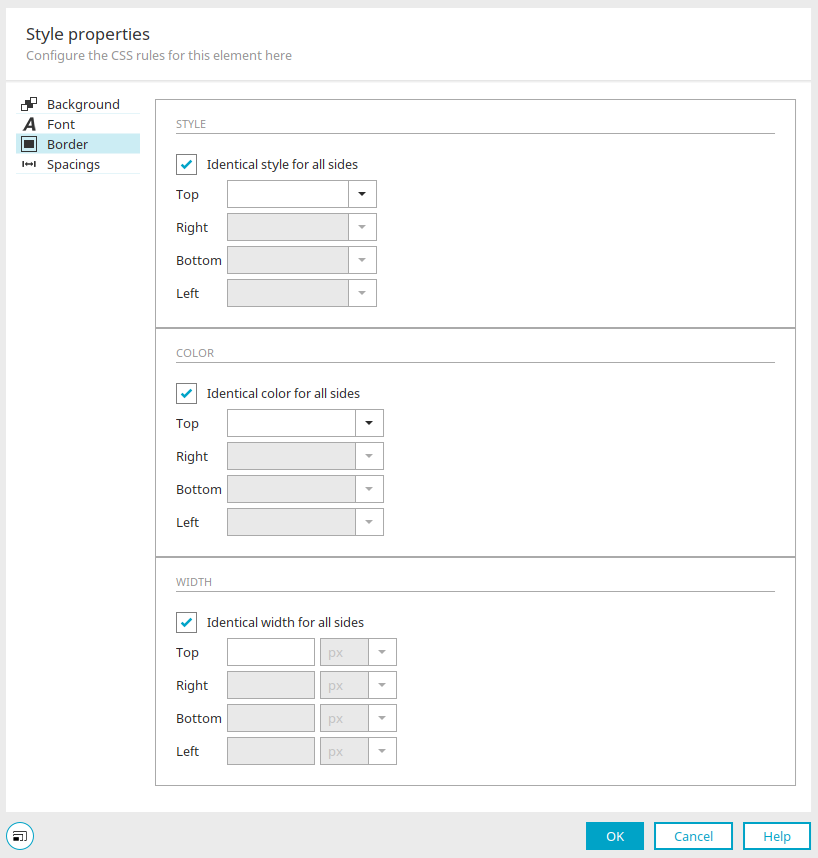
Style
Define the type of line that frames the element.
Color
The line color can be selected for each page.
Width
Define the width of the border lines in pixels, em or percent.
Same style / color / width for all sides
With this setting, the desired property only needs to be entered once in each case. It is then applied to all of the border sides.
Spacings
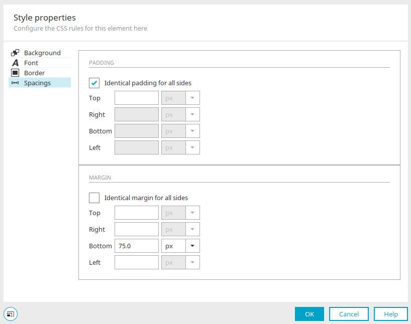
Padding
Here, you can define the space between the element content (e.g. text) to the border of the element. In each case, you can select the unit - pixel, em or percent - from the drop-down list.
Margin
Here, you can define the space between the border of the element and the next adjacent or surrounding element. In each case, you can select the unit - pixel, em or percent - from the drop-down list.
Same margin / padding for all sides
With this setting, the desired property only needs to be entered once in each case. It is then applied to all of the border sides.
History
Click here for more information about this area.