

Responsive Layout
What is a responsive layout?

A responsive website allows the content to be displayed in a way that adapts to the size of the browser window. With Intrexx, you can design your portal and all of its application pages for three different screen sizes:
-
SMALL (e.g., smartphones)
-
MEDIUM (e.g., tablets)
-
LARGE (e.g., desktop PCs)
Following the "mobile-first" principle, a responsive website is designed first for the smallest device. Design guidelines for the smallest display size are automatically applied to larger displays as well. The rules are therefore inherited from the smallest to the largest, unless they are explicitly overridden when designing a page for the MEDIUM or LARGE display sizes.
Grid
You can find the grid element—or the principle of the grid—in three places:
It is the basic building block of a responsive website.
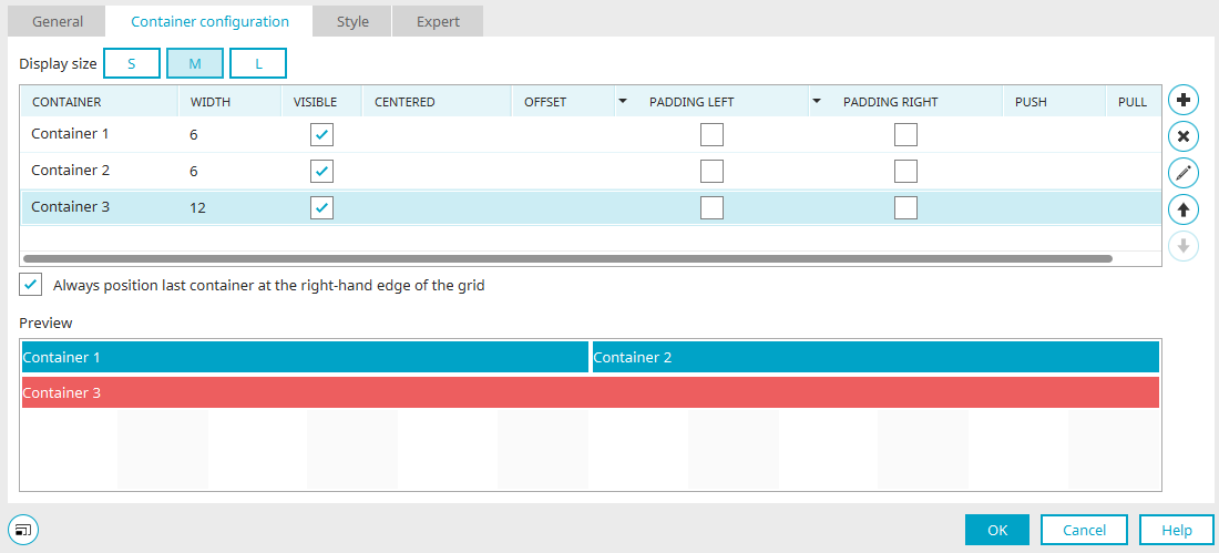
In the figure above, you can see a preview of a grid in the lower section of the Properties dialog box.
A grid generally consists of 12 adjacent units.
Any number of containers can now be arranged within the grid. A container, in turn, can occupy any number of the 1–12 units in a grid. It ultimately contains the desired layout or application elements.
In this illustration, for example, the containers are positioned so that the first and second containers each occupy six grid units. This will display them side by side. The third container holds 12 units. This means it takes up an entire row of the grid.
Containers that you define are placed in the grid one after another. If the twelfth unit is exceeded, the affected container is positioned on a new line at grid unit 1.
Containers are always implemented as div elements.
A `div` element can be used to enclose multiple elements—such as text, graphics, or tables—within a single area. The div element always starts on a new line of the body text. This allows you to create areas that can be formatted using CSS.
The grid element can be nested as many times as desired, offering a wide range of design options. Grids and containers can also be used on a page alongside non-responsive elements. Any number of containers can be arranged in a grid. There must always be at least one container in a grid.
Application Pages with a Grid
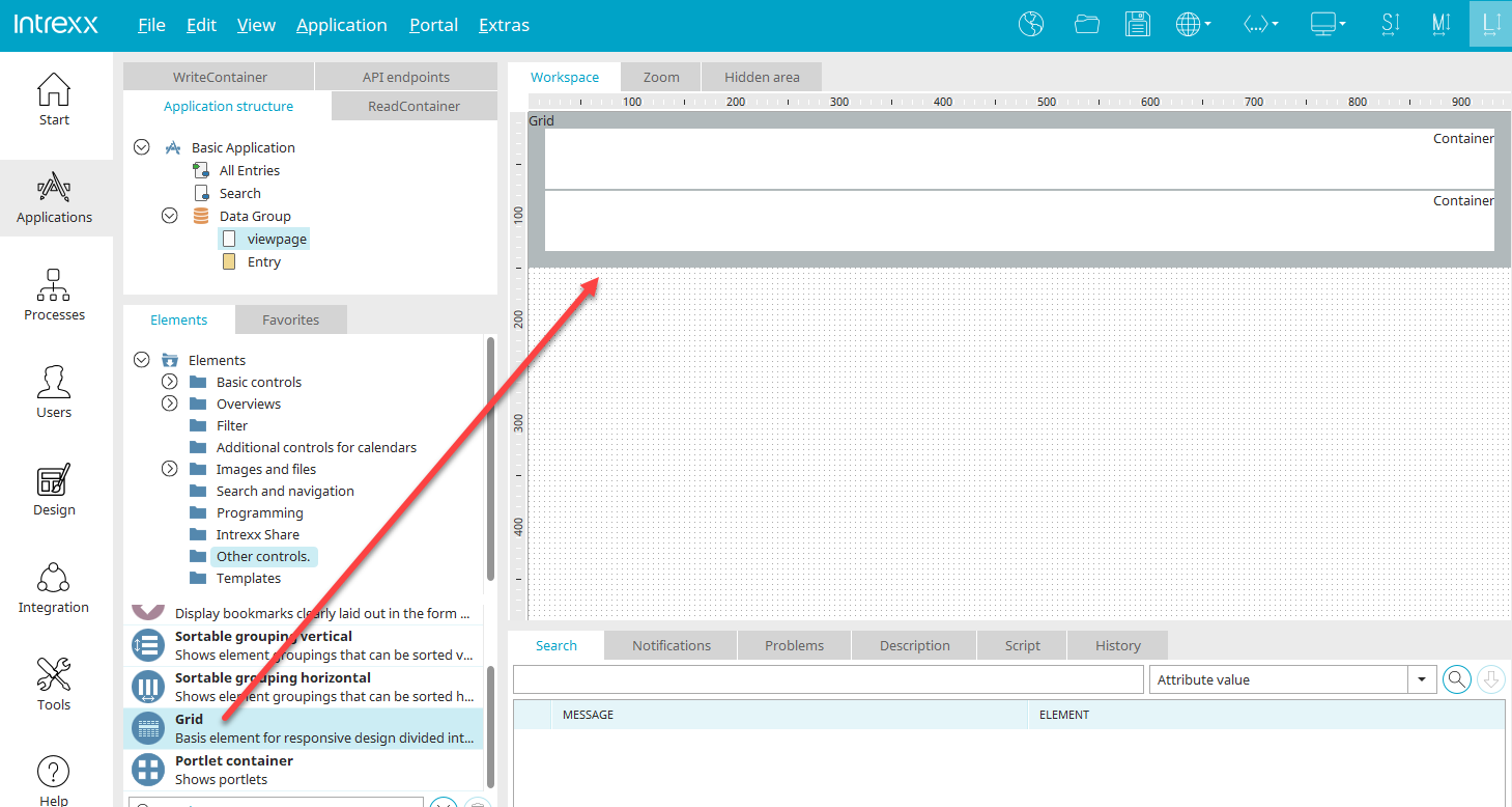
In the "Applications" module, you design your application pages.
To build a responsive application page, you can drag and drop the grid from the Elements panel onto the workspace. When you place the element, you'll already find two containers (Container 1, Container 2) on the grid. Double-clicking on one of the containers opens the zoom area.
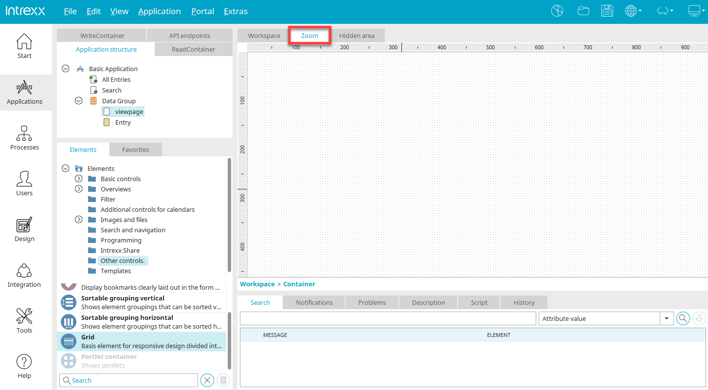
The zoom area is a separate workspace for each individual container, where you can place the elements you want to see in the currently selected container. Then click the "Workspace" tab below the zoom area again to view the entire grid with all containers on the workspace.
A preview of the containers and their contents is then displayed on the workspace. From here, too, you can open the Properties dialog box for the elements by double-clicking on an element. New elements can be created directly on the workspace, so it is not necessary to switch to the zoom area.

On the toolbar, you'll find the S, M, and L buttons, which you can use to switch between different screen sizes. The grid element on the workspace is then displayed in the corresponding preview.
Grid Properties of the Application Element

You can open the grid's Properties dialog box by double-clicking the border area.
"General" tab

Title
Enter a title for the grid element here. You can find more information on this topic here.
Same container height
With this setting, the containers in the grid always occupy the same height, regardless of their respective contents. This feature is an important design element, especially when using background colors or images. The height is based on the tallest container included in the grid.
The following settings from the "Container" tab are ignored if the "Same Container Height" option is selected here:
-
Centered
-
Always position the last container at the right edge of the grid
"Screen Size" Column
Here you'll find the three sizes: SMALL, MEDIUM, and LARGE.
"Visible" Column
Here, the entire grid can be hidden for each screen size, if desired. To do this, simply uncheck the corresponding checkbox. Please note that hidden grids are still present on every device. This does not result in less data being transmitted.
Conditional Display
Enables conditional display of the grid.
 Edit Condition
Opens the script editor, where you can enter the condition.
"Container" tab
The following settings in this dialog box are ignored if you have selected the "Same Container Height" option on the "General" tab:
-
Centered
-
Always position the last container at the right edge of the grid
The preview at the bottom still shows the result of the two settings, even though they have no effect in this case.
Screen Size
Here, you can choose to set the screen size to S (SMALL), M (MEDIUM), or L (LARGE) to adjust the grid accordingly.
We recommend starting with the layout for the SMALL display setting. Naturally, displaying content on smaller devices, such as smartphones, will pose the greatest challenge. Once all containers have been created for the smallest screen size, it is very quick and easy to adapt the display for larger devices.
"Container" column
Double-clicking a container's name opens a dialog box where you can change the container name.
Properties - Container
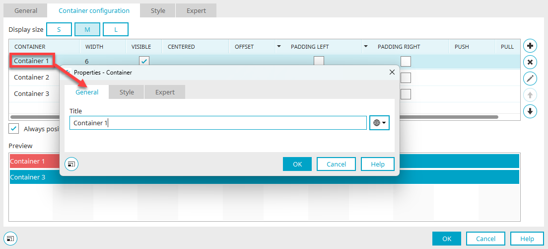
Title
Enter the container's title. You can find information about multilingual titles here.
Click "OK" to save the changes and close the dialog box.
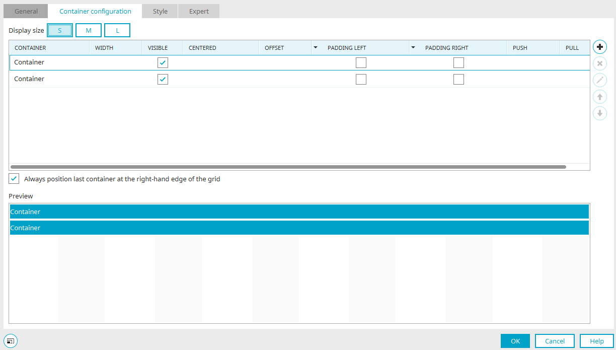
"Width" Column
Click in the column to select from a list how many grid units the container should occupy. If no width is specified, the container automatically occupies all 12 units of the grid.
If the content of a container is larger than the container itself due to fixed width specifications, it will extend beyond the container's boundaries. The content that extends beyond the container is overlapped by subsequent containers. The containers' responsive behavior is not affected. If you avoid using elements, you can prevent the content from overflowing the container's boundaries. You can also apply a custom style to the relevant responsive container or a grouping within a responsive container to control the overflow behavior. The overlapping area can be hidden using the CSS property `overflow-x: hidden`, or horizontal scrollbars can be displayed using the CSS property `overflow-x:scroll`.
"Visible" Column
With this setting, the respective container is visible in the grid. Less important content can be hidden on small devices. The following containers will close up so that no gap is left. Please note that hidden containers are still present on every device. This does not result in less data being transmitted.
"Centered" Column
With this setting, all containers positioned in the grid before the centered container retain their positions. The remaining space in the row is reserved for the centered container. The centered container is not positioned in the center of the reserved space, but rather horizontally in the center of the entire grid. If the preceding containers already take up half (or more) of the space, the centered container will overlap them.
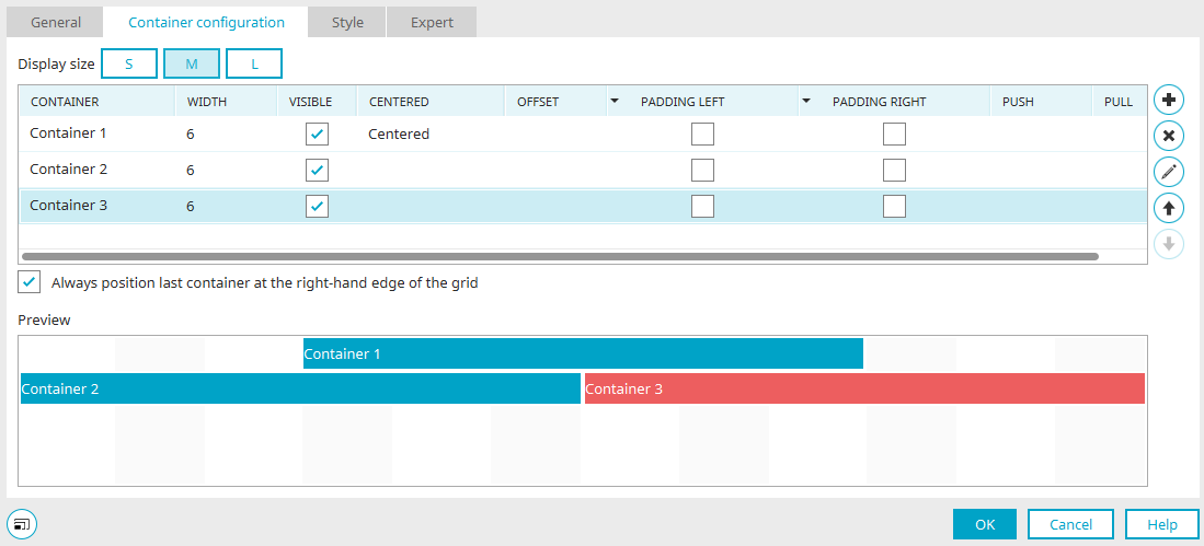
If there are containers following the centered container, they are wrapped to the next line and positioned starting at grid position 1. Here, too, the rule applies that the last container in a row is positioned at the right margin. This can be aligned with the other containers by turning off the "Always position the last container at the right edge of the grid" setting.
As a general rule, it is recommended to apply the "Centered" setting to a container only if it appears alone in the grid and is not intended to occupy the full 12 grid units.
"Offset" Column
This property allows you to move a container a specific number of grid units to the right. The following containers will also be moved.
"Inner Spacing (Left, Right)" Column
If this setting is not enabled, the container will be displayed without any inner spacing on the left or right.
"Push/Pull" Column
These properties make it possible to align a container to the right or left by a specified number of grid units. Unlike the "Offset" setting, this does not move subsequent containers. Typically, the "Push" and "Pull" properties are used to swap containers of the same size. In this process, one container is assigned the "Push" property (move to the right) and the second container is assigned the "Pull" property (move to the left). Please note that if the "Push" or "Pull" values are set incorrectly, containers may overlap, which usually leads to undesirable results.
Always position the last container at the right edge of the grid
If this setting is not enabled, the last container is positioned directly next to its predecessor.
Preview
At the bottom of the dialog, you'll see a preview of the current configuration.
 Add a column
A new column is created.
 Delete Column
Removes the column selected in the list.
Edit Column
Opens a dialog box where you can edit the column title.

 Change Order
Moves the selected column up or down.
When you delete a column, the elements it contains are also deleted. A message to that effect will be displayed before deletion.
Page Assistant for Application Pages
Responsive pages can be created manually or very easily automatically using the Page Wizard. Below, you'll learn everything you need to know about manually building responsive pages. You can find information about the Page Assistant here.
Portal Pages with a Grid
In the "Design" module, you can customize your portal layout. To create responsive portal pages, you can use drag-and-drop to position the grid from the Elements panel within the layout structure.
Grid Properties of the Layout Element
If layout elements already exist, you can open the Properties dialog box for a grid by double-clicking the element in the layout structure. When a new element is created, it opens automatically.
"General" tab
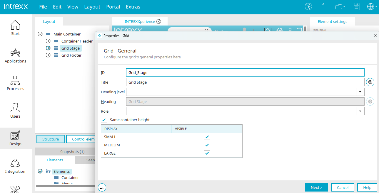
You can find descriptions of the ID, Title, Heading Level, Heading, and Role settings here.
Same container height
With this setting, the containers in the grid always occupy the same height, regardless of their respective contents. This feature is an important design element, especially when using background colors or images. The height is based on the tallest container included in the grid.
The following settings from the "Container" tab are ignored if the "Same Container Height" option is selected here:
-
Centered
-
Always position the last container at the right edge of the grid
"Screen Size" Column
Here you'll find the three sizes: SMALL, MEDIUM, and LARGE.
"Visible" Column
Here, the entire grid can be hidden for each screen size if desired. To do this, simply uncheck the corresponding checkbox. Please note that hidden grids are still present on every device. This does not result in less data being transmitted.
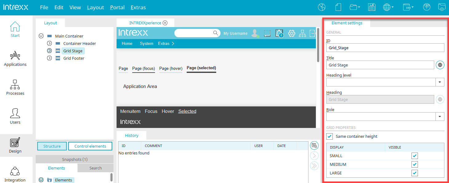
As always, you can access these properties in the "Design" module in the Properties dialog box, as well as in the element settings.
"Container" tab
The settings here are identical to the settings for the "Grid" application element. You can find the corresponding description here.
Layout Properties - Set Screen Sizes
In the "Design" module, you can set the minimum width for the MEDIUM and LARGE screen sizes in the layout properties, which you can access via the main menu under "Layout / Layout Properties. "
FAQ
Why does the grid have twelve units?
Twelve-column layouts are widely used in web design and offer the greatest possible flexibility in page layout.
What is the difference between mobile and responsive websites?
Responsive websites are not a substitute for mobile websites. The appropriate structure depends on the specific use case. Here are the pros and cons of mobile and responsive websites:
|
Mobile Site |
Responsive Website |
||
|---|---|---|---|
|
+ |
Lower data volume, since fewer CSS and JavaScript files are transferred |
- |
Even hidden containers are transferred |
|
- |
Separate pages must be created for desktop PCs and mobile devices |
+ |
View and input pages need to be created only once |
|
+ |
Automatic adjustment to the available display size |
||
|
+ |
Well-suited for situations with poor mobile data connectivity, e.g., no Wi-Fi |
+ |
Well-suited when all clients have an optimal data connection, such as Wi-Fi |
|
- |
Changes must be made on several pages |
+ |
Less maintenance required |
|
- |
Greater design effort, since the page must be designed for three screen sizes |
||
|
+ |
The design and content can be optimally adjusted to the screen size |
||
|
+ |
Can be implemented at any time alongside an existing desktop version |
||
Why is the last container in the grid always positioned on the far right, and how can I change that?
This behavior is due to the need to adapt to different browsers. If you want the last container in the grid to be positioned directly next to the one before it, you can disable the "Always position the last container at the right edge of the grid" setting in the container settings. If inner spacing is not removed or if the column heights are made equal, the last container is positioned directly next to its predecessor.
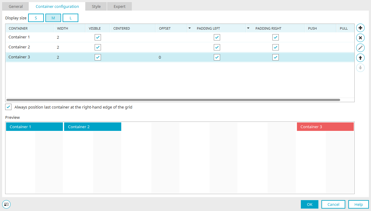
In the preview at the bottom of the dialog box, you can see three containers, each two grid units wide and evenly spaced within the grid, when the "Always position the last container at the right edge of the grid" setting is enabled.
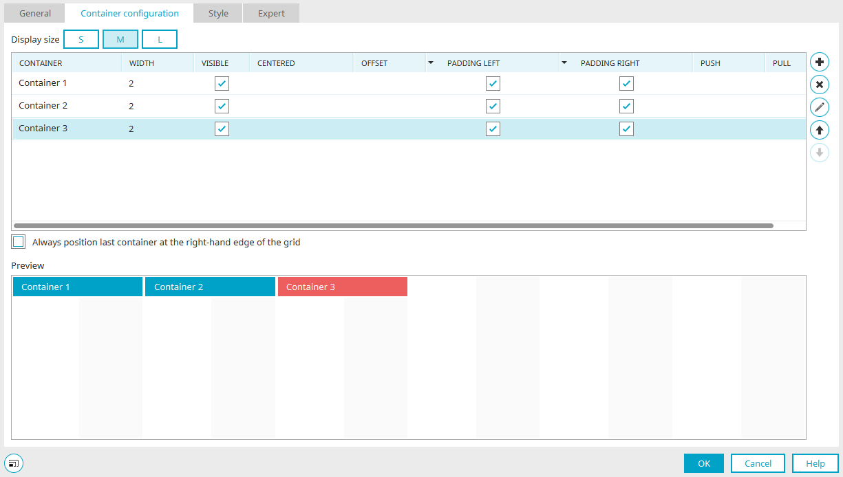
And here is the layout when the "Always position the last container at the right edge of the grid" setting is disabled.
How can I center a container on a page, and what are the implications?
You can find all the information on this topic here.
How are the distances between containers defined, and what effect does the "Offset" setting have?
Using the "Offset" setting, you can shift a container and all subsequent containers to the right by a specified number of grid units.
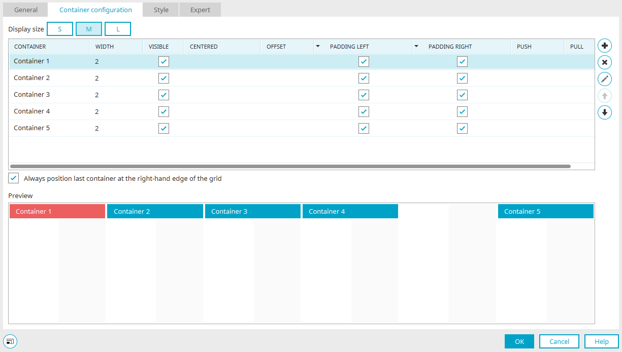
Here you can see five containers, each two grid units wide.
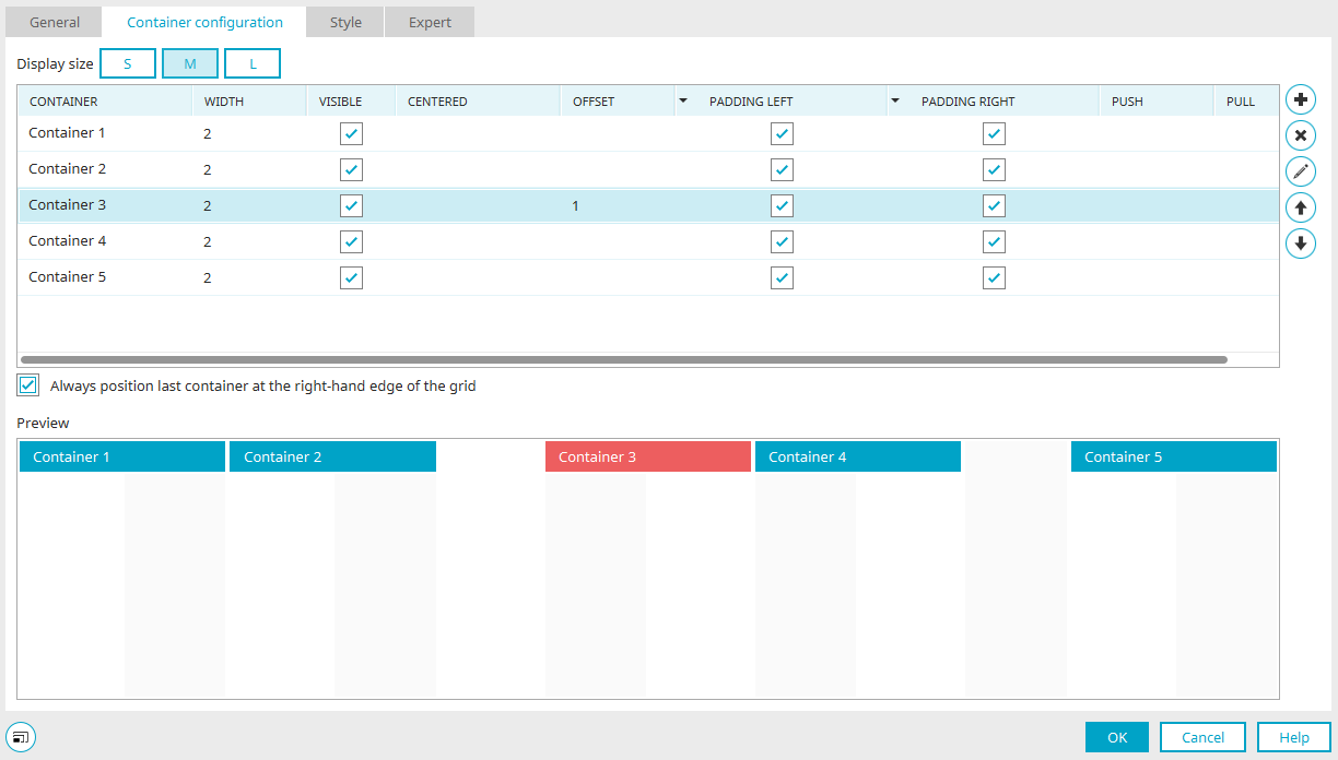
Here is the same container layout, each two grid units wide. An offset of one grid unit was specified for Container 3.
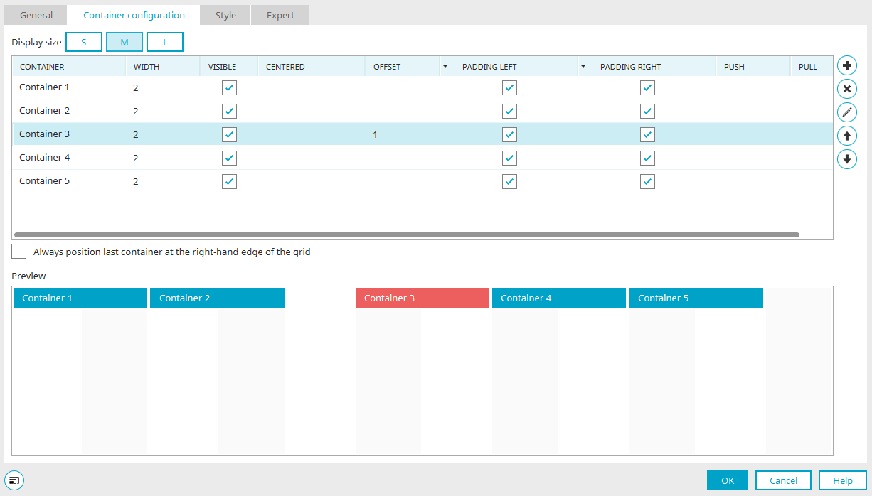
The same container layout, each two grid units wide. An offset of one grid unit was specified for Container 3. The setting "Always position the last container at the right edge of the grid" has been disabled.
Why don't I see any containers on my desktop PC that I've hidden for the "SMALL" screen size?
Settings such as visibility, which are defined for the SMALL screen size, also apply to the MEDIUM and LARGE screen sizes, as long as no separate settings have been specified for those screen sizes.
Why does a tooltip need fixed widths when it's opened from within a container?
When a tooltip is opened from a container, it must have a fixed width specified; otherwise, the tooltip will be only as wide as the container from which it is loaded. For example, if a container spans only one grid unit, the tooltip is also only as wide as the percentage-based width of that grid unit. You can set the width of a tooltip by opening the Properties dialog box for the button that loads the tooltip. You'll find the landing page options on the "Actions" tab. Click on " " and configure the tooltip's position.
How can individual containers be rearranged to accommodate different screen sizes?
Containers can be assigned the "Push" or "Pull" properties. These properties allow you to move a container a specific number of grid units to the right or left. Unlike the offset option, this does not move subsequent containers. Typically, the push and pull properties are used to swap containers of the same size. In this process, one container is assigned the "Push" property—move to the right—and the second container is assigned the "Pull" property—move to the left.
Containers may overlap when the values for push or pull are unfavorable, which usually leads to undesirable results.
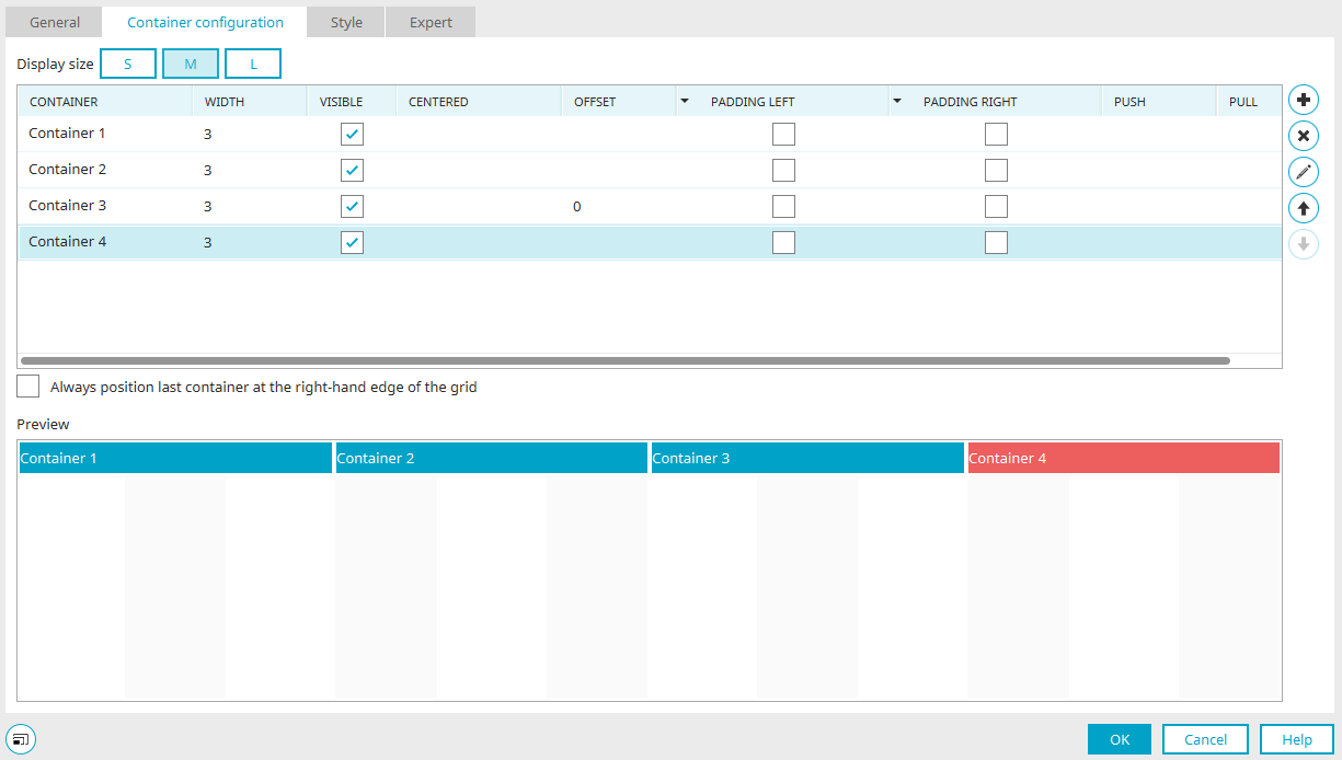
Here you can see four containers, each three grid units wide, in the MEDIUM screen size. Containers 1 and 4 should switch places in the LARGE view.
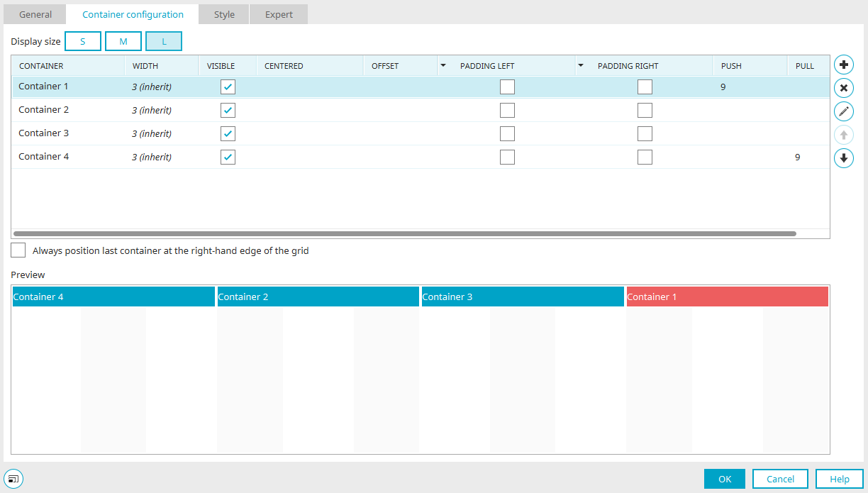
To do this, the Push property for Container 1 is set to 9. For Container 4, "Pull" is set to 9.