

Dependencies
The following application elements list data:
These elements can be filtered based on other controls; for example, when a term is entered into an input field, the dependent view table then displays only the data that contains that term.
Any application elements that support JavaScript can be used as triggering controls for a dependency. Application pages can also trigger a dependency—for example, during an onload event.
Example
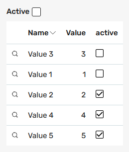
Here you can see a view table containing various values for which a dependency has been set up, in its unfiltered, initial state.
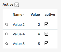
The "Active" checkbox above the table is the trigger control. If a user clicks on it, the dependency is triggered. The table will then display only the values that are "active."
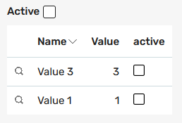
If the "Active" checkbox is unchecked, the table displays only the inactive values.
Configuration in the Applications Module
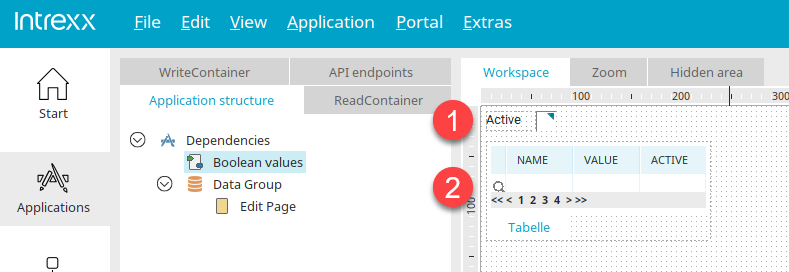
Here you can see the corresponding page in the "Applications" module, showing the triggering control (1) and the view table (2).
Dependencies
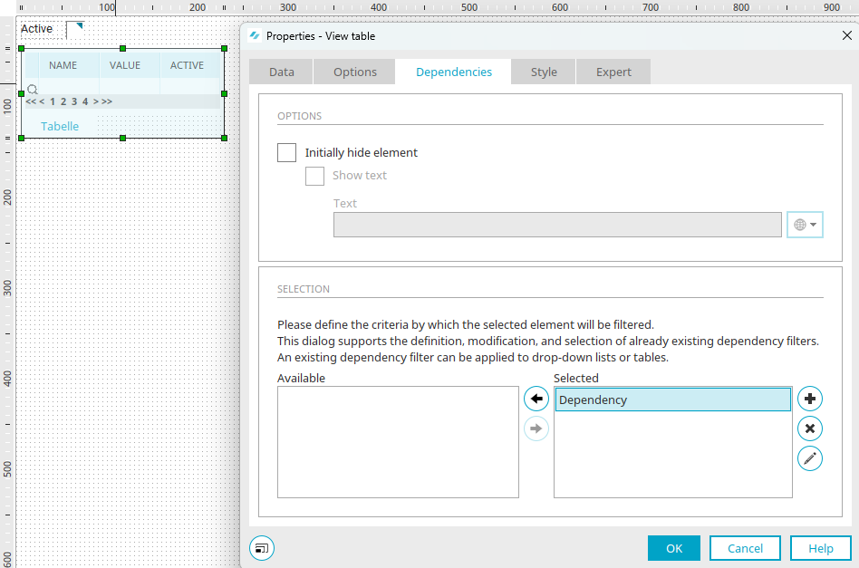
In the Properties dialog box for the view table, you'll find the dependency on the "Dependencies" tab. Any number of dependencies can be defined per page. Any dependency that appears in the "Selected" list applies to the corresponding element—in this case, the view table—and filters it accordingly.
View Table, Custom Table, Search, Chart
For these elements, you can configure the following settings in the "Options" section:
With "Do not display element initially," the filtered element is not displayed until the filter is triggered—for example, by selecting an entry from a drop-down list that is defined as the triggering control in the dependency.
The "Show Text" option also allows you to specify whether text should be displayed if the element is not initially visible. Simply enter the text you want. Click here to learn how to enter text in multiple languages.
Drop-down list and list box
For these two elements, the "Dependencies" tab only includes the setting "Display list initially without entries." This causes the corresponding element to be displayed in the browser without any entries as long as no filtering has taken place yet.

 / Edit Dependency
Opens a dialog box where you can create a new dependency or edit an existing one.
General
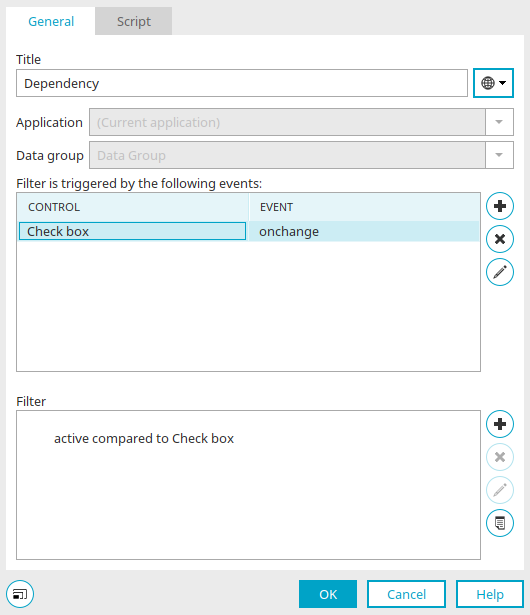
Enter the name of the dependency here. You can find information about multilingual titles here.
If you open the dialog from an element, the application and data group for the dependency are already selected here.
If this dialog is opened via the properties of an application page, you can select the application and data group for which you want to configure the dependency.
Filtering is triggered by the following events
The triggering checks are configured in this section. Click "Add Event" at to define a new trigger control, or click "Edit Event" at to edit an existing control.
Select Trigger Control
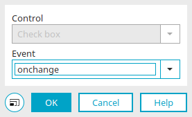
In this list, you can select all controls on the current page that support JavaScript, including the page itself.
Event
Select here which event should trigger the update of the element. Which events can be selected depends on the type of triggering control.
For example, with a drop-down list, you can use the "onchange" event, which occurs as soon as the current selection in the drop-down list changes. For a button, for example, you can select the onclick event, which occurs when a user clicks the button.
In general, all events that can be used in Intrexx with JavaScript and the corresponding control are available.
Click "OK" to save the settings and close the dialog box.
The actual filters are defined in the "Filter" section.
Click "Add New Filter Expression" to define a new filter expression, or click "Edit Filter Expression" to edit an existing filter expression.
Properties of the filter expression
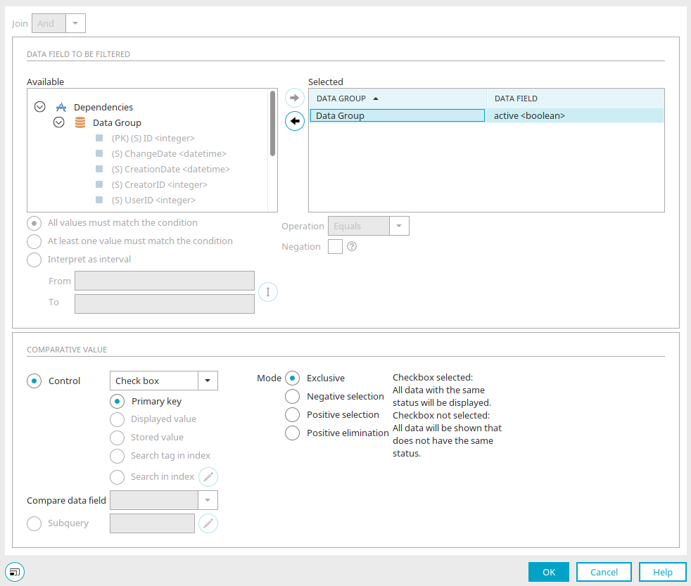
At the top of the dialog box, you can see the type of link. If multiple filter expressions are created for a dependency, they can be linked using either an "AND" operator or an "OR" operator. An "AND" operator returns only those records to which all filter expressions apply. With an OR operator, the records to which at least one filter expression applies are returned.
Below that, specify the data fields you want to filter. Use the arrow buttons to move the desired data fields from the "Available" list to the "Selected" list.
All values must meet the condition / At least one value must meet the condition
When comparing multiple data fields, you can specify here whether all data fields or at least one data field must meet the filter expression.
Interpret as an interval
This option is available when the "Value Range" or "Calendar" filter elements are selected as the comparison value.
The interval must cover the range to be filtered overlap or intersect.
For example, if a start date of December 1 is used to filter tasks, and an end date of December 5. If this option is selected, the "Interpret as Interval" setting returns all assignments that are due before December 1. were started and completed within the specified time frame, and all tasks that were started after December 5, were completed and started within the defined time period.
When filtering by time periods, please note that a day always begins at 12:00 a.m. So if you select the date range August 1, through August 5 To filter, the filter expression must be greater than 1.8. and <August 6. read, so that August 5 is still trapped in the filter.
Operation
Select the desired operator here.
Negation
If this setting is enabled, the result set will include all data that does not meet the condition.
Starting with Intrexx version 12.2.0:
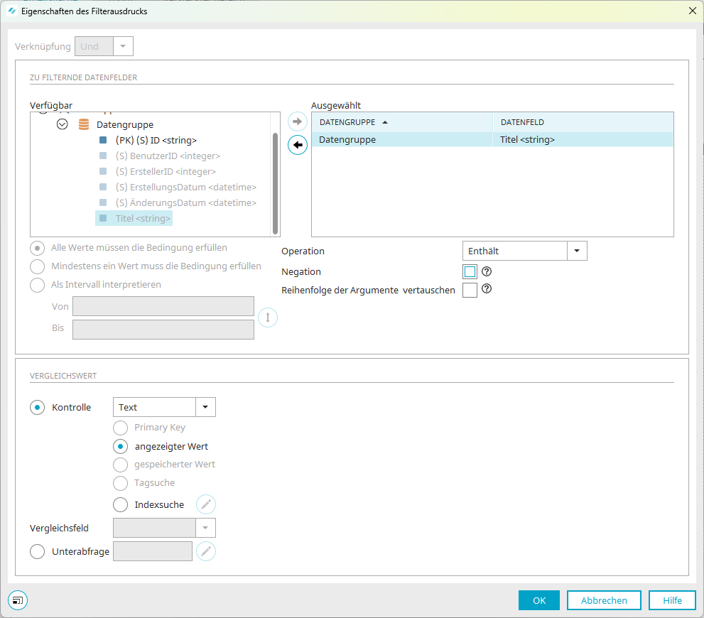
Swap the order of the arguments
For the operators "Contains," "Starts with," and "Ends with," the order of the arguments can be reversed:
From
"Data field contains / starts with / ends with value"
will be
"Value contains / starts with / ends with data field".
Starting with Intrexx 12.2.0, the filter expression "Data field contains data field" can be applied to the following database types and OData:
-
MariaDB
-
Oracle
-
Postgres
-
Mssql
-
MySQL
Comparative figure
Select the control that contains the reference value here.
Primary Key
Compares the value of the data field with the LID of the record.
Displayed value
Compares with the string displayed in the triggering control.
Stored value
The "Saved Value" setting compares the value of the data field with the LID of the record.
Tag Search
If the "Tagging Bookmark" element is selected as the trigger control, clicking on a tag will filter the relevant element (e.g., a table) accordingly. You can find more information here.
Index Search
This option allows you to compare data fields with the "Integer" or "String" data type to input fields with the "Text" control type. To do this, you must specify a search configuration and a comparison field. The text from the control selected as the reference value is passed to the search configuration. The search result is then returned. The "is contained in" operator is then used to check whether the value of the data field to be filtered is contained in the result set. If this is the case, the corresponding data record is displayed.
Edit Index Search
Opens a dialog box where you can configure the index search.
Index Search
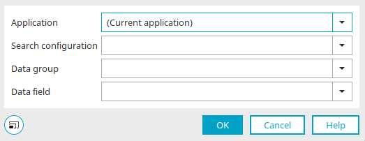
Here, you can select the application, search configuration, data group, and data field for which the index search should be used as a comparison value.
Click "OK" to save the settings and close the dialog box.
Comparison Table
If the selected control is the "Operator" filter element, you can select the data field here whose values are to be compared.
Boolean values
When comparing with the "Boolean Values" filter element, you can specify the mode for the effect that selecting the checkbox has in the browser.
-
Exclusive
With this setting, only the records that have the same status as the filter's checkbox are displayed.
-
Negative Selection
If the checkbox is selected, all records are displayed. If the checkbox is not selected, the records whose value is false are displayed.
-
Positive Selection
If the checkbox is selected, only records with a value of true are displayed. If the checkbox is not selected, all records are displayed.
-
Positive-Exclusive
If the checkbox is selected, only the records whose value is false are displayed. If the checkbox is not selected, all records are displayed.
Subquery
This comparison can be performed in combination with the operators "Is contained in" or "Is not contained in. "
Edit SubqueryOpens a dialog box where you can define the subquery for a data group.
Filter Output for Multiple Selections with the "Distribution List Selection" Data Source
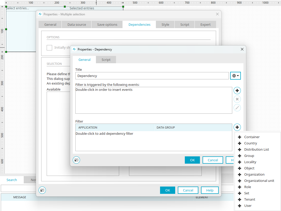
When making a multiple selection using the "Distribution List Selection" data source, clicking " " ("Add Dependency Filter") here displays a menu from which you can first select the desired user object for the filter.
A dialog box will then open where you can create the filter.
Filter
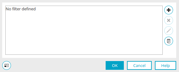
/ Edit filter expression
Opens a dialog box where you can enter the new filter expression.
 Remove filter expression
Deletes a filter expression.
 Edit Filters in Expert Mode
Opens the filter editor, where you can edit the filter's XML directly.
Clicking "OK" saves the changes and closes the dialog box.
Page Properties - Dependencies
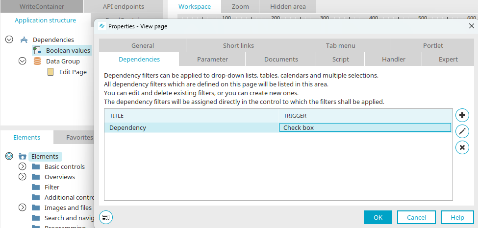
In the " Page Properties" dialog box, you'll also find the "Dependencies" tab. All dependencies defined on the current page are listed here.
Here you will find the title and the triggering check for each of the defined dependencies.
Dependency filters used in a multiple selection with the "Distribution Selection" data source are displayed in the list of page properties on the "Dependencies" tab, but they cannot be created or edited. This is only possible in the properties of the multiple selection.
Filter Elements
Intrexx offers a number of filter elements that you can use for dependencies. Compared to traditional application elements, they offer a number of special features, such as the "Value Range" filter element, which allows you to filter by any range. You can find information about the individual filter elements here:
Value Picklist / Value List Box
Additional Checks for Calendars