Button – Actions
By clicking on a button in the browser, a variety of other actions can be performed in addition to saving and deleting records. The actions can be configured in the button properties dialog on the "Actions" tab.
Find out how to create and configure a button here.
No action

If a button is only used to load another page, for example, select the action type "No action".
Save
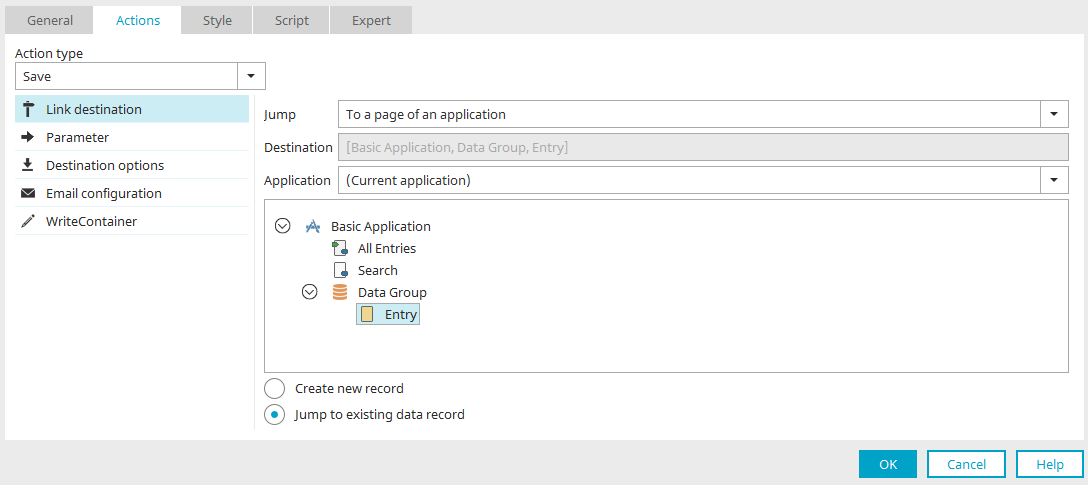
Button on edit pages
The "Save" action is available if the button is on edit pages that a WriteContainer has been defined for. The current data record is saved when the user clicks on the button.
Button on view pages
The "Save" action is available on view pages that contain a free layout table. All data records in the free layout table will be saved. Click here to read our Tips & Tricks article about editing data in free layout tables.
Permissions
If the user does not have the corresponding permissions, the button will be hidden in the browser.
Delete
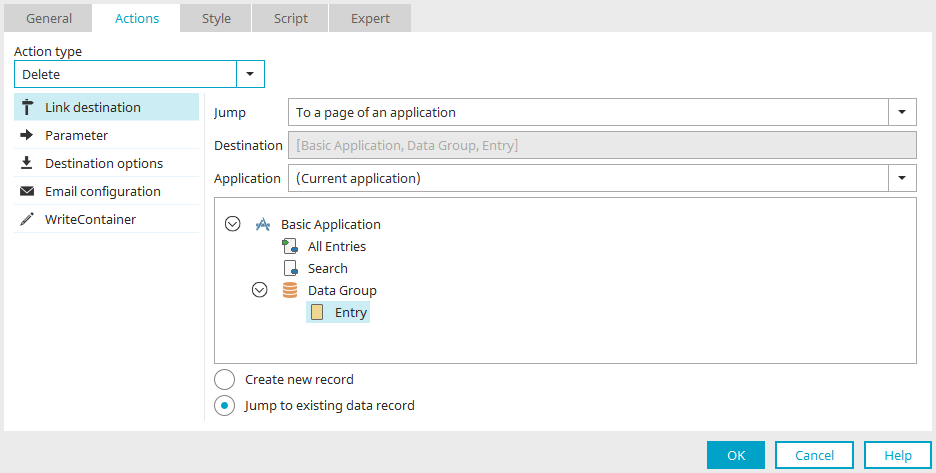
On a page within a data group, the current data record and all dependent data records in subordinate data groups will be deleted with this action.
Move container up / down

With this action type, the button can be used to page through data records.
Options
Select the property of this navigation button.
 Edit parameter
Opens a dialog where parameters for the navigation button can be defined.
To the first record
Jump to the first record.
To the previous record
Jump to the previous record.
To the next record
Jump to the next record.
To the last record
Jump to the last record.
Save current data record
With this option, the data record will be saved.
Email configuration
All information on this topic can be found here.
Data Picker
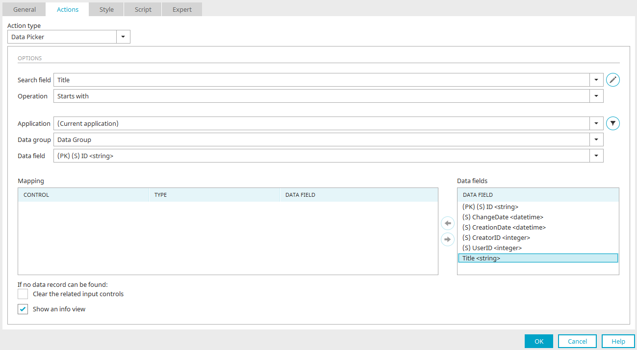
This action type compares a search term with the values of a data field. The edit fields of the current page can be mapped to the data fields of the selected application and data group. If the search is successful the found data will automatically populate the mapped edit fields. If, for example, a user enters the name of an employee into the field and clicks on the Data Picker button, the Data Picker searches for the email address and telephone number of the employee and enters these automatically into the assigned edit fields.
Search field
Select the edit field that should be used as the search field.
From Intrexx version 12.1.0:
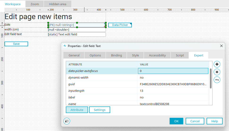
When the data picker is reinitialized, the focus is automatically set for it. If this is not desired, create the expert attribute "data-picker-autofocus = 0" in the properties of the search field. This prevents the automatic setting of the focus.
Advanced
Opens a dialog where the appearance of the table, where the search results are listed, can be modified.
Advanced
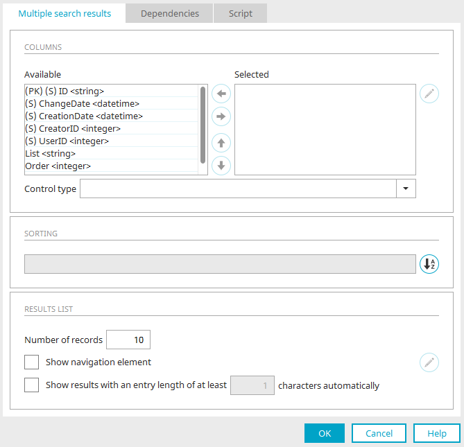
Columns
Available
In this list, all edit fields in the connected data group will be shown.
Selected
The fields in this list will be shown in the results table as a column.
 Move right / left
Move entries from one list to the other.
 Move up / down
Set the order of the columns in the table. The following rule applies here: the higher a field is placed in the list, the further left the column will be shown in the table.
 Edit
Edit
Opens a dialog where the title of the column can be changed.
Control type
The desired control type can be selected here to display the values in the results table.
Sorting
The results table will be sorted by the field entered here.
 Sorting
Opens a dialog where the sorting can be edited.
Results list
Number of records
The maximum number of shown hits per table page.
Show navigation element
Shows the navigation element at the foot of the results table, which allows the user to move to additional pages of the table.
Show results with an entry length of at least ... characters automatically
If a single result is found, it will automatically be entered into the connected fields by the Data Picker. Multiple hits will be shown as a tooltip. This setting defines after how many entered characters this tooltip will open.
To ensure that the data picker can be used without barriers, you must deactivate the "Automatically display result from an input length of ... Display automatically" checkbox.
Click "OK" to save changes and close the dialog again.
Operation
The type of comparison can be determined here:
-
Contains
Returns results if the search term is contained in the data field value.
-
Starts with
Returns results if the search term corresponds to the first characters of the data field value.
-
Ends with
Returns results if the search term corresponds to the last characters of the data field value.
-
Equal to
Returns results if the search term corresponds to the data field value.
Application, Data group, Data field
Here, select the data that should be searched through.
 Filter
Opens a dialog where a filter for restricting the data can be defined.
Mapping
In this list, you can see every element that can be populated by the Data Picker.
Data fields
Mapping list
All of the elements on the current page, which are available for the Data Picker, are listed here.
Data fields list
All of the available data fields from the current application and data group are listed here.
Maps the selected elements to one another or removes the mapping, respectively. An assignment can only be made if the data type of the elements and data fields match.
If no data set can be found: Clear the related input controls
The search field will be cleared if the search was unsuccessful.
Show an info view
With this setting, a message will be shown if the search was successful (e.g. "A data record was found and inserted") or unsuccessful("No data record found"). The message is also shown if multiple potential data records are shown in a results table for selection.
Add data record
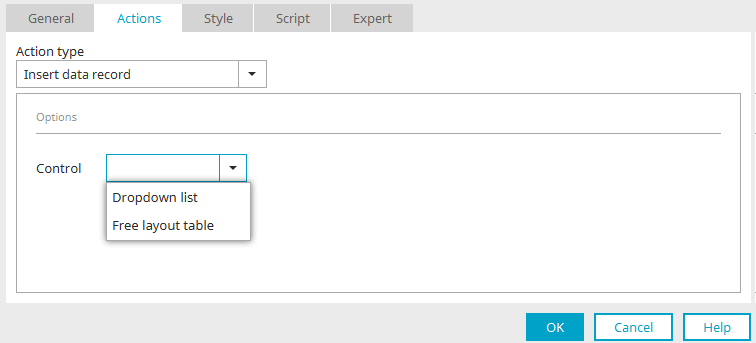
With this action, new entries can be added to drop-down lists, listboxes or free layout table in the browser. The new entries will be simultaneously saved to the data group connected to the drop-down list or table, respectively.
Depending on whether you select a drop-down list or a listbox or a free layout table, different settings are can be chosen here.
Drop-down list / Listbox

Control
Select the desired drop-down list or listbox here.
Page
Select the edit page where new data can be defined. When the user clicks on the button in the browser, a tooltip will open where the new entry for the drop-down list can be defined.
Parameters
The description for these settings is available here. You can find general information on parameters here.
Free layout table
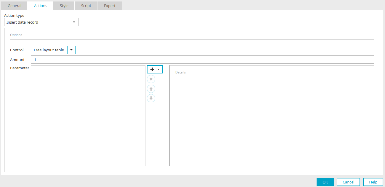
Control
Select the desired free layout table. Only tables that use an edit page for the data view can be selected here.
Number
Enter an integer that defines how often the edit page should be loaded in the table. With a number > 1, multiple data records can be defined in the table.
Parameters
The description for these settings is available here. You can find general information on parameters here.
Function in the browser

Here you can see the free layout table after clicking the "Add data" button. The number is set to 1 in the button properties. A blank linked input page is therefore displayed at the bottom of the table and a record can be entered. The "OK" button with the "Save" action on the edit page is also shown. When the user clicks on "OK", the new data record will be saved. Here you will find tips and tricks for editing data in a free layout table.
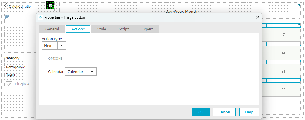
Calendar plugin
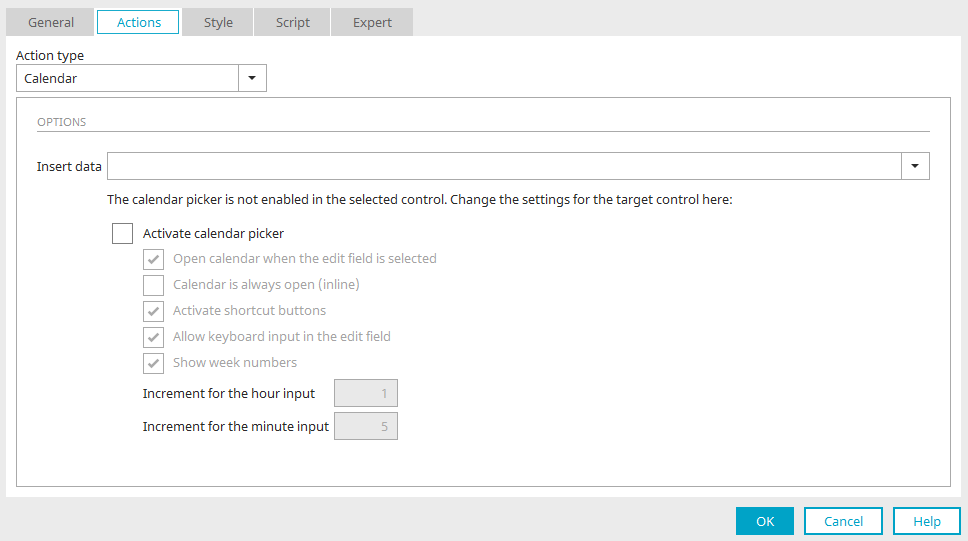
Click here for further information about this action button.
Show/Hide
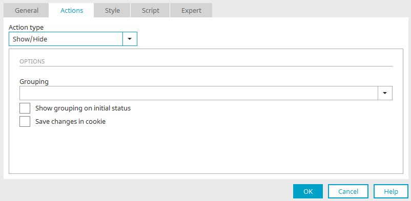
This action will show or hide grouped elements in the browser.
Grouping
Select the group to be shown or hidden from this list.
Show grouping on initial status
This setting will show the group when the page is loaded.
Save changes in cookie
Selecting this option will return the user to the last status (group shown or hidden) when the page is reloaded in the browser.
Show/Hide flexible
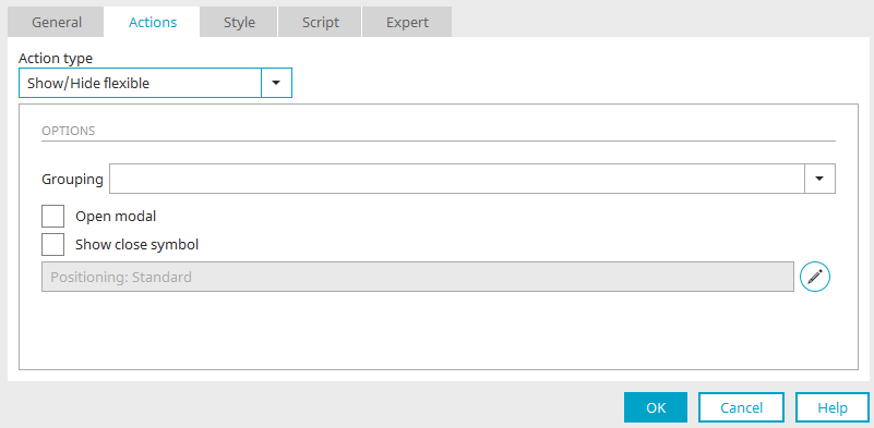
As opposed to the “Show/Hide” action, the grouped elements will be shown here in the form of a tooltip.
Grouping
Select the grouping from this list that should be shown or hidden in the tooltip.
Open modal
If a tooltip is opened modally, the rest of the page is only accessible once the tooltip has been closed.
Show close symbol
Shows a  button at the top right of the tooltip. This can be used to close the tooltip.
Positioning
The currently defined positioning of the tooltip is shown here.
Configure tooltip positioning
Opens a dialog where the position the tooltip should open at can be configured.
Search

The Search button action is used in connection with the “Search” view element. You can find all information here.
Microsoft Teams communication
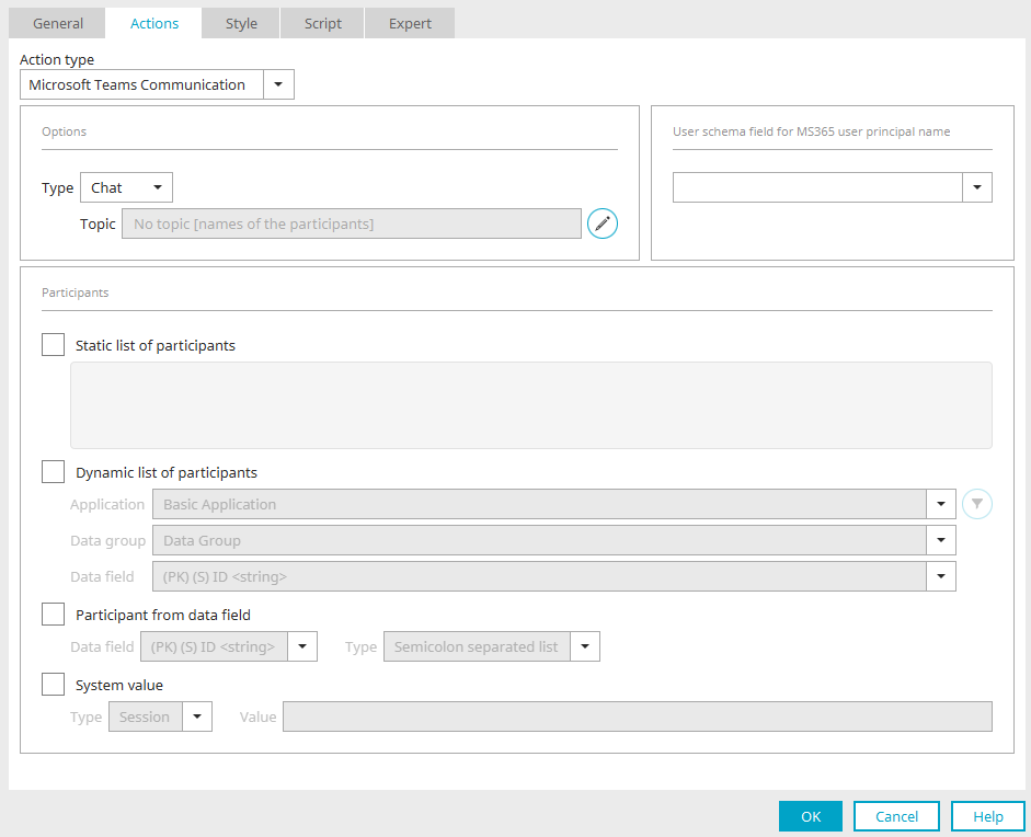
All information on this topic can be found here.
Create document
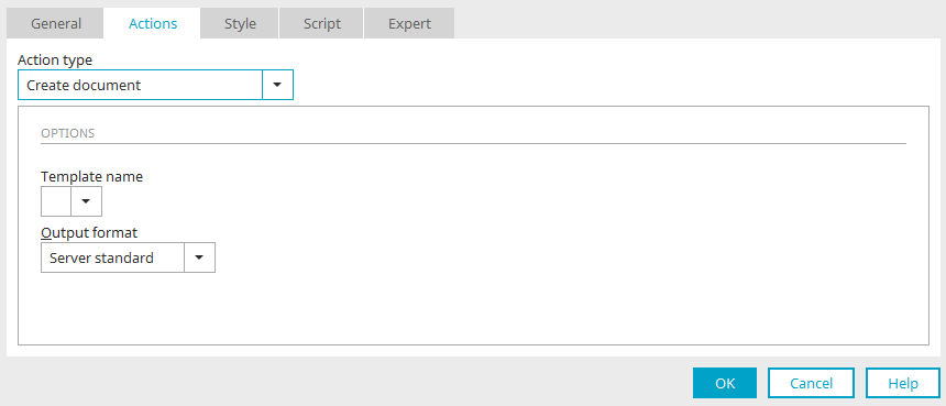
All information on this topic can be found here.
Previous / Next
Click here for more information about these actions.
Delete folder
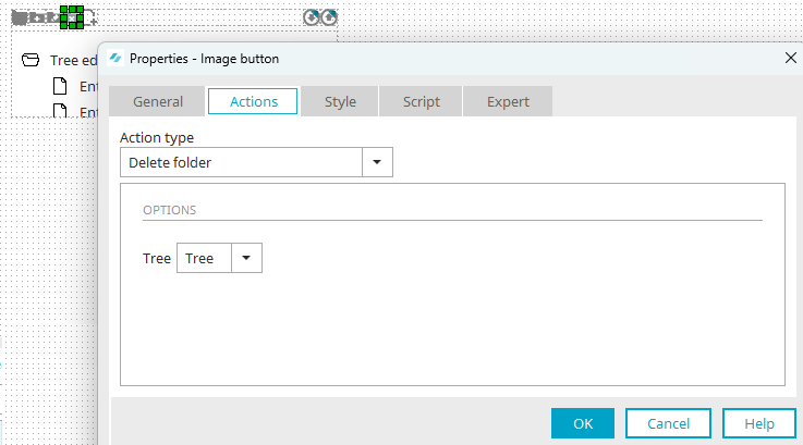
This action is used in combination with the elements Tree and Tree view for the "Delete folder" button. This button can be generated in the Final settings dialog while creating a Tree element. Clicking on this button in the browser deletes the currently selected folder in the tree.
Options
Tree
Select the tree element that the button is connected to.