

Expert Attributes
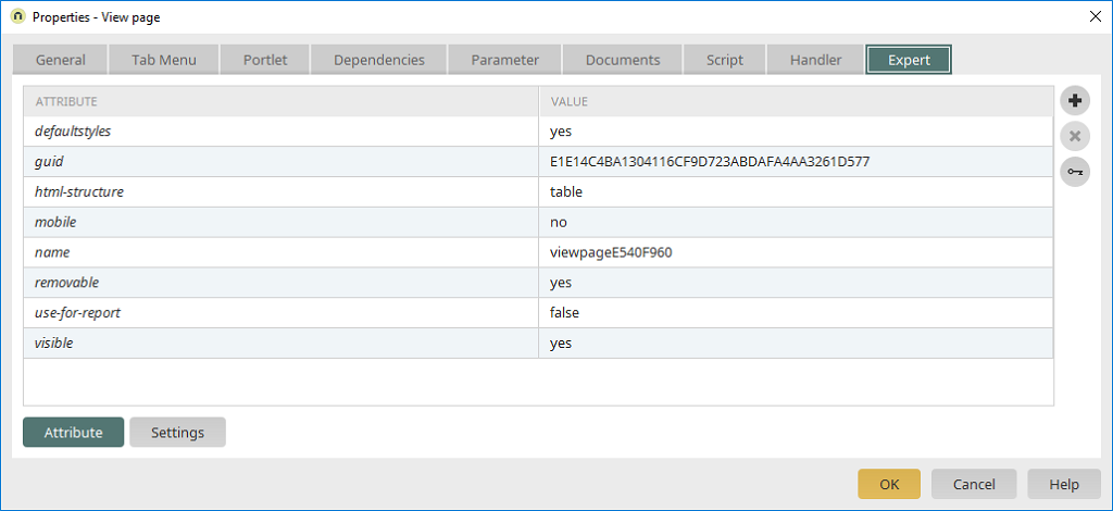
Expert attributes can be used to extend Intrexx's functionality. Click here to learn how to include Expert attributes in application elements.
accesskey
Function: Keyboard shortcut for navigating to input fields or buttons
Data type: text
Default value: Blank
Possible values: Strings
Using a keyboard shortcut consisting of the ALT key and the character specified in the "Value" field, you can jump directly to the current input field or button. If, for example, the value is set to 1, you can use the ALT+1 keyboard shortcut on Windows systems to navigate to the input field or button. This triggers the button's action. We recommend that you avoid using the browser's built-in keyboard shortcuts—use only combinations with the numbers 0–9 whenever possible. Can be used with the following elements:
-
File Selection
-
Input field
-
Checkbox
-
List box
-
Radio button
-
Button
-
Text field
accordion
Function: Show and hide groupings in the custom table
Data type: boolean
Default value: false
Possible values: true, false
Applies to buttons with the "Show/Hide" action on view pages that are embedded in a custom table. The value "true" ensures that only one group is open at a time. The most recently opened group will be closed automatically. Can be used with the following elements:
-
Button
additionalcheck
Function: Hides or shows buttons when a page loads, depending on a value
Data type: text
Default value: Blank
Possible values: velocity commands, request parameters
An operator and the comparison value can be specified as additional attributes for the attribute (type: text, default value: ==). The operator is defined using the opadditionalcheck attribute. Possible operators are ==, !=, <, >, depending on the data type of the value being compared. The comparison value is specified using the valueadditionalcheck attribute (type: text). For comparisons with integer data types, use the valueintadditionalcheck attribute; for comparisons with Boolean data types, use the valuebooleanadditionalcheck attribute instead of valueadditionalcheck. The button is displayed only if the return value is 1 (the condition is met). Example: If the value "$Loader.getDataCollection().getAttribute('textviewcontrol123456')" is used for the additionalcheck attribute, the system compares it to the current value of an input field. The opadditionalcheck attribute can be omitted in this case, since the comparison is for equality (default). You can enter the desired value in the valueadditionalcheck attribute to be used for the comparison. As soon as the input field displays this value, the button configured in this way will appear. Please note that the name of the element being compared to its current value must be updated when importing an application, since the names of all elements will change unless the "Overwrite existing applications" setting is selected during import. Buttons can still be displayed even if the result is `false` by using the `text-if-addcheck-false` attribute, without causing the user to be redirected to the target page when such a button is clicked. Can be used with the following elements:
-
Button
adjust-height
Function: Adjust the height of the tree element
Data type: Boolean
Default value: true
Possible values: true, false
If set to `true`, the tree element will resize to fit its content without displaying a scroll bar. If the value is set to `false`, the tree control is displayed at a maximum height equal to the value defined in the Applications module. If the content exceeds this height, scroll bars will appear. Can be used with the following elements:
-
Tree
-
Tree View
allowInput
Function: Enables or disables direct entry of the date and time in the input field
Data type: Boolean
Default value: true
Possible values: true, false
If the value is "true," the date or time can be entered directly into an input field with the "Date & Time, Date, or Time" control type. If the value is "false," the date must be selected using the linked calendar. Can be used with the following elements:
-
Input field
always-trigger-action
Function: Tree Folder Action
Data type: Boolean
Default value: false
Possible values: true, false
With `always-trigger-action="true"`, the tree folder action can be triggered with every click, even if the node is already selected. By default, the action is executed only when a new tree node is selected.
-
Tree View
appmainbutton
Function: Hide a button in a tooltip and pop-up window
Data type: Boolean
Default value: false
Possible values: true, false
The button is displayed only when the page on which it appears is open in the main window. It will not be displayed if the page is opened in a pop-up window or in a tooltip. Can be used with the following elements:
-
Button
auto-pagination
Function: Set the time interval for automatic scrolling in tables
Data type: integer
Default value: 0
Possible values: Time interval in milliseconds
This attribute can be used to define a time interval after which the table automatically scrolls to the next available page. For example, a value of 5000 causes the page to advance to the next page after 5 seconds. The value must be a time interval in milliseconds. Can be used with the following elements:
-
View Table
-
Freely Formatted Table
autoreset
Function: Reset fields linked to the data picker
Data type: boolean
Default value: false
Possible values: true, false
If set to true, the fields linked to the data picker are reset if no entry is found. The attribute must be specified in the Data Picker. To do this, select the button in the Applications module, press F4 to open the Details dialog, switch to the XML tab, and edit the XML. Can be used with the following elements:
-
Data Picker
autosubmit
Function: Automatically loads the target page when a hit occurs
Data type: boolean
Default value: false
Possible values: false, true
If a query (e.g., using a dynamic filter defined in a view table as a triggering control in a dependency) returns only one record, the page will automatically navigate to the target page. The onclick event for the button on which the autosubmit attribute has been set to true is triggered. This attribute can be used with all tables and searches. This is entered for the buttons that load the landing page. Can be used with the following elements:
-
View Table
-
Freely Formatted Table
-
Research
backgroundcolor
Function: Dynamically Set the Background Color of a Group
Data type: text
Default value: Blank
Possible values: hexadecimal color code
This attribute sets the background color for a group to the current value of a control that contains a hexadecimal color value. The "backgroundcolor" expert attribute is created in the group. The value specified here is the GUID of the control that contains the color information. Can be used with the following elements:
-
Grouping
background image
Function: Sets the background image for a group to the value of a control
Data type: text
Default value: empty
Possible values: GUID of the control that contains the URL to the image
For this function, you must create a control that references a shorttext data field containing the URL for the image. The "hidden" attribute of this control must be set to "true." For the group—which must be created on the same page—you can then set the "backgroundimage" expert attribute. Enter the GUID of the control created in Step 1 as the value. Related attribute: backgroundcolor. Please note that the URL will not be modified. Relative URLs must start in the portal's htmlroot. Additional background properties, such as `background-repeat` or `background-position`, must be specified in the individual styles for each group. Can be used with the following elements:
-
Grouping
barHeight
Function: Sets the height of the bar chart in the survey portlet
Data type: integer
Default value: 11
Possible values: Height in pixels (integer)
On the Surveys Portlet page in survey applications, you'll find a special control that manages the display within the portlet. After the vote, the bar chart displays the current distribution of votes in the portlet. The barHeight attribute specifies the height of the bar chart in the survey portlet in pixels. Can be used with the following elements:
-
Survey Portlet
barMaxWidth
Function: Sets the width of the bar chart in the Polls portlet
Data type: integer
Default value: 120
Possible values: Width in pixels (integer)
On the "Surveys Portlet" page in survey applications, you'll find a special control that manages the display within the portlet. After the vote, the bar chart displays the current distribution of votes in the portlet. The barMaxWidth attribute specifies the width of the bar that is displayed when the vote result is 100%. With the default setting of 120, a bar representing a vote result of 100% is 120 pixels wide. A vote result of 50% is represented by a bar that is 60 pixels wide. The width of a bar is automatically calculated proportionally to a total of 100%. Can be used with the following elements:
-
Survey Portlet
bIgnoreSingleResult
Function: Data Picker - Automatic Display When Only One Result Is Found
Data type: boolean
Default value: false
Possible values: true, false
If the data picker finds only one result, it is automatically selected. Setting bIgnoreSingleResult to true prevents this behavior. Can be used with the following elements:
-
Data Picker
buttonIntrexxSmilies
Function: Display of smiley icons in the HTML editor Data type: boolean
Default value: true
Possible values: true, false
If the "Editor Mode" setting is selected on the Options tab in the Properties dialog, the element is displayed in the browser as an HTML editor with formatting options. You can insert smileys into HTML text using the toolbar. If this is not desired, the smiley icon in the HTML editor's toolbar can be hidden by setting the value to false. Can be used with the following elements:
-
Text field
checklinewrap
Function: Suppress line breaks in view fields
Data type: boolean
Default value: false
Possible values: true, false
If the value is true, line breaks are not allowed (<nobr> tag). When set to `false`, `checklinewrap` depends on the browser's behavior. This setting can be configured in the Properties dialog box (on the "Options" tab) using the "Line Break" option. If this setting is selected, the value of the attribute is automatically set to true. Can be used with the following elements:
-
Viewport
checkuri
Function: Specifying the protocol in URL view elements
Data type: boolean
Default value: true
Possible values: true, false
Checks whether the protocol (e.g., HTTP) has been specified in the data field whose value is to be displayed in the URL view element. If this is not the case, the protocol is inserted before the text if the text does not begin with "javascript:". If you want to suppress this behavior, set the checkuri attribute to false. Can be used with the following elements:
-
Viewport
choosereferencefields
Function: Search in reference fields
Data type: boolean
Default value: false
Possible values: true, false
This expert attribute enables searching in reference fields. If the value is true, reference fields can be selected for the search in the search function. Can be used with the following elements:
-
Research
choosesystemfields
Function: Allows you to search system fields
Data type: boolean
Default value: false
Possible values: true, false
If this attribute is applied to the "Search" view element, system fields for searches are also listed in the data field selection lists. In Intrexx CRM, the attribute can also be applied to the XUnits "Search for Customers" and "Search for Contacts." Can be used with the following elements:
-
Customer Search (Customer Management)
-
Research
-
Search for a Contact Person (Customer Management)
closebychange
Function: Closes the pop-up window after editing a record
Data type: boolean
Default value: true
Possible values: true, false
If a button opens a pop-up and the value of the attribute is true, then all buttons in the newly opened pop-up whose actions result in changes to the database (Save, Delete) will close the pop-up again after the action has been executed. This attribute can be applied to the XUnits of the Day, Week, and Month calendar views on the Calendar page in calendar applications. When you click on an appointment in the calendar, a pop-up window opens displaying the appointment's details page, from which you can access the editing page. If the value of the attribute is "true," the pop-up window will close when the appointment is saved or deleted. If the value is false, the corresponding calendar view is loaded in a pop-up window after saving or deleting. This attribute can also be applied to the XUnit `upResourceVerticalControl` on the Diagram page in resource applications. If you click on a reservation in the chart, a pop-up window opens displaying the reservation details page, from which you can access the editing page. If the value of the attribute is "true," the pop-up window will close when the reservation is saved or deleted. If the value is false, the chart is loaded in the pop-up window after the reservation is saved or deleted. Can be used with the following elements:
-
Calendar
-
Resource Diagram - upResourceVerticalControl
closeOnSelect
Function: Close the calendar after selecting a date
Data type: boolean
Default value: true
Possible values: true, false
Closes the calendar associated with an input field (control type "Date") used to select a date after the date has been selected, if the value is "true." If the value is "false," the calendar for selecting a date remains open. Can be used with the following elements:
-
Input field
compareText
Function: Compares with the text of a drop-down list entry
Data type: boolean
Default value: false
Possible values: true, false
The compareText attribute is used in combination with the customdefault attribute. If the value is `false` (default), a comparison is made with the value of a drop-down list entry. If you want to compare the text with that of a selection list entry, you must set `compareText` to `true`. Can be used with the following elements:
-
Shortlist
-
List box
confirm
Function: Suppress the prompt "Are you sure you want to delete this record?"
Data type: boolean
Default value: true
Possible values: true, false
If you set the value of the attribute to false, the prompt "Are you sure you want to delete the record?" will appear. suppressed for buttons with the "Delete" action. Can be used with the following elements:
-
Button
cookie
Function: Saves the last setting for the "Show/Hide" button action
Data type: boolean
Default value: false
Possible values: true, false
The user's last setting is stored as a cookie. If, for example, the group was displayed when the page was exited, it will also be displayed when the page is reloaded. This setting can be accessed in the Properties dialog (the "Actions" tab) for a button. If the "Save last setting in cookie" option is selected, the cookie attribute is automatically set to true. Can be used with the following elements:
-
Button
css file
Function: Including a CSS file (VTL Include and Custom Table)
Data type: text
Default value: Blank
Possible values: Path and name of the CSS file
You can include your own stylesheets using the css-file attribute. If it is applied to the VTL Include view element, a CSS file can be included in the _head.vm file. You can include multiple CSS files by adding the attribute multiple times and appending a sequential number to "css-file" each time (css-file1, css-file2...). The value of the attribute must be the name of the CSS file. If the file is not located directly in the portal directory `external/htmlroot/css/`, you must also specify the path starting from the `css` directory. If, for example, the file is located in the portal directory external/htmlroot/css/test/test.css, the name of the attribute is css-file1 and the value is "test/test.css". To style the "Freely Designed Table," you can use a custom CSS file, which must be located in the portal directory external/htmlroot/css/custom. You should copy the file external/htmlroot/css/shapedtable.css as a template. The relevant style classes are then created and can be used as needed. Even and odd rows must be formatted using the evenrowclass and oddrowclass attributes. These two attributes must be used in combination. Please note that CSS files included using the css-file attribute are not automatically carried over when exporting or importing an application! Can be used with the following elements:
-
Freely Formatted Table
-
VTL Include
accumulate
Function: Calculating Totals in a Chart
Data type: boolean
Default value: true
Possible values: true, false
Summing the values for an existing category and series Can be used with the following elements:
-
Chart
customdefault
Function: Sets a default value when creating new records
Data type: text
Default value: Blank
Possible values: Velocity, request parameters
The value of a request parameter can be retrieved using $Request.get('rq_MyParam') in the attribute value. When creating a new record, this value is displayed in the input field as an editable default. This attribute has no effect on records that have already been saved. To overwrite the value even for existing records, you must set another Expert attribute: customdefaultOverwrite = true. For drop-down lists, list boxes, and multiple-selection fields, the default entry can be dynamically defined using `customdefault`. If you want to compare using the text instead of the value (default setting), you must use the additional attribute `compareText` with a value of `true` and a type of `boolean`. If a drop-down list, list box, or multiple-select field is used for resource lists—such as company vehicles or rooms—the value $!Request.get('rq_GroupId') can be used to preselect the resource in the list that is highlighted in the resource diagram. Please note that the names of elements used in the value of the customdefault attribute must be updated when the application is imported. If the "Overwrite existing applications" option is not selected during import, the names of the elements in the new application will change. Can be used with the following elements:
-
Shortlist
-
Input field
-
List box
-
Resource Diagram - upResourceVerticalControl
-
Multiple Selection
customdefaultcondition
Function: Condition for values in the "customdefault" expert attribute
Data type: text
Default value: Blank
Possible values: Condition
Specifies a condition for the expert attribute "customdefault." If this condition is not met, the value in `customdefault` is not set (e.g., `$Request.containsKey('rq_Test')`).
customdefaultiso
Function: Write values from the calendar check to input fields
Data type: text
Default value: Blank
Possible values: see Description
This Expert attribute allows the start and end times of an appointment selected in a calendar or resource element to be transferred to input elements of the Date type. To do this, the two request parameters rq_DateFrom (start of the appointment) and rq_DateTo (end of the appointment) are used as the attribute's value:
$!Request.get('rq_DateFrom') $!Request.get('rq_DateTo')
customdefaulttype
Function: Sets the calendar view in the dynamic filter
Data type: text
Default value: month
Possible values: month, year
In a Calendar-type dynamic filter, the calendar is displayed in the year view when the page loads if the value of the attribute is "year." Can be used with the following elements:
-
Dynamic Filter
customdefaultvalidateisodateparam
Function: Passing ISO date values via request parameters
Data type: text
Default value: Blank
Possible values: Name of the request parameter
If a request value (e.g., rq_myDate) containing a date in ISO format is passed when navigating to an input page, an input field can be automatically populated by setting the Expert attribute `customdefaultvalidateisodateparam`. The name of the request parameter is specified as the value (e.g., rq_myDate). The date must be provided in ISO format (e.g., 2005-12-25 00:00:00). Any number of milliseconds can be added to or subtracted from this date: For example, using `rq_myDate||1800000` would add 1,800,000 milliseconds (or 30 minutes) to the date returned by the `rq_myDate` request parameter.
rq_myDate||-1800000
In this case, 1,800,000 milliseconds, or 30 minutes, would be subtracted from the date provided by the request parameter rq_myDate. Can be used with the following elements:
-
Input field
customdescription
Function: Displays the text from the title of an "Image" type button when the mouse hovers over it
Data type: boolean
Default value: false
Possible values: true, false
Buttons can be displayed as images in Intrexx. This display is configured using the "Image" setting in the button's Properties dialog box. When you hover over a button configured this way in the browser, a tooltip appears. If the value is false (default), the tooltip displays the action assigned to the button (which can be configured in the Properties dialog, on the Actions tab). If `customdescription` is set to `true`, the button's title is displayed in the tooltip instead. If the title is stored in multiple languages, the title will be displayed in the respective language in the tooltip when the portal's language is changed. Can be used with the following elements:
-
Button
customdescription-text
Function: The value is displayed as a tooltip for buttons
Data type: text
Default value: Blank
Possible values: string
The value of the attribute is displayed as a tooltip when you hover over the button. Can be used with the following elements:
-
Button
defaultFilterFrom
Function: Adjusting the start date in the statistics application on the "Overview" page
Data type: text
Default value: Blank
Possible values: see Description
If no value is specified, all data is displayed. The start date can be adjusted using the year, month, day, hour, minute, second format. For example, if you want to display all data from today minus one month, starting at 00:00:00, you would specify the value as follows:
defaultFilterFrom ,-1,,0,0,0
defaultFilterFromType=2
This attribute is always used in conjunction with the defaultFilterFromType=2 attribute. Can be used with the following elements:
-
Statistics - upStatisticsGlobalControl
defaultFilterTo
Function: Adjusting the end date in the statistics application on the "Overview" page
Data type: text
Default value: Blank
Possible values: see Description
If no value is specified, all data is displayed. The end date can be adjusted using the year, month, day, hour, minute, second format. For example, if you want to display all data up to today minus one month, with a start time of 00:00:00, you would specify the value as follows:
defaultFilterFrom ,-1,,0,0,0
defaultFilterFromType=2
This attribute is always used in conjunction with the attribute `defaultFilterFromType=2`. Can be used with the following elements:
-
Statistics - upStatisticsGlobalControl
defaultImageHeight
Function: Set the height of the image
Data type: integer
Default value: Blank
Possible values: Integer
For "Image" buttons with the "Image from Data Field" option, you can use `defaultImageHeight` to set the height of the image. Can be used with the following elements:
-
Button
defaultImageWidth
Function: Set the width of the image
Data type: integer
Default value: Blank
Possible values: Integer
For "Image" buttons with the "Image from Data Field" option, you can use this attribute to specify the width of the image. Can be used with the following elements:
-
Button
disabled
Function: Focus on Read-Only Controls
Data type: boolean
Default value: false
Possible values: true, false
Focus cannot be set on read-only controls if the disabled attribute has the value true. Can be used with the following elements:
-
Viewport
-
Shortlist
-
Input field
-
Text field
disposition-type
Function: Display files
Data type: text
Default value: inline
Possible values: inline, attachment
This attribute controls how FileWalker files are displayed. If the value is set to "inline," the contents of the selected file are displayed in the browser. When the value is set to "attachment," clicking the file link displays the browser dialog for saving or opening the file. Can be used with the following elements:
-
Filewalker
drag-and-drop
Function: Disable drag-and-drop in the tree view
Data type: boolean
Default value: true
Possible values: true, false
Setting this value to `false` disables drag-and-drop in the current tree control. Can be used with the following elements:
-
Tree View
dynamic
Function: Dynamic width of view fields in a group
Data type: boolean
Default value: false
Possible values: true, false
If multiple view fields are grouped, setting `dynamic = true` causes them to be displayed one after the other, regardless of the length of the content. The columns are written without specifying a width. Can be used with the following elements:
-
Grouping
dynamic-param_xxx
Function: Access data from the current record in a freely designed table
Data type: text
Default value: Blank
Possible values: GUID of an element
The expert attribute must be created for the button on the page that is embedded in the customizable table. The suffix "xxx" in the "dynamic-param_xxx" attribute represents the name of the JavaScript variable from which the value can be retrieved later. The value of the attribute specifies the GUID of an element on the page embedded in the custom table. In the button's OnClick event, you can now use the JavaScript variable xxx to retrieve the value of the field. The value can then be passed as a request parameter when navigating to a page. To do this, create a new expert attribute:
Name: rq_myParam
Value: " + xxx + "
Type: Text
Please note the quotation marks and plus signs included with the value. Can be used with the following elements:
-
Freely Formatted Table
-
Button
empty string
Function: Change the output to *blank* when a value is missing in view tables
Data type: text
Default value: Blank
Possible values: any string
In view tables, any field or column can be defined as a link (Text button type) that navigates to the target page. If the underlying data field does not contain a value and the "Display *empty* when value is missing" setting is selected in the column's Properties dialog (Options tab), the string *empty* is displayed in the corresponding table cell. You can change this string using `empty-string`. Enter the desired text as the value of the attribute. Can be used with the following elements:
-
View Table
emptyfilter
Function: Display the table unfiltered when the filter is empty
Data type: text
Default value: Blank
Possible values: all
If a dependency is defined for a table and the "Do not display element initially" setting is selected, the table will not be displayed either when the page loads or when the filter is reset (empty filter). The `emptyfilter` attribute with the value `all` now causes the table to be displayed unfiltered when the filter is empty. The "Do not display element initially" setting must be enabled. Can be used with the following elements:
-
View Table
-
Freely Formatted Table
encode-title
Function: Enable or disable HTML encoding of the folder title
Data type: boolean
Default value: true
Possible values: true, false
Enable or disable HTML encoding for the folder title. Can be used with the following elements:
-
Tree View
encode-vtl
Function: Velocity in a button's title
Data type: boolean
Default value: true
Possible values: false, true
This attribute allows Velocity snippets to be used in a button's title (e.g., Number of items: ${articleCount}).
encode-vtl=false
Velocity code is being executed
encode-vtl=true
Velocity code is not executing
Can be used with the following elements:
-
Button
evenrowclass
Function: Sets the CSS class for even rows in the custom table
Data type: text
Default value: Blank
Possible values: Name of the CSS class
This attribute is used exclusively in combination with the oddrowclass attribute. The desired CSS class must be included in the CSS file specified by the css-file attribute. The class name is specified in the value of the evenrowclass attribute (e.g., SCUP_ShapTab_RowEven_normal_BG). The attributes `evenrowclass` and `oddrowclass` are best used only when there is one data record per row. If you set the option to include multiple records per table row—which can be configured in the Properties dialog box under the Options tab—a different table structure is generated. Can be used with the following elements:
-
Freely Formatted Table
eventselector
Function: Open the appointment tooltip when the mouse hovers over the surrounding container in the diagram
Data type:
Default value:
Possible values:
In calendar and resource charts, hovering over the title of an appointment opens a tooltip that displays additional information about the appointment. When set to "all," the "eventselector" attribute causes this tooltip to open when the mouse hovers over the container surrounding the event. Can be used with the following elements:
-
Calendar
-
Resource Diagram - upResourceVerticalControl
filename
Function: Displays the file name in addition to the file selection element
Data type: boolean
Default value: true
Possible values: true, false
If the value is true, the file name is displayed in addition to the file type icon. If the value is false, only the icon is displayed. This attribute can be applied to the "File Selection View" and "File Selection" elements. Note: Starting with Intrexx 7.0, this can be configured directly in the dialog; the attribute will no longer be supported after that. Can be used with the following elements:
-
File Selection
-
File Selection View
flipflop-all-control
Function: Simultaneously show or hide all groups
Data type: text
Default value: Blank
Possible values: see Description
A button can be configured to close or open all groupings listed in a custom table at the same time. If the view page listed in the table contains groupings controlled by a button with the "Show/Hide" action, you can use the Custom Table to simultaneously close and open them using the settings described below. First, create the button with the "Show/Hide" action on the view page, and then select the desired grouping on the Actions tab of the Properties dialog box. Enter the view page in the Properties dialog box for the custom table. On the page containing the custom table, create a button with no action that links to the same page. For this attribute to function correctly, the button must be placed directly above the custom table. Please do not place the button next to or below the table. Enter the attribute "flipflop-all-control" for this button. The name of the button on the view page is entered as the value. In addition, the "flipflop-all-table" attribute must be created. The name of the custom table is specified as the value. Please be sure to use the name specified in the "name" attribute on the Expert tab. In this case, do not use the name that can be retrieved by pressing the F4 key in the "Details" dialog box. Finally, create the attribute "flipflop-all" (value: true, type: boolean) for the button on the view page. After saving the application, clicking the button above the custom table in the browser opens or closes all groupings in the table at once. Can be used with the following elements:
-
Button
getQuery
Function: Displays the SQL query for a table
Data type: boolean
Default value: false
Possible values: true, false
If this attribute is set to true, the SQL query for a table is displayed above the table. Can be used with the following elements:
-
View Table
-
Freely Formatted Table
height
Function: Sets the absolute or relative height of pages and groups
Data type: text
Default value: Blank
Possible values: see Description
This attribute can be used to set the height of a page in the pop-up window. Enter the attribute in the Properties dialog box (Expert tab) for the page. Absolute values are entered as integers; relative values are entered in the form of 50%. If an element on the page has the `dynamic-height` attribute set to `true`, the `height` attribute has no effect. The height of a grouping can also be specified using the height attribute. Can be used with the following elements:
-
Grouping
-
Page
hiddenfield
Function: The value of an element is written to another, hidden element
Data type: text
Default value: Blank
Possible values: Name of the hidden element
If you want to store a value in a form field with a specific name so that it can then be retrieved under that name in the request, you can use the hiddenfield attribute. The name of the hidden form field does not change when the application is imported. Enter the attribute for the element that provides the value and is displayed in the browser. The record must already exist; the attribute cannot be applied to new records. Can be used with the following elements:
-
Viewport
-
Input field
history-entry
Function: Page Request in the History (Back Button)
Data type: boolean
Default value: true
Possible values: true, false
In the Ajax layout, every page request is recorded in the browser history so that the Back button works. If you do not want this to happen (for redirect pages), you can set this expert attribute to "false" in the action control. Can be used with the following elements:
-
Button
hourIncrement
Function: Set the number of steps for selecting hours in the calendar when choosing a date
Data type: integer
Default value: 1
Possible values: Integer
In the calendar for selecting a date, which is linked to an input field (control type: time), you can increase or decrease the hours by clicking. This expert attribute allows you to specify, using an integer, the increments or decrements to be used. Can be used with the following elements:
-
Input field
icon
Function: Displays an icon for the file type
Data type: boolean
Default value: true
Possible values: true, false
The file type icon can be hidden by setting the value to false. Note: Starting with Intrexx 7.0, this can be configured directly in the dialog; the flag will no longer be supported after that. Can be used with the following elements:
-
File Selection: Input and View
include-application-script
Function: Include the application.js file
Data type: boolean
Default value: true
Possible values: true, false
On application pages—if the application contains custom scripts—application.js is always included when the value of the attribute is true. If the application page is in a portlet, iFavorites, or similar... If this is the case, application.js is included only if an event with a script is defined on that exact page. This behavior can be overridden using `include-application-script`. If `include-application-script=false`, any existing `application.js` file will not be included. This value should only be set if there are no scripts on this page that use functions from application.js. Can be used with the following elements:
-
Page
inline
Function: Inline calendar display for selecting a date
Data type: boolean
Default value: true
Possible values: true, false
If the value is "true," the calendar associated with an input field of the Date & Time, Date, or Time control type is displayed inline for date selection. Can be used with the following elements:
-
Input field
jsobject
Function: Accessing Values from Columns and Rows in Tables
Data type: boolean
Default value: false
Possible values: true, false
If the attribute is used in a view table or a custom table, an UpTable object is automatically created. The UpTable object can be accessed via the global object oTableReg. In addition to table properties such as ID and GUID, it contains a list of the RecIds for the records displayed on the browse page and a list of the table columns. A column object contains properties such as ID, GUID, displayName, and controlType, and provides methods for accessing nodes (<a> or <span> tags) or directly accessing the content of text nodes. Example of accessing the oTableReg object:
oTableReg.getTableByGuid(table GUID).getColByGuid(column GUID).getNodeValue(recid)
For free tables, the RecordID of the data record is passed here; for view tables, the VelocityCounter is passed. This method returns the value from the column specified as the argument:
oTableReg.getTableByGuid(table GUID).aRecIds
An array of the page's RecordIDs is created here (new Array(1,2,5)). Additional methods are included in the object.js file. For the custom table, the GUID must be determined using the Properties dialog (Expert tab). Please do not use the GUID that can be obtained by pressing the F4 key (Details). For view elements, the attribute establishes a bidirectional relationship between the element's HTML object and the corresponding UP object for use in JavaScript. For input validation, the bidirectional relationship is the default. For example, calculations can be performed using the value of a date view field, taking into account the control-specific formatting. The value of the view controls can be retrieved directly using the getElement(GUID).oUp.displayValue function. For the "View" checkbox view element, the value can be retrieved using the function `getElement(GUID).oUp.checked`. The return value is true or false. Please note that the names and GUIDs will be changed when you import an application. If the application is not imported using the "Overwrite existing applications" option, the element names and GUIDs used must be replaced afterward. Can be used with the following elements:
-
Viewport
-
View Table
-
Freely Formatted Table
-
"View" checkbox
link-alignwith
Function: Align the Datapicker results list with controls
Data type: text
Default value: Blank
Possible values: GUID of the control used to align the results list
The Datapicker results list is aligned with the element whose GUID is specified as the value. If no GUID is specified, the list is aligned with the Datapicker's input field. Can be used with the following elements:
-
Button
link-pollExecution
Function: Displays an alternative input page for voting in the Polls portlet
Data type: text
Default value: GUID of the "Answer" input page
Possible values: GUID of an alternative input page
The attribute is applied to the specific element on the "Survey Portlet" page in survey applications. By default, the "Answer" input page is loaded when a poll is conducted. An alternative input page can be loaded by specifying its GUID in the attribute value. Can be used with the following elements:
-
Survey Portlet
link-pollNew
Function: Go to an alternative input page for new polls (Polls portlet)
Data type: text Default value: GUID of the "New Survey" input page
Possible values: GUID of an alternative input page
By default, clicking the "Create New Survey" button in the survey portlet loads the "New Survey" entry page. An alternative input page can be used by entering its GUID in the attribute value. The "Create New Poll" button is displayed only if the showPollButtonNew attribute is set to true (see (showPollButtonNew attribute). Can be used with the following elements:
-
Survey Portlet
link-pollResult
Function: Displays an alternative view page for the survey results in the Survey Portlet
Data type: text
Default value: GUID of the "Survey Results" view page
Possible values: GUID of an alternative view page
The attribute is applied to the specific element on the "Survey Portlet" page in survey applications. By default, the "Survey Results" view page is loaded to display the survey results. An alternative view page can be loaded by specifying its GUID in the attribute value. Can be used with the following elements:
-
Survey Portlet
link-staPagesTarget
Function: Integrate an alternative view page for page views in the Statistics application
Data type: text
Default value: GUID of the Application Statistics page
Possible values: GUID of an alternative page
By default, clicking on an application in the overview list of the statistics application displays the "Application Statistics" page. This page lists the individual page views. Here, you can use a filter to specify the start and end dates of the date range to be analyzed. Alternatively, by specifying the GUID in the attribute value, you can use the "Application Statistics Without Filters" page, which does not offer any filtering options and simply displays a list of page views. Can be used with the following elements:
-
Statistics - upStatisticsGlobalControl
link-tooltip-content
Function: Display the contents of a column in a view table as a tooltip in another column
Data type: text
Default value: Blank
Possible values: GUID of the hidden column
When you hover over an entry in one column, the contents of a table column can be displayed as a tooltip. The tooltip content is stored in a separate column (a separate data field), which can be maintained as usual via an input page. Add this data field to the list of selected columns (table properties dialog). Then select the column in which the contents of the tooltip column should be displayed as a tooltip. Click the "Format" button, and then click the Expert tab. Enter the new attribute "link-tooltip-content" here. The value specified is the GUID of the column that provides the tooltip content. The column containing the tooltip content can be hidden, if desired, using the `hidden` attribute (value: `true`, type: `boolean`). Can be used with the following elements:
-
View Table
mail-checkimage
Function: Using checkbox icons when sending emails
Data type: boolean
Default value: false
Possible values: true, false
Checkboxes are usually displayed as text in HTML-formatted emails. This prevents the need to attach two images per email, which some email clients display in a separate section. If desired, the `mail-checkimage` attribute can be set to `true` on the view page used for sending emails. This will attach the images associated with the first checkbox. In HTML, all checkboxes that use images include a reference to that checkbox. Can be used with the following elements:
-
Page
mailpagesize
Function: Sets the number of records per page that are sent via email
Data type: integer
Default value: Blank
Possible values: -1, number of records
If the value is -1, all records are displayed. If no value is specified, the same number of records that are currently displayed in the browser will be emailed. Can be used with the following elements:
-
View Table
maxBarWidth
Function: Sets the width of a bar in the statistics overview
Data type: integer
Default value: Blank
Possible values: Integer values for the bar width in pixels
In the statistics overview, page views on the "Overview" and "Application Statistics" pages are displayed as a bar chart. The value of the attribute determines the width of a bar in pixels for a result of 100%. If the results differ, the width of the bar is calculated automatically. Can be used with the following elements:
-
Statistic - upStatisticsAppControl; Statistic - upStatisticsGlobalControl
maxEntries
Function: Sets the maximum number of statistics entries in the Statistics system application
Data type: integer
Default value: -1
Possible values: Integer values for the number of statistics entries
This attribute can be used to limit the number of results displayed on the "Overview" and "Application Statistics" pages to the number specified in the value. If no value or the value -1 is specified, all entries are displayed. Can be used with the following elements:
-
Statistic - upStatisticsAppControl; Statistic - upStatisticsGlobalControl
maxheight
Function: Maximum height of the DataPicker results list
Data type: integer
Default value: 0
Possible values: Integers (for the maximum height in pixels)
If the maximum height of a DataPicker results list is exceeded, a scroll bar appears. If no valid number is specified or if the expert attribute is not present (default), the list adjusts to the displayed results. Can be used with the following elements:
-
Button
maxtext
Function: Character Limits in Long Text Fields in View Tables
Data type: integer
Default value: 20
Possible values: integers
If the value is -1, the text in the long-text fields that are included in table column views is displayed in full. By default, the first 20 characters are displayed. This setting can be configured in the Properties dialog box (the "Options" tab) for view tables using the "Maximum Text Length (Column Width)" option. The value entered here is automatically copied to the maxtext attribute. Can be used with the following elements:
-
View Table
maxtextHeadline
Function: Character limit for event titles in calendar views
Data type: integer
Default value: Blank
Possible values: integers
If no value is specified, or if the value is -1, the text is displayed in its entirety. This attribute cannot be used to set the character limit for the tooltip heading. Can be used with the following elements:
-
Calendar
minuteIncrement
Function: Set the step size for selecting minutes in the calendar when choosing a date
Data type: integer
Default value: 1
Possible values: Integer
In the calendar for selecting a date, which is linked to an input field (control type: time), you can increase or decrease the minutes by clicking. This expert attribute allows you to specify, using an integer, the increments or decrements to be used. Can be used with the following elements:
-
Input field
oddrowclass
Function: Sets the CSS class for odd rows in the custom table
Data type: text
Default value: Blank
Possible values: Name of the CSS class
This attribute is used exclusively in combination with the evenrowclass attribute. The desired CSS class must be included in the CSS file specified by the css-file attribute. The class name is specified in the value of the oddrowclass attribute (see Description of the css-file attribute). The evenrowclass and oddrowclass attributes should only be used when there is one data record per row. If you set the option to include multiple records per table row—which can be configured in the Properties dialog box under the Options tab—a different table structure is generated. Can be used with the following elements:
-
Freely Formatted Table
offsetX
Function: Horizontal offset of the Data Picker results list
Data type: integer
Default value: 0
Possible values: Integer values
Sets the horizontal offset of the Data Picker results list. Can be used with the following elements:
-
Button
offsetY
Function: Vertical offset of the Data Picker results list
Data type: integer
Default value: 0
Possible values: Integer values
Sets the vertical offset of the DataPicker results list. Can be used with the following elements:
-
Button
on-text
Function: Text for the ON/OFF state of iPhone-style checkboxes
Data type: text
Default value: Blank
Possible values: string
If a checkbox is displayed in the iPhone style (toggle), this Expert attribute can be used to specify the text for the "On" state. The text for the "OFF" state is determined by the "off-text" attribute. This does not apply to the iPhone, since the implementation for the iPhone relies solely on lightweight CSS.
-
Checkbox
onload
Function: Runs a script when tables are loaded
Data type: text
Default value: Blank
Possible values: Script call
The script specified in this attribute (MyScript()) is executed after every sort, scroll, navigation through preselections, etc. The attribute can be used, for example, to calculate totals via a script. If there are multiple preselections, the attribute must be entered for the top-level preselection—that is, the level that is displayed when the page loads. Can be used with the following elements:
-
View Table
-
Research
open-by-html
Function: Display files or images in pop-ups without a fixed window size
Data type: boolean
Default value: false
Possible values: true, false
File and image validation is rendered using HTML only. No JavaScript object is created. "target=_blank" opens a new window. This attribute only takes effect if the open-popup=true attribute is also set (see "General" tab in the element's Properties dialog box - "Open in a new window" property). Can be used with the following elements:
-
File Selection View
open-popup
Function: Opens a pop-up window when a file is opened
Data type: boolean
Default value: true
Possible values: true, false
If the value is true and a browser plugin is used for the MIME type, the file is loaded in the open pop-up window. If a browser without a plugin is used, the file opens in a separate window; the pop-up window remains open but empty. If the value is `false` and a browser plugin is used for the MIME type, the file is opened in the current window. If you're using a browser without a plugin, the file will open in a separate window. Can be used with the following elements:
-
File Selection View
-
Filewalker
optionlink
Function: Determines the display of the "Options" links for configuring calendar views
Data type: integer
Default value: 1
Possible values: 0, 1, 2
You can use the "Options" link in calendar applications to change the settings for displaying the Day, Week, and Month calendar views. The following values of the `optionlink` attribute show or hide the link depending on the user's language setting:
-
optionlink = 2 --> The link is visible only to application administrators
-
optionlink = 1 --> The link is visible to all users except anonymous users
-
optionlink = 0 --> The link is visible to all users and anonymous users
Can be used with the following elements:
-
Calendar>
optionMaxLength
Function: Limits the number of characters in a response in the survey application
Data type: integer
Default value: 30
Possible values: Integer values (number of characters)
If the number of characters in the answer exceeds the value specified here, the remainder will be truncated and replaced with "..." If no value is specified, or if the value is -1, the answer is displayed in full. Can be used with the following elements:
-
Survey Portlet
overflow
Function: Sets the height and width of a group
Data type: text
Default value: Blank
Possible values: auto, hidden
If the value is "auto," the height and width of the group specified in the Application Designer are retained. Scroll bars appear when the content is longer. Using this attribute, the "Text Field" view element, for example, can be included in a group. If the content of the text field exceeds the height or width of the group, scroll bars will appear. When set to "hidden," content that is too long is truncated without displaying scrollbars. Can be used with the following elements:
-
Grouping
pattern
Function: Restricts input to allowed characters
Data type: text
Default value: Blank
Possible values: see Description
For the *value* parameter, you can specify a regular expression that defines which values may be included in the input element. When you exit the element, the input is checked against the regular expression. Example: ^[a-f0-9]{6}With this specification in the attribute value, all letters from a to f (A–F) and numbers from 0 to 9 are allowed. The entry must contain at least 6 characters. Capitalization of letters is not taken into account during the exam. Can be used with the following elements:
-
Input field
-
Text field
permalink
Function: Copies the link of a button of type "Button" to the clipboard. This feature is not available for the "Text" and "Image" button types.
Data type: boolean
Default value: false
Possible values: true, false
Generates a permalink from a button's link destination. Depending on the browser (and its settings), the permalink will be copied to the clipboard. If this is not possible, the permalink will be displayed in a text area within the tooltip at the bottom right of the screen. There, the user can copy it out. In the Mozilla browser, you must enable a permission to copy text to the clipboard. To obtain this authorization, you must complete the following one-time steps:
-
Enter "about:config" as the URL in your browser
-
Find the entry "signed.applets.codebase_principal_support"
-
Double-clicking this line changes its value to true
-
Then close the window
Can be used with the following elements:
-
Button
presentationtitle
Function: Display or show the header row of the Datapicker results list
Data type: boolean
Default value: true
Possible values: true, false
If a button with the Datapicker action returns multiple results, you can use the value `false` to hide the header (field name) of the results table. Can be used with the following elements:
-
Button
precision
Function: Displays labels and lines when using values with more than two decimal places on the value axis.
Data type: integer
Default value: Number of decimal places
Possible values: Integer
This attribute works only with all line and bar charts. Can be used with the following elements:
-
Chart
popupbutton
Function: A button is displayed only if it is located in a pop-up window
Data type: boolean
Default value: false
Possible values: true, false
If the page containing the button is opened in the main window, the button will not be displayed. Can be used with the following elements:
-
Button
qualifiedUrl
Function: Specifies an alternative directory for buttons on pages that are sent via email.
Data type: text
Default value: Blank
Possible values: fully qualified path to the portal
If a button that links to the server is located on a page that is sent via email, this attribute can be used to specify whether the default server path or an alternative directory should be used for the link. In the Application Designer, every button on a page that is sent via email can be used with the qualifiedName attribute.
Example:
https://myServer/myVirtualDirectory/
or (Tomcat): https://myServer/myVirtualDirectory/
Can be used with the following elements:
-
Button
questionMaxLength
Function: Limits the number of characters in the survey text
Data type: integer
Default value: 80
Possible values: Integer values (number of characters)
If the number of characters in the survey text in the survey portlet (survey applications) exceeds the value specified here, the remainder will be truncated and replaced with "..." . If no value or the value -1 is specified, the full text is displayed.
-
Survey Portlet
rawvalue
Function: Unformatted display of the values in the data fields of a system data group
Data type: boolean
Default value: false
Possible values: true, false
View fields that are linked to fields in a system data group display their values unformatted (as stored in the database). Can be used with the following elements:
-
Viewport
-
View Table
-
Text field
reloadbychange
Function: Reloads calendar views or resource charts after a record is modified
Data type:
Default value:
Possible values:
If a button with a value of true opens a pop-up window, all buttons contained in the newly opened pop-up that make changes to the database (Save, Delete) will reload the original window after the action has been executed. Depending on the application, the Day, Week, or Month calendar views or the resource chart will be reloaded (see closebychange).";"boolean";"false";"true, false";"all versions" Can be used with the following elements:
-
Calendar
-
Resource Diagram - upResourceVerticalControl
reloadparentanyway
Function: Load the table or the entire page
Data type: boolean
Default value: false
Possible values: true, false
If you click a button in a view table, custom table, or search results table that opens a page containing a button with the "Reload opening window" setting, only the table itself is reloaded, not the entire window. If you want to reload the entire window, set the value of the attribute to true. Can be used with the following elements:
-
Button
research-allow-longtext
Function: Search in long text fields
Data type: boolean
Default value: false
Possible values: true, false
When set to true, this enables searching in long-text fields. Setting this value to "false" prevents the search. Can be used with the following elements:
-
Research
research level
Function: Search tab when the page loads
Data type: text
Default value: 0
Possible values: 0.1
Searches can be saved as personal (accessible only to the current user) or global (accessible to all users). The "Save Search" page, which loads when you click the "Save Search" link, contains a tab menu with the "Personal" and "Global" tabs. If the attribute's value is 0, the focus is set to the "Personal" tab when the page loads. If the value is 1, the focus is set to the Global tab. Can be used with the following elements:
-
Research
resizewin
Function: Adjust the size of a pop-up window to match the size of the page when the page loads
Data type: boolean
Default value: true
Possible values: true, false
By default (value: true), the window size of a popup is adjusted to match the size of the page when the page loads (e.g., when a button is used to show or hide the popup). To prevent this, set the attribute on the button to false.
-
Button
rq_<any expression>
Function: Sends a request parameter in the URL to the destination page
Data type: text
Default value: Blank
Possible values: any expression, Velocity command
All attributes that begin with "rq_" are passed to the following page as request parameters. Please be sure to use the correct capitalization here. You can name the rq_parameter anything you like (e.g., rq_myParameter). The value specified in "Wert" can be retrieved on the destination page using the $Request.get(rq_myParameter) method. Can be used with the following elements:
-
Button
rq_exactmatch
Function: Any expression, Velocity command
Data type: boolean
Default value: false
Possible values: true, false
Buttons that trigger the Datapicker action allow you to search for terms in the linked input field. If there is more than one result, the matches are displayed in a table. The result selected here will be automatically copied into the input field. Since Online Update 10, the Datapicker button has included a new expert attribute that allows you to control how data records are compared and, as a result, influence the set of results. If the value is `true`, an exact comparison is performed. Can be used with the following elements:
-
Button
rq_matchmode
Function: Control the set of results returned by DataPicker buttons
Data type: integer
Default value: 0
Possible values: 0 (starts with), 1 (contains), 2 (ends with)
Buttons that trigger the Datapicker action can be used to search for terms in the linked input field. If there is more than one result, the matches are displayed in a table. The result selected here will be automatically copied into the input field. Since Online Update 10, the Datapicker button has included a new expert attribute that can be used to control how data records are compared and, as a result, influence the set of results. Can be used with the following elements:
-
Button
sameWindow
Function: Load records from a view table into individual pop-up windows
Data type: boolean
Default value: true
Possible values: true, false
If you want to load records from a table into individual pop-ups, you can set this attribute to false. Set the attribute for the button in the table that is used to navigate to the records. Can be used with the following elements:
-
Button
show-clientpath
Function: Displays the ClientPath in all three FileWalker styles
Data type: boolean
Default value: true
Possible values: true, false
If the value is true, the ClientPath can be displayed and modified in all three FileWalker styles. If this is not desired, the value must be set to false. Can be used with the following elements:
-
Filewalker
show-empty
Function: Display rows and list items with empty values
Data type: boolean
Default value: true
Possible values: true, false
Applies to "List" and "DIV" group types: This expert attribute causes rows and list items to be displayed if a view control in the row or list item has an empty value (null). Example: On iPhone view pages where a label and a view field are always displayed side by side, rows and list items can be filtered. If there are 5 different phone numbers, only the rows containing those phone numbers will be displayed. Can be used with the following elements:
-
Grouping
show-no-records
Function: Tooltip text for the "Custom Table" view element
Data type: boolean
Default value: false
Possible values: true, false
As with the view table, a custom table displays the message "No records found" if no records are currently stored and the value of `show-no-records` is set to `true`. In addition, the no-records-text attribute (type: Text) can be used if you want to display a message other than "No records found." The value of the attribute is displayed instead of the default message. Can be used with the following elements:
-
Freely Formatted Table
show-only-stuffed
Function: Displaying a table based on existing data
Data type: boolean
Default value: false
Possible values: true, false
If the value is `false`, a view table is always displayed. If the value of this attribute is true, the table is displayed only if data is available. Can be used with the following elements:
-
View Table
show-title
Function: Titles Instead of URLs in View Fields and View Tables
Data type: boolean
Default value: false
Possible values: true, false
With `show-title=true`, the title can be displayed in view fields instead of the URL link. In view tables, you can set this attribute by opening the Properties dialog, selecting the URL field, and clicking the Format button (Expert tab). Can be used with the following elements:
-
Viewport
-
View Table
show-totalcount
Function: Hide or show the total number of records in view tables
Data type: boolean
Default value: false
Possible values: true, false
In view tables, the total number of records is displayed in the footer on the right if the value of the attribute is true. The default output text (Number of records: [number]) can be overridden using the totalcount-text attribute. The variable $totalCount is used to display the total. The value of the attribute could be, for example: $totalCount entries. Can be used with the following elements:
-
View Table
-
Freely Formatted Table
-
Research
show_if_not_set
Function: Shows or hides a button based on the value of a request parameter
Data type: text
Default value: Blank
Possible values: see Description
The button is displayed only if the reference specified in the value is not equal to 1. The value can be retrieved as follows: $Request.get(rq_NameRequestvariable). Can be used with the following elements:
-
Button
showadvice
Function: Suppress the informational message when inserting a record via the Data Picker
Data type: boolean
Default value: true
Possible values: true, false
When inserting a record using a button that triggers the Datapicker action, or when using a drop-down list with data mapping, setting the value to `true` displays an informational message in the browser. This message can be suppressed by setting the value of the attribute to false. Can be used with the following elements:
-
Shortlist
-
Button
showclosewin
Function: Hides the "Close Window" link in pop-up windows
Data type: boolean
Default value: true
Possible values: true, false
The attribute must be set in the Properties dialog (Expert tab) for the button that opens the pop-up window. Can be used with the following elements:
-
Button
showColAccess
Function: Hides the "Hits" column in the table (Statistics application)
Data type: boolean
Default value: true
Possible values: true, false
The column in the table on the "Overview" page is hidden if the value is false. Can be used with the following elements:
-
Statistics - upStatisticsAppControl
-
Statistics - upStatisticsGlobalControl
showColApplication
Function: Hides the "Application" table column (statistics application)
Data type: boolean
Default value: true
Possible values: true, false
The column in the table on the "Overview" page is hidden if the value is false. Can be used with the following elements:
-
Statistics - upStatisticsGlobalControl
showColAppLink
Function: Hides the "Overview" column in the table (Statistics application)
Data type: boolean
Default value: true
Possible values: true, false
The column in the table on the "Overview" page is hidden if the value is false. Can be used with the following elements:
-
Statistics - upStatisticsGlobalControl
showColBar
Function: Hides the "Graph" column in the table (statistics application)
Data type: boolean
Default value: true
Possible values: true, false
The column in the table on the "Overview" page is hidden if the value is false. Can be used with the following elements:
-
Statistics - upStatisticsAppControl
-
Statistics - upStatisticsGlobalControl
showColPages
Function: Hides the "Page" column in the table (statistics application)
Data type: boolean
Default value: true
Possible values: true, false
The column in the table on the "Application Statistics" page is hidden if the value is false. Can be used with the following elements:
-
Statistics - upStatisticsAppControl
showColPercent
Function: Hides the "Percentage" column in the table (Statistics application)
Data type: boolean
Default value: true
Possible values: true, false
The column in the table on the "Overview" page is hidden if the value is false. Can be used with the following elements:
-
Statistics - upStatisticsAppControl
showDeletedApps
Function: Hides deleted applications from the statistics (Statistics application)
Data type: boolean
Default value: true
Possible values: true, false
Only the current applications are listed in the table on the "Overview" page. If you want deleted applications to be displayed as well, you can set the value to true. If deleted applications appear in the statistics, please note that no application name can be determined for them. These applications are marked with *Deleted Application*. Can be used with the following elements:
-
Statistics - upStatisticsGlobalControl
showFilter
Function: Displays the filter for restricting the date range (statistics application)
Data type: boolean
Default value: true
Possible values: true, false
If you want to hide the filter, you can set the value to false. Can be used with the following elements:
-
Statistics - upStatisticsAppControl
-
Statistics - upStatisticsGlobalControl
showFilterInfo
Function: Date Range in the Table Header (Statistics Application)
Data type: boolean
Default value: false
Possible values: true, false
If a date range is specified using the filter (see If ` showFilter)` is set, the date range is displayed in the table header when the value is `true`. Can be used with the following elements:
-
Statistics - upStatisticsAppControl
-
Statistics - upStatisticsGlobalControl
showheader
Function: Shows or hides column headers
Data type: boolean
Default value: true
Possible values: true, false
For view tables, this setting can be configured in the Properties dialog (Options tab) using the "Show Column Headings" option. If the value is `false`, column headers are hidden. This setting can be used, for example, for pages with view tables that are to be displayed in portlets. Can be used with the following elements:
-
View Table
-
Bizwalker - upBizwalkerControl
-
Statistics - upStatisticsGlobalControl
showOutlookExportControl
Function: Hides the button (button type: image) for appointments in the Outlook export
Data type: boolean
Default value: true
Possible values: true, false
In calendar applications, the default setting (value: true) displays an icon next to each event that allows the event to be exported as a VCS file. To hide this icon, set the value of showOutlookExportControl to false. Can be used with the following elements:
-
Calendar
showPollButtonNew
Function: Displays a "Create New Survey" button in the Surveys portlet
Data type: boolean
Default value: false
Possible values: true, false
If the value is true, the button for creating a new survey is displayed in the Survey Applications portlet; if the value is false, the button is hidden (see (including the "link-pollNew" attribute—jump to an alternative input page). Can be used with the following elements:
-
Survey Portlet
showPollButtonResult
Function: Hides or shows the "Result" button in the survey portlet
Data type: boolean
Default value: true
Possible values: true, false
After the vote, the current poll results are displayed in the poll portlet as a bar chart. Below the bar chart, the "Result" button appears to display the results chart if the attribute's value is true. If the value is false, the button is hidden. Can be used with the following elements:
-
Survey Portlet
showPollResult
Function: Hides or shows the bar chart of the survey results in the survey portlet
Data type: boolean
Default value: true
Possible values: true, false
If the value is true, the results of a poll are displayed in the portlet once the user has voted. If the value is `false`, the result is not displayed. Can be used with the following elements:
-
Survey Portlet
showPollStatusIfNew
Function: Displays the poll results even if no votes have been cast
Data type: boolean
Default value: false
Possible values: true, false
If the value is `false`, the poll results are displayed only after voting has taken place in the poll application portlet. Can be used with the following elements:
-
Survey Portlet
showSelectedColor
Function: Displays the selected color
Data type: boolean
Default value: true
Possible values: true, false
With a color picker, this attribute causes the currently selected color to be displayed as an action button (colored square) instead of the text link "Select Color." If you want the text link to be displayed instead, set the Expert attribute `showSelectedColor` to `false`. Can be used with the following elements:
-
Color Picker (Color Selection)
showTabFileSearch
Function: Show or hide the "Search for Files" tab
Data type: boolean
Default value: true
Possible values: true, false
To hide the "Search in Files" tab, set the value of the showTabFilesearch attribute to false. Can be used with the following elements:
-
Search
showTabSearch
Function: Show or hide the "Search" tab
Data type: boolean
Default value: true
Possible values: true, false
To hide the Search tab, set the value of the showTabSearch attribute to false. Can be used with the following elements:
-
Search
showTitle
Function: Shows or hides the table title on the "Overview" page in statistics applications
Data type: boolean
Default value: false
Possible values: true, false
If the value is true, the table title "Application Accesses" is displayed. Can be used with the following elements:
-
Statistics - upStatisticsAppControl
-
Statistics - upStatisticsGlobalControl
showtooltip
Function: Shows or hides the tooltip in the Resource Application chart.
Data type: boolean
Default value: true
Possible values: true, false
Setting the value to "false" hides the tooltip in the chart. Can be used with the following elements:
-
Resource Chart - upResourceVerticalControl
showWeekNo
Function: Display the calendar week in the "Calendar" dynamic filter
Data type: boolean
Default value: false
Possible values: true, false
If set to true, the calendar weeks are displayed in the dynamic filter's calendar. Can be used with the following elements:
-
Dynamic Filter
showweeknr
Function: Show or hide the calendar week in the small calendar
Data type: boolean
Default value: true
Possible values: true, false
In calendar, blog, and resource applications, the small calendar is used to select appointments. The display of calendar weeks can be suppressed by setting the attribute value to false. Can be used with the following elements:
-
Project Management - upGanttControl
sortable
Function: Determines whether a table column can be sorted or not
Data type: boolean
Default value: true
Possible values: true, false
A table column can no longer be selected by clicking on the column header (which appears as a link) if the value is false. The column heading is no longer displayed as a link. Can be used with the following elements:
-
View Table
sortField
Function: Sorting statistical data
Data type: text
Default value: OrderByHits
Possible values: see Description
The following values are possible for an application's statistics (page views):
-
OrderByHits
-
OrderByPageName
The following values are possible for the global statistics (application accesses):
-
OrderByHits
The `sortOrder` expert attribute can also be used to specify whether the list should be sorted in ascending or descending order. Can be used with the following elements:
-
Statistics - upStatisticsAppControl
-
Statistics - upStatisticsGlobalControl
sortOrder
Function: Sort tables in the statistics application in ascending or descending order
Data type: integer
Default value: 1
Possible values: 0.1
Setting `sortOrder = 1` sorts a table in descending order. Setting `sortOrder = 0` sorts the table in ascending order. In the statistics application, the sortOrder attribute can be applied to the XUnits on the "Overview" and "Application Statistics" pages. If you want to change the sort order of a custom table, you must enter the attribute directly in the view elements defined on the linked view page. Can be used with the following elements:
-
Freely Formatted Table
-
Statistics - upStatisticsAppControl
-
Statistics - upStatisticsGlobalControl
sw-past-years
Function: Year display on the spinning wheel
Data type: integer
Default value: 50
Possible values: Integer values
Input controls for date and time are automatically equipped with a spinning wheel as an input aid on the iPad and in mobile WebKit browsers. This Expert attribute specifies how many years before and after the current year are offered as options. Can be used with the following elements:
-
Input field
text-if-addcheck-false
Function: Displays buttons when `additionalcheck` returns `false`, without a jump action
Data type: boolean
Default value: false
Possible values: true, false
The `additionalcheck` attribute can be used to compare a value with that of an element on the page. If the result is true (the value of the element matches the value of the attribute), the button is displayed. If the result of the comparison is false, the button is hidden. If this attribute is also set, the button will continue to be displayed but will not trigger a jump. Can be used with the following elements:
-
Button
textTransform
Function: Converts text to uppercase or lowercase as it is entered
Data type: integer
Default value: 0
Possible values: 0, 1, 2
If the attribute with a value of 1 is set for input fields with the "text" data type, all letters are converted to uppercase during entry. A value of 2 converts all letters to lowercase. Can be used with the following elements:
-
Input field
ticker
Function: Displays the contents of a group in a ticker format (automatic scrolling)
Data type: boolean
Default value: false
Possible values: true, false
If the attribute's value is "true," the content of a group is displayed in ticker format. The scroll direction can be controlled using the additional attribute `tickerDirection`:
tickerDirection: 0 -> Up
tickerDirection: 1 -> Down
tickerDirection: 2 -> to the left
tickerDirection: 3 -> to the right
If the tickerDirection attribute is not set, the content scrolls from the bottom to the top. Can be used with the following elements:
-
Grouping
timeInterval
Function: Changes the minute interval for the small calendar
Data type: text
Default value: 30
Possible values: integers
If the "Calendar" action is set for buttons (Properties dialog, Actions tab), a small calendar appears in the browser for selecting appointments. You can select the time from a drop-down list if the linked input field is of the Date & Time type. By default, an interval of 30 minutes is displayed here. The interval can be changed by specifying an alternative interval (e.g., 10 for 10 minutes) in the value of the timeInterval attribute. Can be used with the following elements:
-
Button
timeout
Function: Controls the timeout when requesting large amounts of data
Data type: integer
Default value: -1 = no timeout
Possible values: Integer values
Timeout value for XMLHttp requests in milliseconds. Can be used with the following elements:
-
Button
tiny-user-configuration
Function: Additional configuration options for the editor
Data type: text
Default value: Blank
Possible values: string
The `tiny-userconfiguration` attribute can be used to include a VM file with additional configuration options for each editor instance, in order to extend an existing configuration or override fixed settings. Can be used with the following elements:
-
Text field
tooltip-adoptmeasure
Function: Defines the behavior of pages that are loaded into an existing tooltip.
Data type: text
Default value: min-both
Possible values: see Description
Works with the "Open in Current Window" button option. If the value is *empty*, the tooltip always updates to reflect the current content.
Value: fix-both or fix-width | fix-height: The tooltip adopts the current width and/or height.
Value max-both | max-width | max-height: The tooltip uses the current width and/or height as the maximum width/height.
Value min-both | min-width | min-height: The tooltip uses the current width and/or height as the minimum width/height.
Can be used with the following elements:
-
Button
tooltip-alignment
Function: Position of a tooltip relative to the action control
Data type: text
Default value: see Description
Possible values: see Description
Action controls that open tooltips can have the following attributes, which determine their positioning relative to the action control:
tooltip-alignment - right|left tooltip-valignment - bottom | top
For action controls in tables, the default value is right - bottom. Otherwise, the default value is left - bottom. The position of a tooltip can be adjusted using offsets (see Expert attributes `tooltip-offsetY` and `tooltip-offsetX`). Can be used with the following elements:
-
View Table
-
Button
tooltip-classname
Function: Defines the style class of a tooltip
Data type: text
Default value: TT_POPUP or TT_MODAL
Possible values: styleclass
First, you need to define a new style class for the tooltip in the current layout. The best approach is to duplicate an existing one, such as TT_POPUP (with the corresponding substyle classes). Can be used with the following elements:
-
Button
tooltip-close-on-click
Function: Automatically close tooltips
Data type: boolean
Default value: false
Possible values: false, true
A tooltip closes automatically when you click with the mouse outside the tooltip. Can be used with the following elements:
-
Button
tooltip-draggable
Function: Move tooltips that are opened by buttons using drag-and-drop.
Data type: boolean
Default value: true
Possible values: true, false
Refers to buttons that open a tooltip. The "tooltip-draggable" attribute controls whether the tooltip can be moved in the browser.
-
Button
tooltip-maxheight
Function: Maximum height of a tooltip
Data type: integer
Default value: Setting for the current layout
Possible values: Integer values
Defines the maximum height of the tooltip to be opened. Can be used with the following elements:
-
Button
tooltip-maxwidth
Function: Maximum width of a tooltip
Data type: integer
Default value: Setting for the current layout
Possible values: Integer values
Defines the maximum width of the tooltip when it opens. Can be used with the following elements:
-
Button
tooltip-offsetX
Function: Distance of a tooltip from the action control
Data type: integer
Default value: see Description
Possible values: see Description
tooltip-offsetY controls the vertical distance between a tooltip and an action control, measured in pixels. tooltip-offsetX controls the horizontal distance, in pixels, between a tooltip and an action control. Can be used with the following elements:
-
View Table
-
Button
tooltip-overflowWindow
Function: Tooltip Position
Data type: boolean
Default value: false
Possible values: true, false
If the value is `false`, the tooltip to be opened is positioned within the visible area; if the value is `true`, it is positioned exactly at the defined location (in the table: to the right of the button; otherwise, below the button). Can be used with the following elements:
-
Button
tooltip-popup-name
Function: Grouping Tooltips
Data type: text
Default value: <Name of the action control>
Possible values:
Regarding campaign checks that open their landing page in a new tooltip: You can define tooltip groups using the expert attribute `tooltippopup-name`. The attribute must be set on the button that opens the tooltip. This attribute automatically ensures that only the tooltip for the most recently clicked button is ever displayed. Example: 3 buttons with 3 different link destinations and the expert attribute `tooltippopup-name=groupTest`. Clicking Button 1 opens a new tooltip; clicking Button 2 closes the tooltip and opens a new one ... Can be used with the following elements:
-
Button
userecid
Function: Jump to a specific record
Data type: integer
Default value: Blank
Possible values: Integer values
Loads the record with the LID specified in the attribute value on the jump destination page. Can be used with the following elements:
-
Button
visibleentries
Function: Set the number of entries for the scroll bars in the list box (ListBoxControl)
Data type: integer
Default value: 5
Possible values: Integer values
How many entries are visible to each other? If there are more entries, scroll bars will appear. This attribute is applied to the HTML element as an inline CSS style. Can be used with the following elements:
-
List box
vm-file
Function: Include a VM file to display user information
Data type: text
Default value: Blank
Possible values: Name and path of the alternative VM file for displaying user information
In Intrexx, view fields can be configured to display user information. The user's name is displayed as a link that opens a pop-up window showing additional information about the user. The content of the pop-up is defined in the static VM file `userinfo.vm` in the portal directory `internal/system/vm/html/user/userinfo.vm`, which can be customized as needed. Copy the userinfo.vm file, give it a new name, and enter the new name along with the full path in the value of the vm-file attribute. Can be used with the following elements:
-
Viewport
weekNumbers
Function: Display of calendar weeks in the calendar for date selection
Data type: boolean
Default value: true
Possible values: true, false
Displays the calendar weeks in a calendar linked to an input field (control type: Date) to select a date, or hides them by setting the value to "false." Can be used with the following elements:
-
Input field
width
Function: Sets the absolute or relative width of a page
Data type: text
Default value: Blank
Possible values: see Description
This attribute can be used to set the width of a page in the pop-up window. Enter the attribute in the Properties dialog box (Expert tab) for the page. Absolute values are entered as integers; relative values are entered in the form of 50%. If an element on the page has the `dynamic-width` attribute set to `true`, the `width` attribute has no effect. Can be used with the following elements:
-
Page [FRAME_APPMAIN]
windowprops
Function: Configuring pop-up window properties
Data type: text
Default value: Blank
Possible values: dependent=yes, menubar=no, toolbar=no, scrollbars=yes, resizable=yes
Sets the properties of a pop-up, such as which toolbars are displayed. Can be used with the following elements:
-
Filewalker
-
Button
windowsettings
Function: Defines the size and position of a pop-up window
Data type: text
Default value: 400,400,10,0,1
Possible values: see Description
The size and position of a popup are specified using the width, height, offsetX, and offsetY properties. These four properties are specified in the value of the `windowsettings` attribute in the order listed above, in pixels and separated by commas. The fifth parameter determines whether the popup should be aligned with the button that opens the window (value 1, as specified in the default value) or with the upper-left corner of the screen (value 0). This attribute can only be used for links to internal pages. It has no effect when clicking on external links. Can be used with the following elements:
-
Filewalker
-
Button