

Button - Landing Page Options
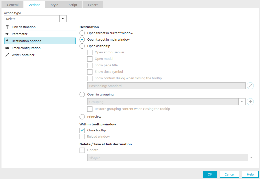
For the "No Action," "Save," and "Delete" actions associated with a button, you can configure here how the destination page should be loaded.
Open in the current window
Loads the destination page in the currently open window.
When buttons with this setting load pages from portlets, the pages are displayed in the portlet with the "Open in current window" setting. For pages with a lot of content, not all page elements may be displayed. In this case, the "Open in Main Window" setting is more suitable, as it allows the loaded page to be displayed in its entirety.
Open in the main window
Loads the destination page in the main window.
Loads the landing page in the tooltip. The following additional settings can be configured here:
-
Open on mouseover
Loads the landing page when the mouse hovers over the tooltip.
-
Open Modal
This setting is not available if the "Open on Mouseover" setting is enabled.
A modal dialog box freezes the rest of the application while it is displayed. This allows access only to application elements within the modal dialog, but not to elements located outside the dialog.
-
Show Page Title
The page title appears in the browser's title bar of the tooltip. You can move the tooltip using drag-and-drop by clicking on the page title. This isn't possible without the page title.
-
Show Close Icon
A button appears in the upper-right corner of the tooltip that can be used to close the tooltip.
-
 Configure the Position of the Tooltip
Clicking this button opens a dialog box that allows you to adjust the position of the tooltip on the page.
-
Show confirmation dialog when closing
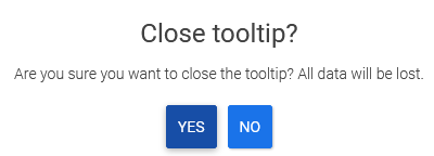
With this setting, the message shown above appears when a tooltip page is about to be closed using the close icon in the upper-right corner (
 ) and there is data entered in input or text fields. This helps prevent accidental data loss. For this setting to work, the elements must not be in the hidden area. You also shouldn't be read-only. This setting is not available in the " Show/Hide " action.
Open in Group (embedded tooltip)
With this setting, the tooltip is integrated into a group on the current page, which can be selected below the setting. The grouping must use the "DIV" HTML element. If an HTML element other than a DIV is used in a grouping that serves as the target container for a tooltip, a warning message appears. In addition, the "Messages" section lists the elements in which this grouping is set as the target container. From there, you can double-click to navigate to the triggering elements.
 Create a New Group
Creates a new, empty grouping.
Restore the grouping when the tooltip is closed
When the tooltip is displayed within a group, it takes up the entire container. Any existing content will be overwritten. When the "Restore grouping content when closing the tooltip" setting is enabled, the original content is displayed again when the tooltip is closed. If this setting is not enabled, the grouping remains empty.
Open as a print preview
With this setting, the page can be printed from the browser. All buttons are hidden in the print preview of a page. A "Print" button appears automatically at the bottom of the page, which opens the system dialog for selecting a printer.
You can customize the print preview layout using custom styles. You can find more information here.
Current page is Tooltip
These settings are relevant when the page where the landing page options are configured is itself displayed in the tooltip.
Close tooltip
Closes the current page when you click the button.
Reload the pop-up window
The current page will be refreshed with this setting.
Delete / Save in Jump Destination
If the destination page opens in a pop-up or tooltip, you can specify here which part of the page from which the destination page is loaded should be refreshed. After performing a delete or save action on the target page, you can refresh the entire page or just the table. If the button is located in a custom table, that custom table can also be reloaded. In this case, select the entry "<Current Custom Table>" from the "Update the following area" list.
Configure the Position of the Tooltip
For the "Save," "Delete," and "No Action" button actions—found in the destination page options—and the "Show/Hide (Flexible)" button action, you can configure the position where the corresponding tooltip should appear.
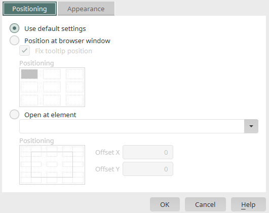
Use default settings
Depending on the other settings (e.g., a modal tooltip), the positioning used previously will be applied. By default, the tooltip is always aligned with the button that has focus, for example.
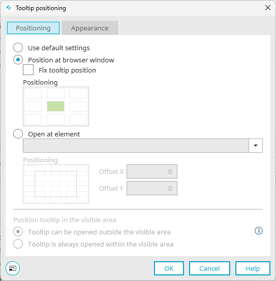
Position in the browser window
If this setting is enabled, the tooltip will be aligned with the browser window. Click in the graphic below the setting to set the position of the tooltip relative to the browser window.
Lock Tooltip
With this setting, the tooltip remains at the assigned window position and does not scroll with the page content.
Open in Element
Here, you can select an element for which you want to open the tooltip.
Starting with Intrexx version 12.1.0:
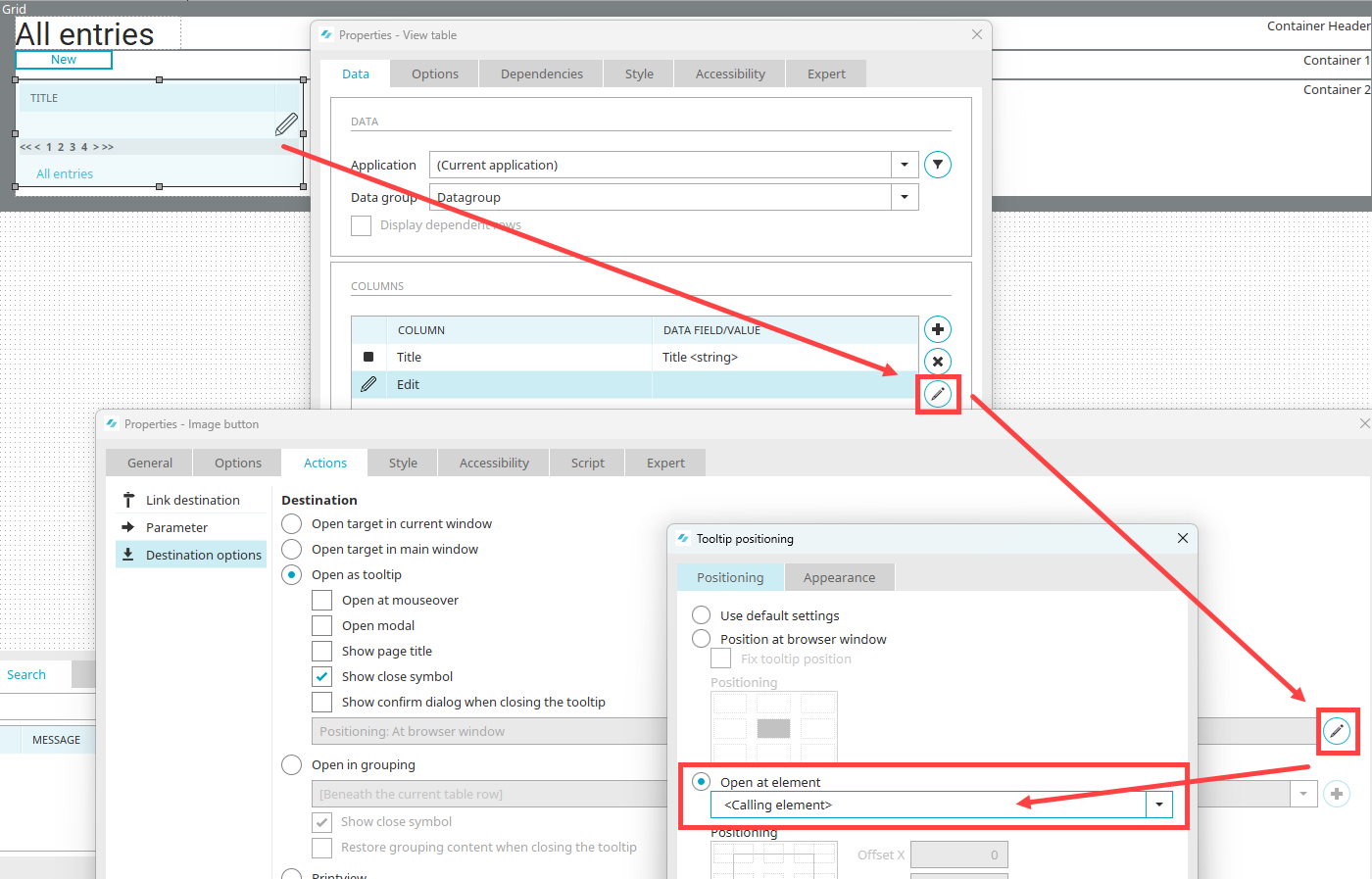
To open a tooltip directly on the calling element for items in a view table (e.g., buttons), select the "Calling Element" option here.
Positioning
Here, the element is represented by a frame and green dots. The areas around the points correspond to the future position of the tooltip. Click the location in the positioning diagram where you want the tooltip to open.
X/Y Offset
Here, you can specify an additional distance from the element in pixels. Offset X moves the tooltip away from the element along the horizontal axis, and Offset Y moves it away along the vertical axis.
Examples
The following figure shows some examples of how positioning without an offset is implemented in the browser.
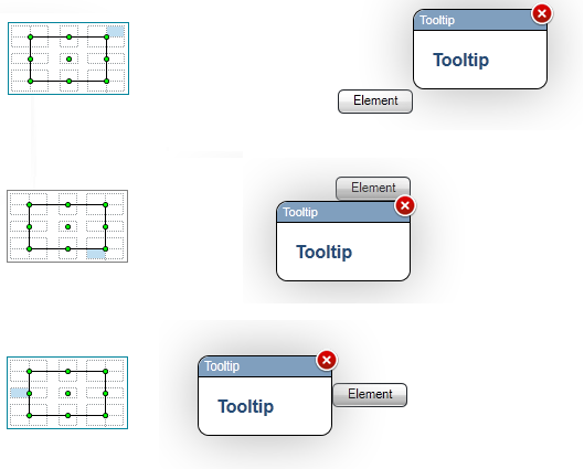
Using the last two settings in the dialog, you can specify whether the tooltip opens inside or outside the viewport:
-
The tooltip can be opened outside the visible area
-
The tooltip always opens within the visible area
Presentation
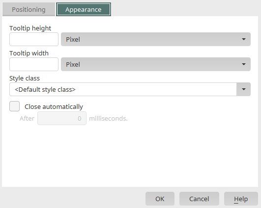
Height / Width of the tooltip
Here, you can specify the height or width of the tooltip in pixels or as a percentage of the window's height or width.
Style Class
Here, you can select one of the style classes defined in the "Design" module for tooltips. Selecting "Default Style Class" sets the default style class for tooltips.
Close automatically
The tooltip closes automatically after the specified time has elapsed.
After ... milliseconds
Enter the time, in milliseconds, after which the tooltip should close.