

Page Assistant
The Page Assistant helps you create and expand applications. It guides you through the design process and creates fully responsive, stylish app pages. The pages created with the wizard are responsive.
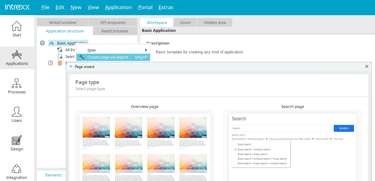
You can access the Page Wizard in the "Applications" module via the main menu option "New / Create Page with Wizard" when an application node or a data group is selected in the application structure. It can also be accessed via the context menu of the application node or a data group. You can launch the Page Assistant from the toolbar by clicking the corresponding "  " icon.
You can also use the "New" option in the main menu to create input pages and view pages. When you select one of the two menu options, a dialog box will appear where you can choose whether to create a blank page or launch the Page Wizard.
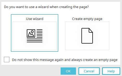
If desired, this dialog page can also be permanently disabled by selecting the setting "Do not show this message again and always create a blank page." New pages will then be created without using the wizard. The wizard can still be accessed via the main menu, the context menu, or the toolbar.
Page Types
If you launch the Page Assistant while an application node is selected, the first step allows you to choose between the page types "Overview Page" and "Search Page."
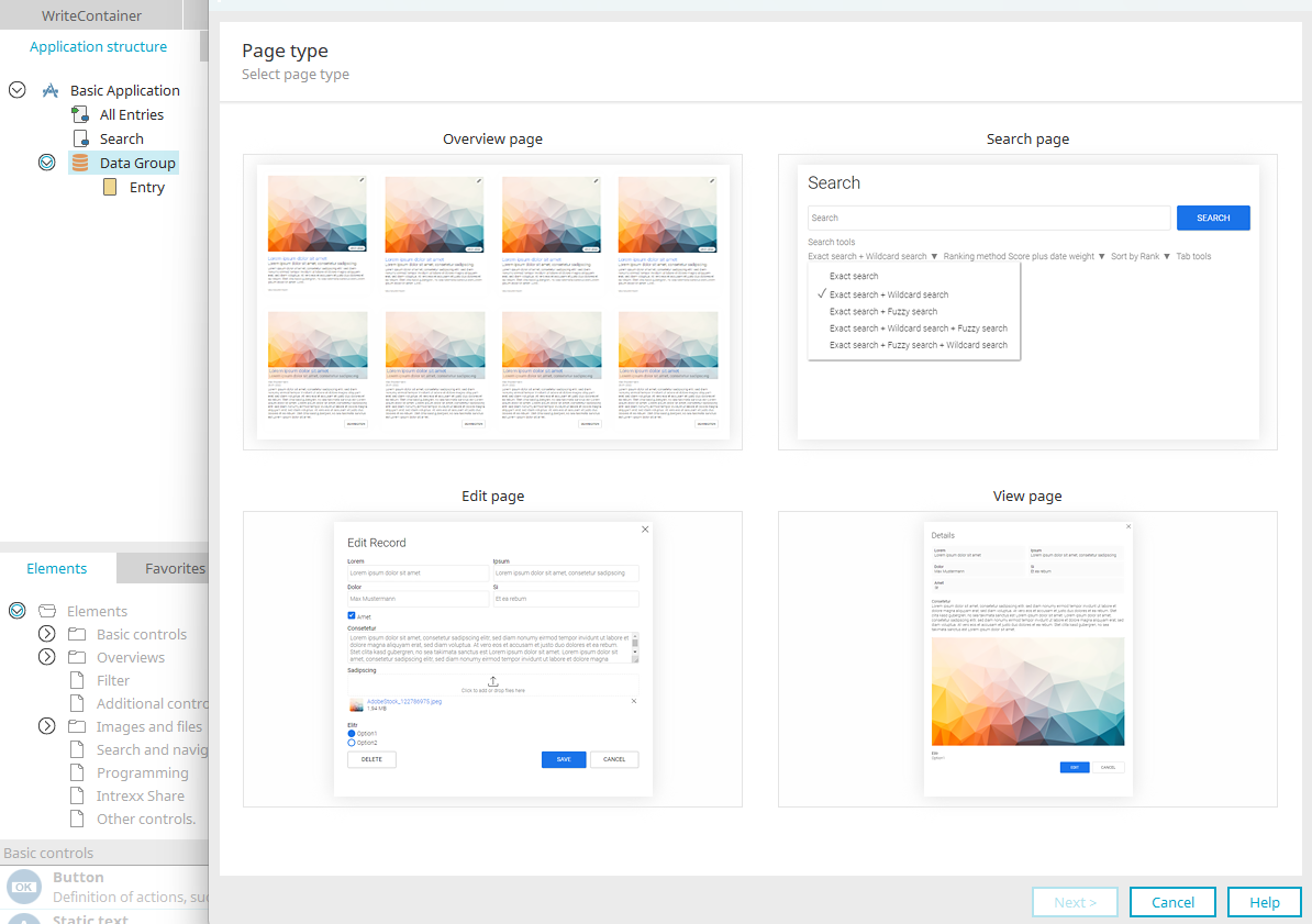
If you launch the Page Assistant with a data group selected, you also have the option here to create input and view pages.
Overview Page
To create a new overview page, follow these steps:
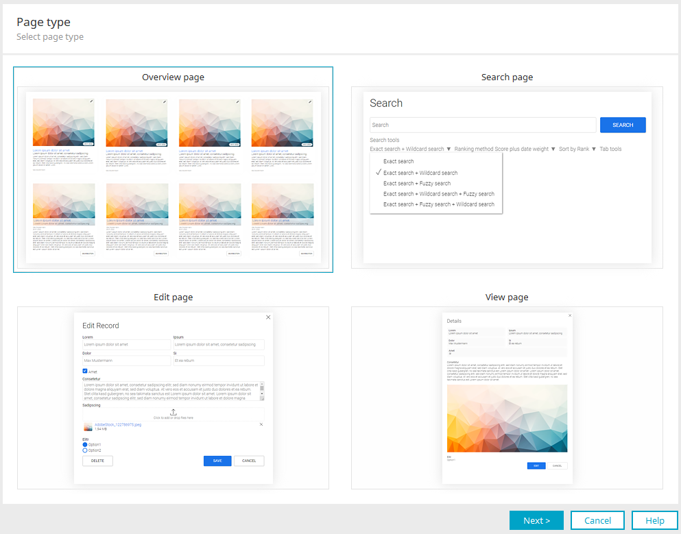
1. Select the thumbnail for an overview page here, and then click "Next."
Page Title
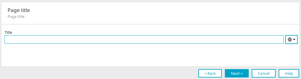
This dialog box is used on search pages as well as on overview pages.
2. You can enter the title here, including multilingual versions. Click "Next."
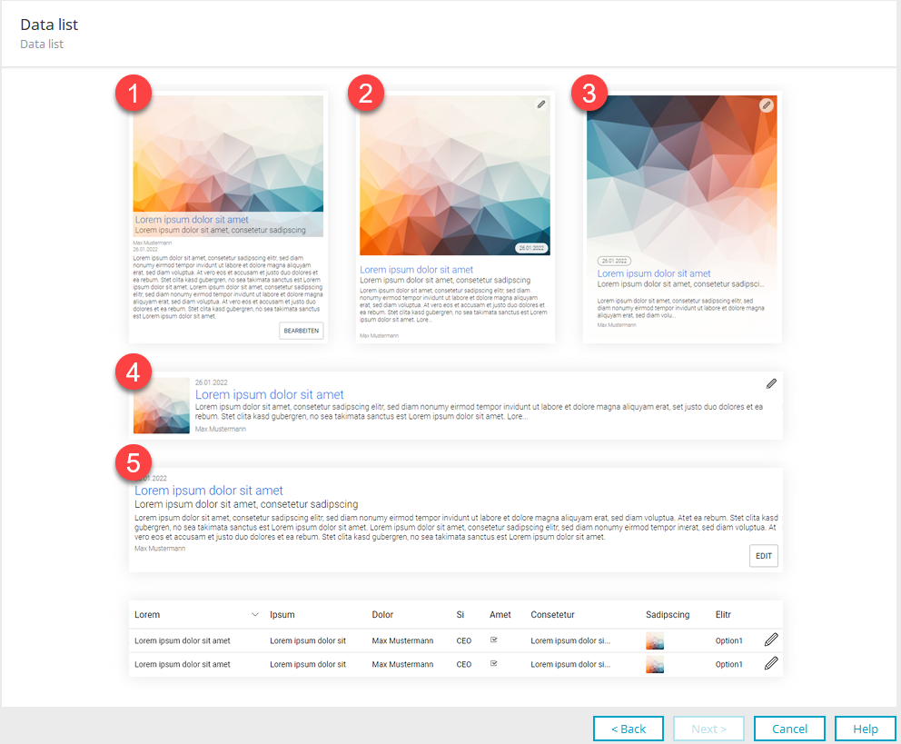
Select the type of data list here.
On an overview page, multiple data records are displayed in a tile view (1–5) or in a table (selectable at the bottom of the dialog). The wizard provides thumbnails that allow you to select a tile type or (at the bottom of the dialog) the tabular view.
The names of the tile components are provided as examples. For example, instead of a name, you can select a data field that contains other information. The key point is that the element will be displayed later as shown in the preview (for example, the "Title" in a slightly larger font and in blue).
Here is an overview of the components of the various tiles:
-
Tiles 1–4: Image (file)
-
Tile 1-5: Heading / Title, including optional jump target (string)
-
Tiles 1-3, 5: Subheading (string, integer, double, datetime)
-
Tile 1-5: Longer text (text, string)
-
Tile 1–5: Date (string, integer, double, datetime)
-
Tile 1-5: Name (string, integer, double, datetime)
-
Tiles 1–5: Edit button
3. Select the preview you want, and then click "Next."
The following section describes the various options for displaying data sets in the order in which they appear in the dialog shown above—from left to right and top to bottom.
1. Vertical Tile
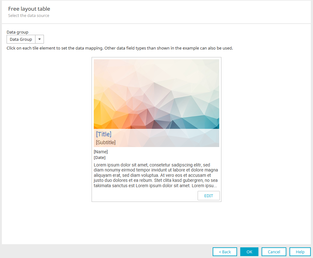
Data Group
Select the data group here whose data you want to display in the tile.
Title / Subtitle / Name / Date / Text
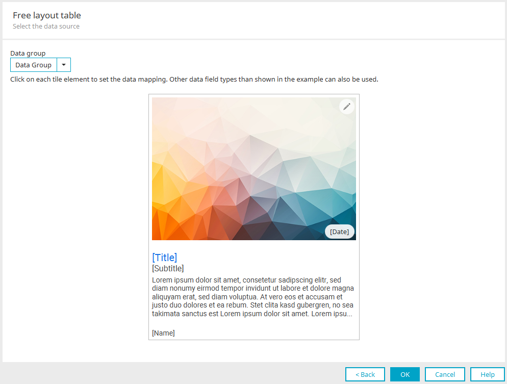
If you click on one of the components here—for example, the title—another dialog box will open where you can specify the data mapping. You have complete flexibility in choosing the data types. You are not required to use a corresponding data field with the appropriate data type for each tile component. Instead of a title, you can also use a numeric value, for example, or plain text instead of a date. Find out here which components can be used in which tile.
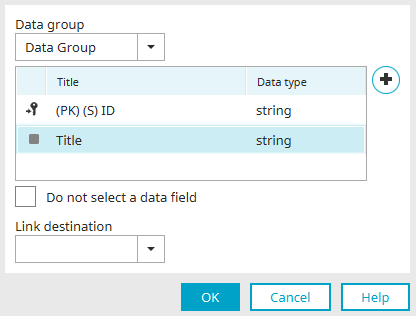
Here, you can change the data group and assign the desired data field if necessary. Clicking "Add Data Field" at  opens a dialog box where you can create a new data field. "Do not select a data field" specifies the desired control without linking it to a data field. You can also set a jump target for the title here. The value is then generated as a link that can be used to navigate to the destination.
Click "OK" to save the changes and close the dialog box.
Click "Edit" here.
Edit
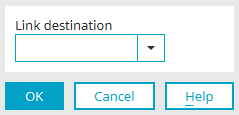
This component is a button that allows you to edit the page's data. Here, you can only change the link destination for this button.
Click "OK" to save the changes and close the dialog box.
Click "OK" here as well.
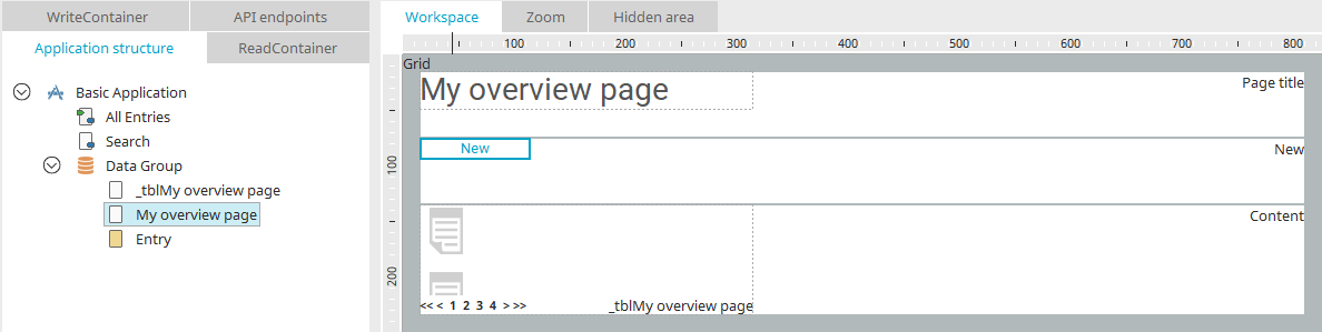
The overview page has now been created. If you started the wizard from the selected application node, you will find the page at the top level of the application structure. When creating a page using a data group, you'll find the new page within the data group.
No check is generated for components that were not assigned during configuration. So this element is then "missing" from the newly created page. The exception is the "Edit" button—this is created for tiles even if no link destination has been selected.
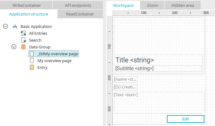
In addition to the actual overview page, the wizard also creates the data view page, which is integrated into the customizable table on the overview page.
2. Vertical Tile
On the second vertical tile, you'll find the "Edit" button in the upper-right corner. The date is located at the bottom right of the tile image. Below that are the title, subtitle, text, and the name of the editor or creator.
In the description of the first vertical tile, you will find all the information you need about selecting the data group whose data is to be displayed in the tile and about mapping the individual components of the tile.
3. Vertical Tile
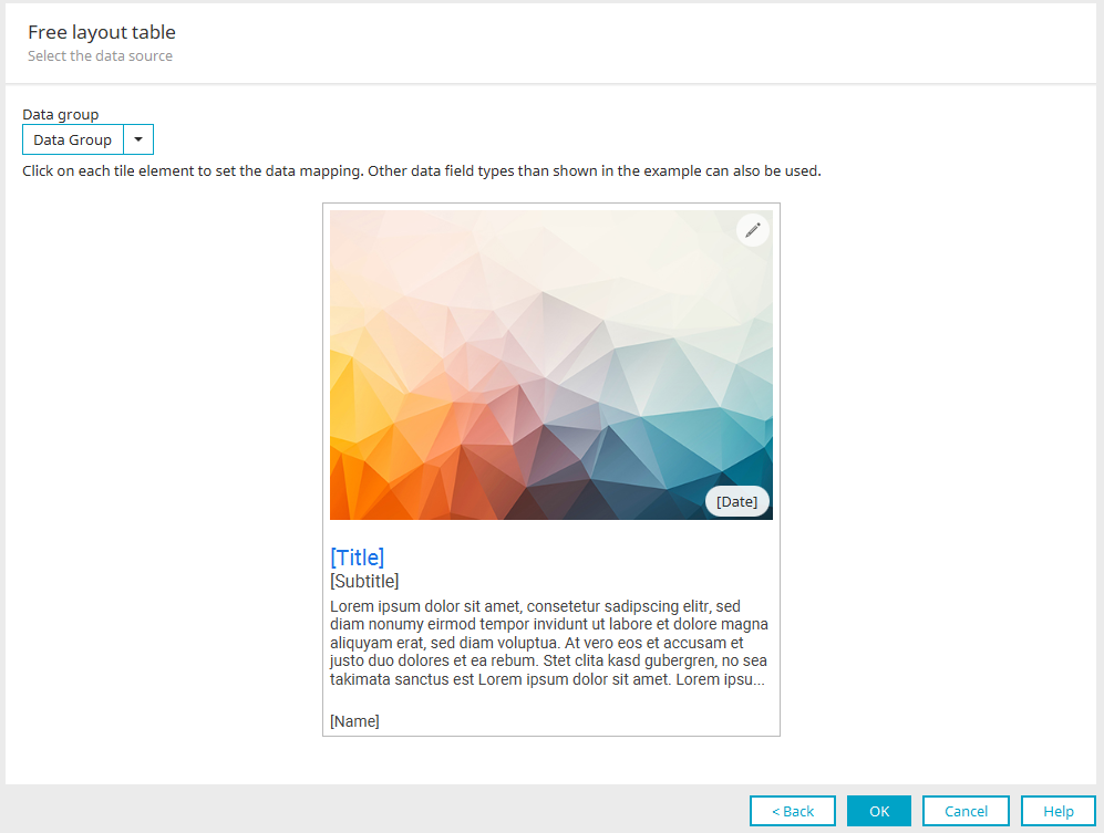
On the third vertical tile, you'll find the "Edit" button in the upper-right corner. The date is located at the bottom left of the tile image. Below that are the title, subtitle, text, and the name of the editor or creator.
In the description of the first vertical tile, you will find all the information you need about selecting the data group whose data is to be displayed in the tile and about mapping the individual components of the tile.
4. Horizontal Tile
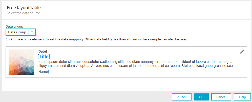
On the first horizontal tile, the tile image is on the left, with the date, title, text, and the name of the editor or creator to the left and right of it. The "Edit" button is located in the upper right corner.
In the description of the first vertical tile, you will find all the information you need about selecting the data group whose data is to be displayed in the tile and about mapping the individual components of the tile.
5. Horizontal Tile
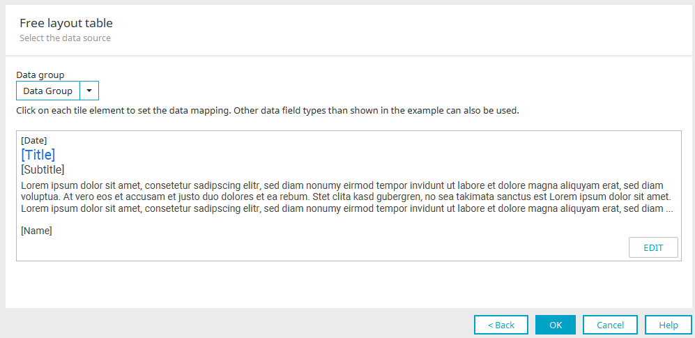
In the second horizontal tile, the date, title, subtitle, text, and the name of the editor or creator appear one below the other. The "Edit" button is located at the bottom right.
In the description of the first vertical tile, you will find all the information you need about selecting the data group whose data is to be displayed in the tile and about mapping the individual components of the tile.
6. View Table
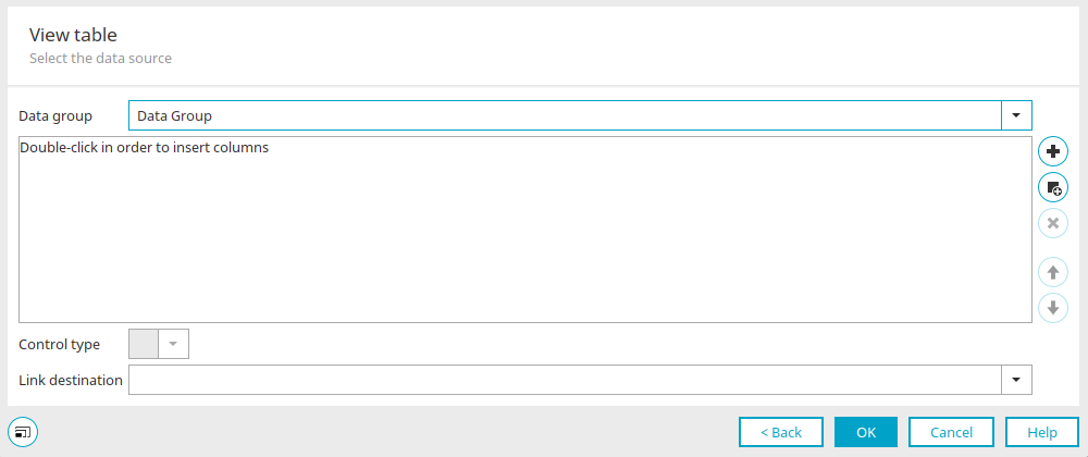
With this template, the data is displayed in a view table rather than in a tile.
Select the data group whose data you want to display.
Create a data field
Opens a dialog box where you can create a new data field. The data field is automatically added to the table as a column.
 Add a check
Opens a dialog box in which existing data fields can be added as table columns.
 Remove Checkmark
Removes the selected control from the table.
Control Type
Select the desired control type for the currently selected table column here.
Jump to
Select the page here that you want to load when you click on a record in the table.
Style Classes
Tiles are implemented using custom tables with special style classes. Among other things, style classes determine how many data points are displayed in a row.
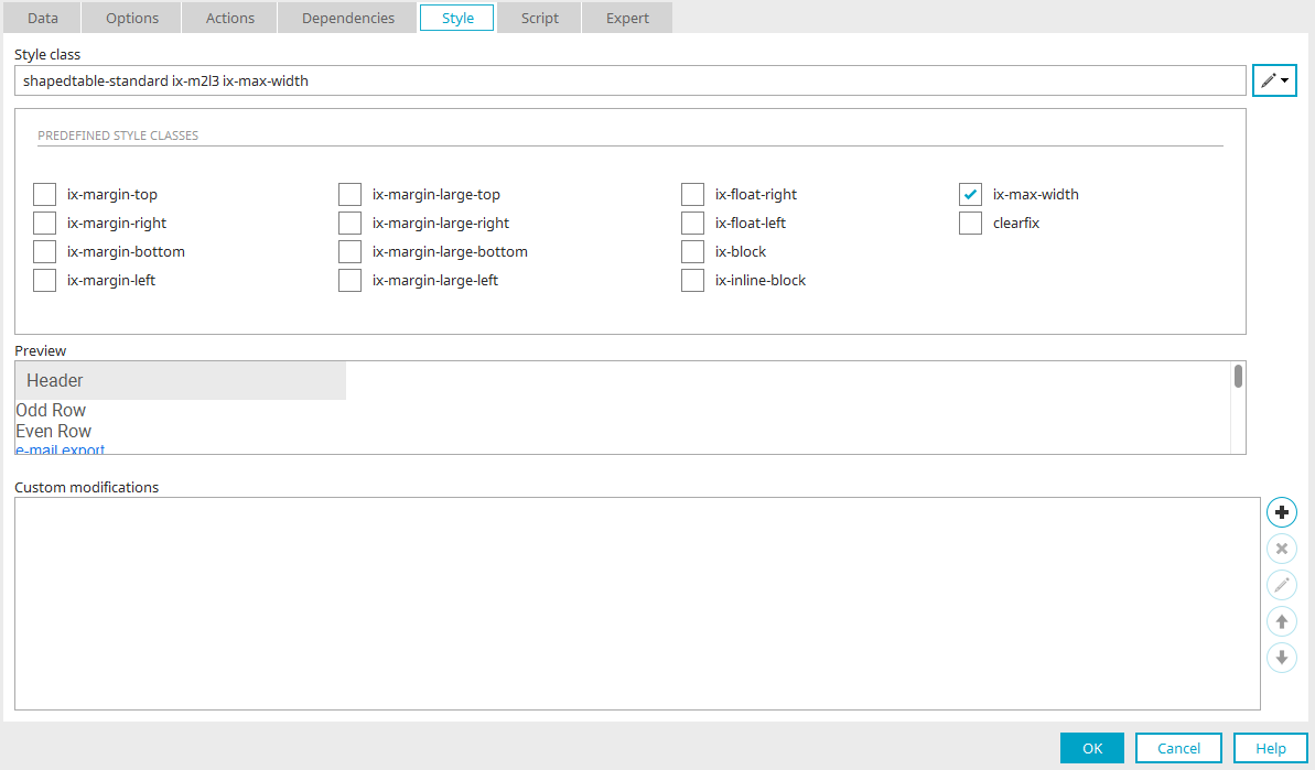
For the vertical tiles (1–3), the style class .ix-m2l3 is set in the "View" tab of the customizable tables. This results in the following display on the various screen sizes:
-
On small screens (S), all data records are displayed one below the other
-
On medium-sized screens (M), two data sets are displayed in each row
-
On large screens (L), three data sets are displayed in each row
To change the number of data records displayed per row, simply adjust the style class on the "View" tab of the customizable table.
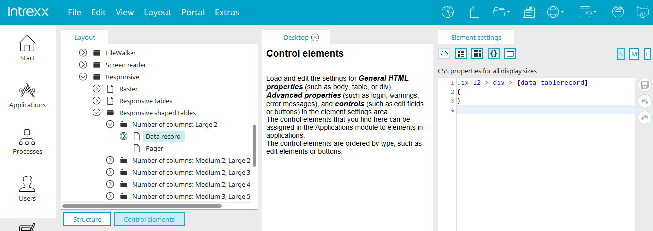
When Expert Mode is enabled, you can find the following additional style classes for arranging tiles in the "Design" module, in the "Layout / Control Elements" section, under "Advanced Properties" in the "Responsive" folder:
-
.ix-l2
-
.ix-m2l2
-
.ix-m2l3
-
.ix-m2l4
-
.ix-m3l5
-
.ix-s2m4l6
-
.ix-s2m5l7
Search Page
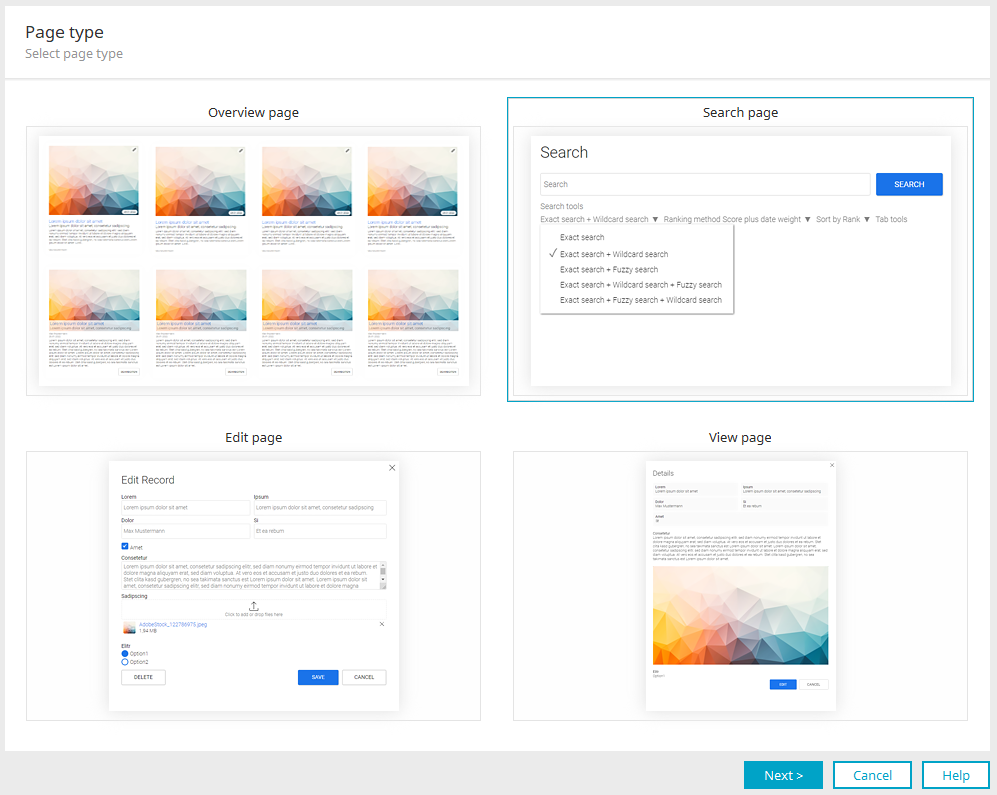
Select the thumbnail for a search page here, and then click "Next."
Page Title
You can enter the page title here, including multilingual versions. Click "Next."
Search
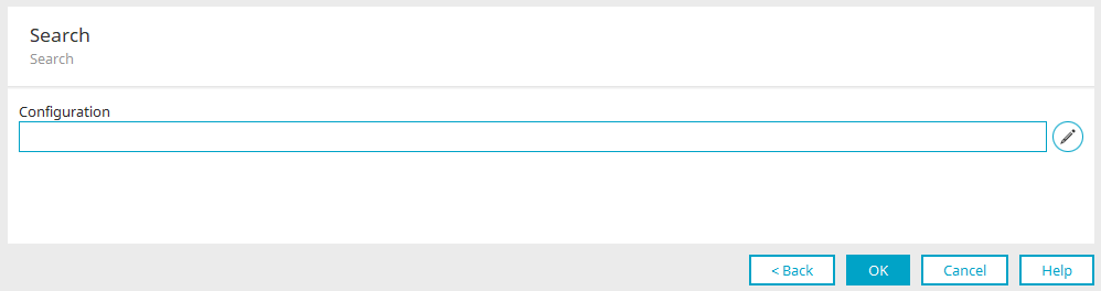
Clicking "Select Search Configuration" at  opens a dialog box where you can select the desired search configuration. If there isn't a (suitable) search configuration yet, you can create one there. You can access help for the settings required there by pressing F1 in the dialog box or by clicking the Help button. Once selected, the name of the search configuration is entered in the "Configuration" field. Click "OK."
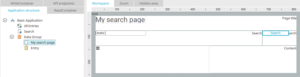
The search page has now been created. If you started the wizard from the selected application node, you will find the page at the top level of the application structure. When creating a page using a data group, you'll find the new page within the data group.
For more information on configuring the search, click here.
Input Page
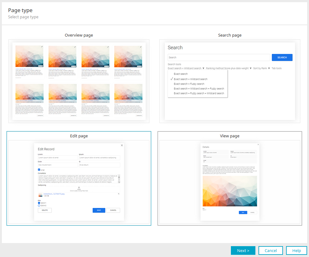
Input pages can be created using the Page Wizard when it is launched from a selected data group. Select the "Input Page" preview here and click "Next."
You can enter the page title here, including multilingual versions. Click "Next."
Input Elements
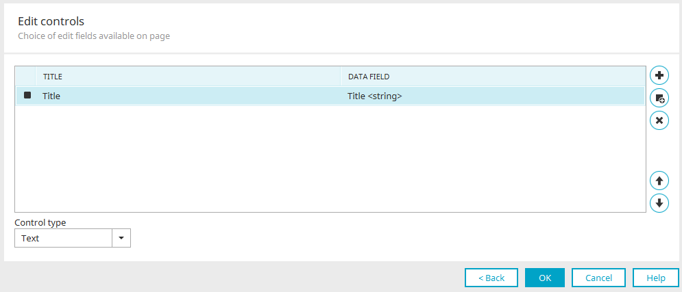
Here, you can specify the input elements for the new page and their order. You'll also find the same dialog box for view elements.
The controls are placed in grid containers. A distinction is made between large-scale and small-scale inspections. Small controls are assigned a container width of 6 for screen sizes M and L. Large checks have a container width of 12 for sizes M and L. On screen size S, all controls have a container width of 12.
The controls are placed row by row from left to right within the grid.
Create a data field
Opens a dialog box where you can create new data fields in the current data group.
Add a check
Opens a dialog box where you can select existing data fields for the object in the group.
Remove Checkmark
Removes the currently selected item from the list.

 Move up / down
Changes the order of the elements. The rule is: the higher an item is positioned in the list, the higher up it will appear on the new page.
Control Type
Here, you can select the format in which the control's content should be displayed in the browser.
- Multiple selection
- Dynamic View
Click "OK" in all dialog boxes to save the settings and close the Page Wizard.
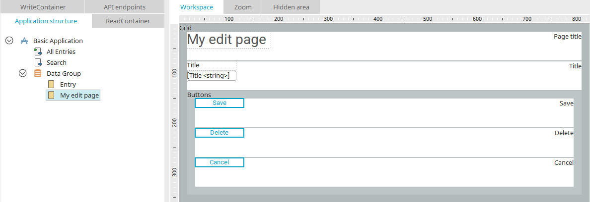
The input page has now been created within the data group from which the Page Wizard was launched.
View Page
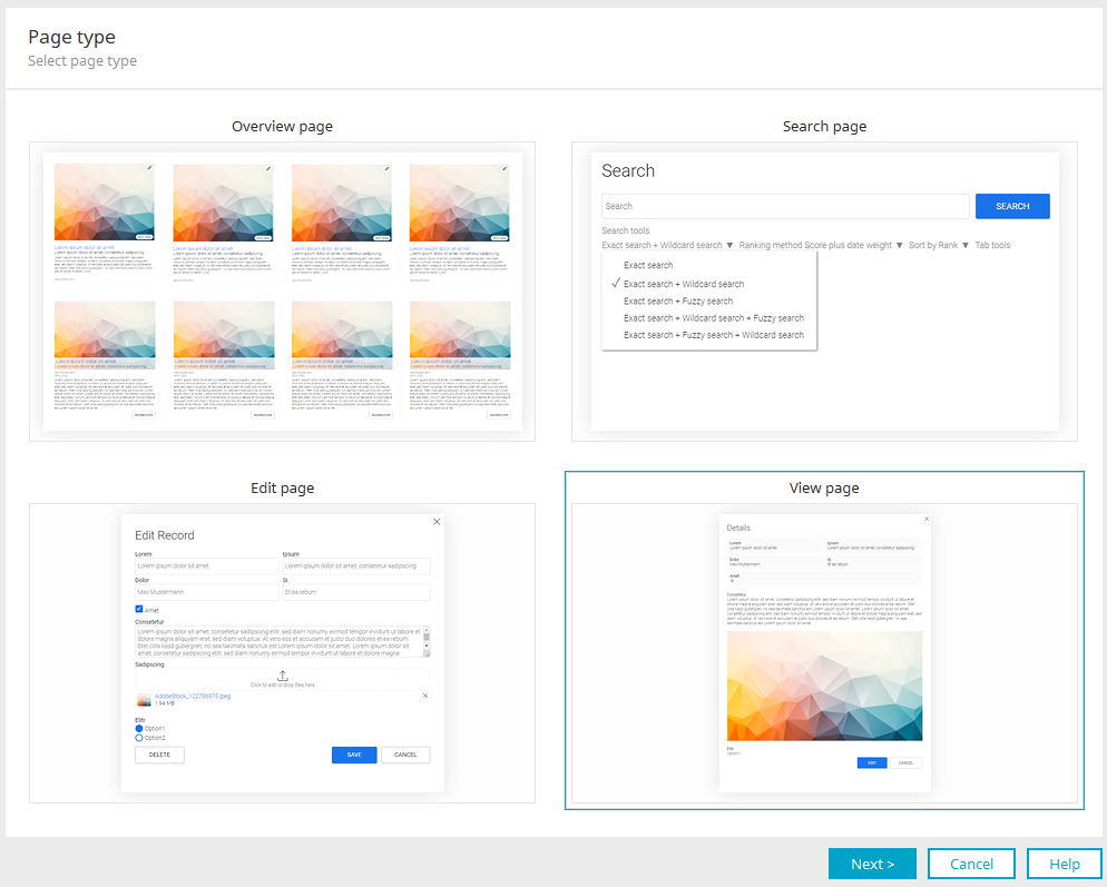
View pages can be created using the Page Wizard when it is launched from a selected data group. Select the "View Page" preview here and click "Next."
You can enter the page title here, including multilingual versions. Click "Next."
View Elements
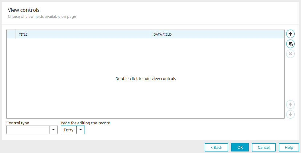
Here, just as when creating an input page, you can specify the view elements for the new view page and their order. You can find all the information about the settings in the dialog box here.
When creating a view page, you can also select the page for editing the record. On the new view page, you can then use the automatically generated "Edit" button to navigate to the desired input page.
- Dynamic View
- Web application (string)
- Tree path (integer)
- Multiple selection
Display images as a gallery
To display images as a gallery rather than as a list of files, you must select the "Image" control type in the wizard.
Synchronize Icons
To ensure that the new GIFs for the Page Assistant's checkboxes appear in Portal Manager, you must manually refresh the collection once.
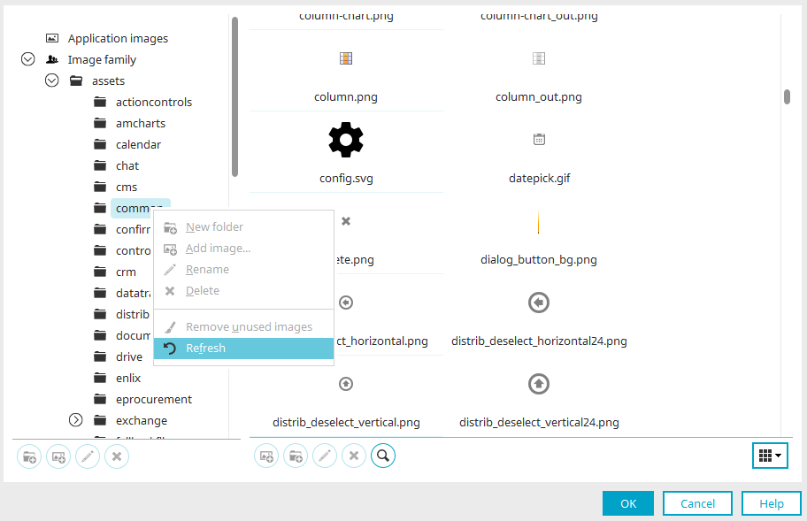
To do this, open the image selection dialog (for example, via the Properties dialog for the "View Checkbox" element) and select the "Refresh" context menu item in the tree on the left.
Form Wizard
You can find all the information on this topic here.