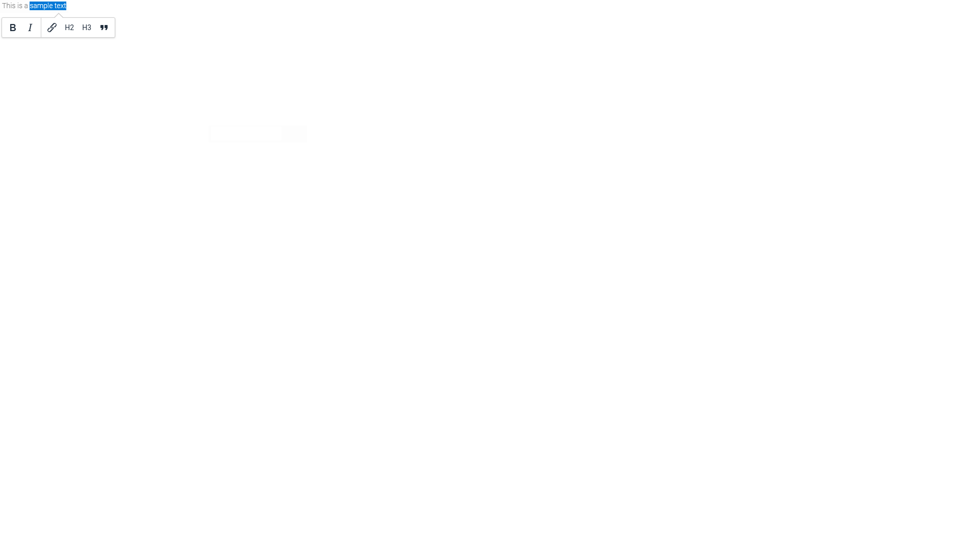
Text area / View text area
The "Text box" edit element and the "View text area" view field are among the basic controls.
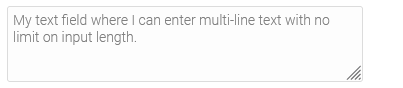
Multi-line text can be entered in text fields. The input length is not limited. Text boxes can only be connected to fields with the type "Text". The text box can be set as a markdown editor or as a TinyMCE editor in addition to inputting plain, unformatted text.
The "View text area" is only used to display data entered in a data field of the data type "text". You can link the element with the desired data field both when creating the element as well as afterwards.
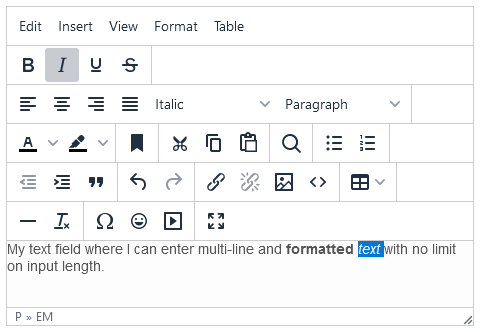
The figure above shows the text box where any text can be entered as needed. This input can be saved with a corresponding button, provided that a data field is linked to the text box.
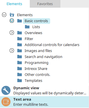
The text box element can be found in the "Elements" section of the "Applications" module. A new text box can be created by dragging and dropping the element from here and positioning it in the workspace.
More information on creating elements can be found here.
The properties dialog of a text field element opens automatically when a new text field is created. The properties dialog of an existing text field can be opened by double-clicking on the element on the workspace, via the context menu "Properties" or via the main menu "Edit / Properties" if the text field is selected on the workspace.
Text field (input element)
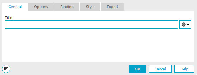
General
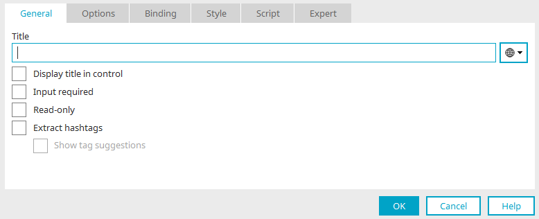
Title
Provide the text area with a title here. Further information on multilingual titles and the use of language constants can be found here.
Display title in control
This setting means the title will be displayed in the edit field when it is viewed in the browser.
Input required
This setting makes the edit field into a mandatory field.
Write-protected
The text area cannot be edited if this setting is active.
Extract hashtags
When entering the text, hashtags can be created by inserting a "#" in front of the desired characters (e.g. "#mytag"). When the text is saved, the hashtags will be extracted and saved. The hashtags can then be depicted by the View tagging - Bookmarks element. The text can contain as many hashtags as desired.
Show tag suggestions
When text is entered in the element, a tooltip will display suggestions based on existing tags. Clicking on this suggestion will insert it as a hashtag.
With this setting, the options "Use TinyMCE" and "Use Markdown Editor" cannot be selected in the next step on the "Options" tab. Tag suggestions cannot be displayed in the editors.
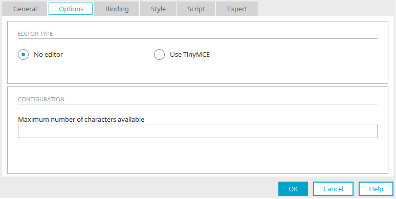
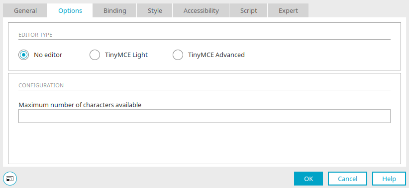
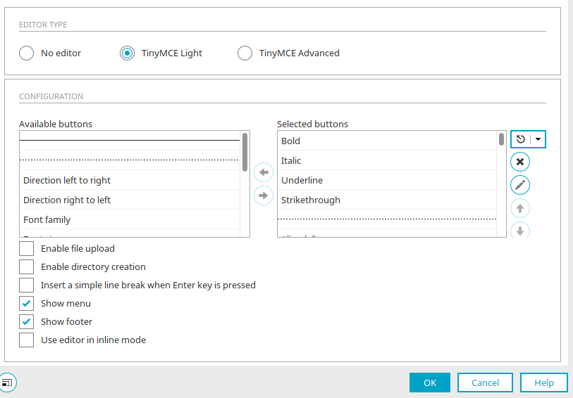
Options
No editor
Simple text can be entered in the browser with this option. The size of the text field can be changed at the bottom right by dragging it with the mouse.
Intrexx version 12.0.1
The TinyMCE editor is available in a Light and an Advanced version. You can find more information here:
Maximum number of characters available
This setting limits the number of characters that can be entered in the text field.
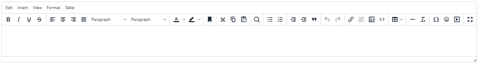
Use TinyMCE
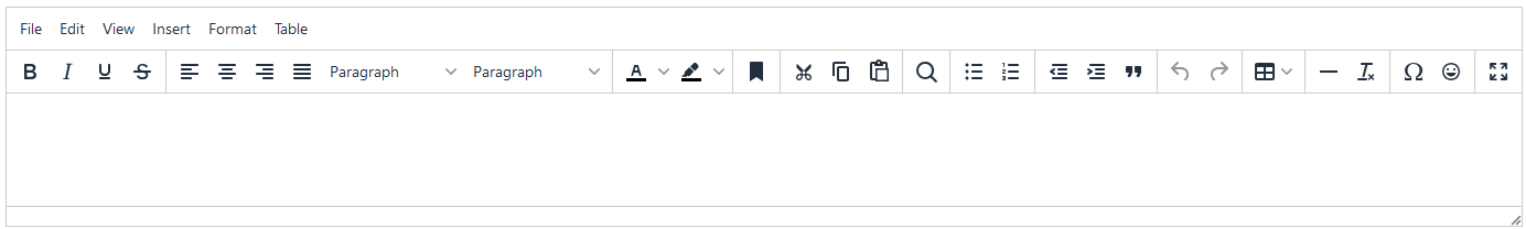
The text field becomes an HTML editor in the browser. At the top you will find a number of buttons that can be used to format the text. The size of the editor can be changed at the bottom right by dragging it with the mouse.
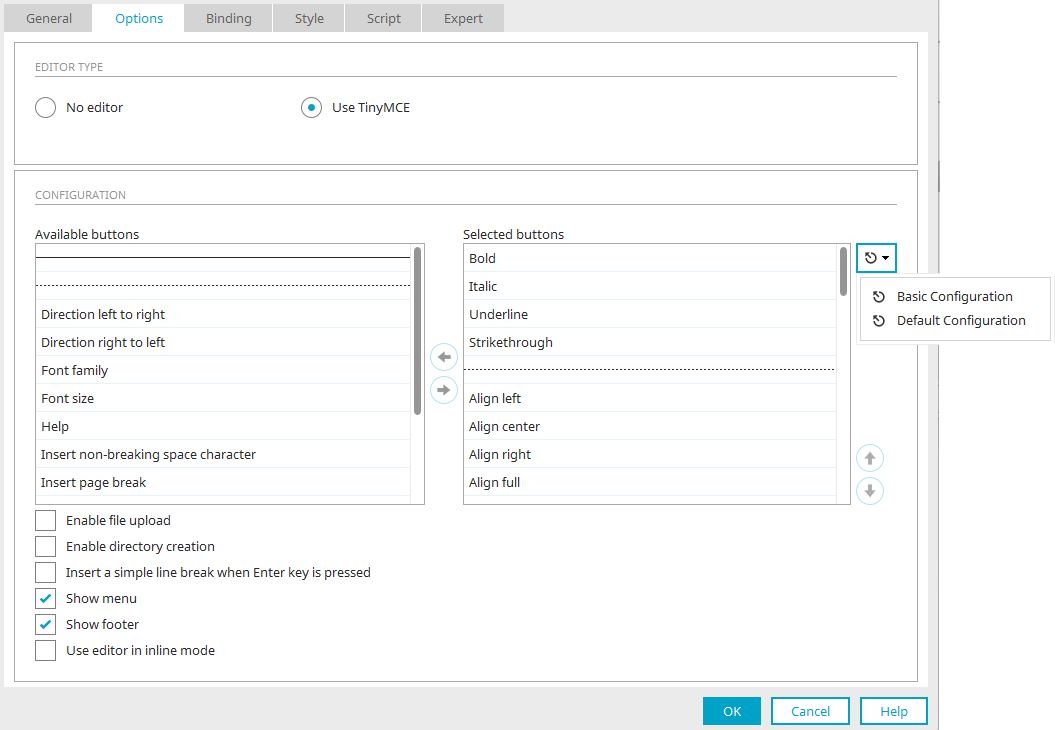
You can select the desired buttons in the configuration.
Available / Selected buttons
Here, you will find all buttons that you can add to the editor. If you want to add an additional button, highlight it in the column and move it with the arrow button to the "Selected buttons" column. With the dotted line, buttons will be visually combined into groups. In this way, you will get a clear overview in the Editor. The solid line will be used to create an additional icon bar below a previous one.
 Move right / Move left
The selected field is moved to the right/left column, respectively.
 Load standard configuration
By clicking on this button, the settings can be reset to a basic configuration with the most necessary buttons or the default configuration. If you click on the arrow to the right, a corresponding menu will open.
 Delete configuration
Moves all elements from the "Selected buttons" column back to the "Available buttons" column
 Edit additional configuration
Click here for more information on this topic.
 Move up / Move down
These define the order of the buttons in the editor. The following applies here: The higher the button is in the list, the further to the left it will be shown in the editor toolbar.
Enable file upload
With this setting, files can be uploaded using the text editor, for example if an image will be inserted.
Enable directory creation
Enables the creation of directories.
Insert a single line break by pressing the Enter key
Inserts a simple line break when the Enter key is pressed in the editor.
Show menu
Displays the menu in the editor.
Show footer
Displays which HTML element is currently being edited in the status bar at the bottom of the editor, depending on the position of the cursor.
Use editor in inline mode
An IFrame element is not used in inline mode. Therefore, the content is depicted exactly as it will be later in the portal. More information about inline mode is available here.
When used in conjunction with tooltips, the inline mode can cause problems with the appearance of the editor toolbar. Alternatively, the quickbar plugin can be used. Click here to find out how to integrate this plugin.
Click here for an example of the plugin.
Another alternative to the inline mode can be found here.
Intrexx version 12.0.1
TinyMCE Light
The light version does not support external sources (links, images, html code, media) - neither in buttons nor in the menu or context menu. The following buttons are not supported:
-
link (insert/change link)
-
unlink (remove link)
-
image (insert/replace image)
-
code (edit HTML source code)
-
media (embed/edit multimedia)
You can select the desired buttons in the configuration.
Available / Selected buttons
Here, you will find all buttons that you can add to the editor. If you want to add an additional button, highlight it in the column and move it with the arrow button to the "Selected buttons" column. With the dotted line, buttons will be visually combined into groups. In this way, you will get a clear overview in the Editor. The solid line will be used to create an additional icon bar below a previous one.
Move right / Move left
The selected field is moved to the right/left column, respectively.
Load standard configuration
Click on this button to reset the settings to the default configuration. If you click on the arrow to the right, a corresponding menu will open.
Delete configuration
Moves all elements from the "Selected buttons" column back to the "Available buttons" column
Edit additional configuration
Click here for more information on this topic.
Move up / Move down
These define the order of the buttons in the editor. The following applies here: The higher the button is in the list, the further to the left it will be shown in the editor toolbar.
Enable file upload
This setting has no function in the TinyMCE Light editor.
Enable directory creation
Enables the creation of directories.
Insert a single line break by pressing the Enter key
Inserts a simple line break when the Enter key is pressed in the editor.
Show menu
Displays the menu in the editor.
Show footer
Displays which HTML element is currently being edited in the status bar at the bottom of the editor, depending on the position of the cursor.
Use editor in inline mode
An IFrame element is not used in inline mode. Therefore, the content is depicted exactly as it will be later in the portal. More information about inline mode is available here.
When used in conjunction with tooltips, the inline mode can cause problems with the appearance of the editor toolbar. Alternatively, the quickbar plugin can be used. Click here to find out how to integrate this plugin.
Click here for an example of the plugin.
Another alternative to the inline mode can be found here.
Intrexx version 12.0.1
TinyMCE Advanced
The TinyMCE editor is available in the Advanced version, which also supports external sources as before. In addition to the standard configuration, you can also select a basic configuration with the most necessary buttons here.
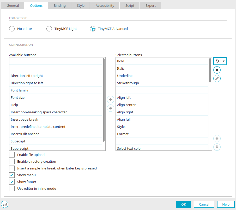
Enable file upload
With this setting, files can be uploaded using the text editor, for example if an image will be inserted.
Images or files embedded in HTML are visible to all users in the Intrexx portal and are not subject to the authorization check of a data record in Intrexx. This function is therefore only suitable for publicly visible files. In other cases, please use a file field in the data group and add a file selection to the page.
All other settings in the properties of the editor correspond to the settings that you will also find in TinyMCE Light.
File manager
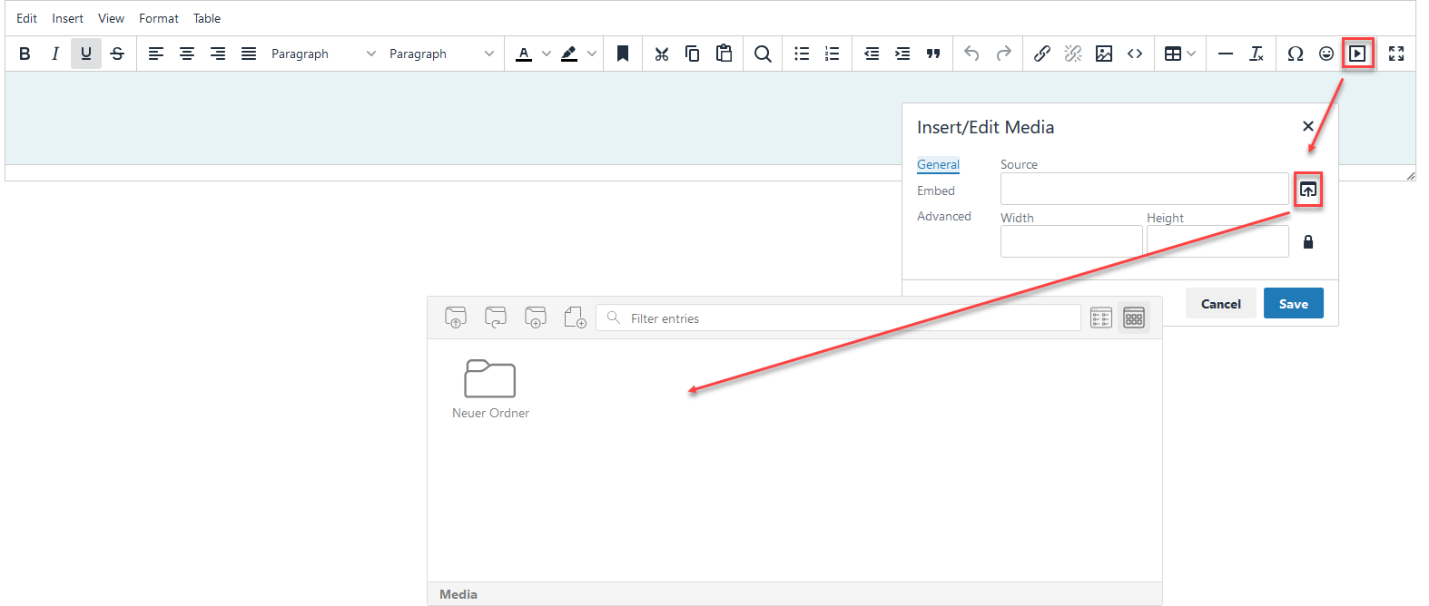
If file upload is permitted in the settings, you can access the file manager in the browser in the editor toolbar by clicking on  "Insert / Edit Media". In the next dialog, click on
  "Source". You can then manage the desired files in the file manager - in a folder structure if desired.
Use Markdown Editor
Since Intrexx version 11.3.0, the content editor is available for Markdown. Click here for more information.
Additional configuration TinyMCE
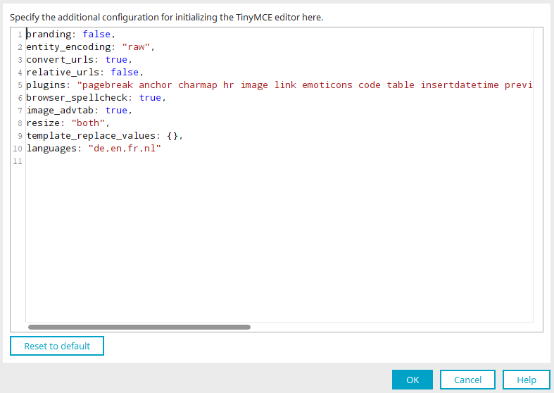
Additional configurations for initializing the TinyMCE Editor can be stated with a JSON string here. There must be no comma in the last line of the code.
Please note that INTREXX Ltd does not provide support for additional configurations. United Planet does not assume any liability for incorrect modifications.
Examples of editor configurations
Add individual buttons
If you want to adjust the "Setup" property in the additional configuration, you must store the functions under "additionalSetup". When adding buttons, additional buttons must be defined as 'additionalButtons: "Button1 Button2"' and added to the existing toolbar (or via toolbar2: "Button1 Button2").
            branding: false,
entity_encoding: "raw",
convert_urls: true,
relative_urls: false,
plugins: "pagebreak anchor charmap hr image link emoticons code table insertdatetime preview media searchreplace print paste directionality fullscreen noneditable visualchars nonbreaking template lists",
browser_spellcheck: true,
image_advtab: true,
resize: "both",
template_replace_values: {},
languages: "de,en,fr,nl",
additionalButtons: 'myCustomToolbarButton',
base url: '/script/dist/tinymce',
suffix: '.min',
additionalSetup : function(ed) {
ed.ui.registry.addButton('myCustomToolbarButton', {
    text: 'My Custom Button',
    onAction: function(){alert('Button clicked!')}
  });
}
Add images in the editor via drag & drop and upload them automatically
            branding: false,
entity_encoding: "raw",
convert_urls: true,
relative_urls: true,
plugins: "pagebreak anchor charmap hr image link emoticons code table insertdatetime preview media searchreplace print paste directionality fullscreen noneditable visualchars nonbreaking template lists",
browser_spellcheck: true,
image_advtab: true,
resize: "both",
template_replace_values: {},
languages: "de,en,fr,nl",
automatic_uploads: true,
paste_data_images: true
Edit images in the editor with the imagetools plugin
            branding: false,
entity_encoding: "raw",
convert_urls: true,
relative_urls: true,
plugins: "pagebreak anchor charmap hr image imagetools link emoticons code table insertdatetime preview media searchreplace print paste directionality fullscreen noneditable visualchars nonbreaking template lists",
browser_spellcheck: true,
image_advtab: true,
resize: "both",
template_replace_values: {},
languages: "de,en,fr,nl"
Load and integrate an external plugin
            branding: false,
entity_encoding: "raw",
convert_urls: true,
external_plugins: {
  'tinycomments': 'https://cdn.tiny.cloud/1/no-api-key/tinymce/5/plugins.min.js?tinycomments=sdk'  },
relative_urls: true,
browser_spellcheck: true,
image_advtab: true,
resize: "both",
template_replace_values: {},
languages: "de,en,fr,nl",
toolbar1: false,
toolbar: 'bold italic underline | addcomment',
menubar: 'file edit view insert format tools tc',
menu: {
  tc: {
    title: 'TinyComments',
    items: 'addcomment showcomments deleteallconversations'    }
},
plugins: 'paste tinycomments',
tinycomments_mode: 'embedded',
tinycomments_author: 'Author'
The example uses a paid premium plugin. The example does not work if you have not purchased this specific plugin. Adapt the example accordingly to the plugin that you want to reload and integrate.
Quickbars plugin replaces the toolbar
            branding: false,
entity_encoding: "raw",
convert_urls: true,
relative_urls: true,
menubar: false,
plugins: [
  'autolink',
  'codesample',
  'link',
  'lists',
  'media',
  'powerpaste',
  'table',
  'textcolor',
  'image',
  'quickbars'  ],
toolbar: false,
toolbar1: false,
quickbars_insert_toolbar: 'quicktable image',
quickbars_selection_toolbar: 'bold italic | h2 h3 | blockquote quicklink',
contextmenu: 'inserttable | cell row column deletetable',
powerpaste_word_import: 'clean',
powerpaste_html_import: 'clean'
The editor is shown in the inline mode - menu and toolbar are hidden.
The quickbars plugin replaces the toolbar More informationUpdate documentation
You can find more examples here: https://www.tiny.cloud/docs/demo/
Text field view
General
As with the view field, only the title can be edited on the "General" tab in the properties dialog for the View text field. Information on multilingual titles and the use of language constants can be found here.
Options
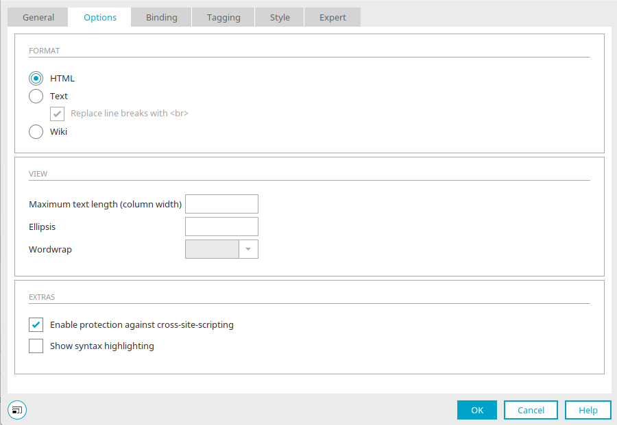
Format - "HTML"
The text is interpreted as HTML with this option.
View
These settings are only available if the text area is not in a table.
Maximum text length
The number of displayed characters can be limited here. If you enter -1, all characters are shown.
Ellipsis
The character entered here will be attached to the last displayed character when the text length exceeds the maximum allowed text length.
Wordwrap
You can define the type of line break here.
Extras
Activate protection against Cross-Site-Scripting
Prevents information from a context, where it is not trusted, from being inserted into a context where it would be classified as trustworthy.
Show syntax highlighting
Activates syntax highlighting when viewing source code in the text area (applies to the options HTML and Markdown).
Column presentation in view tables
Click here for more information.
Format - "Text"
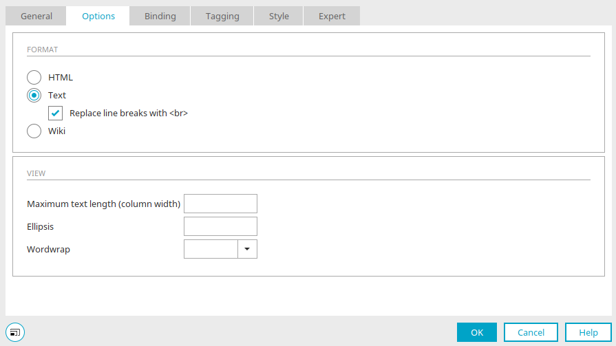
Displays unformatted text.
Replace line breaks with <br>
Enters the HTML tag <br> for every line break.
View
These settings are only available if the text area is not in a table.
Maximum text length
The number of displayed characters can be limited here. If you enter -1, all characters are shown.
Ellipsis
The character entered here will be attached to the last displayed character when the text length exceeds the maximum allowed text length.
Wordwrap
You can define the type of line break here.
Column presentation in view tables
Click here for more information.
Format - "Wiki"
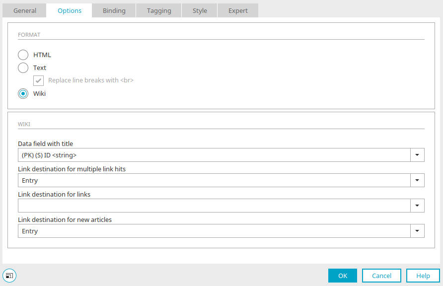
Wiki syntax is interpreted with this option.
Wiki
Data fields and pages from a wiki application can be integrated here.
Wiki syntax
|
Links |
|
|---|---|
| Links to posts: |
The double square bracket indicates that this is a link to an article within the wiki: [[Article1]] If there is no article with this heading yet, a link to a new article is shown. If the article has been created, the user can jump directly to this article.
[[article|display name in text]] The "|" character can be used to add a display text to a link. The alias text is used instead of the heading. |
| Links to images: |
The keyword "Image:" indicates that an image is displayed. [[Image:myImage.png]], [[Image:http://www.intrexx.com/images/meinBild.png]] This allows you to refer to an image that is located in the "htmlroot" directory. Naturally, subfolders or links to external websites can also be specified.
[[Image:myImage.png|alt tag]] The "|" character can be used to add an alt tag to an image. |
| Links to websites: |
The single square bracket indicates that this is a link to an external web page: [http://www.intrexx.com] This is the link to the Intrexx website.
[http://www.intrexx.com|The Intrexx website] The "|" character can be used to display a web link with an alternative text within the article. |
|
Text design for lists |
|
|---|---|
|
Sty |
View |
* one * two ** two-one ** two-two * three |
|
|
List types |
|
|---|---|
° with a circle icon |
 one one |
- with a square icon |
|
1. numbered list |
|
a. alphabetically numbered list (with small letters) |
|
A. alphabetically numbered list (with capital letters) |
|
i. numbered list (roman small) |
|
I. numbered list (roman capital) |
|
|
Combination of list types |
|
|---|---|
1. one ii. two-one ii. two-two III. two-two-one III. two-two-two ii. two-three 1. three |
|
|
Combining list entries |
|
|---|---|
|
With a \ at the end of a line, you can link a list entry to the next line. Example:
1 List entry line 1\ List entry line 2\ List entry line 3 1 List entry line 1\ List entry line 2\ List entry line 3 |
|
Particularities
Masking with the '\' character can prevent styles from being applied or lists from being generated (to output the '\' character, you must enter '\\').
Example:
\1. Text does not become a list
or
\& becomes &
\< becomes <
\> becomes >
Text embedded in [[! !]] is ignored.
Example:
[[! [[! == Heading 1 == !]] is output as == Heading 1 ==.
Tagging
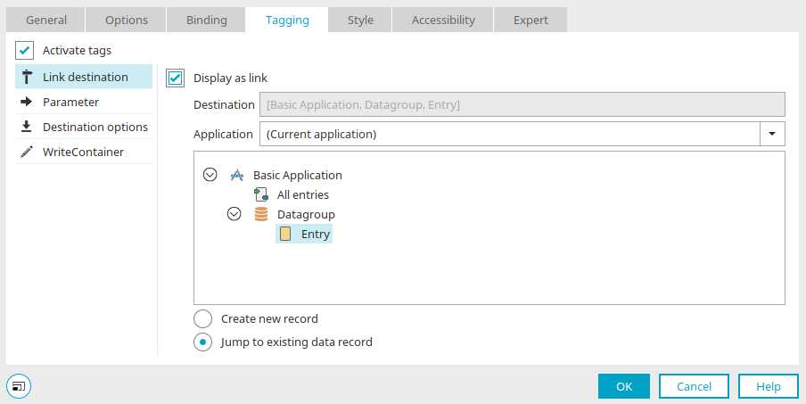
As well as normal text, hashtags (e.g. #mysite) can also be entered in view text areas.
Activate tags
With this setting, the tags will be shown in the form of a link. If this is not activated, they will be shown as normal text.
Link destination
When tags are activated, a link destination can be specified that is loaded when the link is clicked on.
Target page options
Click here for more information.