Button
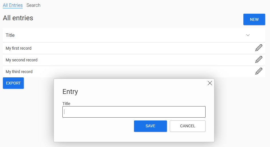
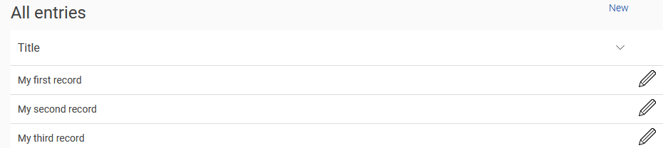
The "Button" application element is one of the basic controls. In the image above you can see the "New" button, which opens an input page in the tooltip when clicked. A new data record can be entered on the edit page. The "Save" and "Cancel" buttons execute the corresponding actions when clicked and then close the input page again.
Buttons are very versatile and can do a great deal more.
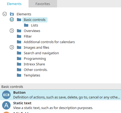
The button element can be found in the "Applications" module in the "Elements" area. A new button can be created by positioning the element on the workspace from here using drag & drop.
Further information on creating elements can be found here.
The properties dialog of a button opens automatically when a new button is created. The properties dialog of an existing button can be opened by double-clicking on the element on the workspace, via the "Properties" context menu or via the "Edit / Properties" main menu if the button is selected.
General
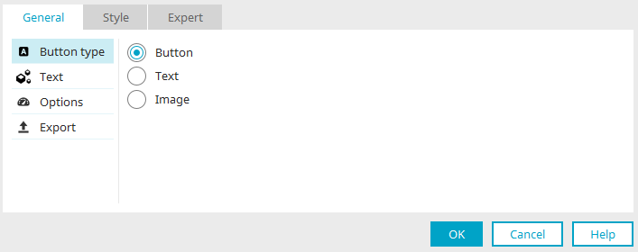
The type of the button, its text and other options can be set here.
Button type
There are different types for displaying buttons in the browser, shown here using the "New" button as an example:
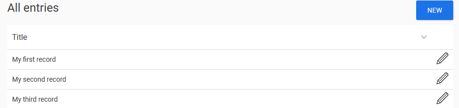
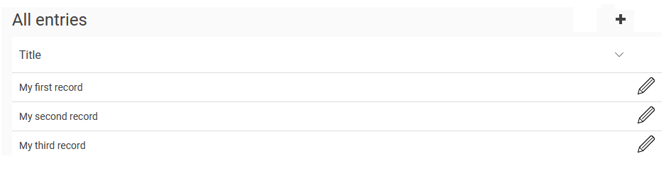
With the "Button" setting, the "New" button is displayed as a button in the browser.
With the "Text" setting, the "New" button is displayed in the browser as a text link.
With the "Image" setting, a freely selectable image becomes a button in the browser.
Button text
Set which text is used as the label or title of the button here.
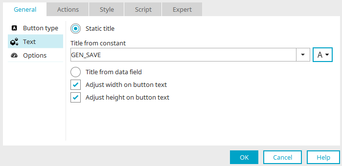
Static text
A static text can be defined with this option.
Title
Enter the static text here. Information on multilingual titles can be found here.
Adjust height / width on button text
The width or height is adjusted to the size of the button text.
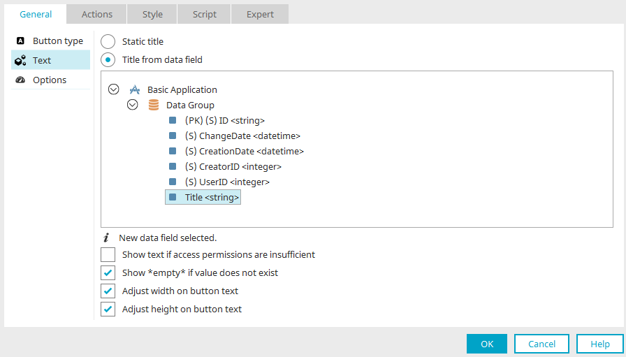
Title from data field
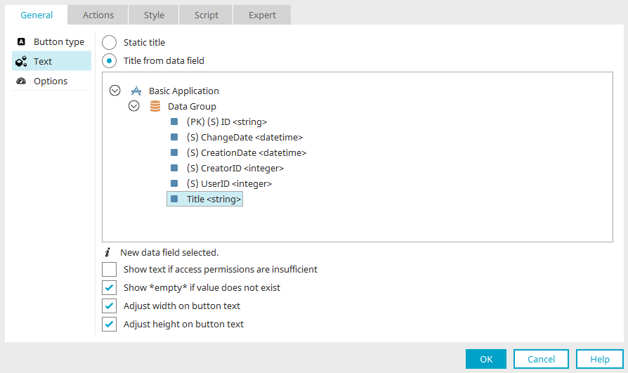
This option can be used to select a data field in the application structure whose value will be used as the title for the button.
Display text if rights are missing
If there are insufficient page or data group rights, a corresponding message is displayed when the button is clicked.
Display "empty" if value is missing
If the data field contains an empty entry, the expression "empty" is displayed in the browser.
Adjust height / width on button text
The width or height is adjusted to the size of the button text.
Text button
If the "Text" option was selected as the button type in the first step and then "Text" in the left-hand area of the dialog, you can set the text to be used for the button text link here. The settings correspond to the settings for the "Button" button type.
Screen button
If you select the "Image" option as the button type, the "Text" entry in the left-hand area of the dialog changes to "Image". Here you can set which image is to be used as a button in the browser.
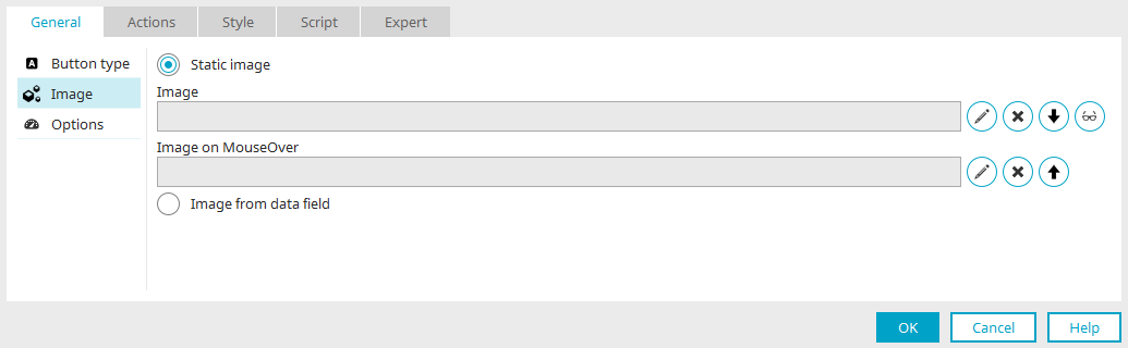
Static image
With this option, a static image with or without an option for MouseOver can be used.
-
 Edit
EditOpens the dialog for image selection.
-
 Delete
Removes the image.
-


With the arrow buttons the selected image in ""Image /Image on MouseOver"" can be copied to the other field.
-
 Edit text alternative
Opens a dialog in which text can be entered as an alternative to the image in non-image-capable browsers.
Save settings
If you click "OK" here, the button is created. The size of an image is adapted to the dimensions of the button on the workspace. You can use the main menu "Edit / Set original size" to display the image on the workspace in its original size.
Image from data field
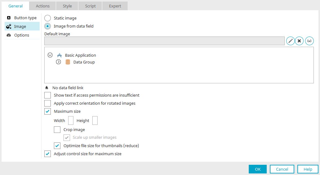
This option uses images that have been saved in a file data field. Select this data field by clicking in the illustration below the "Default image" setting.
-
Default image
The image selected here is shown when the linked data field does not deliver a value.
-
Display text if rights are missing
If there are insufficient page or data group rights, a corresponding message is displayed.
-
Rotate images
Images from digital cameras always have the same aspect ratio. If it is a portrait photo, the subject will later be seen lying down in the image. In general, cameras have a position sensor. Instead of rotating the image correspondingly, they will write the positioning information to the image. With this setting, the positioning information will be evaluated by Intrexx and the image will then be rotated as necessary.
-
Maximum size: Width / Height
The image size is limited to the pixel value entered here.
-
Crop image
Allows the width and height of the image to be adjusted to the aspect ratio of the button.
-
Enlarge smaller images
Smaller images will be enlarged up to the stated maximum size.
-
-
Optimize file size for thumbnails (reduce)
Reduces the file size for the purpose of increasing the application page's loading time.
-
-
Adjust control size to maximum size
Causes the current width and height to be automatically entered in the properties dialog when the button size on the workspace is changed. If the setting is not set, these values and the size of the control on the workspace are not synchronized.
Options
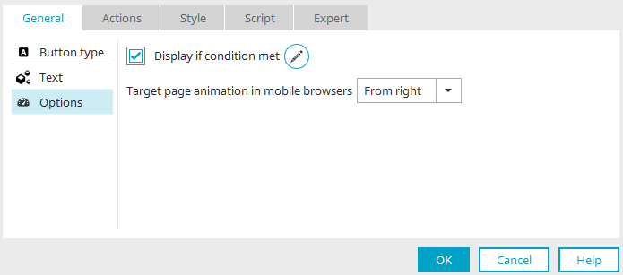
Conditional display
All information on this topic can be found here.
Target page animation in mobile browsers
Allows you to determine how the button will function for touch screens. Select the direction of movement "From right" or "From left".
This setting is only available if the current page has been transformed for mobile devices.
Export
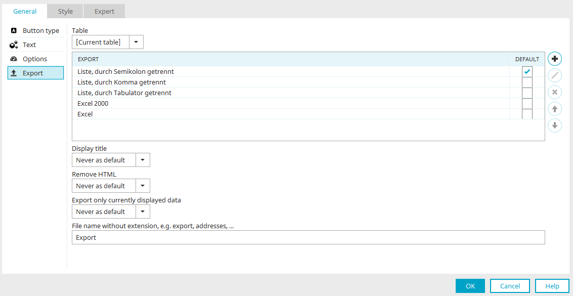
This setting can be found on the "Options" tab under
You can find all the information here.
 Send us an e-mail