Button – Landing page options
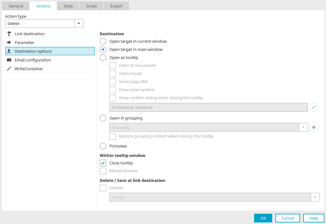
For the "No action", "Save" and "Delete" actions of a button, you can set here how the target page should be loaded.
Open target in current window
Opens the target page in the currently opened window.
If buttons with this setting load pages from portlets, the pages with the setting "Open in current window" are displayed in the portlet. For large pages, not all page elements may be displayed. In this case, the "Open in main window" setting is more suitable, as the loaded page can be displayed in full.
Open target in main window
Opens the target page in the main window.
Opens the target page as a tooltip. The following settings can also be made here:
-
Open at mouseover
The target page will be shown as a tooltip as soon as the user moves the mouse over the link/button.
-
Open modal
This setting is not available if the "Open on mouseover" setting is set.
A modally opened dialog disables the rest of the application as long as it is being displayed. This means that users can only interact with application elements within the modal dialog but not with elements outside the dialog.
-
Show page title
The page title is shown in the title bar of the tooltip in the browser. The tooltip can be moved via the page title using drag & drop. This is not possible without the page title.
-
Show close symbol
A symbol will be shown in the upper right-hand corner of the tooltip, allowing the tooltip to be closed.
-
 Configure tooltip positioning
Clicking on this button opens a dialog where you can set the position of the tooltip on the page.
-
Show confirm dialog when closing the tooltip
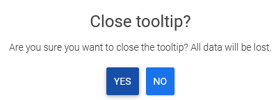
With this setting, the message shown above is displayed if a tooltip page is to be closed via the
 close icon at the top right and there are entries in input or text fields. This helps prevent data from being lost unintentionally. For the setting to work, the elements must not be in the hidden area. You should also not be write-protected. The setting is not available for the Show/hide flexible action.
Open in grouping (embedded tooltip)
With this setting, the tooltip will open in a grouping on the current page; this can be selected beneath this setting. The grouping must use the HTML element "DIV". If another HTML element is used as a DIV in a grouping that is used as the target container for a tooltip, a message is displayed. The "Messages" area also lists the elements in which this grouping is set as the target container. From here, you can navigate to the triggering elements by double-clicking.
 Create new grouping
Creates a new, empty grouping.
Restore grouping content when closing the tooltip
When displaying a tooltip in a new grouping, the tooltip will take up the entire container. Content, which was already there, will be overwritten in this way. With the setting "Restore grouping content when closing the tooltip", the original content is displayed again when the tooltip is closed. If the setting is not set, the grouping remains empty.
Print view
Use this setting to print the page via the browser. For this, the target page must be loaded in a popup window. The ""Print view"" setting has no effect for pages in the main window.
The layout of the print view can be influenced with custom styles. Further information can be found here.
Within tooltip window
These settings are relevant if the page on which the landing page options are set is itself displayed in the tooltip.
Close tooltip
Closes the current page when the button is clicked on.
Reload window
The target page can be reloaded with this setting.
Delete / Save at link destination
If the target page is opened in the popup or tooltip, you can specify here which area of the page from which the target page is loaded should be updated. After the Save / Delete action is performed, the entire page (or just the table) can be refreshed. If the button is in a freely designed table, this freely designed table can also be reloaded. In this case, select the entry "<Current freely designed table>" in the "Update following area" list.
Configure tooltip positioning
For the "Save", "Delete" and "No action" button actions, each in the target page options, and the "Show-hide-flexible" button action, the position at which the corresponding tooltip is to be displayed can be configured.
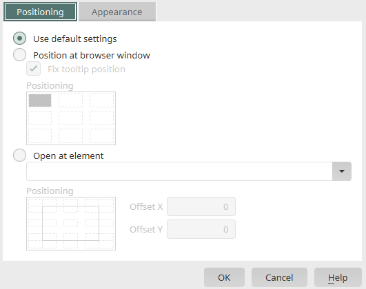
Use default settings
Depending on the other settings (e.g. a modally opened tooltip), the previously used positioning will be applied. With the standard setting, the tooltip will, for example, always orientate itself to the button clicked on.
Position at browser window
If this setting is set, the tooltip is aligned with the browser window. Click on the graphic below this setting to determine the position of the tooltip relative to the browser window.
Fix tooltip position
With this setting, the tooltip stays at the assigned window position and does not scroll with the page's content.
Open at element
You can select an element here at which the tooltip should be opened.
Positioning
Here, the element will be symbolized with a border and green dots. The greyed-out areas around the dots correspond to the later position of the tooltip. In the positioning schema, click on the position where the tooltip should be opened.
Offset X / Y
An additional offset from the element can be specified in pixels here. Offset X offsets the tooltip horizontally and Offset Y vertically.
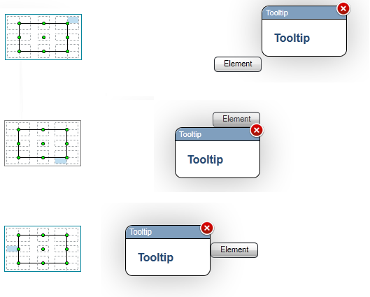
Examples
In the following figure, you will see a few examples of how the positioning (without offset) will be implemented in the browser.
View
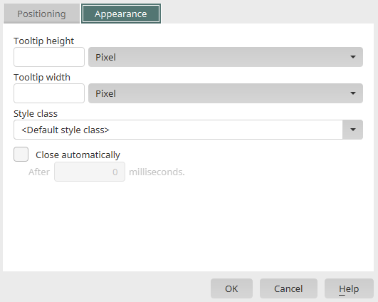
Tooltip height / width
The height and width of the tooltip can be defined in pixels or as a percentage based on the window height/width.
Style class
One of the style classes defined for tooltips in the "Design" module can be selected here. If you select "Default style class", the default style class for tooltips is used.
Close automatically
The tooltip will be closed automatically after the specified time.
After ... milliseconds
The length of time is specified in milliseconds here.
 Send us an e-mail