Tips & Tricks - Change button image when showing/hiding groupings
This Tips & Tricks article will demonstrate how a custom application style can be applied to "Text" buttons that are used to show and hide groupings. Depending on whether the grouping is currently shown or hidden, the button link will show different images in the browser.
Create an application
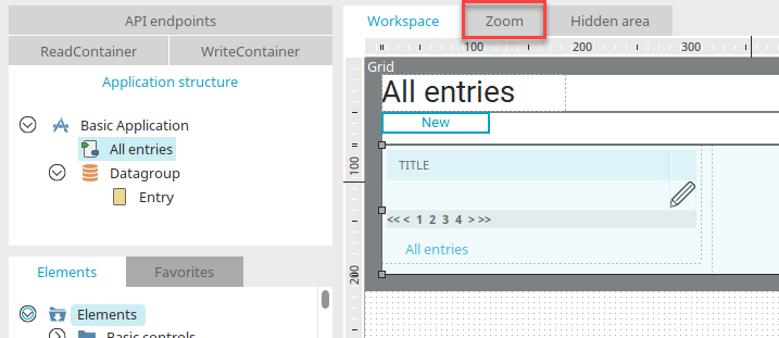
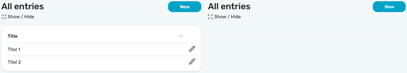
Go to the Applications module and create a new application based on the Basic application template. Select the third line of the grid on the "All entries" page and switch to the zoom area.
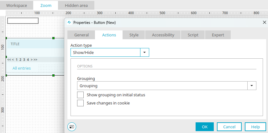
There is a grouping containing the table. Create a new button entitled "Show/Hide". Go to the "Actions" tab and select "Show/Hide" as the action. The grouping should be automatically selected. The button will be created when you click on "OK".
A new style for the button can be created via the "Edit" menu / Edit layout / Edit layout.
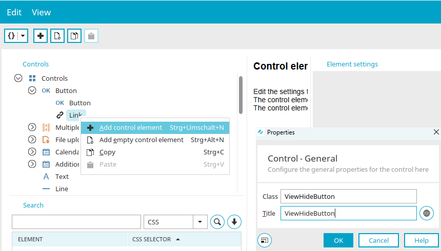
Below "OK buttons" in the "Controls" area you will find further styles, which you may first have to show by clicking on the arrow symbol to the left of "OK buttons". Then select the "Link" entry and select the "Edit / Add control element" menu.
Enter "ViewHideButton" as the class and title and click "OK".
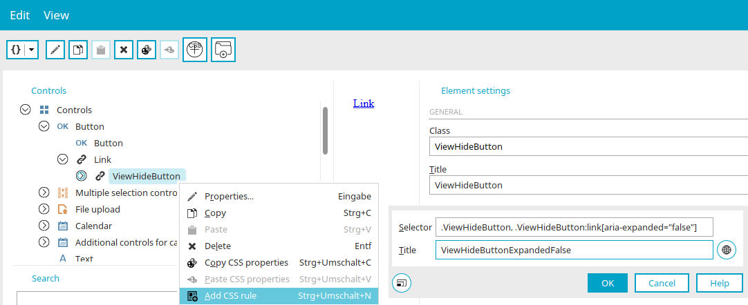
Select the new "ViewHideButton" entry and then select "Add CSS rule" from the Edit menu.
Enter the selector
.ViewHideButton, .ViewHideButton:link[aria-expanded="false"]
as the selector and "ViewHideButtonExpandedFalse" as the title. Click on "OK".
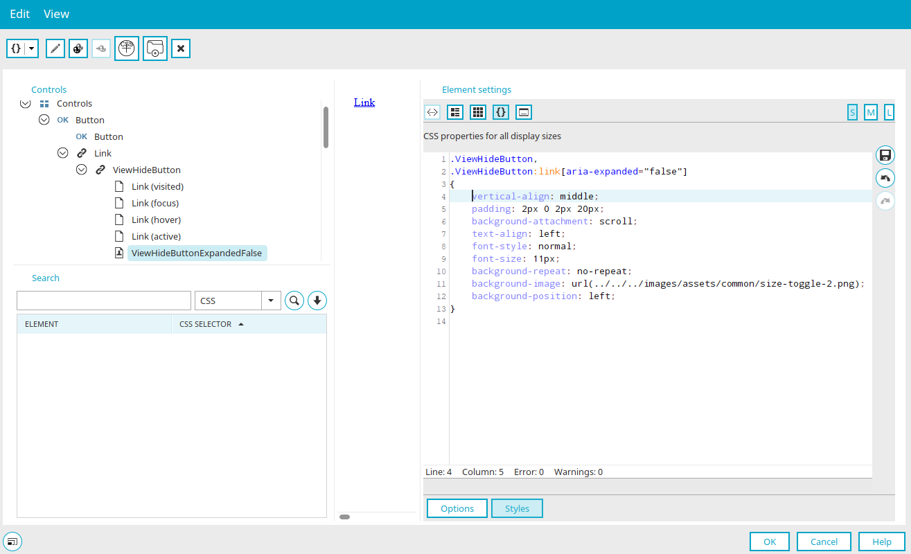
Select the new "ViewHideButtonExpandedFalse" entry.
You can edit the CSS of this entry in the Element settings area on the right-hand side. Click on "Styles" at the bottom and select  "Show CSS properties in editor".
Enter the following CSS:
            .ViewHideButton,
.ViewHideButton:link[aria-expanded="false"]
{
	vertical-align: middle;
	padding: 2px 0 2px 20px;
	background-attachment: scroll;
	text-align: left;
	font-style: normal;
	font-size: 11px;
	background-repeat: no-repeat;
	background-image: url(../../../images/assets/common/size-toggle-2.png);
	background-position: left;
}
Save the CSS by clicking on  "Save CSS" and then click on "OK".
In the same way, create a second CSS rule with the selector
.ViewHideButton, .ViewHideButton:link[aria-expanded="true"]
and title "ViewHideButtonExpandedTrue". Enter the following CSS for the second rule:
            .ViewHideButton,
.ViewHideButton:link[aria-expanded="true"]
{
	vertical-align: middle;
	padding: 2px 0 2px 20px;
	background-attachment: scroll;
	text-align: left;
	font-style: normal;
	font-size: 11px;
	background-repeat: no-repeat;
	background-image: url(../../../images/assets/common/size-toggle-1.png);
	background-position: left;
}
Save the CSS and then click on "OK".
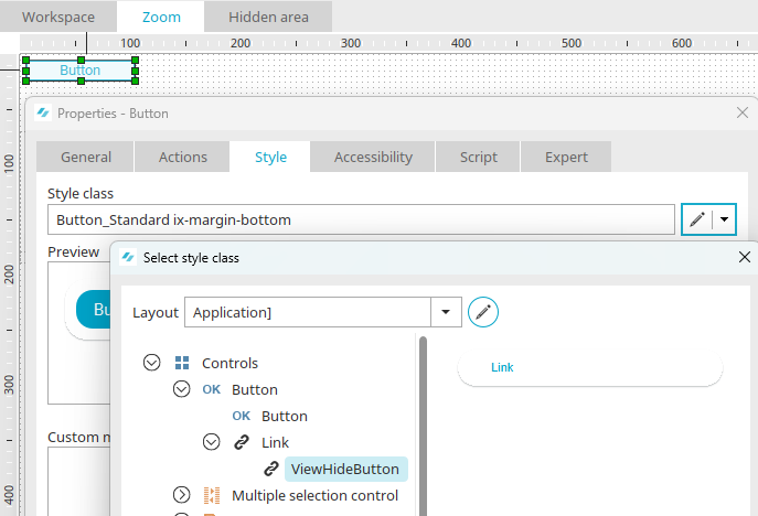
You can now assign the new style to the button on the "View" tab in the properties dialog. Click on  "Edit style class" to do this.
Select "[Application]" as the layout and then the "ViewHideButton" style you have just created. Apply all dialogs with "OK" and publish the application. Test the result.