

Additional Checks
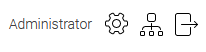
Additional controls are layout elements—such as sign-in buttons or language selectors—that are grouped together.
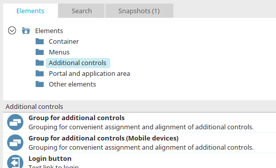
You can find all additional controls in the "Design" module under "Elements."
Additional checks can be created in various ways:
-
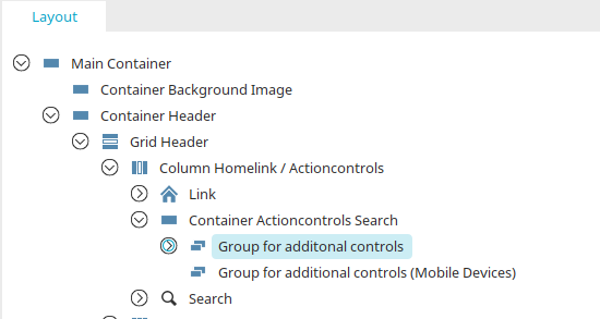
From the "Elements" section, drag and drop into a "Group for Additional Controls" in the layout structure
-
In the Properties dialog box for "Grouping for Additional Checks"
-
In the element settings for "Grouping for Additional Checks"
Grouping for Additional Checks
This element is used to group additional controls within a container. If your layout does not yet include a "Group for Additional Controls," you can create one in the layout structure by dragging and dropping it from the "Elements" section.
The Properties Dialog Box
In the layout structure, you can open the Properties dialog box by double-clicking the "Grouping for Additional Controls" element.
Grouping - General
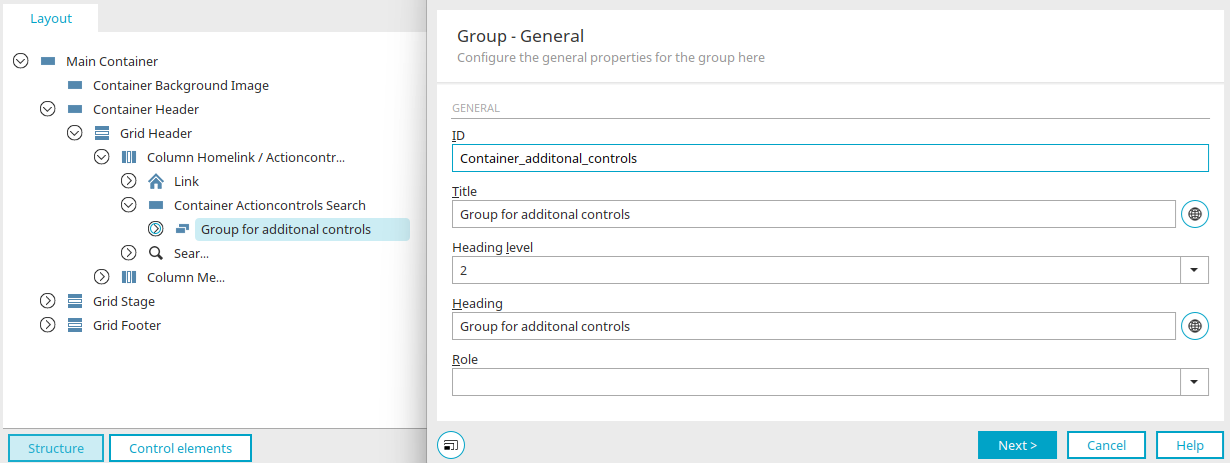
This is where you configure the general settings. You can find a description of these settings here. Press F1 or click the "Help" button in the lower-right corner of the dialog box to view a description of the available settings. You can find general information on the topic of "containers" here.
Click "Next."
Grouping - Positioning and Size
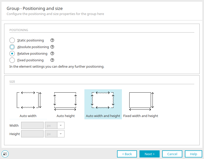
Here, you can adjust the positioning and size of the group. You can find a description of the individual settings in this dialog box here. Click "Next."
Grouping - Background
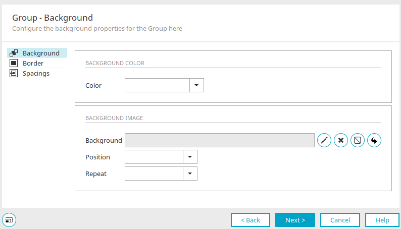
Here you can set the background for the grouping. You can find a description of the individual settings in this dialog box here. Click "Next."
Grouping - Additional Checks
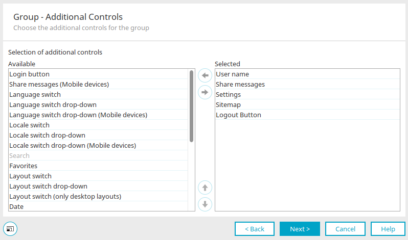
"Available" column
Here is a list of all additional checks.
"Selected" Column
Here you can see which additional controls are used in the layout.

 Move left / right
Moves the currently selected additional check from one list to the other.

 Move up / down
Changes the arrangement of the additional controls in the layout.
Click "Next."
Grouping - Settings
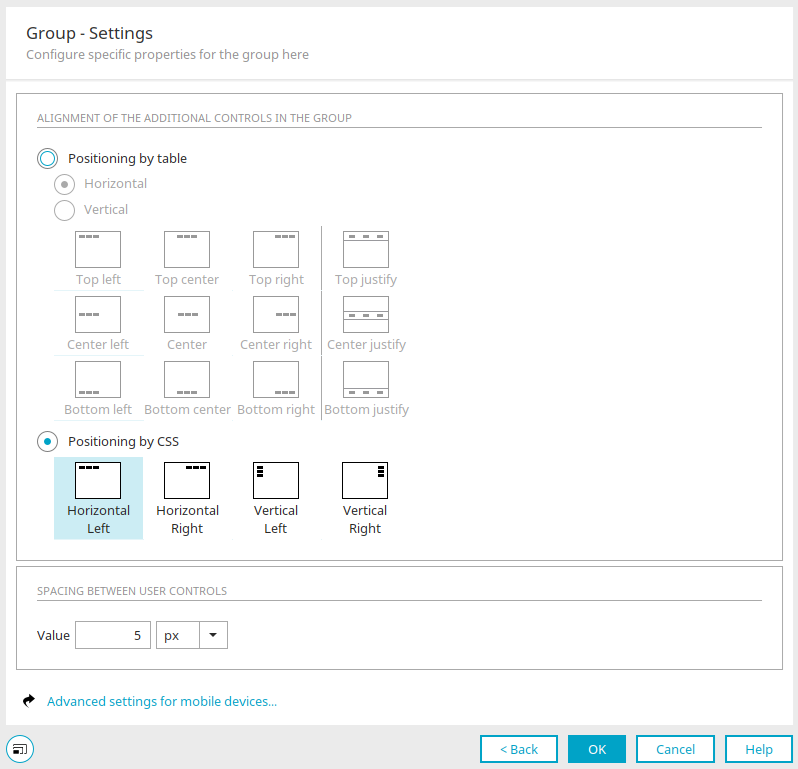
Orientation of the Additional Controls in the Grouping
Horizontal
With this option, the additional controls are arranged horizontally within the group. Select the desired orientation from the graphic below the option.
Vertical
With this option, the additional controls are arranged vertically within the group. Select the desired orientation from the graphic below the option.
Positioning Using CSS
With this option, the additional controls are positioned using CSS rules rather than a table. Here, too, you can select the layout you want from one of the preview images.
Interval between additional inspections
Value
Enter the desired distance as a number here and select the unit from the drop-down list to the right of it.
Additional Settings for Mobile Devices
Opens a dialog box where you can configure additional settings for mobile devices.
Additional Settings for Mobile Devices
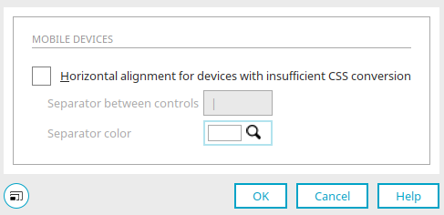
Mobile Devices
Horizontal Layout for Devices with Inadequate CSS Implementation
If the layout is also displayed on mobile devices, you can specify here that the controls should always be arranged horizontally. This setting is particularly beneficial for devices with inadequate CSS support.
Delimiters between the checks
A separator between the checks can be specified here.
Color of the separator
Here you can see the color of the separator.
 Select a color
Opens a palette from which you can select a color.
Click "OK" to close the dialog box.
If you close this dialog box by clicking "OK," all current settings will be saved.
Grouping Settings for Additional Controls
If you select "Grouping for Additional Controls" in the Layout / Structure section, the currently included additional controls and all their properties will be displayed in the Element Settings / Options.
Add or Remove Additional Checks
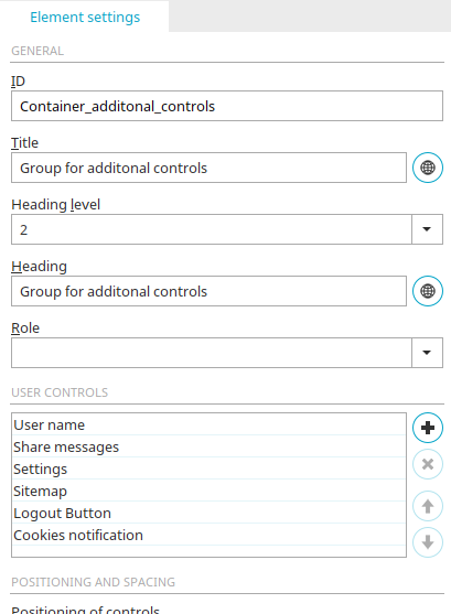
You can find information about general element settings here.
Additional Checks
Here is a list of the additional checks that have already been selected.
 Add an Additional Check
Removes the currently selected additional check from the list.
Move up / down
Changes the arrangement of the additional controls in the layout.
 Add an Additional Check
Opens a dialog box where new additional controls can be added.
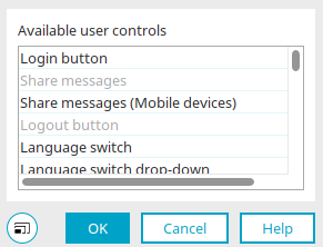
Select the desired additional checks here and click "OK" to apply your selection and close the dialog box.
Grouping for Additional Checks (Mobile Devices)
For mobile devices such as smartphones or tablets, there is a separate group of additional controls designed for layouts on mobile devices.
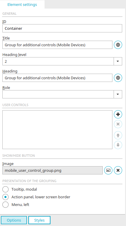
In addition to the general settings and the additional checks described here, the following settings can be configured for mobile grouping of additional checks:
Show/Hide Button
This button appears in the upper-right corner of the group header. You can select an image for the button here.
 Select an image
Opens a dialog box where you can select the image.
Remove Image
Removes the reference to the image.
Presentation of the Grouping
Tooltip, modal
The grouping is displayed in a modal tooltip.
Action Panel, bottom of the screen
The group appears at the bottom of the Action Panel.
Menu, left
The group appears on the left side of the menu.
Additional checks that can be included in the group for additional checks
Sign-in button
This additional control appears in the browser as a link that users can click to log in to or out of the portal. If the user is already logged in, they also have the option to change their password.
Share News
Displays the number of new messages and the profile picture from Intrexx Share. You can find more information here.
Share News (Mobile Devices)
How to share messages, optimized for mobile device layouts.
Logout button
This additional control allows a user to log out of the portal.
Language Selector
The language selector displays the portal languages in the browser as a link that allows you to switch the portal to the desired language. You can find more information here.
Language Selector Drop-down List
Similar to a language switcher, but not as a link—rather, in the form of a drop-down list.
Language Selector Drop-down List (Mobile Devices)
Like the language selector drop-down list, suitable for layouts on mobile devices.
Locale Switch
The locale switch displays the portal languages in the browser as a link that allows you to switch the portal to the desired format. You can find more information here.
Locale Switch Selection List
Similar to a locale switch, but not as a link—rather, in the form of a drop-down list.
Locale Switch Selection List (Mobile Devices)
Like the Locale Switch drop-down list, suitable for layouts on mobile devices.
Table of Contents
Clicking this additional control loads a structured table of contents (sitemap) listing all menu items and applications in the portal and application areas. If you have the appropriate permissions, you can use the table of contents to navigate to the selected menu item or application,
Search
This additional control allows you to perform a portal-wide search. You can find more information here.
Favorites
Favorites added to the "Favorites" portlet can be selected from a drop-down list using this additional control. The corresponding pages will then be loaded. If no favorites have been added to the "Favorites" portlet, the additional control is hidden.
Layout Selector
This additional check displays the names of the published layouts as links. Users can switch between the different layouts with a single click.
Layout Selector Drop-down List
Like a layout switcher, but not as a link—rather, in the form of a drop-down list.
Layout Selector (Desktop Layouts Only)
This control can only be used in desktop layouts. If you want to use the layout for mobile devices, please use the "Layout Switcher" control.
Username
Displays the first and last name of the current user.
Date
Displays the current date and time.
Portal Name
Displays the name of the portal.
Hide Menu
Hides all menus; only the application window is displayed.
Breadcrumb trail
Displays the path from the home page to the currently loaded page in the portal.
Application Name
Displays the name of the currently open application.
Settings
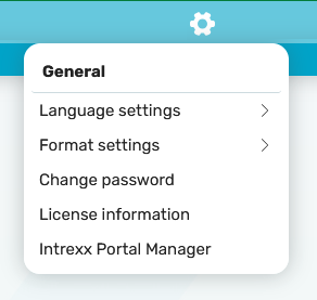
This additional control allows you to change language, format, and layout settings, as well as the password. Elements from the hidden area of an application page can also be shown or hidden if the user has the appropriate permission (keyboard shortcut ALT + H).
You'll also find the latest licensing information for your portal here.
You can download the Portal Manager by clicking the "Intrexx Portal Manager" link.
Cookie Notice
Displays a message and the "Agree" button at the bottom of the portal. The standard text of the message is:
"Cookies: We use cookies to optimize our website for you and to continuously improve it. By continuing to use this website, you consent to the use of cookies. "For more information on this, please see our Privacy Policy."
The text of the message can be changed in the global language constant "COOKIE_HINT_TXT". In addition to the text, the additional prompt includes an "Agree" button that allows users to accept cookies. If additional cookies are used, the Cookie Notice Manager application can also be integrated into the portal.
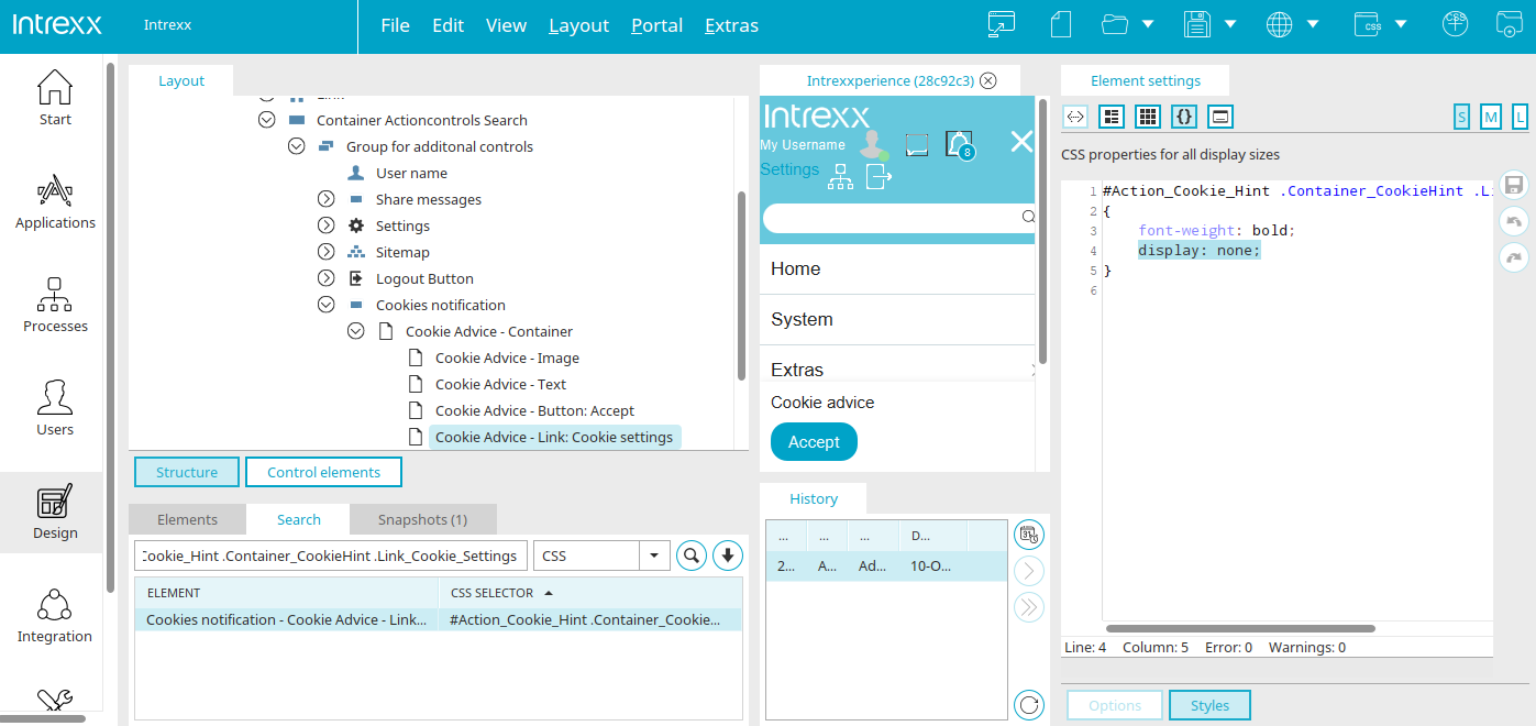
To display the link to the app, "display:none" must be removed from the CSS selector "#Action_Cookie_Hint .Container_CookieHint .Link_Cookie_Settings". The text of the link can be changed in the global language constant "COOKIE_HINT_LINK_SETTINGS".
Logout Button (Mobile Devices)
Like a logout button, suitable for layouts on mobile devices.
Toplink (Mobile Devices)
This additional control allows you to navigate up one level on a mobile device.
Table of Contents (Mobile Devices)
Like a table of contents, suitable for layouts on mobile devices.
Layout Switch (Mobile Devices)
Like a layout switcher, suitable for layouts on mobile devices.
Default Layout (Mobile Devices)
Same as the standard layout; suitable for layouts on mobile devices.
Breadcrumb Trail (Mobile Devices)
Like a breadcrumb trail, suitable for layouts on mobile devices.
Language Selector (Mobile Devices)
Like a language switcher, suitable for layouts on mobile devices.
Locale Switch (Mobile Devices)
Like a locale switch, suitable for layouts on mobile devices.
Change Password
You can change your password using this additional verification step.
For example, all additional checks for mobile devices do not include tables and are implemented correctly even when JavaScript is disabled.
The Properties dialog box for additional checks
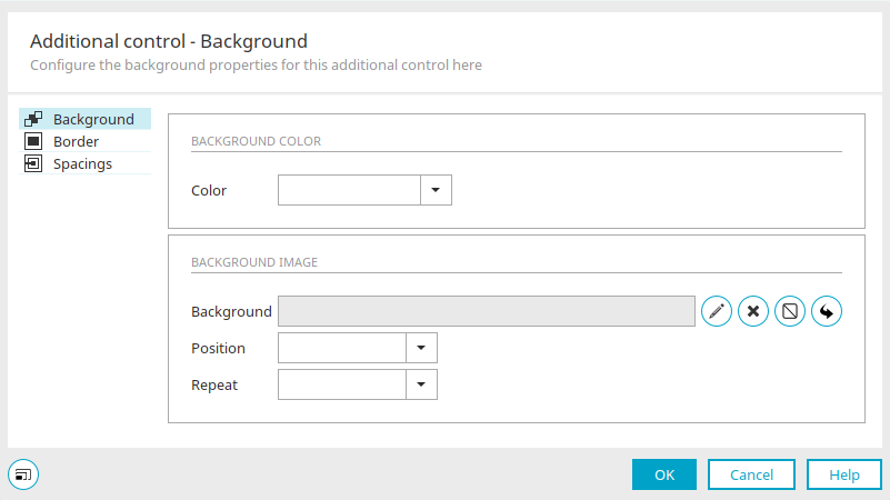
In the Additional Checks Properties dialog box, you can customize the container for the additional check. You can find all the information about the settings here.
Additional options in the element settings
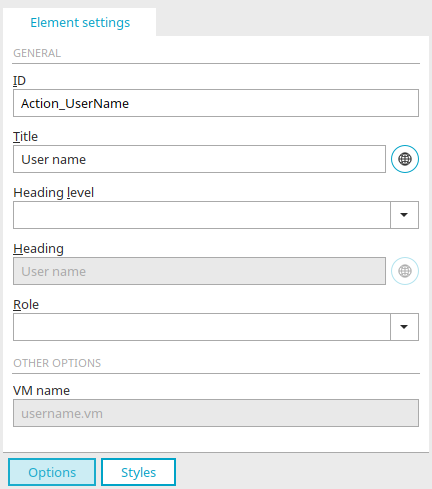
You can find information about the general settings here.
More Options
Each additional check is based on a VM file. The respective VM file is located in the portal directory internal/system/vm/html/actioncontrol.
VM Name
Displays the name of the VM file.