Multiple Selection 2.0
The multiple selection 2.0 is a list element in which several entries can be selected at once. It is suitable, for example, for distribution lists, article groups and much more. Selected entries are stored in the linked data field when the page is saved if a corresponding link exists.
Multiple selection 2.0 is responsive and very user-friendly.
It can be configured with default values. Entries can be static, values from applications, or from special value sources.
The entries can be filtered using the search operations "Starts with" or "Contains".
Entries can be displayed with pictures or initials. In addition to the title, a subtitle can also be included in the display of an entry.
Multiple selection 2.0 can be controlled via an API and can be operated using the keyboard. Your layout can be styled using CSS variables.
The element exists as an input and view element.
Input element
Properties in the browser

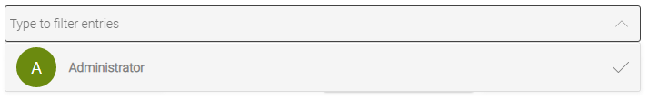
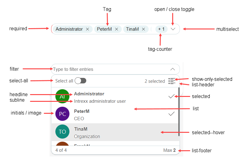
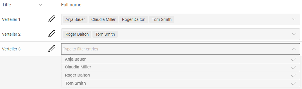
Multiple selection 2.0 shows up as an edit control in the form of a selection list in the browser. Click the arrow icon on the right side of the element to show the entries for multiple selection.
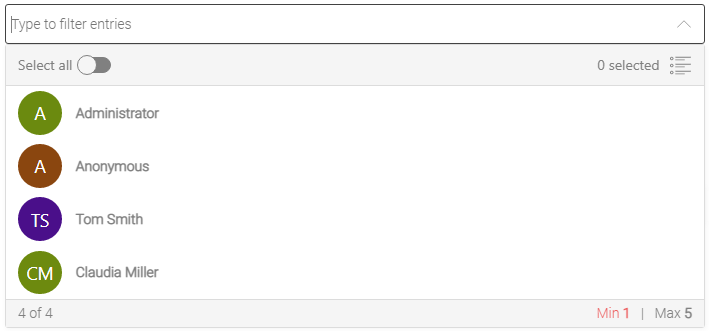
This example illustration shows a multiple selection that is linked to the data from the portal's user management. The field above can be used for filtering the entries, e.g. by entering the name of a user.
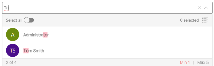
The entries are then filtered accordingly. The term you have entered will be highlighted in the entries. If you want to remove the filter and display all entries again, click on the  close icon on the right-hand side of the filter field.
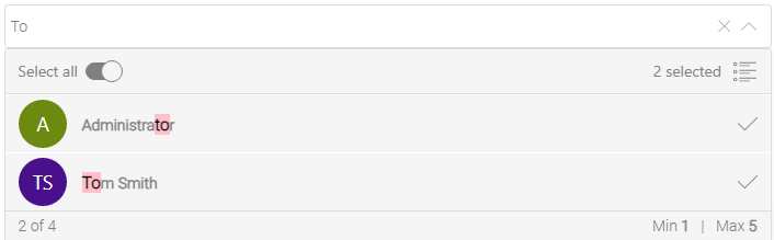
Click on the entry or entries to be selected. A checkmark is shown to the right of the selected entries.
To select or deselect all entries, you can also use the "Select all" slider at the top left below the filter field. The function only affects the currently visible entries.
How many entries are currently selected can be seen on the right below the filter field. The quantity refers to all entries including those that are not displayed due to filters that may have been set.
The number of entries that are selected of the total number of existing entries is displayed on the left below the list.
How many entries at least and how many entries at most should be selected is shown on the right below the list.

Once the desired entries are selected, please click on the arrow symbol on the right in the filter field of the multiple selection or alternatively in an area outside of the multiple selection. The list is then closed and the selected entries are displayed. Individual entries can be deselected by clicking on the close icon to the right of the entry.
Properties in the "Applications" module
When you create a multiple selection 2.0 in the "Applications" module, the properties dialog opens automatically.
General
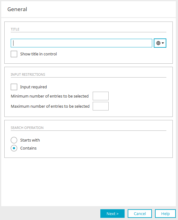
The general properties of the multiple selection can be defined here.
Title
Enter the title here. Further information on this topic can be found here.
Display title in control
If no values are selected, this option displays the title of the multiple selection as a placeholder in the browser.
Input restrictions
Input required
This setting makes the multiple selection control mandatory.
Minimum / maximum number of entries to be selected
Defines the minimum and maximum number of entries to be selected. The minimum or maximum number of entries to be selected is displayed in the browser at the bottom right in the multiple selection.
If nothing is entered as the maximum, all entries can be selected. A minimum must be specified if the setting "Input required" is set for the multiple selection in the general properties.
Search operation
The search operation determines the way in which the terms entered in the filter field of the multiple selection in the browser are searched for.
Starts with
All entries are displayed in which the title starts with the entered term.
Contains
All entries are displayed in which the term occurs in the title or subtitle.
Click "Next" when all settings are set as desired.
Document template
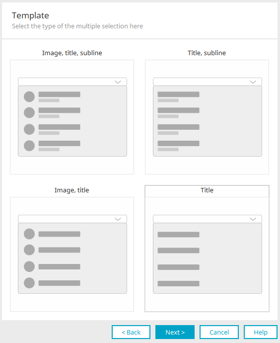
The form in which the entries of the multiple selection should be displayed can be selected here. From left to right and top to bottom, the options are as follows:
-
Image, title and subtitle
-
Title and Subtitle
-
Image and title
-
Title
Select the desired type and click "Next".
Data source
Values from application
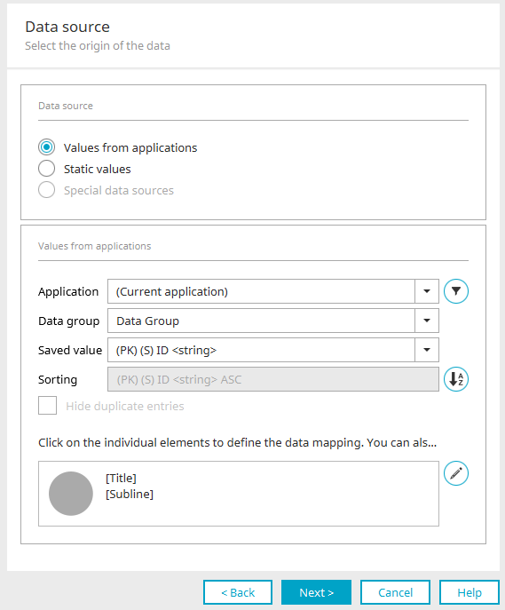
Application, Data group
Select the application and data group whose values should be shown in the multiple selection.
 Filter
Opens a dialog in which a filter can be defined. The data is then shown in the multiple selection based on the filter criteria.
Saved value
Here, all data fields from the selected data group will be shown. Specify the field whose values are to be saved when the user selects an entry in the multiple selection. This gives you the ability, for example, to show names of employees in the multiple selection, but to save their ID number instead of the name.
Sort
The entries in the multiple selection are sorted based on the fields shown here.
 Sort
Sort
Opens a dialog in which the sort fields can be selected.
Hide duplicate entries
With this setting, duplicate entries are displayed only once.
Data mapping
The elements that you have previously defined in the "Type of multiple selection" settings are displayed here. Click on the individual items to view or set the data mapping. Other data types can be used than those shown in the example. For example, the title can also be assigned a data field that contains integers.
Clicking on the image opens a dialog where you can specify the images you want to use.
Data source "Image" - Image from initials
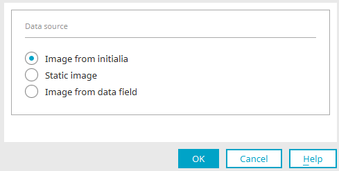
With this setting, the two initial letters of the title and subtitle are displayed on a circular background instead of an image.
Data source "Image" - Static image
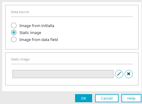
A static image can be defined here, which is then displayed for each individual entry in the multiple selection.  "Edit" opens a dialog in which a suitable image can be selected. "Remove" removes the assignment again.
Data source "Image" - Image from data field
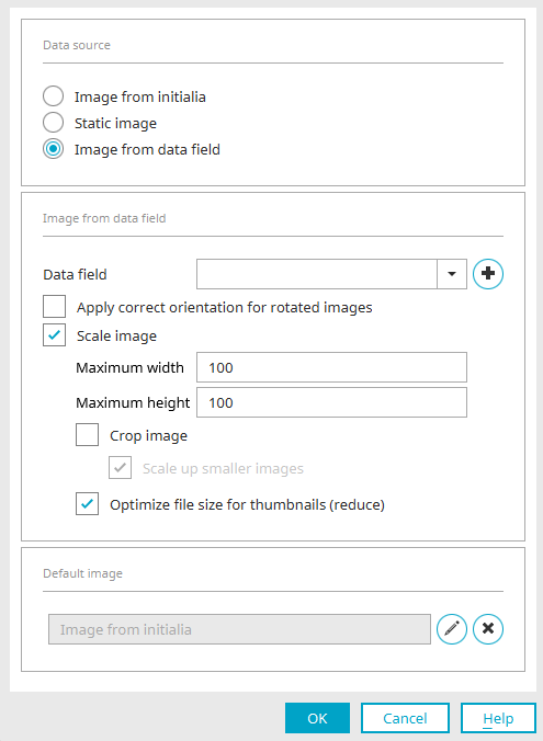
Data Field
Select the required data field. If a suitable field does not yet exist, click on  "New data field" to open a dialog in which a new data field can be created.
Rotate images
Most cameras write information about the image's orientation (rotated by 90, 180 or 270 degrees) in the header of the image file. With the "Rotate rotated images" setting, this information is evaluated and the images are automatically rotated so that they are not upside down when displayed in the portal.
Scale image
The image is scaled to the dimensions entered in "Maximum width" and "Maximum height".
Crop image
The image is cropped to the dimensions entered in "Maximum width" and "Maximum height".
Enlarge smaller images
If the image is too small, it is enlarged to the size entered in "Maximum width" and "Maximum height".
Optimize file size for thumbnails (reduce)
Reduces the file size for the purpose of increasing the application page's loading time.
Default image
The image selected here is shown when the linked data field does not deliver a value.
"Edit"
Opens a dialog in which a suitable image can be selected.
"Remove"
Removes the assignment.
Click "OK" to save the settings and close the dialog.
Clicking on "[Title]" or "[Subtitle]" opens a dialog in which the editing can be carried out accordingly.
Clicking on  "Edit" opens the dialog for selecting the "Type of multiple selection" again, which can be used to change the elements for the data assignment.
User-defined values
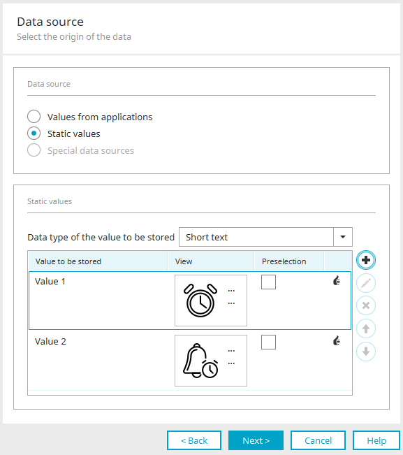
User-defined values are values that do not stem from a data source, but rather are entered statically.
Data type of the stored value
Enter the data type with which the selected value is to be saved. The format of the stored value of all defined entries must correspond to the data type selected here. Whether this is the case for the individual user-defined values is shown in the last column of the table with a corresponding  symbol.
Saved value" column
The value entered here is stored in the data field associated with the multiple selection in the options for saving.
View" column
Shows a preview of how the entries will appear later in the browser. Clicking on the title opens the dialog in which the entry can be edited.
Preselection" column
The entry for which the checkbox in this column is selected is preselected in the multiple selection for new and empty data records. The column is deactivated if the default values have been adjusted in the default settings.
Add new user-defined value /  Edit user-defined value
Opens a dialog where a new user-defined static value can be created. There, depending on the previously selected type of multiple selection, the title, saved value, subtitle and image can be set. The stored value must match the data type previously set for the user-defined values. If this is not the case, you will be notified with a message.
If a date or Boolean data type was previously specified, an example of the correct format with which the value in "Saved value" must be specified is displayed here at the bottom of the dialog.
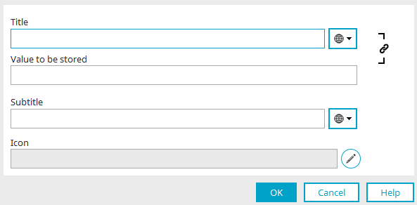
Title / Subtitle
A static title or subtitle can be entered here, or optionally a constant can be used as the source for the title. You can find more information here.
 Synchronize title / memory value
As a rule, the content of one of the two fields "Title" and "Saved value" is automatically transferred to the other field when it is changed. This behaviour can be prevented by clicking on "Synchronize title / memory value".
"Edit"
Opens a dialog in which an image can be selected.
Click "OK" to save the settings and close the dialog.
Delete user-defined value
Deletes the value currently selected.
 Move value up / down in the display sequence
Change the order of the entries.
Special data sources
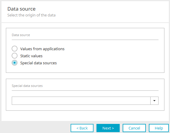
This option can only be selected if no subtitle is included in the type of multiple selection. All further information on the settings can be found here.
Click "Next".
Saving options
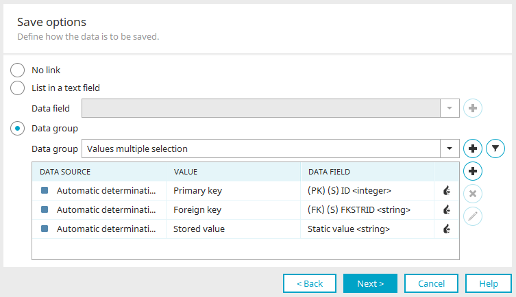
All information on this topic can be found here.
Click "Next".
Final settings
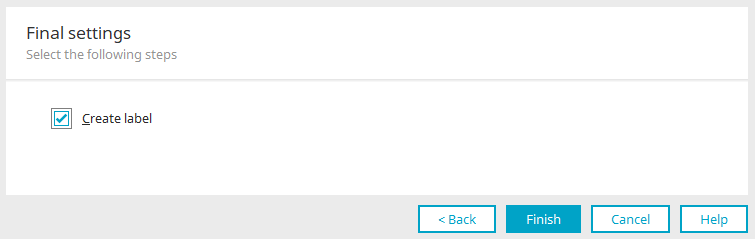
All information on this dialog can be found here.
Click "Finish". Multiple selection is now configured and can be used after saving the application in the browser.
Default
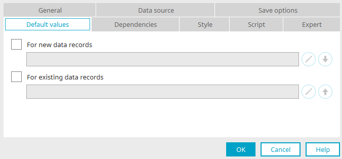
Once the multiple selection control has been completed and created, the properties dialog can be opened again. Here you will also find the "Default" tab, where you can set which value is displayed in the multiple selection for new or existing empty data records.
Edit
Opens a dialog in which the default values can be defined.
Apply
The respective value is also applied for the other setting.
View
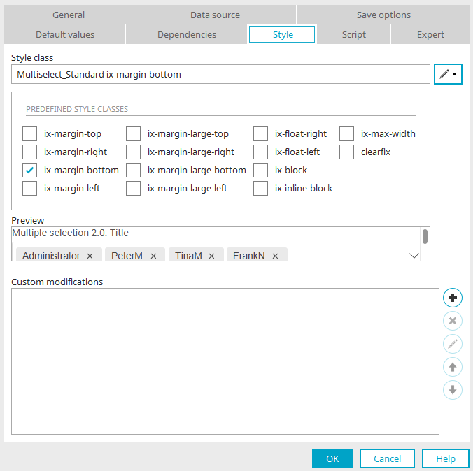
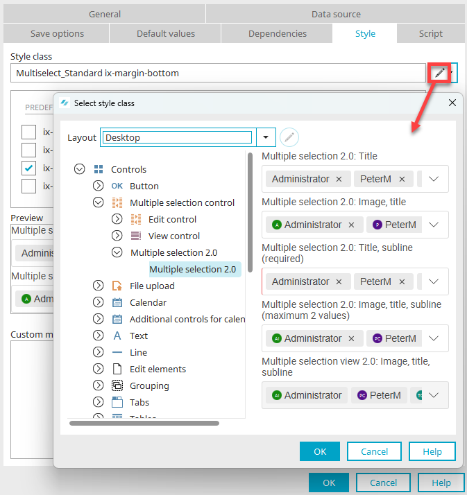
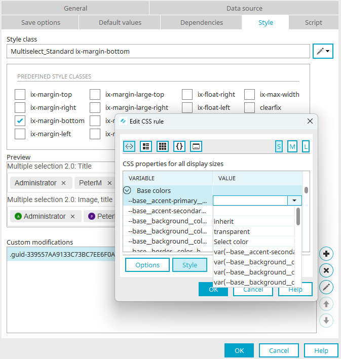
Style class
Here you can select a style class that is defined in the layout or application layout for the current multiple selection.
Individual settings
You can find all the information here.
Multiple selection 2.0 View
Properties in the browser

Multiple selection 2.0 is displayed as a view control in a selection list format in the browser. Click the arrow icon on the right side of the element to show the entries for multiple selection.
The upper part of the multiple selection can be used for filtering the entries - just as in the edit control.
Properties in the "Applications" module
If you create a multiple selection view 2.0 in the "Applications" module, the properties dialog opens automatically.
Apply settings from input control
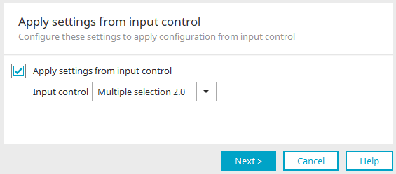
If a multiple selection 2.0 input control already exists, the settings can simply be adopted here. To do this, select the desired multiple selection and set the "Apply settings from input control" setting.
Click "Next".
General
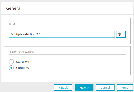
Title
Enter the title here. Further information on this topic can be found here.
Search operation
The search operation determines the way in which the terms entered in the filter field of the multiple selection in the browser are searched for.
Starts with
All entries are displayed in which the title starts with the entered term.
Contains
All entries are displayed in which the term occurs in the title or subtitle.
Click "Next".
Document template
The desired type of multiple selection can be changed here. Further information can be found here. Click "Next".
Data source
As with the multiple selection edit control, the data source can be specified here. Information on the settings can be found here. Click "Next".
Read options
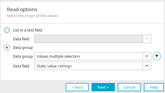
All information on this dialog can be found here.
Final settings
All information on this dialog can be found here.
Click "OK" to save the changed settings and close the dialog again.
Layout
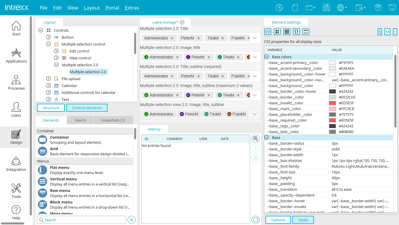
In the "Design" module, there is the "Multiselect 2.0" control element with the "Multiselect standard" style class in every layout.
If the "Multiple selection 2.0" control element is selected in the "Control elements" area, click on  "Show CSS variables" in the "Styles" area. The variable values can be conveniently edited here in the "Value" column.
All changes are immediately displayed in the preview in the middle area of the "Design" module. The following illustration provides an overview of the components of the multiple selection and the associated variable groups.
As usual, new control elements of the type "Multiple selection 2.0" can be added in the "Control elements" area in all layouts and their appearance can be edited by changing the values of the variables.
The control elements can then be assigned to the multiple selection 2.0 elements in applications via the style class on the "View" tab in the application designer.
The appearance of a single multiple selection can be changed through customization. Customization overwrites the values of the CSS variables. The individualized customization is only valid for the multiple selection currently being edited and has no effect on other multiple selection 2.0 elements also contained in the application.
Dependencies
Multiple selection 2.0 can be used both as a triggering control in dependencies and as a dependent filter. The only event available is "onchange". In the dependency filter, the multiple selection control is available as a comparison value. Comparisons can only be made with the stored value.
Subquery
The filter dialog has been expanded to include the possibility of a subquery when a dependency is defined in the multiple selection. When selecting the comparison value, in addition to the comparison with the value of a control, there is also the option of comparing with a value from a subquery. Further information on the filter dialog can be found here.
Keyboard operation
In accordance with the WCAG suggestions, the control is also keyboard operable.
The assigned keys are:
-
Tab - Next focusable element
-
Spacebar - Select / deselect the current element
-
CTRL + ↑ - Close list
-
CTRL + ↓ - Open list
-
↑ - Close list or focus on previous list entry
-
↓ - Open list or focus on next entry
-
Enter - select focused entry
-
Backspace - deselect focused entry
API
Click here for more information about this topic:
Control type "Multiple selection 2.0" in view tables
In view tables, the control type "Multiple selection 2.0" can be selected if data fields of the multiple selection are included as a column in the table. In the browser, the data are subsequently displayed per cell in the table column in a selection list.
Further information on this topic can be found here.
 Send us an e-mail