Menus
There are different menu types in Intrexx that allow portal content to be displayed in a structured manner and easily accessed. Menus are elements that you can access, like all other Layout elements, in the "Elements" area. Menus can be arranged in containers or in responsive grid columns in the layout.
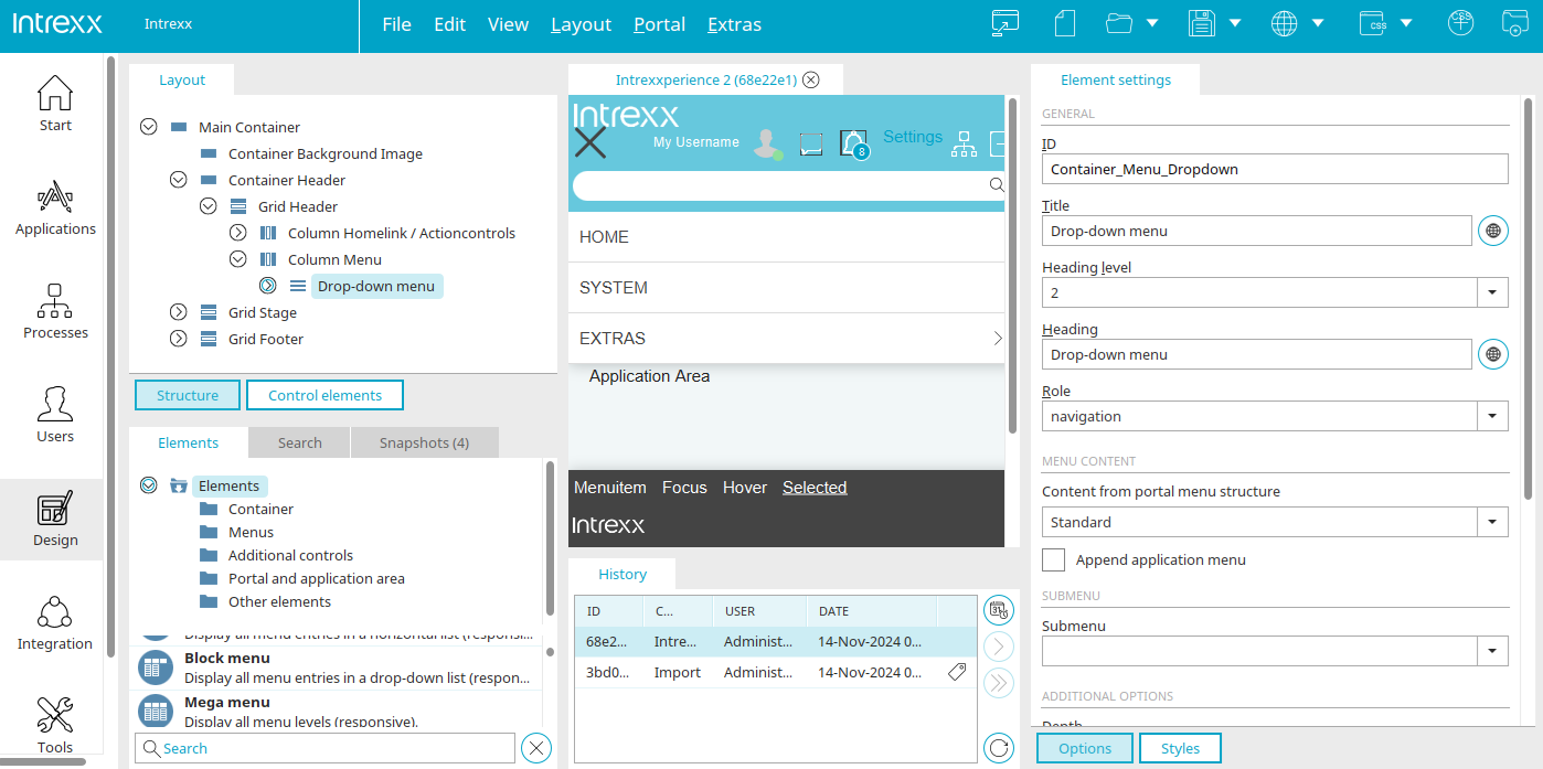
If a menu already exists in a layout, it can usually be found at the top left in the "Layout" area under Container Header / Grid Header / "Menu" column. If you open the structure up to this point, you will see the click-down menu there and, if it is selected, you can edit its element settings in the right-hand area.
If you want to use a different menu, delete the existing menu in the "Layout" area by choosing "Delete" from the context menu. Then the desired menu can be created again in the same place ("Menu column"). To do this, simply drag and drop the menu from the "Elements" panel to this location in the layout structure.
Alternatively, the new menu can also be created via the context menu "Insert sub-element / Menus" in the "Layout" area in the "Menu" column.
Flat menu

A flat menu can only show one level (arranged horizontally or vertically). On which level the display begins depends on how it is linked to other menus. This is defined in the element settings.
If you are creating a new flat menu by dragging it with the mouse from the "Elements" area to the Layout structure, or by double clicking on the current flat menu, the properties dialog is opened.
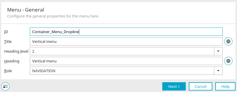
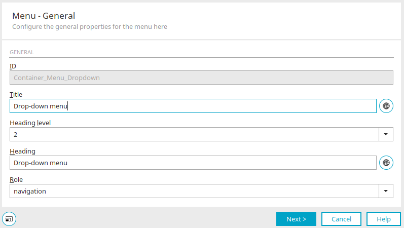
General

Click here for more information about these settings. Click on "Next".
Alignment
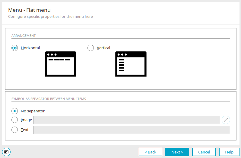
Horizontal / Vertical
These settings arrange the menu items horizontally or vertically.
Symbol as separator between menu items
No separator
With this option, a separator will not be shown between menu items.
Image
With this option, an image will be inserted as a separator.
 Select image
Opens a dialog where the image can be selected.
Text
With this option, text can be entered that will be inserted as a separator between menu items.
Click on "Next".
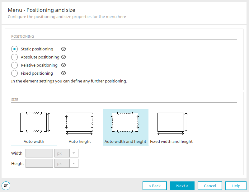
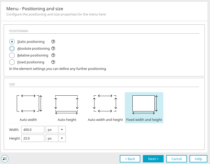
Positioning and size
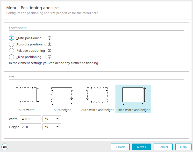
Click here for more information about these settings. Click on "Next".
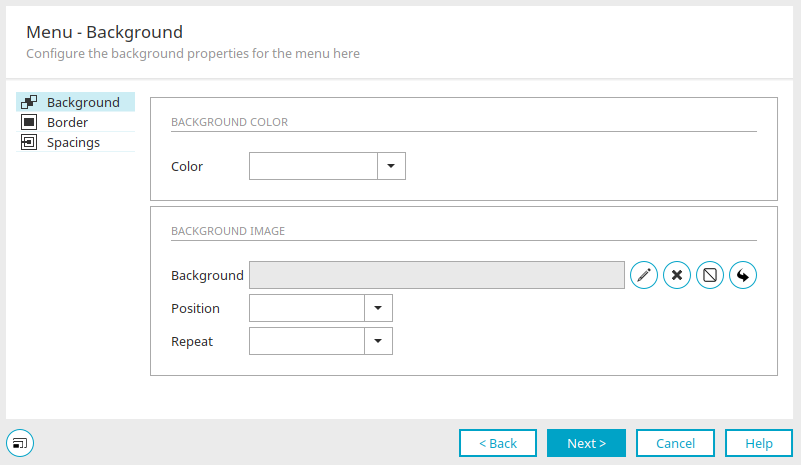
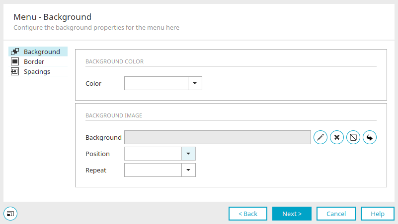
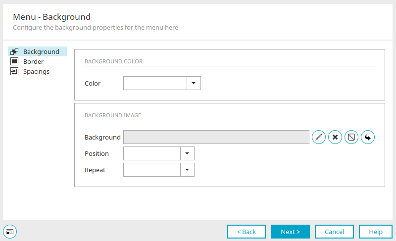
Menu - Background
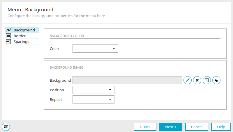
Click here for more information about these settings. Click on "Next".
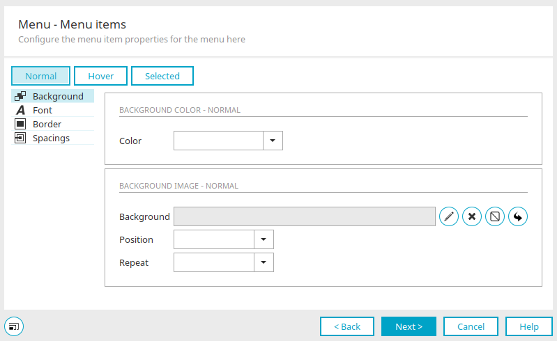
Menu - Menu items

Click here for more information about these settings. Click on "Next".
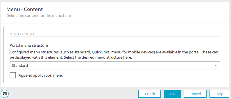
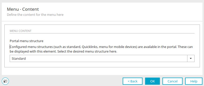
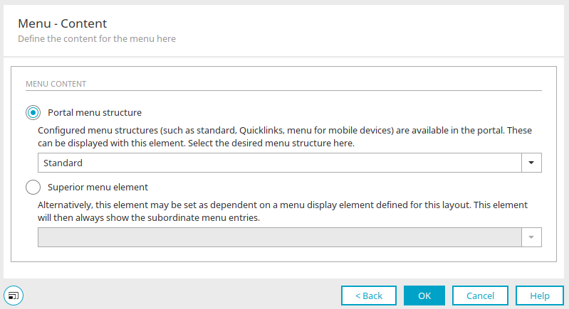
Menu - Contents
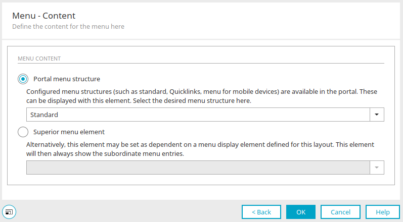
Click here for more information about these settings.
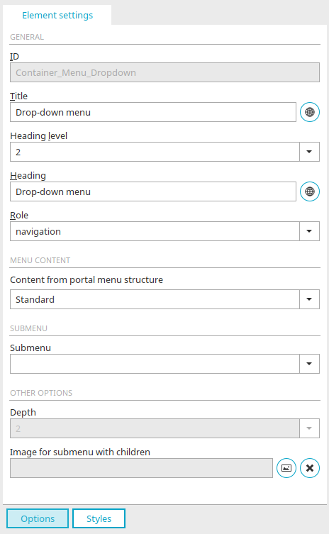
Element settings
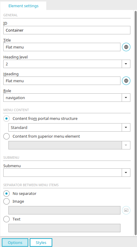
General
Click here for more information about these settings.
Menu content
Content from portal menu structure
Select the menu structure that should form the content of the menu.
Content from superior menu element
Here you can select an existing menu element that should be linked to the flat menu. This menu controls the flat menu.
Submenu
An existing submenu can be selected that will be controlled by the flat menu.
Separator between menu items
No separator
With this option, a separator will not be shown between menu items.
Image
With this option, an image will be inserted as a separator.
Select image
Opens a dialog where the image can be selected.
Text
With this option, text can be entered that will be inserted as a separator between menu items.
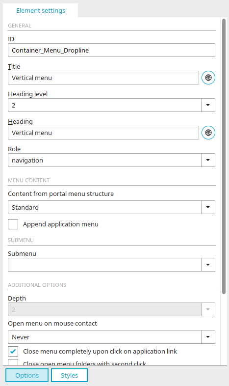
Vertical menu
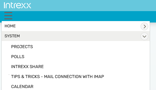
A vertical menu can be implemented if you require a menu item presentation that saves space, e.g. for mobile devices. This menu type behaves responsively meaning that it adjusts itself accordingly to the various display sizes. The distance between the  Start symbol and the menu items can be specified using the "top" and "left" properties of the #Container_Menu_Dropline .menuopenclose selector.
Information about the element settings can be found here.
If you are creating a new vertical menu by dragging it with the mouse from the "Elements" area to the Layout structure, or by double clicking on the current vertical menu, the properties dialog is opened.
General
Click here for more information about these settings. Click on "Next".
Positioning and size
Click here for more information about these settings. Click on "Next".
Menu - Background
Click here for more information about these settings. Click on "Next".
Menu - Contents
Click here for more information about these settings.
Element settings
Click here for more information about these settings.
Menu content
Content from portal menu structure
Select the menu structure that should form the content of the menu.
Content from superior menu element
You can select a superior menu, such as a flat menu, that provides the content for the subordinate vertical, row or block menu.
Append application menu
With this option, the pages, which are included in the application menu, are displayed as submenu items - provided the user has the appropriate permissions.
Submenu
A subordinate menu element can be selected here. This will be controlled by the vertical, row or block menu.
Additional options
Depth
Specify here how many levels should be displayed in the menu.
Open menu on mouse contact
With this setting the menu is opened already on mouse contact and not only after a click.
Close menu completely with click on application link
Closes the entire menu when a menu item in an application menu is clicked.
Close open menu folders with second click
If a menu folder is clicked on a second time, then it will be closed.
Only one open menu path allowed
Menu paths not currently selected are closed.
Only one open menu path allowed in the first level
In the first level, menu paths not currently selected are closed.
Highlight selected menu item
Writes an additional class called "selected" that can be designed accordingly. The class can, for example, use special events.
Close menu with click away from menu
Closes the menu when the user clicks on a display area that does not belong to the menu.
Upon click, open menu folder and target destination
Opens the menu folder and the menu item's start page.
Include functions from custommenu.js
Integrates the file "custommenu.js" from the portal directory external/htmlroot/include/custom in which additional JavaScript actions can be specified for when the user clicks on the menu.
Row menu
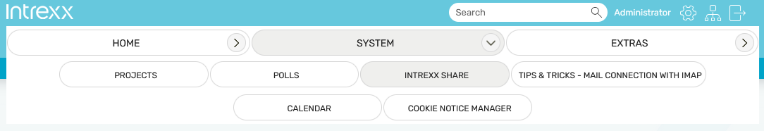
In the Row menu, the menu items of all levels are depicted horizontally in the same format. It can be implemented if you require a menu item presentation that saves space, e.g. for mobile devices. This menu type behaves responsively, simply meaning that the Start symbol is shown in smaller display sizes. The menu items can be opened by clicking on that link.
Information about the element settings can be found here.
For more detailed information on the properties of this menu, see the description of the Vertical menu.
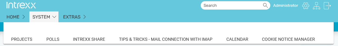
Block menu
In the Block menu, the menu items of the first level are depicted horizontally, the rest are depicted vertically. It can be implemented if you require a menu item presentation that saves space, e.g. for mobile devices. This menu type behaves responsively, simply meaning that the Start symbol is shown in smaller display sizes. The menu items can be opened by clicking on that link.
Information about the element settings can be found here.
For more detailed information on the properties of this menu, see the description of the Vertical menu.
Mega menu
In the element settings of the mega menu, you can define the number of levels and also how the application menu is appended. In principle, the structure of the mega menu corresponds to the structure of the block menu. The following selectors have been added to the block menu for this purpose:
Selector block 1:
#Container_Menu_Droplist .menu .input:checked ~ .level0.list
#Container_Menu_Droplist .menu .input:checked ~ .level1.list
#Container_Menu_Droplist .menu .input:checked ~ .level2.list
#Container_Menu_Droplist .menu .input:checked ~ .level3.list
Selector block 2:
#Container_Menu_Droplist .menu .input:not([checked]) ~ .level0.list
#Container_Menu_Droplist .menu .input:not([checked]) ~ .level1.list
#Container_Menu_Droplist .menu .input:not([checked]) ~ .level2.list
#Container_Menu_Droplist .menu .input:not([checked]) ~ .level3.list
The behavior in this case differs as follows.
Selector block 1:
A menu level (0,1,2 or 3) in the open state, i.e. the parent menu level has been explicitly clicked.
Selector block 2:
A menu level (0, 1, 2 or 3) when it is closed, meaning the menu level above was not specifically selected.
The selectors respond to the "ul" of the respective level. This makes it possible to display and style menu levels as desired, regardless of the status of the parent menu level (clicked / unclicked).
Information about the element settings can be found here.
For more detailed information on the properties of this menu, see the description of the Vertical menu.
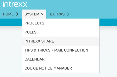
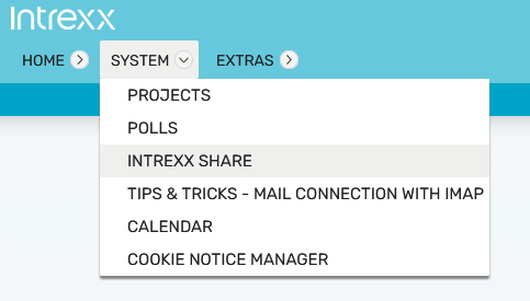
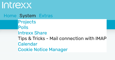
Drop-down menu
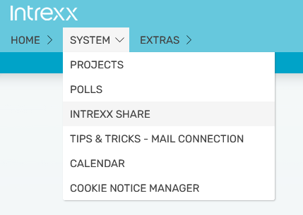
A drop-down menu consists of a flat main menu (arranged horizontally or vertically) And popouts that contain the subordinate menu items. The drop-down menu is responsive and therefore automatically adapts to SMALL, MEDIUM and LARGE screen sizes.
Information about the element settings can be found here.
For more detailed information on the properties of this menu, see the description of the Vertical menu.
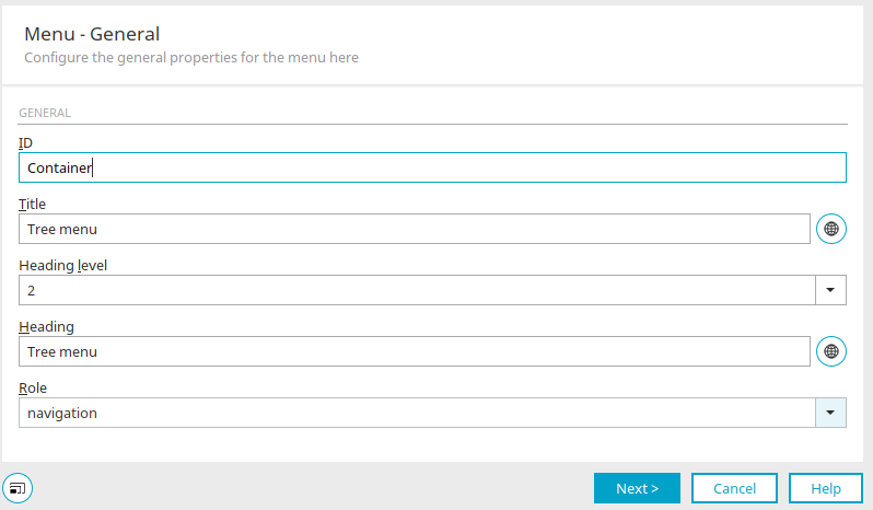
Tree menu
In the element settings of the tree menu, you can define the number of levels and also how the application menu is appended. For the tree menu, a responsive grid layout with a border in the right area is needed. In this case, two containers should be placed next to each other. The menu is placed in the left container and the stage container in the right one.
All information on the settings in the properties of this menu can be found in the description of the vertical menu.
Drop-down menu (Alt)

A drop-down menu consists of a flat main menu (arranged horizontally or vertically) And popouts that contain the subordinate menu items. If you are creating a new drop-down menu by dragging it with the mouse from the "Elements" area to the Layout structure, or by double clicking on the current drop-down menu, the properties dialog is opened.
General
Click here for more information about these settings. Click on "Next".
Alignment
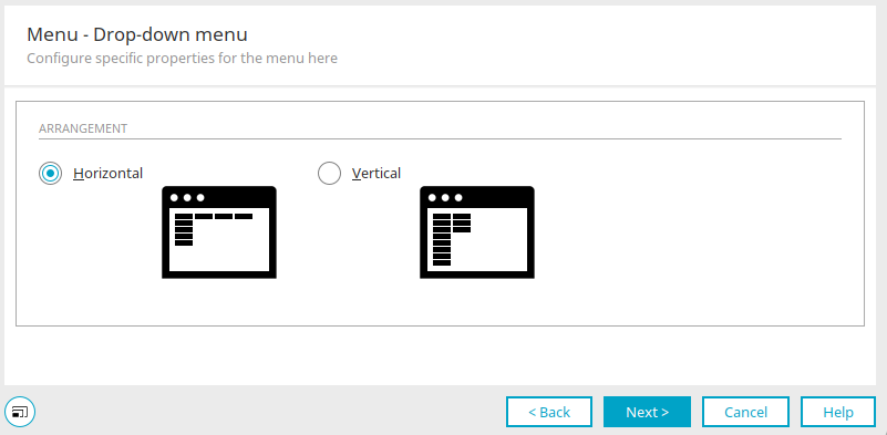
Horizontal / Vertical
These settings arrange the menu items horizontally or vertically. Click on "Next".
Positioning and size
Click here for more information about these settings. Click on "Next".
Menu - Background
Click here for more information about these settings. Click on "Next".
Menu - Menu items

Click here for more information about these settings. Click on "Next".
Menu - Background Popout
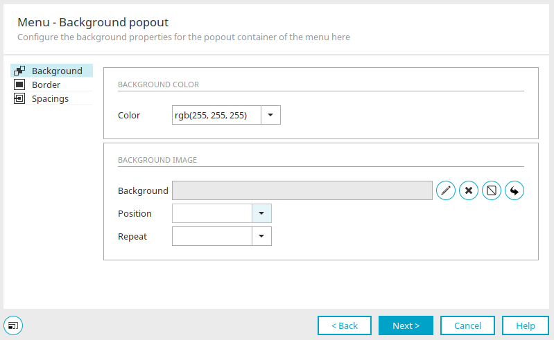
Click here for more information about these settings. Click "Next".
Menu - Menu items Popout
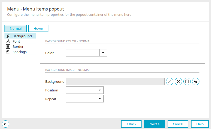
Click here for more information about these settings. Click "Next".
Menu - Contents
Menu content
Portal menu structure
Select the desired menu structure.
Superior menu element
If the current menu is not to be ranked highest in the portal, but should function depending on another menu, it can be connected with another menu with this setting. Select the desired superior menu from the drop-down list.
Append application menu
You can also determine whether the application menu should be integrated into the application menu for row menus, block menus or vertical menus.
Element settings
Menu content
Content from portal menu structure
Select the menu structure that should form the content of the menu.
Submenu
An existing menu can be selected that will be controlled by the drop-down menu.
Additional options
Depth
The depth of the drop-down menu can be defined here. If, for example, a menu structure has 5 levels, you can choose to only display levels 1 and 2 in the drop-down menu. A submenu, which can also be selected here, could then be used to display the remaining 3 levels.
Image for submenu with children
The image selected here is shown in the menu if it has subordinate (child) menu items. The filename of the selected image is shown here.
Select image
Opens a dialog where the image can be selected.
 Delete image
Removes the image specification.
Tree menu (old)
A tree menu can display any number of levels. Where the level of display begins depends on how the menu is linked to additional menus. The individual branches can be shown or hidden. If you are creating a new tree menu by dragging it with the mouse from the "Elements" area to the Layout structure, or by double clicking on the current tree menu, the properties dialog is opened.
General
Click here for more information about these settings. Click on "Next".
Positioning and size

Click here for more information about these settings. Click on "Next".
Menu - Background
Click here for more information about these settings. Click on "Next".
Menu - Menu items
Click here for more information about these settings. Click on "Next".
Menu - Tree menu
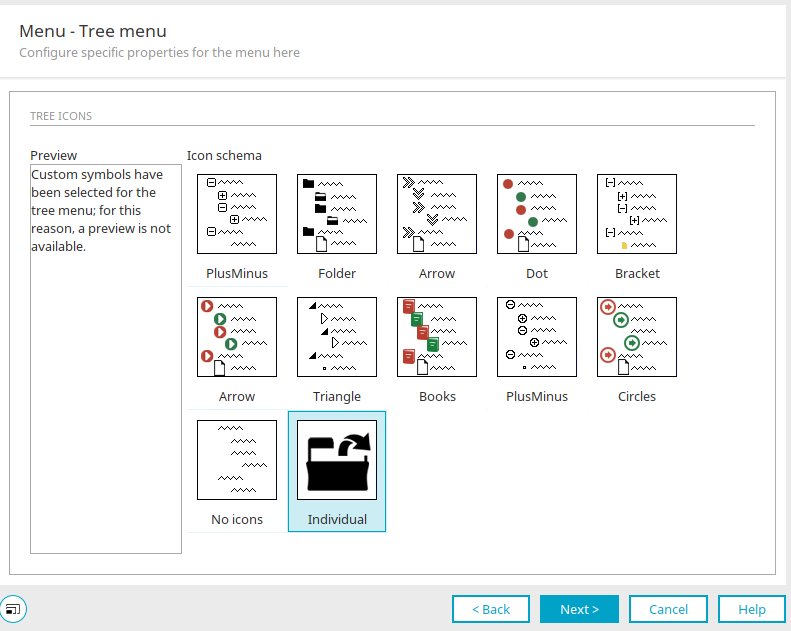
Tree icons
Preview
You can see a preview of the currently selected icon schema.
Icon schema
Here you can select the icons that will be shown to the left of each menu item.
Individual
Images will not be used with this setting.
Click on "Next".
Menu - Contents
Click here for more information about these settings.
Element settings
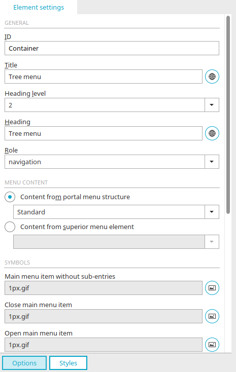
General
All information about the general settings can be found here.
Menu content
Content from portal menu structure
Select the menu structure that should form the content of the menu.
Content from superior menu element
Here you can select an existing menu element that should be linked to the tree menu. This menu controls the tree menu.
Icons
Images can be assigned here that symbolize the individual menu components. If you selected an icon scheme in the properties of the tree menu, the images from that menu are entered here automatically. These can be replaced by custom graphics.
Select image
Opens a dialog where the desired image can be selected in each case.
 Email us