Application design: Style guide
Introduction
This style guide serves as a guideline for designing intuitive and uniform Intrexx applications, providing support during the development of new applications and optimizing existing applications. The aim of this style guide is to guarantee a distinctive and consistent design, and a high level of usability.
-
Consistent look & feel across all portals and applications.
-
User-friendly application design.
-
Rapid and intuitive usability with improved overviews and navigation.
You can download an example application here and import it into your portal as usual.
Design fundamentals
Intuitive design requires the needs and user requirements of the end users to be defined. User-friendliness, and the acceptance resulting from it, can only be achieved when applications line up with the requirements and expectations of the end users and when a simplification of work procedures is the goal.
General principles of design
When planning an application, the principles of the dialog design (EN ISO 9241 Section 11) are to be regarded.
-
Suitability for the task
Suitable functionalities, reduction of unnecessary interactions.
-
Self-descriptiveness
Comprehensibility with help and feedback.
-
Suitability for learning
Instructing the user. Aim: easy to learn.
-
Controllability
The dialog is controllable by the user.
-
Conformity with user expectations
Consistency, adjustment to predictable user requirements as well as generally accepted conventions.
-
Suitability for individualization
Adjustability to the user's needs and knowledge.
-
Error tolerance
System reacts to errors tolerantly or enables errors to be corrected easily by the user.
Presentation of information / Page design
When presenting information, the following criteria are to be regarded:
-
Clarity
The content is communicated quickly and correctly.
-
Distinguishability
The information displayed can be distinguished well, e.g. between mandatory and optional fields.
-
Brevity
No more than the information needed to complete the task is displayed, e.g. no unnecessarily long labels for fields.
-
Uniformity
Congenial data is consistently depicted in the same way.
-
Findability
The user's attention is drawn to relevant areas.
-
Legibility
Information is easy to read, e.g. by using a large enough font size and a clear font type.
-
Comprehensibility
Information is easy to understand, cannot be misunderstood and memorable, e.g. with icons that are easily remembered.
Application structure
When developing applications, you should not just concentrate on the mere visual appearance. Overall, you should pay attention that the three "pillars" content, design and structure, which are required for a good result, remain strictly separated from one another and that emphasis is equally placed on all three points. With regard to the structure, attention should be paid to reaching a uniformity and consistency within an application.
The sitemap shown above shows the structure of a correctly built application made with Intrexx. The starting point of this application structure is the overview page (A1). From here, various interaction options are made available to the user so that they can complete tasks quickly. In the following, these are referred to as
-
Buttons
Buttons with the "Button" button type, which are shown as a labelled button, for entering new data.
-
Text links
Buttons with the "Text" button type that are shown as text links that lead to details pages.
-
Pencil icons
Buttons with the "Image" button type,
which are shown as a pencil icon, for editing saved data
The interaction elements and their triggered actions should be the same throughout an application. The interaction elements must be in the context of the information to be changed. Buttons or icons stand for the execution of actions, links for the navigation within an application.
By clicking on the "Add data" button (A1), an edit form (E1 / E1.2) will open as a tooltip in the middle of the page. In this form, empty edit fields are displayed. For a large amount of data, an edit page can also be opened in the main window.
If the "Edit data" pencil icon (A1) is clicked on, an edit form (E1) is shown in this case as well, however the fields are populated.
Therefore, it is the same form for adding and editing data, this saves time during the development phase of the creation. In practice, a user can find their bearings in the application more quickly and the usability is increased due to the consistent structure and the uniform appearance.
Starting from the overview page (A1), a detailed view page (A2) can be reached from the provided View data text link. The details page (A2) can, depending on what's needed, contain the options "Add data", "Edit data" or "View data".
On the detailed view page (A2), users are shown information that is already been created. This data can, once again if required, be modified. If this is the case, an "Edit" button can be used to open the same edit form (E1) with populated fields; this the same form reached via the pencil icon on the overview page (A1).
For all subpages, the same structure and approach as described above is to be regarded.
Application menu structure
The application menu subdivides the most important pages of an application and provides the user with quick access to the respective pages by directly linking the individual menu items. A selected and active menu item should visually stand out from the other menu items. This can be achieved both by using a completely different color (for a:hover and a:active) as well as by using an additional bar underneath the currently selected menu item.
An application menu should be shown above the content area and left-aligned. It should not contain more than 7 +/-2 menu items to ensure clarity.
Application menus should correspond with a logical and in particular, a consistent sequence.
As an example, ordering the items based on how often they are used can be very helpful so that users have immediate access to the information that they are more likely to need.
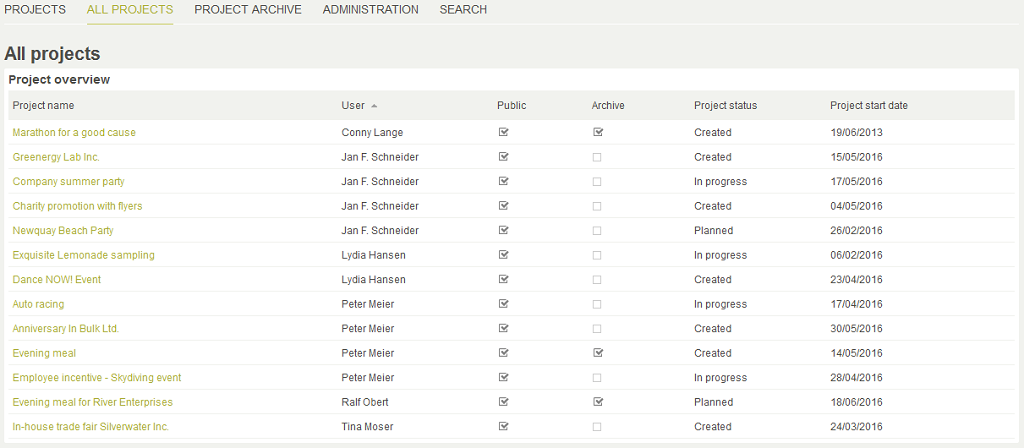
In our example, only the content that is definitely relevant to the user and that is very likely to be accessed is shown under the menu item "Projects". The item "All projects" contains all of the created projects. This menu item is seen as the second most important and is therefore placed second. The menu items "Administration" and "Search" are positioned last because these are accessed least.
If multiple applications in a portal contain the same menu items, these should all correspond to a consistent order, for example in our case, the menu item "Search" is always positioned last. The similar structure makes it easier for users to find their bearings regardless of which application they are using.
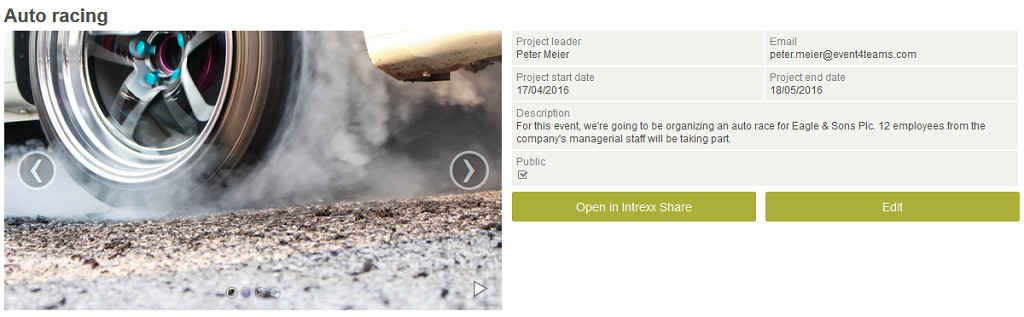
Overview page
Possible structure of an overview page (A1)
With regards to information, there are different needs and amounts for an application page. Because of this, the structure can vary based on content's criteria.
Every application page should have a page title (Heading, Text_h2, distinct and clear name) which ideally matches the selected menu item of the application. Furthermore, the first letter of the page title should be left-aligned with the application menu.
The content area covers the entire width available, if a navigation or filter area is not required.
If an additional filter/navigation area should be provided, this should be positioned to the left of the content area. Individual filtering options are arranged vertically one beneath the other in order to provide the content area with enough space. Also, make sure that the content area is clearly separated from the filter/navigation area (min. 5px).
Possible design of an overview page
Application page with a free layout table (A1)
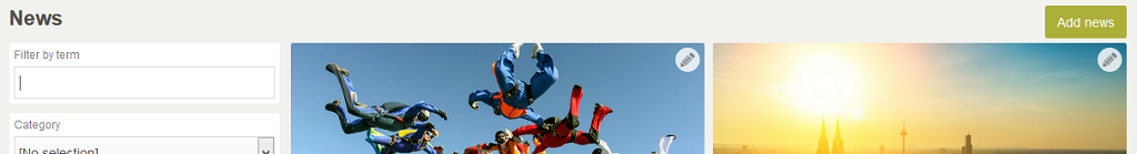
Presenting content in a free layout table is a good idea if data should be presented in a visually appealing manner. A background image draws interest to the content and thus increases the "joy of use".
If tables can be divided into categories (here two columns), there should be a space between the tables (min. 5px) to achieve a visual separation. Additionally, each table group should have an appropriate table title (Text_h3). In our example "Public projects" and "My projects", these titles should be left-aligned above the table and unify all of the table content assigned underneath it.
-
View data
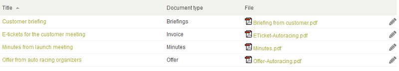
Each table element (image tile) should have a title (text link) that links to the corresponding details page.
-
Edit data
Additionally, data should be editable. This is achieved by clicking on the provided pencil button (icons should be used if the area available is small, otherwise use text buttons).
-
Add data
If a user would like to add new data, they can do this by clicking on the text button ("Create project" in this case) above the view table on the right; this will open a corresponding edit page.
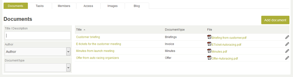
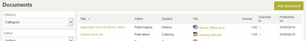
Application page with a view table
If a filter/navigation area is not used, the content area of an application is stretched to take up the entire area of the application area. Each table should have a clear table title that is left-aligned and positioned above the table.
If tables can be divided into different categories, each table group should be given a container that fully encloses it. A gap of 15px should be made between the table groups. If users should be provided with the ability to add new data to a table, a corresponding button should be positioned above the table and right-aligned.
The appearance of an application page with a filter/navigation area could look like this:
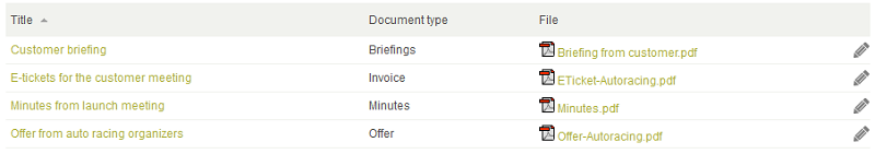
In this case, each table column ought to have a suitable heading and if possible, consist of one apt word. In general, columns should be ordered based on their priority (from left to right with the most important columns first).
Tables enable you to get a quick summary of large volumes of data. Therefore, the aim when designing tables is to provide the user with optimal access to the information needed or wanted.
The following alternatives can be used for viewing or editing a data record. Which variant should be used generally depends on the context within the application. The choice of the target destination (view page or edit page) is also dependent on the context and must be determined on a case to case basis.
View data record (View page A1)
If the primary goal of a table is for displaying data, the title in the first column should be a link that directs to a view page (the magnifying glass symbol is redundant in this case). However, opening a view page from within the table only makes sense if additional data, which is not shown in the table, is displayed.
View data record (Embedded tooltip A2)
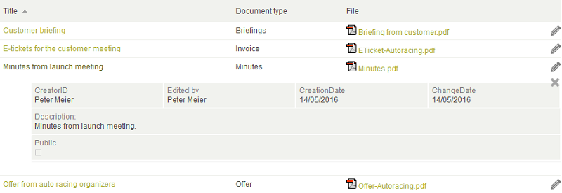
Another available option is to allow a view table's data records to be shown as an embedded tooltip.
The advantage of this is that the user does not need to leave the application page and the data can be viewed conveniently within a table or container. Here, the opened data should be indented and a "Close" function should also be provided.
Edit data record
If the primary function of a view table is to enable data to be edited, the title in the first column should be a link that directs to an edit page with populated fields. This means that the pencil symbol at the end of a row can be omitted.
View and edit data record – strict separation
If the primary goal of a view table is for displaying data, the name in the first column (usually the title) should be a link that directs to the corresponding view page. Furthermore, a pencil symbol is provided at the end of each row; this links to the corresponding edit page.
The distance within a row between the "View" and "Edit" actions should prevent the users from clicking incorrectly.
Summary of the overview page (A1)
Possible structure
-
Page title (Text_h2), left-aligned with the application menu.
-
Content area spreads to maximum available width if a filter/navigation area is not required.
-
Position filter/navigation options on the left next to the content area.
-
Each filter option is arranged vertically one beneath the other.
-
Separation of the filter/navigation area from the content area (min. 5px)
Application page with a free layout table
-
Visual separation of categories with a gap (min. 5px)
-
Each table group contains a table title such as "Public projects" (Text_h3), left-aligned
-
View data
via the title (text link) – links to details page.
-
Edit data
via the pencil icon (icon if the area available is small, otherwise text button).
-
Add data
via a text button ("Create project"), positioned above the content area – links to edit page.
Application page with a view table
-
Content area spreads to maximum available width if a filter/navigation area is not required.
-
Each table should be provided with a clear table title, left-aligned and positioned above the table.
-
Each table group is surrounded by a container. There should be a gap between each table group (15px).
-
Enter new table data via the button positioned above the table and right-aligned.
-
Column order based on priority, column titles short and descriptive.
-
View data (View page A1)
Primary goal of the table is to display data, title in the first column links to view page. Link should only be created if additional data is shown.
-
View data (Embedded tooltip A2)
Data should be indented and a Close function should be provided.
-
Edit data record
The primary focus of the table is on editing data, link first column title, input page opens, edit pencil at the end of the row should be omitted
-
View and edit data record – strict separation
Primary goal of the table is to display data, name in the first column (usually the title) links to view page. Pencil icon for editing is provided at the end of row. Edit page is opened.
Details page
Possible structure of a details page (A2)
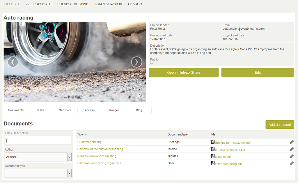
A details page can be divided into two areas, depending on your requirements. The upper content area is for general information and the lower details area provides additional information. Because a details page usually displays a large amount of data, it should not be opened as a tooltip but rather in the main window.
Possible design of a details page (A2, General information)
General information, in this example the most important project data, should be shown as the main information on a details page; this provides the users with a brief rundown of the most important details. To make the presentation visually appealing, the area for the general information could be depicted using two columns, according to your requirements. One area could, for example, show a video or image and the area next to it could display the general information. Here, the general information should correspond to same order that it was entered in. Furthermore, users should be provided with an option to edit this data. For this purpose, a corresponding button is positioned beneath the data (Edit). Above the data is not an option as this area is reserved for the "Add data" text button – if it is required. Likewise, an edit icon should not be used because this could be overlooked amongst the large amount of data.
The details area, which could appear beneath the general information, contains additional information. This information can be opened directly on the details page as an embedded tooltip. This allows the content to be collated under a tab menu. Using the embedded tooltip function prevents overly long pages and the need for scrolling.
The order of the tab menu should be grouped and arranged based on the importance. The most used tab is on the left. As with all navigation elements, the tab menu comes first in the details area and is left-aligned.
The page title (Text_h2) of the details area comes from the currently selected tab. The label of the tab and the left-aligned page title beneath it should coincide.
If filter/navigation options are not provided, the detailed information should stretch to the maximum available width. If a filter/navigation area is also provided, this should be positioned to the left of the detailed information. Here, keep in mind that the detailed information and filter/navigation area should be clearly separated from one another.
Summary of the details page (A2)
Possible structure
-
Two areas
-
Upper area: General information
-
Lower detail area: Additional information
-
Details page opens in main window
Possible design of the details page
-
General information
-
If required, divided into two columns. Left: images or videos, right: the most important general information.
-
Information depicted as it was entered previously.
-
Edit data via text button beneath the general information.
-
-
Details area
-
Open additional information as embedded tooltip.
-
Collate content under a tab menu.
-
Tab menu comes first in the details area, left-aligned.
-
Page title (Text_h2) corresponds to the selected tab menu item.
-
Detailed information spreads maximum available width if there are not filter/navigation options.
-
Otherwise, filter/navigation area is positioned to the left of the content area.
-
Clear separation of the content area from the filter/navigation area (5px).
-
Page design: Edit and view pages
Edit pages
Open edit pages in a tooltip
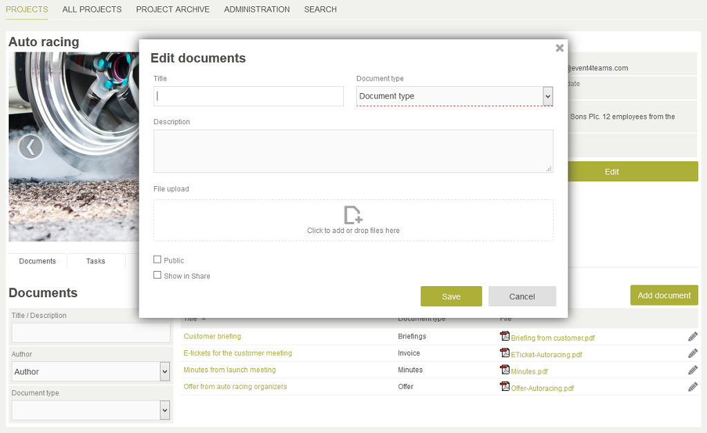
This edit page (E2) is opened as a tooltip in the middle of the layout with the displayed page title (Text_h2). Optionally, an edit page can also be opened modally. A "Close" symbol is shown at the top right. If possible, an edit page should contain no more than seven edit fields. However, as always, the context that the corresponding page is used in should be regarded. The target group should also be regarded here. Normally, one edit form should be enough to record all of the required data. To support navigation within a form via the Tab key, it is essential that the edit fields are arranged logically.
Edit pages as a multi-page wizard (E1 – E2)
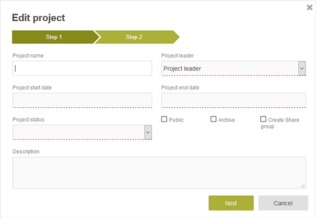
Instead of trying to pack a large amount of edit elements into one overly long form, it is recommended that you create a multi-page wizard which is operated by the Next button (E1, E1.2). Every edit page (E1 and E1.2) is opened as a tooltip in the middle of the layout with the displayed page title (Text_h2). A "Close" symbol is shown at the top right.
Wizards should only be implemented in situations where the content of each edit page can be divided meaningfully (grouping).
As always, the context that the corresponding page is used in should be regarded. This also makes it possible to place more than seven elements in a form without it feeling overloaded.
It is a good idea to provide the user with information regarding the progress within the multi-step process on each page of the multi-page wizard. This means the user knows precisely where here they are and how many steps are left (e.g. Step 3 of 5). By meaningfully dividing the form into multiple steps, it is kept manageable which in turn allows the usability to be increased notably.
Open edit pages in the main window
As a third option, edit pages can also be opened in the main window. This could be useful in a situation where the large number of edit fields would take up too much space in a tooltip.
View pages
View pages should correspond to the same logical structure of their respective edit page. The same, or a similar, arrangement of the elements in the edit or view page helps the user to find their bearings more easily and quickly within the form, regardless of whether it is they are adding, editing or viewing data. In addition, a hierarchical and clear structuring of the elements should be observed.
Summary of page design
Open edit pages in a tooltip (E2)
-
Open tooltip in the middle of the layout.
-
Show page title (Text_h2) left-aligned.
-
Show "Close" symbol at the top right.
-
If possible, no more than seven edit fields on one edit page.
Edit pages as a multi-page wizard (E1-E2)
-
Open tooltip in the middle of the layout.
-
Show page title (Text_h2) left-aligned.
-
Show "Close" symbol at the top right.
-
Show progress (e.g. Step 3 of 5).
-
Navigate through edit pages with "Next" and "Back" buttons.
Open edit pages in the main window
-
When the large amount of edit fields would take up too much space in a tooltip.
View pages
-
Should correspond to the same logical structure of their respective edit page.
-
Regard a hierarchical and clear element structure.
Form design
Forms consist of:
-
Form elements (edit fields)
-
Labels (for edit fields)
-
Control elements (buttons)
Forms should be designed ergonomically for a high level of usability. Minimizing vertical lines and grouping related edit elements are important design criteria. Furthermore, a form should contain as little design elements as possible in order to optimally support the users in their work. Edit fields should correspond with a logical order to support navigation via the Tab key. Anything that does not support a user in filling in the form will distract them and should therefore be removed.
In existing applications, all forms should be checked for redundant edit fields. If you have very complicated forms, it is possible that you have edit fields that no longer have a function or are never filled in by users. These ought to be identified and then removed in order to make work easier and speed up processing times.
Minimizing vertical lines
In forms, the number of vertical lines should be kept as low as possible so that the eye is not overwhelmed and to keep the form well-balanced.
Incorrect
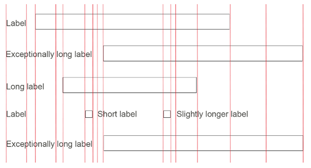
The figure to the above depicts a badly designed form that feels very chaotic due to the large number of vertical lines.
Correct
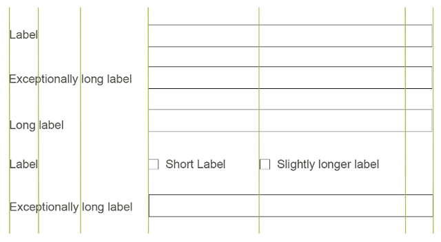
This edit form has the same edit fields but feels clearer and more balanced because the vertical lines have been minimized.
Positioning labels
Labels should be consistently positioned throughout the whole application so that the flow of reading is not disturbed.
Labels should always begin with a capital letter and have a clear meaning (using the language of the company, not a whole sentence). Additionally, the labels should not end with a colon.
The label's positioning has an effect on the form's usability, whereby we can only speak of recommendations in this case.
Labels above edit fields
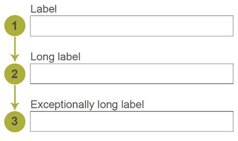
Labels should be left-aligned and positioned above the edit fields. This facilitates legibility and makes the connection between the field labels and edit fields obvious. By arranging the elements vertically, a natural flow of reading from top to bottom, or left to right, is supported. Labels can also have different lengths here without painting a chaotic picture.
Mandatory fields
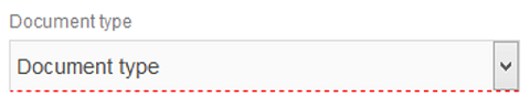
In general, mandatory fields should be easy to recognize from the moment the user first looks at the form. We recommend specifying a color for mandatory fields. Specifying this color makes it less likely that mandatory fields are not missed by mistake, speeds up processing times and increases user-friendliness. To further improve the visibility of mandatory fields, you could, for example, insert a star after the label.
Grouping elements
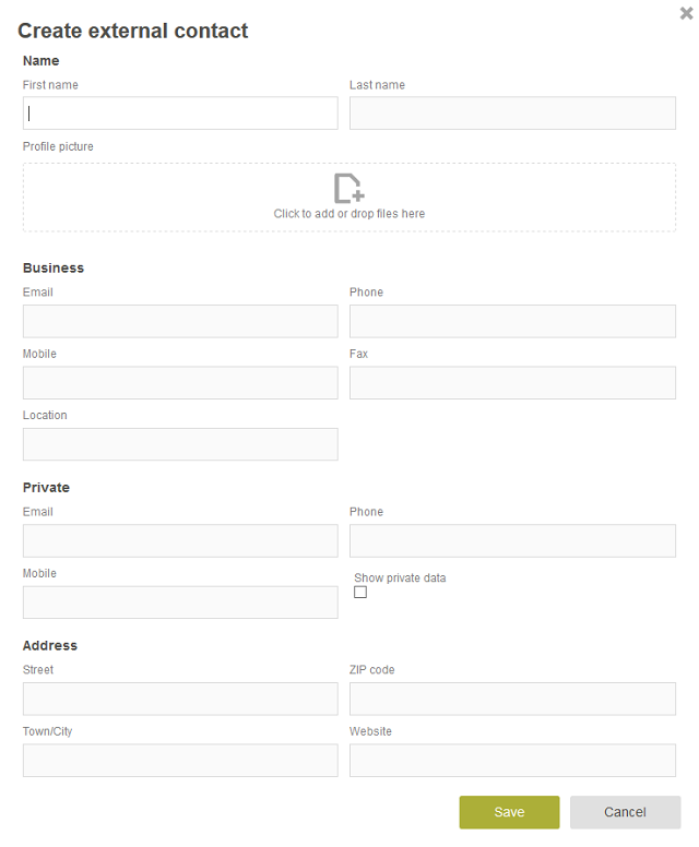
Dividing a form into meaningful groupings helps the users to find their bearings in the form more quickly. In doing so, more comprehensive edit forms can be consolidated into logical units. Here, blocks of edit fields, drop-down lists or lists are formed and distinguished with an optical separation (10px) between the groupings. We recommend using a distance of 5px between the vertically arranged edit fields. Furthermore, groups should be provided with a heading (h3) so that their affiliation is immediately recognizable. However, if a form only contains a few fields (7 +/- 2), it does not make a lot of sense to group the fields.
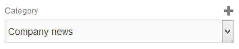
Drop-down list
Drop-down elements within an edit page should, provided it makes sense, be provided with a button (plus icon) for adding a new entry. This would be useful if you want the user to be able to supplement the list. Alternatively, you could use a text button "Add data".
Checkboxes
Checkboxes are used for selecting alternatives that do not cancel one another out. Here, the label should always be positioned to the right of the box.
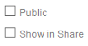
If they are vertically arranged, the boxes and labels should be left-aligned one underneath the other.
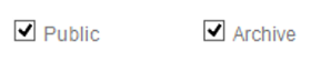
If they are horizontally arranged, boxes and labels should be position at the same height.
Form navigation
Text links
An application's content is linked together via text links. Text links support the navigation within an application and should therefore be indicated clearly. Without having to think about it, a user should know what they can click on and what they cannot. We recommend using a color that corresponds with the design of the application or portal, the overall picture will appear more coherent as a result of this. Text links should stand out clearly from the text body. For "hover" it is recommended that the text link change to a different color (e.g. dark green here), so that the user is given visual feedback.
Buttons
Buttons are implemented as function elements. Clicking on a button always triggers an immediate action, for example saving a form. Buttons should not be used to navigate to other pages. Text links are better suited for this purpose. Exception: For navigation in a wizard, the "Back" and "Next" buttons can be used. In this case, the buttons are arranged as follows:


With buttons, a distinction is made between primary and secondary buttons. The primary buttons are used for the main action (e.g. save) and should stand out visually from the secondary buttons (e.g. cancel and delete).
"Add data" button
The "Add data" button should be positioned above the content area. If the content area has a grouping, the "Add data" button should be provided at the top right above the grouping. By using a color to make the button stand out, you can guarantee that the action cannot be overlooked.
Buttons within a form
Input pages usually contain exactly two buttons: "Save" and "Cancel".
Edit pages contain three buttons: "Save", "Cancel" and "Delete". The "Save" and "Cancel" buttons should always be available at the bottom right at the end of the form. By arranging the buttons "Save – Cancel", you support the user's natural reading behavior from left to right.
The "Delete" button, which is additionally provided by pages used for editing data, should always be positioned at the bottom left at the end of the form. The spatial separation of the crucial "Delete" button from the main button ("Save") should prevent accidental deletion of the entries. Furthermore, the primary button is highlighted with a different color.
More information
Creating and editing applications
Application elements
Practical examples: Responsive design
 Email us