Tips & Tricks - Button tab menu
In addition to the tab menu, which can be defined via the properties dialog of a page and then combines several pages, a tab menu can be created in a page with buttons - e.g. to display contact data clearly. With this approach, actions (such as saving the data) can also be performed when the user clicks on one of the tabs.
The example application can be downloaded here and imported into your portal as usual.
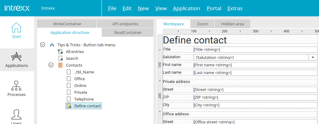
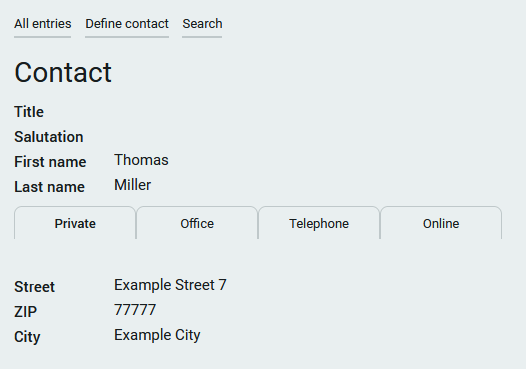
Contact data can be entered on the edit page.
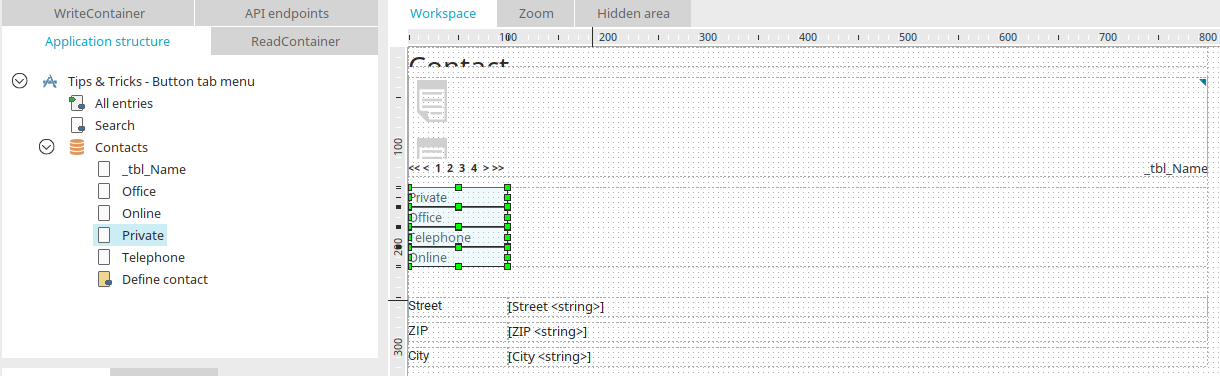
The "Private", "Office", "Telephone" and "Online" view pages are loaded via the buttons shown in the image above. The tab menu can be created on one of the view pages and then copied to the other pages. It is important to switch the buttons' type to “text”. So that the buttons are displayed as tabs in the browser later, they need to be positioned one beneath the other; Otherwise they will be displayed in one tab.
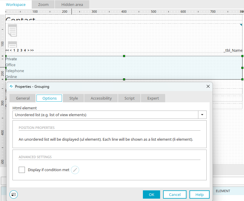
The buttons need to be grouped together in a transparent grouping. In the properties dialog of the grouping, the HTML element is changed to "Unordered List" on the "Options" tab.
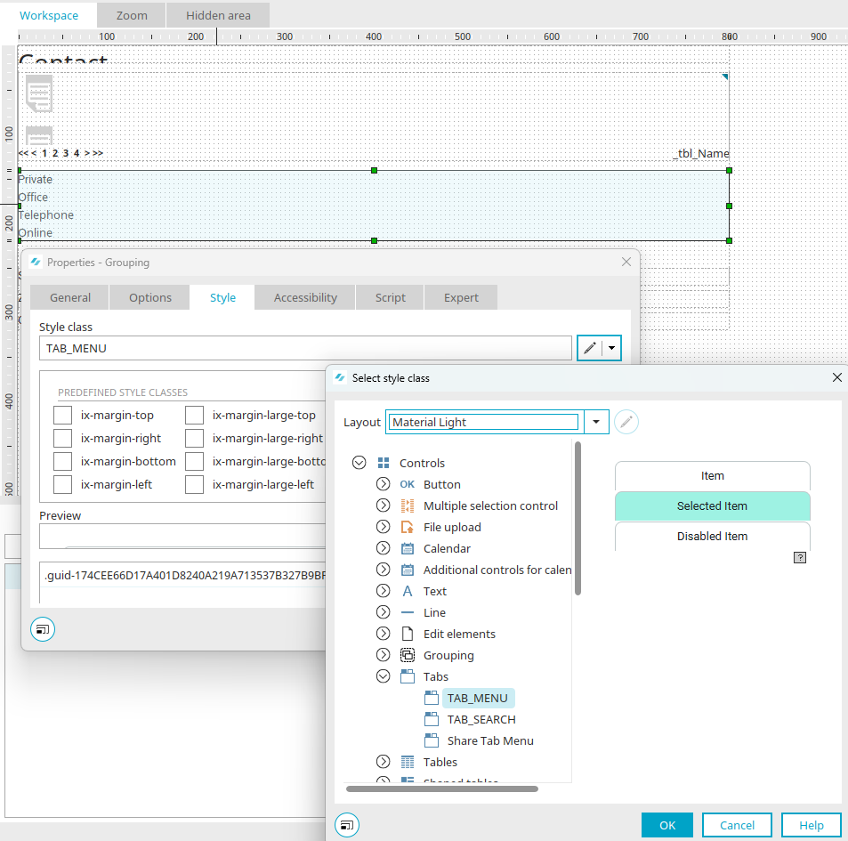
The "TAB_MENU" style class is then assigned on the "View" tab.
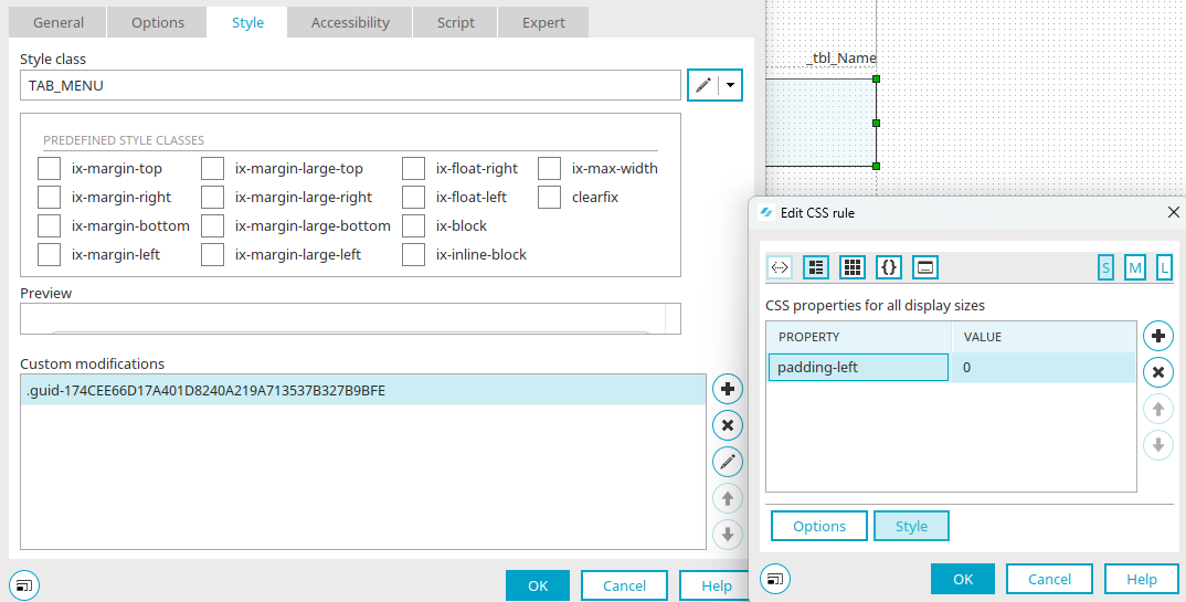
Now the individual adjustment "padding-left:0;" is required, which is created as a CSS rule. With this, the tab menu will not be displayed center-aligned but left-aligned. The grouping can now be copied to other view pages.
To make it easier for the users to know where they are, adjusting the style class for the current tab can be helpful (the "Private" button on the view page "Private", the "Office" button on the view page "Office" etc.). This is done by making them bold with the style class "Link_Strong". Now the user sees which page they are on at a glance.
The result is very similar to the classic tab menu but is positioned in the middle of the page.