Filter - Checkbox selection
The "Checkbox selection" element belongs to the "Filter" element category.
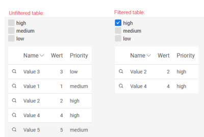
This filter can be used, for example, to filter a view table that is connected to the filter via a dependency using freely definable options.
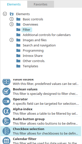
The "Radio button" filter can be found in the "Elements" section of the "Applications" module. A new filter can be created by dragging and dropping the element from here and positioning it on the workspace.
All the information for creating elements can be found here.
The properties dialog of the filter opens automatically when a new filter is created. The properties dialog of an existing filter can be opened by double clicking on the element on the workspace, via the "Properties" context menu, or via the "Edit/Properties" main menu if the filter is selected on the workspace.
Properties
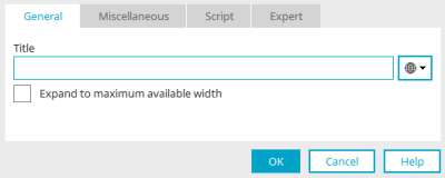
General
The title of the element can be defined here. All further information on this dialog can be found here.
Checkbox
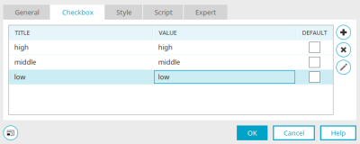
The checkboxes that are to be available in the filter can be defined here.
The title entered here will be shown for the checkbox in the browser. The value is used for filtering.
"Default" column
If the setting in this column is active, the respective checkbox will automatically be shown as active in the browser.
![]() Create new checkbox
Create new checkbox
Creates a new row.
![]() Delete checkbox
Delete checkbox
Deletes the row currently selected.
![]() Edit checkbox
Edit checkbox
Opens a dialog where the title can be modified in the corresponding portal languages.


