Grids

The grid can be used to develop a page layout that is freely collapsible based on the Foundation Framework. It adjusts to the diverse screen sizes of desktops, tablets and smartphones. General information about responsive layout can be found here.
The grid element can only be used on pages that do not use a table layout. When you place the element onto the workspace, it adjusts automatically to the width of the workspace.
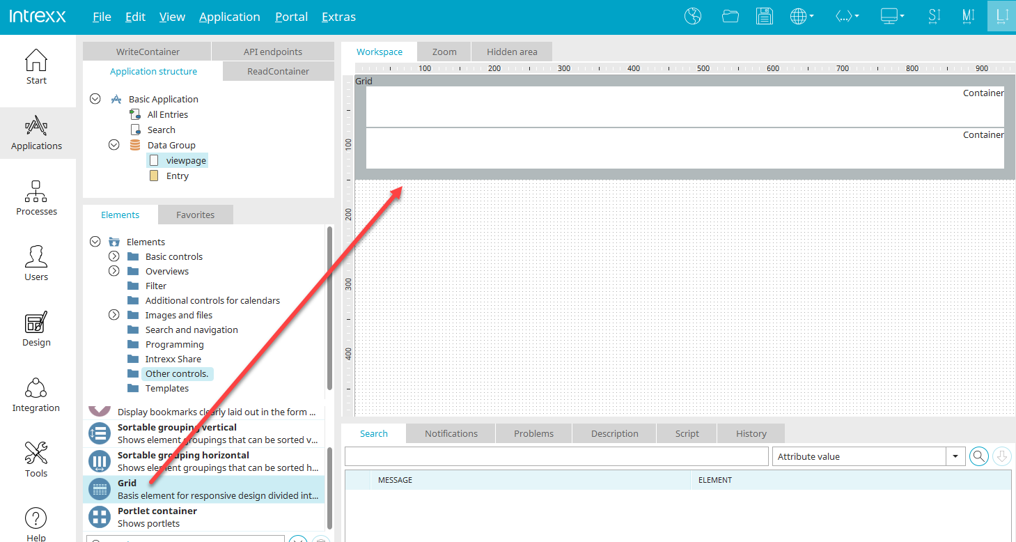
The grid element is the basic element of a responsive page. You can find it in the "Applications" module in the "Elements" area in the "Other controls" category. A new grid can be created by positioning the element on the workspace from here using drag & drop.
All further information on the grid element can be found here.
 Send us an e-mail