Real-World Examples of Responsive Design
Foreword
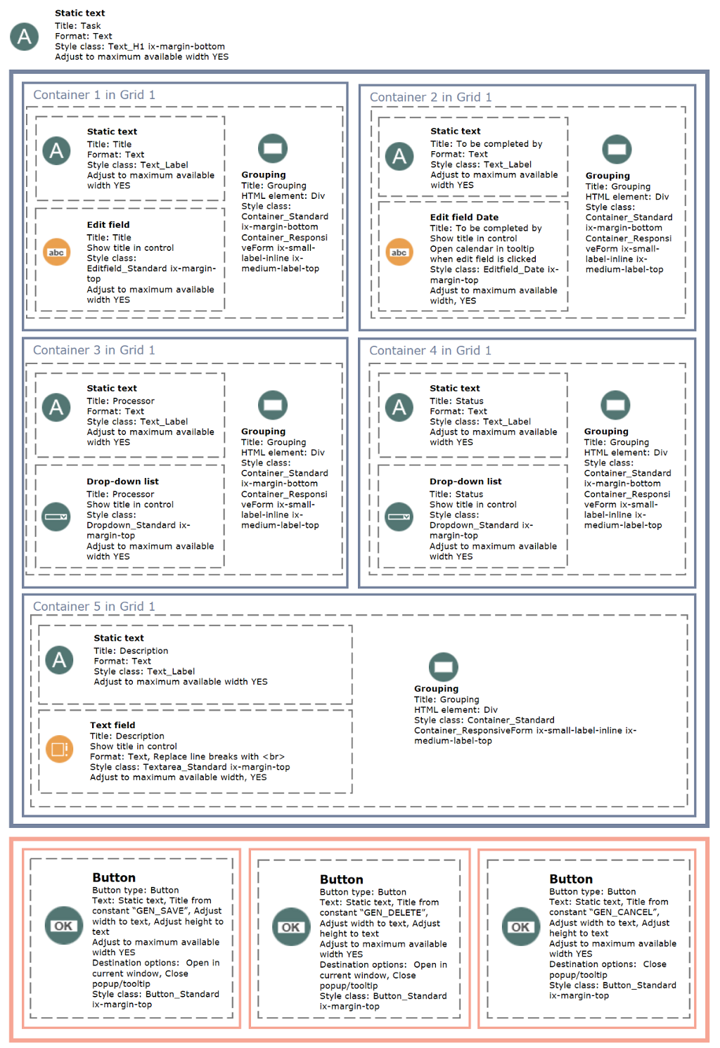
With the advent of the digital workplace, there is a growing need to deliver applications equally across various end devices. With responsive design, functionality, design, and content adapt to the screen resolution of the desktop, tablet, or smartphone being used. Starting with version 8.0, Intrexx also allows users to design and develop responsive applications. For this reason, we have put together a practical guide for you on developing responsive applications with Intrexx. Using a project application as an example, we would like to provide some insight into the development of this application. We'll show you how individual application pages were created, what grid properties are required, and what CSS styles the controls need to be applied to in order to build a responsive application. We hope this will help all app developers, and we look forward to seeing many responsive apps.
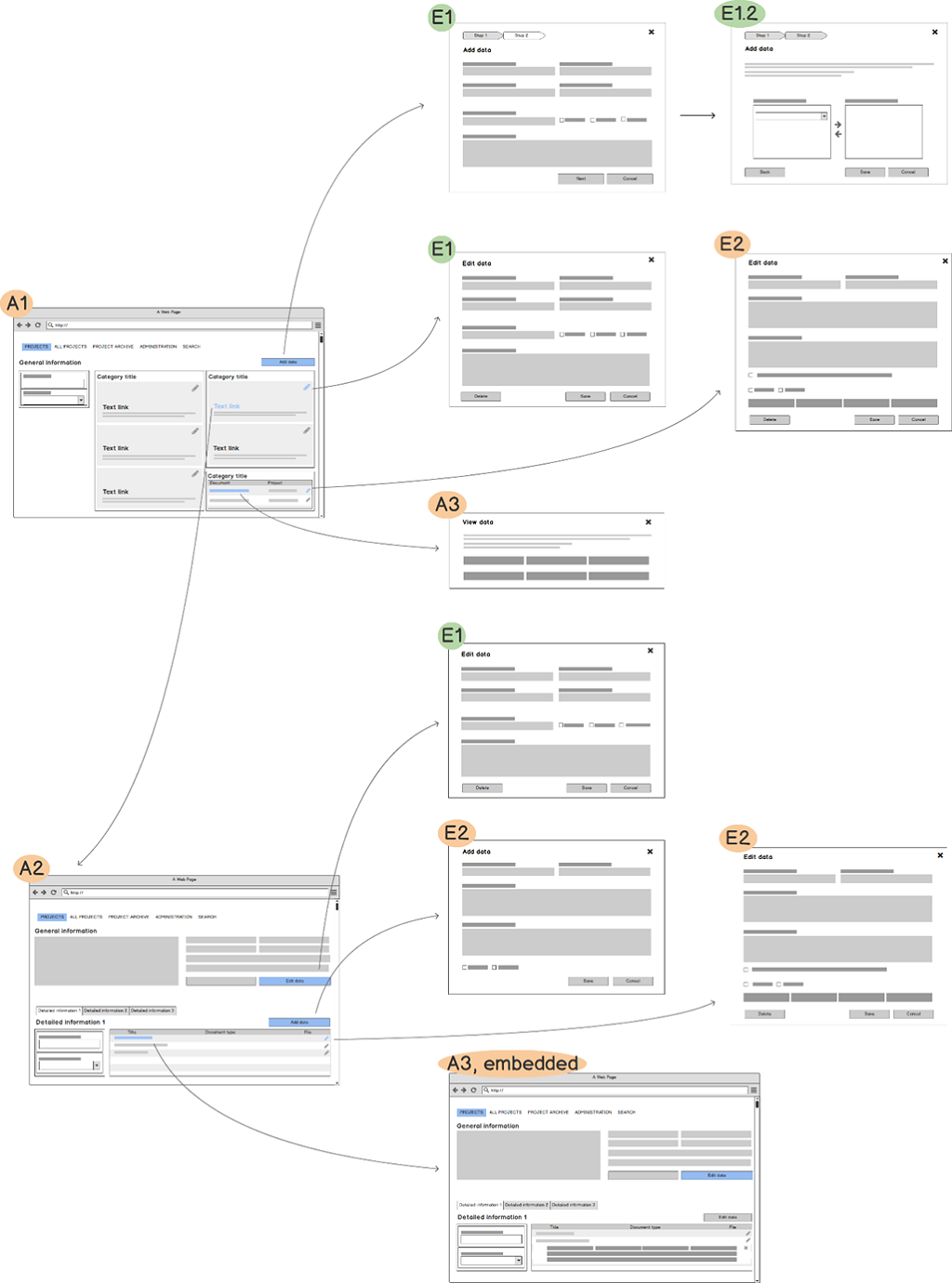
The chapter headings for the practical examples use the same combinations of letters and numbers that are used to identify the page types in the structure (e.g., A1 for the overview page).
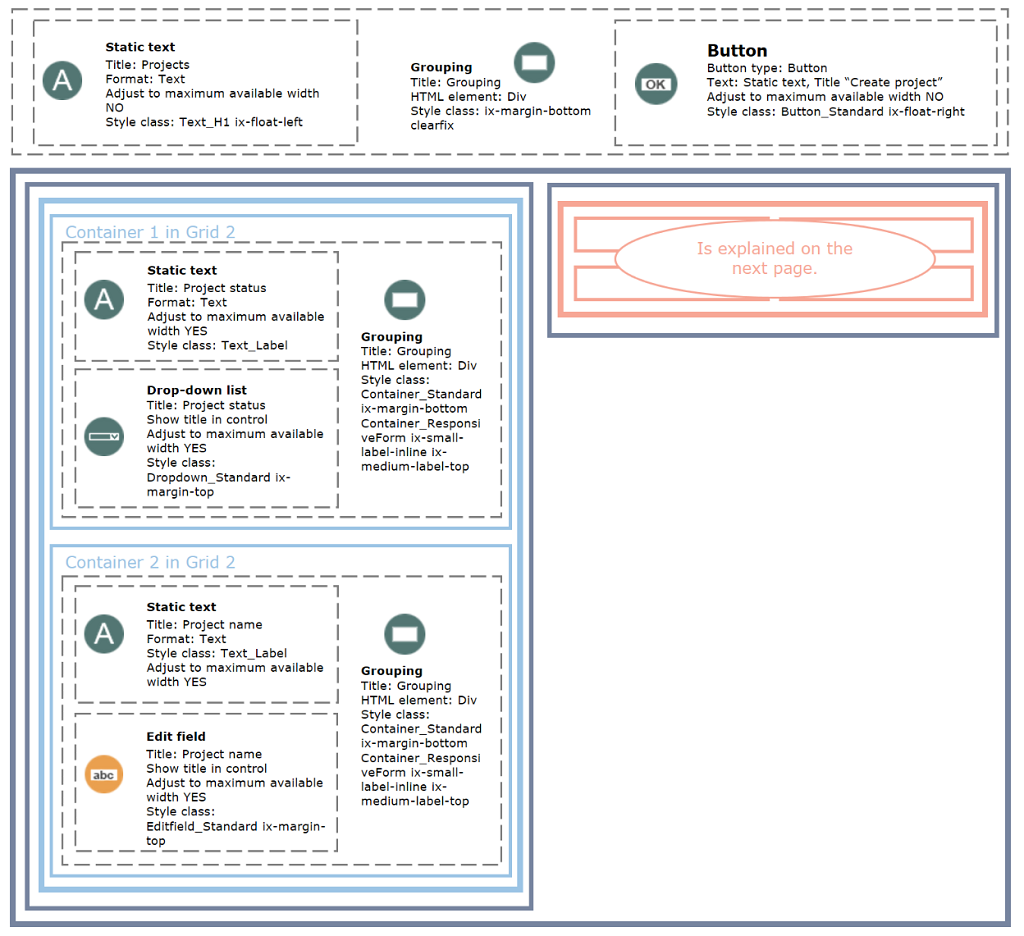
Implementation of the A1 Overview Page
Small
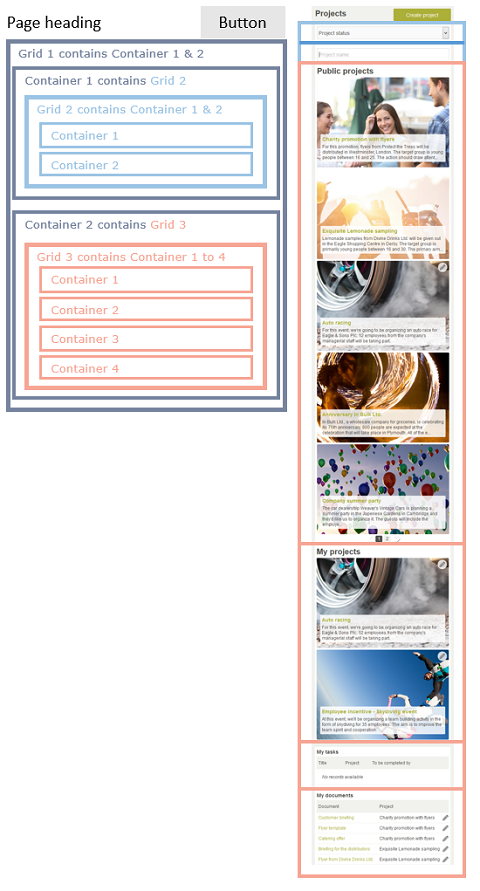
Medium
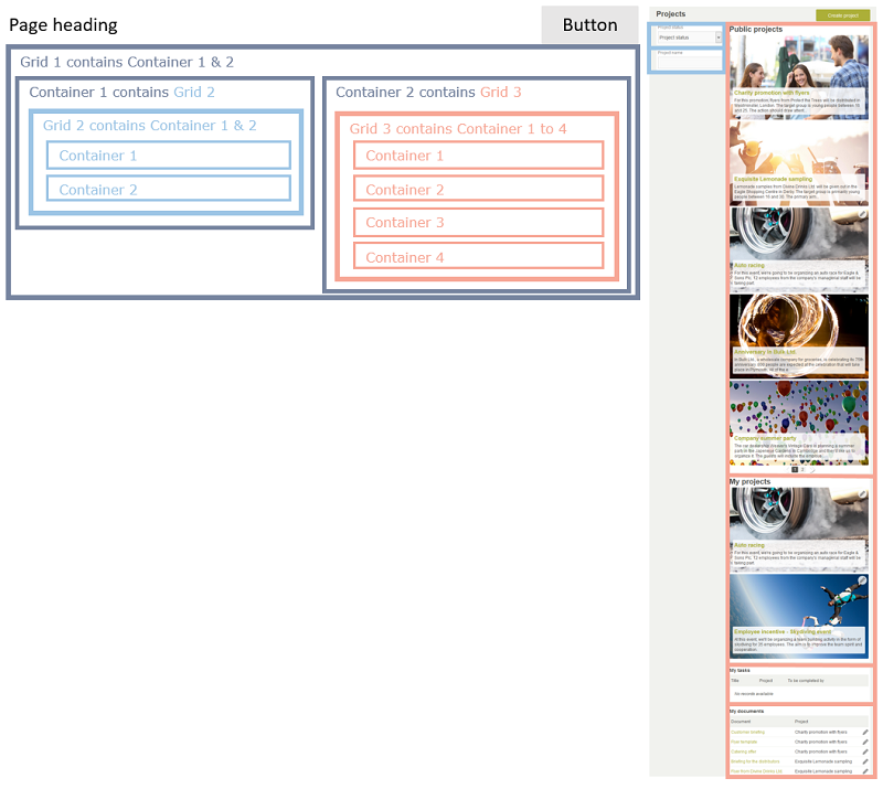
Large
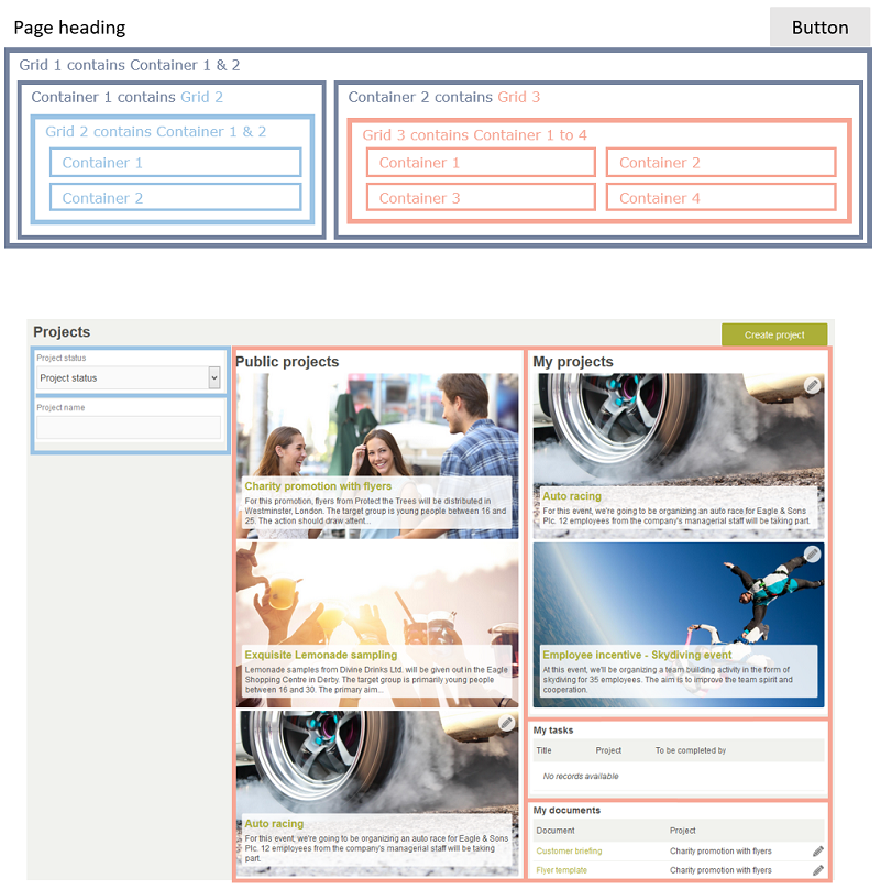
Grid
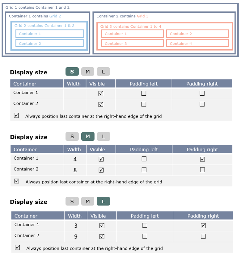

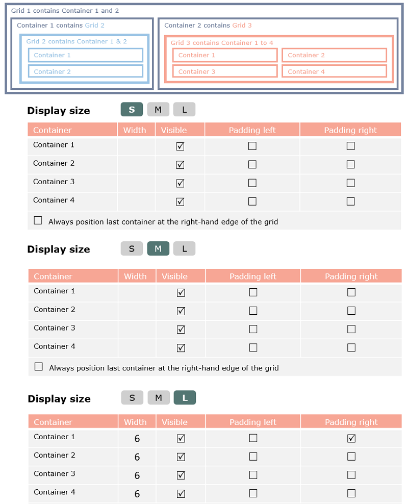
Elements
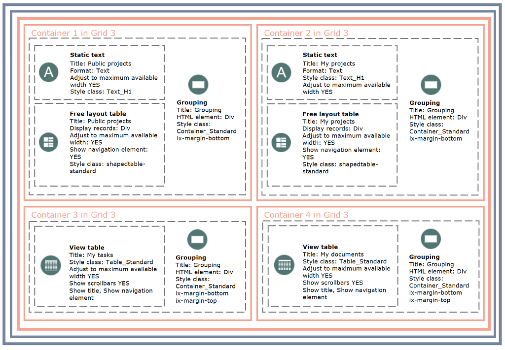


Implementation of the A2 Detail Page
Small
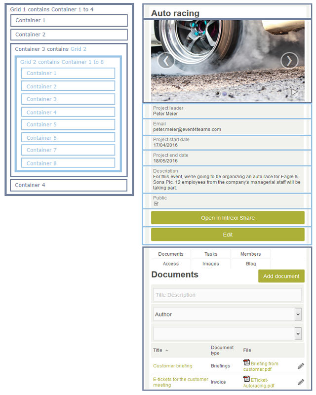
Medium
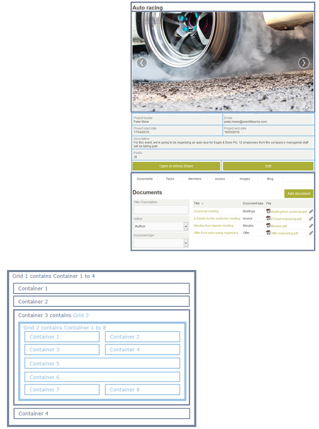
Large

Grid
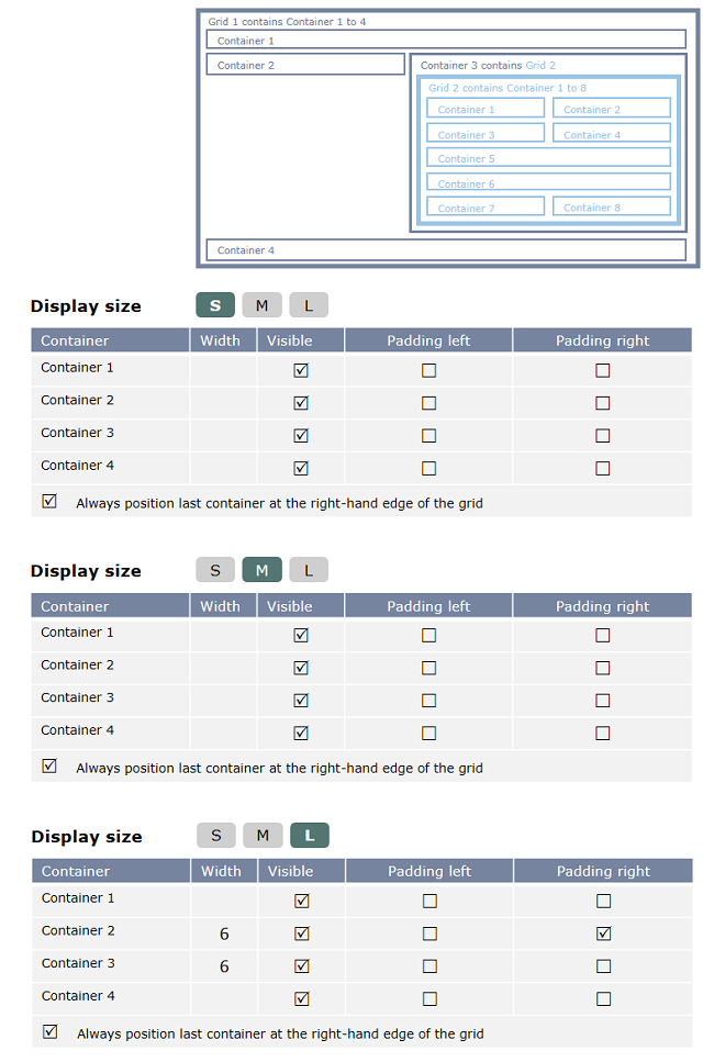
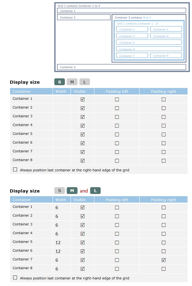
Elements
In the following figure, an image gallery is used at the location marked with a star  . This element has its own styles that are not included in the standard.

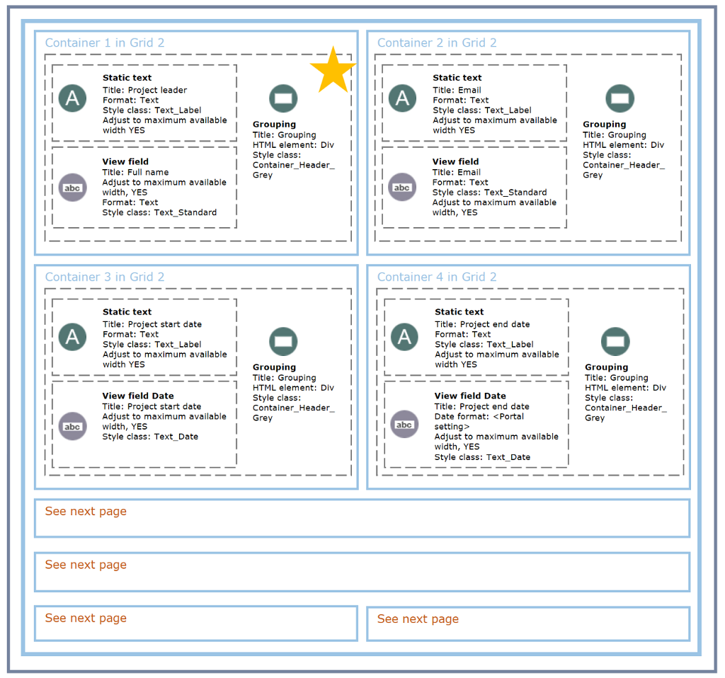
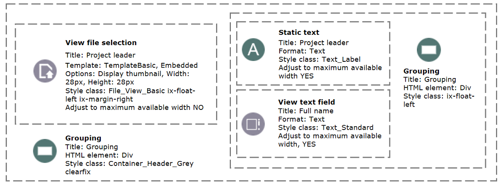
If you want to display an image in addition to the developer's name at the location marked with a star in the figure above, the configuration must look like this:
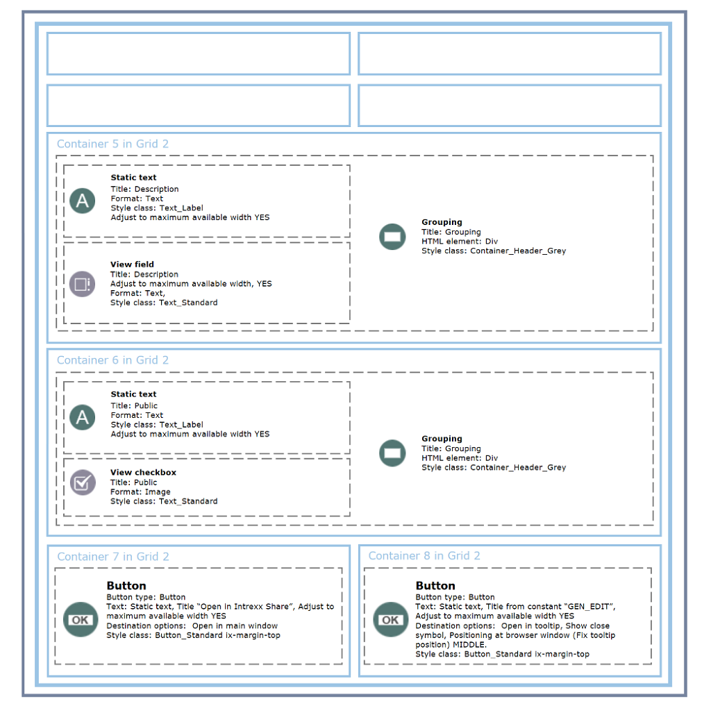
Input Page E2 "Enter Task"
Small
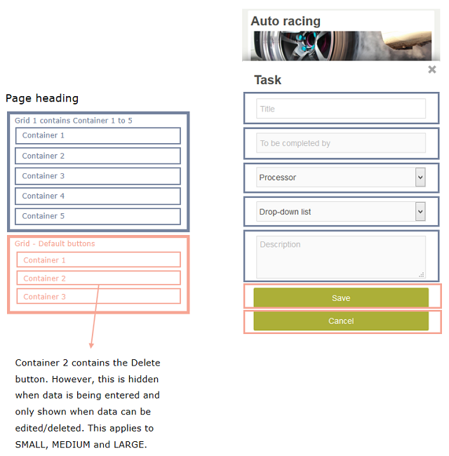
Medium
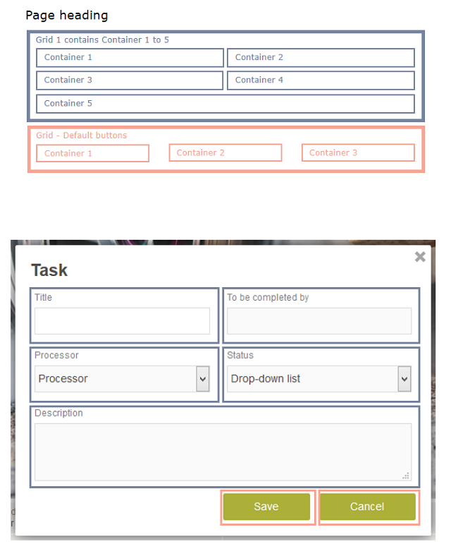
Large
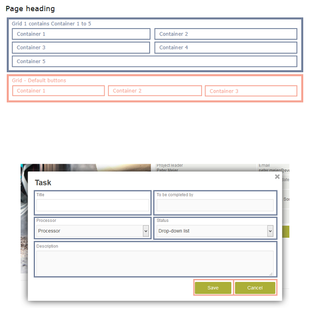
Grid
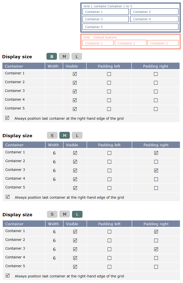
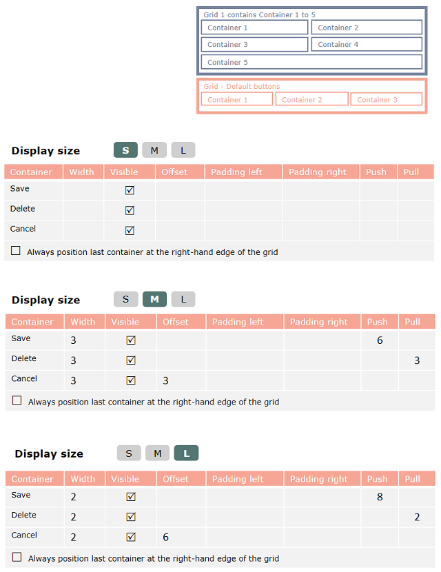
Elements