View field
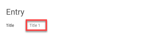
The "View field" application element is one of the basic controls. View fields are used to display data from the connected data fields. As with the input field, there are various control types to choose from.
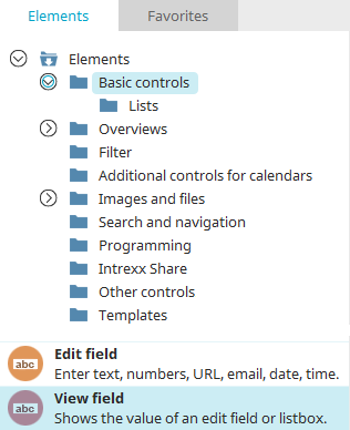
The view field element can be found in the "Applications" module in the "Elements" area. A new view field can be created by positioning the element on the workspace from here using drag & drop.
Further information on creating elements can be found here.
The properties dialog of a view field element opens automatically when a new view field is created. The properties dialog of an existing view field can be opened by double-clicking on the element on the workspace, via the "Properties" context menu or via the "Edit / Properties" main menu if the view field is selected on the workspace.
General
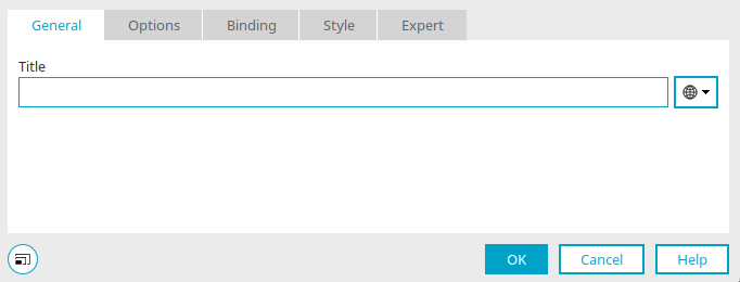
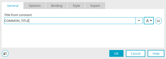
Provide the view field with a title. Information on multilingual titles can be found here.
Options - "Text" and "Video" control types
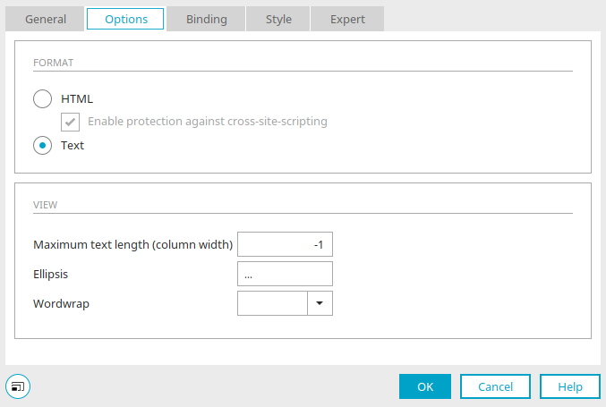
HTML
This format option will interpret the text as HTML.
Activate protection against Cross-Site-Scripting
This setting prevents information from being inserted from a context in which it is not trustworthy into another context in which it is classified as trustworthy.
Text
This option displays unformatted text.
Maximum text length
Here you can specify the maximum number of characters to be displayed using an integer. The value -1 causes all characters to be displayed.
Ellipsis
The character entered here will be attached to the last displayed character when the text length exceeds the maximum allowed text length.
Wordwrap
Here you can select the type of line break.
Options - "Telephone" control type
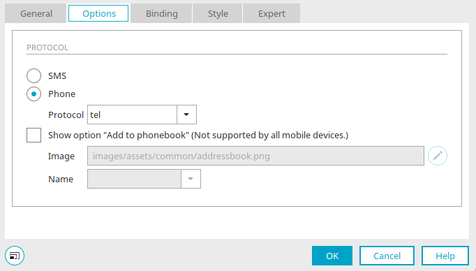
SMS
With this control type, the text in the browser will be constructed as a link, that can be used to send an SMS or to create a telephone connection with an automatically dialed number. For telephony, the following protocols can be selected:
-
tel:
automatic number selection for mobiles
-
callto:
automatic number selection for mobiles and fixed line telephones
-
wtai://wp/mc:
automatic number selection for mobiles
If there are problems establishing a telephone connection, please clarify with the manufacturer which protocol device is suitable and whether browser plug-ins may be required.
Show "Add to address book" option (not supported by all end devices)
With this setting, telephone numbers can be added to the phonebook of the mobile device.
Image
Enter the path and name of the image, which should be shown in the browser to add a contact to the phonebook.
 Edit
Edit
Opens a dialog in which an image can be selected.
Name
Select a string data field that contains the telephone number.
Column presentation in view tables
All information on this topic can be found here.
Options - "Web application" control type
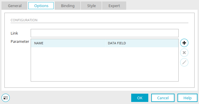
With this control type, you can add dynamic links to web applications, such as location and destination for a web application that calculates routes, to an Intrexx application.
Link
Enter the URL without a parameter here. The key combination Alt + . automatically inserts the URL https://maps.google.de?saddr= (Portal Manager German) or https://maps.google.com?saddr= (Portal Manager English) as a link.
Parameters
Name" column
The parameter names are shown here.
Data field" column
All available data fields are listed here.
 Add parameters / Edit parameters
Opens a dialog in which you can select the data fields that are to provide the values for calling up the web application. Intrexx automatically adds the values, which are contained in the data field, in the browser when the link is clicked on.
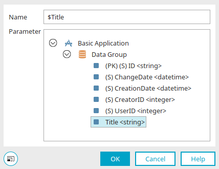
Click "OK" to save the selection and close the dialog again.
 Delete parameters
Removes the currently selected parameter from the list.
Column presentation
All information on this topic can be found here.
General - "Image URL" control type
With the "Image URL" control type, URLs to image files can be displayed as images in the view field. To do this, connect a data field in which image URLs are stored to the view element.
Title
Enter a title for the view field here. Further information on this topic can be found here.
 Edit text alternative
Opens a dialog in which a text can be stored that is displayed if a user has deactivated the loading of images or a user agent does not allow the display of images.
Options - "Image URL" control type
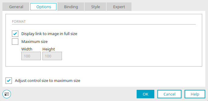
Display link to image in full size
When you click on the image in the browser, a tooltip with the image in its original size is displayed.
Maximum size
Define the desired width and height of the image in pixels.
Adjust control size to maximum size
Means that when the size of the control is adjusted on the workspace, the current width and height will automatically be entered in the properties dialog. If the setting is not set, these values and the size of the control on the workspace are not synchronized.
Column presentation in view tables
All information on this topic can be found here.
An overview of the functions of the view field with control type "Image URL" in comparison with the elements "Sortable list" and "File selection" can be found here.
Options - "Tree path" control type
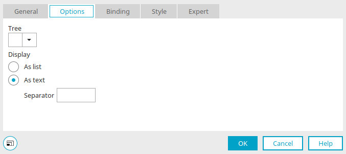
With the "Tree path" control type, the path created by selecting folders in a tree element can be output as a breadcrumb trail. To do that, connect a view field to the data field that is also connected to the tree element. The IDs of each of the tree nodes (folders) are saved in this data field.
Alternatively, the "Path navigation for tree" application element can be used.
Options - "Integer" control type
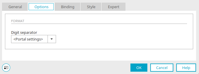
Thousands separator
The 1000 separator can be displayed as a point or a comma. If you select the "Portal setting" entry, the separator is output according to the setting of the number format in the country settings of the portal for the respective language.
Column presentation in view tables
All information on this topic can be found here.
Options - "User information" control type
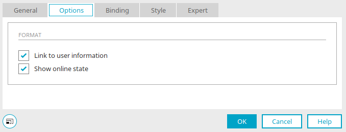
Link to user information
Displays the user name in the browser as a link via which additional information from the "User" module is loaded.
The display of user information is controlled by the Velocity file "userinfo.vm" in the portal directory "internal/system/vm/html/user". The Expert attribute vm-file can be used to create an alternative, customized file can be used.
Show online status
Displays a symbol that informs others whether the user is currently online.
Options - "Floating point number" and "Currency" control types
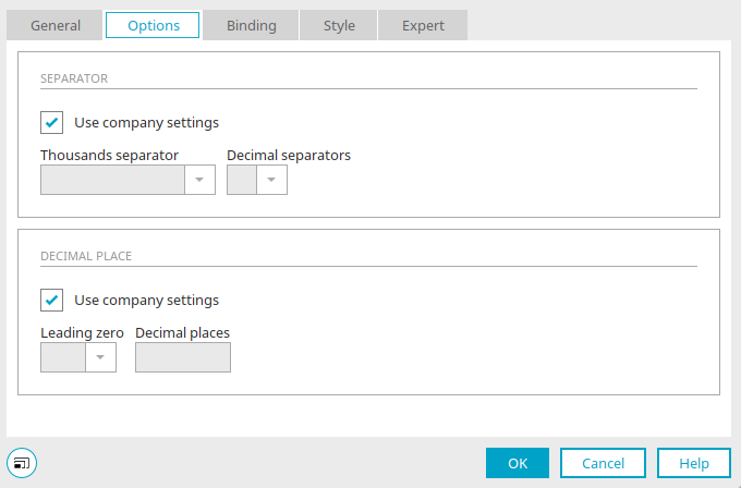
Separator character
With the setting "Use portal setting", the separator is used according to the setting of the number format in the country settings of the portal for the respective language. If you want to set the 1000 separator and decimal separator differently from the portal settings, deactivate this setting so that the "1000 separator" and "Decimal separator" options are activated. Select the desired separator there.
Decimal place
With the setting "Use portal setting", the decimal point is used according to the setting of the number format in the country settings of the portal for the respective language. If you want to set the decimal place differently from the portal settings, deactivate the setting so that the settings "Leading zero" and "Decimal places" are activated.
Leading zero
Defines the format for the display of zeroes in front of the number (i.e. 0.7 or .7).
Decimal places
Enter an integer that defines how many decimal places should be displayed.
Column presentation in view tables
All information on this topic can be found here.
Options - "Date", "Time", "Date & time" control types
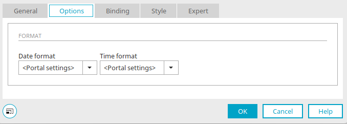
Date format
The format for the displayed date is defined here. Here,
-
dd
-
is the two-digit display of the day
-
MM
-
is the two-digit display of the month
-
yyy
-
is the four-digit display of the year
Time format
The format for the displayed time is defined here. Here,
-
HH
-
is the two-digit display of the hours
-
mm
-
is the two-digit display of the minutes
-
ss
-
is the two-digit display of the seconds
If you select "Portal setting", the format from the country settings of the portal is used for the respective language.
 Send us an e-mail