

Customize the login button for your identity provider
You have the option to place the provider's icon or another icon on your portal's login button.
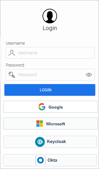
Step-by-Step
To place a provider's icon on your portal's login button, follow these steps:
-
Launch the "Design" module.
-
Open your layout.
-
Select the "Control Elements" view.
-
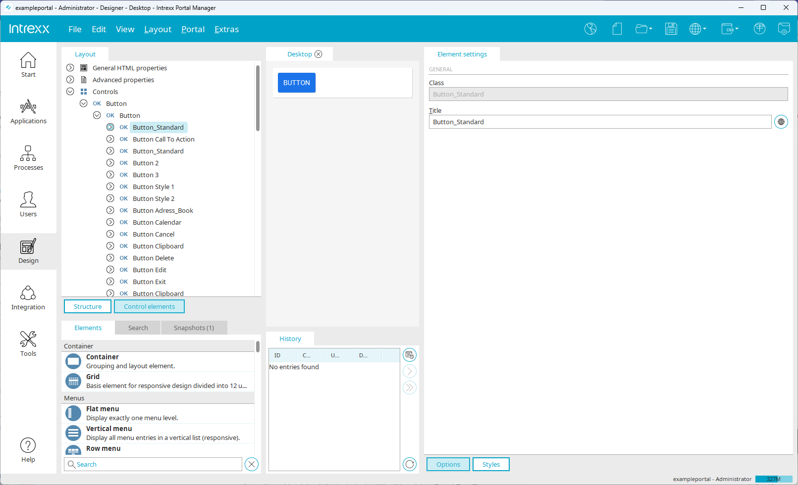
Under "Controls > Buttons > Button," select the "Standard Button" option.
-
Copy the "Button Standard" entry and paste it back under "Controls > Buttons > Button."
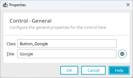
The Properties dialog box appears.
-
Enter an appropriate class name and title. (The title appears on the login button.)
-
Click "OK."
-
Select the style classes below the newly created button (
 ).
). -
For each style class, add the following properties (
 ):
):background-image: url(../../thirdparty/icon54/svg/line/LogosBrands/Google.svg); /* Bildpfad entsprechend anpassen *n/ background-blend-mode: overlay; background-position-x: 1em; background-position-y: center; background-repeat: no-repeat; background-size: 2em auto;In the "background-image " style class, adjust the path to the icon you've chosen accordingly.

-
Follow these steps for all the layouts you use.
-
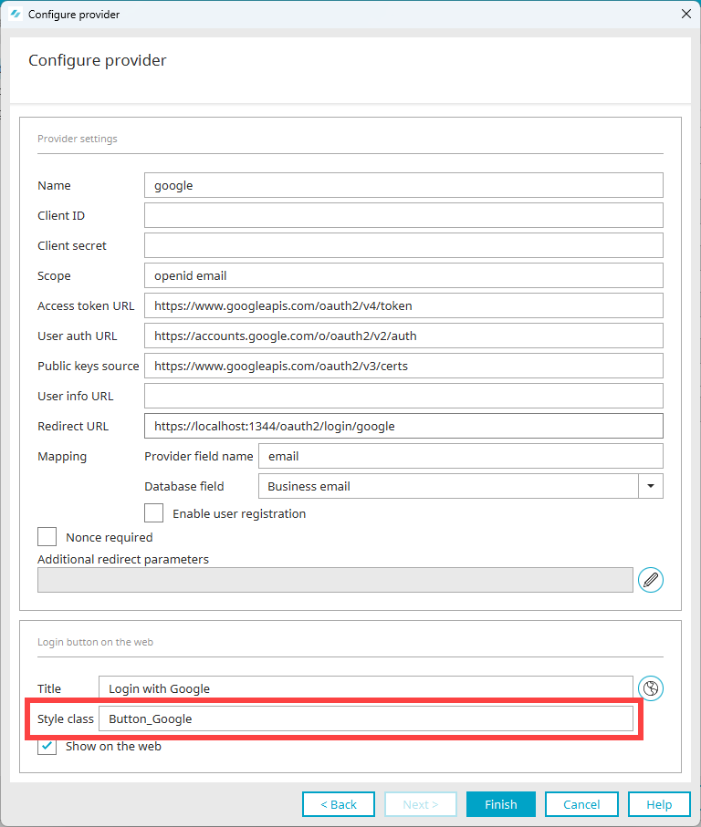
Enter the newly created style class in the "Style Class" field of the "Configure Provider" dialog box.
(The section " Enter ID Provider Data in User Management " describes how to access the dialog box.)
-
Click "Finish."
More Information