

CSS Helper Classes
Here is a list of helper classes in Intrexx 12; you can select some of them directly from the " View" tab in an item's properties as " Predefined Style Class."
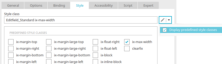
For helper classes that you cannot select directly, you can simply enter them directly in the " Style Class " field on the View tab.
| Category | CSS class | CSS rule | Validity | Description | Deployment | Selection View Tab |
|---|---|---|---|---|---|---|
| Responsive Width | ix-m300 | width: 300px; | Medium | Sets the width of the element in Medium view to 300px. | Dialogs, Forms, Containers | No |
| Responsive Width | ix-m500 | width: 500px; | Medium | Sets the width of the element in Medium view to 500px. | Forms, Panels | No |
| Responsive Width | ix-m700 | width: 700px; | Medium | Sets the width of the element in Medium view to 700px. | Longer dialogs | No |
| Responsive Width | ix-m300l500 | Medium: width: 300px; Large: width: 500px; | Medium, Large | Sets the width of the element to 300px in the Medium view and to 500px in the Large view. | Responsive Dialogs | No |
| Responsive Width | ix-m500l700 | Medium: width: 500px; Large: width: 700px; | Medium, Large | Sets the width of the element to 500px in the Medium view and to 700px in the Large view. | Responsive Forms | No |
| Responsive Width | ix-m700l900 | Medium: width: 700px; Large: width: 900px; | Medium, Large | Sets the width of the element to 700px in the Medium view and to 900px in the Large view. | Extensive Discussions | No |
| Responsive Width | ix-m900l1100 | Medium: width: 900px; Large: width: 1100px; | Medium, Large | Sets the width of the element to 900px in the Medium view and to 1100px in the Large view. | Large Work Areas | No |
| Padding | ix-padding-small | padding: 5px; | Small, Medium, Large | Adds an inner margin of 5px on all sides of the element. | Small Containers | No |
| Padding | ix-padding-medium | padding: 10px; | Small, Medium, Large | Adds an inner margin of 10px on all sides of the element. | Panels, Groups | No |
| Padding | ix-padding-large | padding: 20px; | Small, Medium, Large | Adds an inner margin of 20px on all sides of the element. | Cards, Containers, Dialogs | No |
| Margin | ix-margin-medium-top | margin-top: 10px; | Small, Medium, Large | Adds an outer margin of 10px above the element. | Spacing Between Form Sections | No |
| Margin | ix-margin-medium-right | margin-right: 10px; | Small, Medium, Large | Adds an outer margin of 10px to the right of the element. | Distance between elements | No |
| Margin | ix-margin-medium-bottom | margin-bottom: 10px; | Small, Medium, Large | Adds 10px of padding below the element. | Vertical Spacing | No |
| Margin | ix-margin-medium-left | margin-left: 10px; | Small, Medium, Large | Adds an outer margin of 10px to the left of the element. | Distance between elements | No |
| Margin | ix-margin-top | margin-top: 5px; | Small, Medium, Large | Adds an outer margin of 5px above the element. | Spacing between elements or form fields. | Yes |
| Margin | ix-margin-right | margin-right: 5px; | Small, Medium, Large | Adds a 5px margin to the right of the element. | Horizontal distance between adjacent elements. | Yes |
| Margin | ix-margin-bottom | margin-bottom: 5px; | Small, Medium, Large | Adds a 5px margin below the element. | Vertical spacing between elements or form fields. | Yes |
| Margin | ix-margin-left | margin-left: 5px; | Small, Medium, Large | Adds a 5px margin to the left of the element. | Horizontal distance between adjacent elements. | Yes |
| Margin | ix-margin-large-top | margin-top: 20px; | Small, Medium, Large | Adds an outer margin of 20px above the element. | Greater spacing between content areas or form sections. | Yes |
| Margin | ix-margin-large-right | margin-right: 20px; | Small, Medium, Large | Adds an outer margin of 20px to the right of the element. | Greater horizontal spacing between elements. | Yes |
| Margin | ix-margin-large-bottom | margin-bottom: 20px; | Small, Medium, Large | Adds 20px of padding below the element. | Greater vertical spacing between content areas or form sections. | Yes |
| Margin | ix-margin-large-left | margin-left: 20px; | Small, Medium, Large | Adds an outer margin of 20px to the left of the element. | Greater horizontal spacing between elements. | Yes |
| Layout Utility | ix-float-left | float: left; | Small, Medium, Large | Aligns the element to the left and flows subsequent content to the right of it. | Left-aligned arrangement of images, icons, or containers. | Yes |
| Layout Utility | ix-float-right | float: right; | Small, Medium, Large | Aligns the element to the right and wraps subsequent content to the left of it. | Aligning images, icons, or containers to the right. | Yes |
| Layout Utility | clearfix | clear: both; (via ::after) | Small, Medium, Large | Ensures that a container correctly wraps around floating elements and maintains its height. | Containers with floated elements to avoid layout issues. | Yes |
| Layout Utility | ix-inline-block | display: inline-block; | Small, Medium, Large | Renders the element as an inline-block. The element remains in the text flow and can have both width and height. | Arrangement of multiple elements side by side with defined sizes. | Yes |
| Layout Utility | ix-block | display: block; | Small, Medium, Large | Renders the element as a block element and starts on a new line. | Display an element across the entire available width. | Yes |
| Width | ix-max-width | width: 100%; text-overflow: ellipsis; | Small, Medium, Large | Sets the width of the element to 100% and truncates overflowing text with ellipses (...), provided that the necessary CSS properties for text overflow are in place. | Responsive containers or elements with limited space for text. | Yes |
| Frame | ix-border-radius-full | border-radius: 100% !important; | Small, Medium, Large | Sets the corner radius of the element to 100%, thereby creating a completely round appearance. | Rounded display of buttons or circular elements. | No |
| Frame | ix-border-radius-large | border-radius: 8px; | Small, Medium, Large | Sets the corner radius of the element to 8px. | Rounded display of larger containers, maps, or input fields. | No |
| Frame | ix-border-radius-medium | border-radius: 6px; | Small, Medium, Large | Sets the corner radius of the element to 6px. | Rounded display of standard containers, buttons, or form fields. | No |
| Frame | ix-border-radius-small | border-radius: 4px; | Small, Medium, Large | Sets the corner radius of the element to 4px. | Slight rounding of smaller elements or control elements. | No |
| Grid (Responsive Layout) | ix-l2 | Large: 2 columns (width: 49.5%) | Large | Displays table entries in a two-column layout in Large view. | Splitting lists, table views, or tiles into two equally sized columns on large screens. | No |
| Grid (Responsive Layout) | ix-m2l2 | Medium: 2 columns (width: 49.5%); Large: 2 columns (width: 49.5%) | Medium, Large | Displays table entries in two columns in the Medium and Large views. | Responsive two-column layout for data records, form sections, or tiles. | No |
| Grid (Responsive Layout) | ix-m2l3 | Medium: 2 columns (width: 49.5%); Large: 3 columns (width: 32.66%) | Medium, Large | Displays table entries in two columns in Medium view and in three columns in Large view. | Responsive layout of lists or tiles with more space on large screens. | No |
| Grid (Responsive Layout) | ix-m2l4 | Medium: 2 columns (width: 49.5%); Large: 4 columns (width: 24.25%) | Medium, Large | Displays table entries in two columns in Medium view and in four columns in Large view. | Display of multiple compact elements such as tiles, maps, or overviews. | No |
| Grid (Responsive Layout) | ix-m3l5 | Medium: 3 columns (width: 32.66%); Large: 5 columns (width: 19.2%) | Medium, Large | Displays table entries in three columns in Medium view and in five columns in Large view. | Compact overviews with multiple items per line. | No |
| Grid (Responsive Layout) | ix-s2m4l6 | Small: 2 columns (width: 49.5%); Medium: 4 columns (width: 24.25%); Large: 6 columns (width: 15.8333%) | Small, Medium, Large | Displays table entries with different numbers of columns depending on the view size: 2 columns for "Small," 4 columns for "Medium," and 6 columns for "Large." | Responsive tile views or overviews that automatically adjust to the screen size. | No |
| Grid (Responsive Layout) | ix-s2m5l7 | Small: 2 columns (width: 49.5%); Medium: 5 columns (width: 19.2%); Large: 7 columns (width: 13.4285%) | Small, Medium, Large | Displays table entries with different numbers of columns depending on the view size: 2 columns for "Small," 5 columns for "Medium," and 7 columns for "Large." | Responsive display of many compact elements such as tiles, maps, or data records. | No |